When our sweet clients were ready to dive into a new look for their primary suite, we were more than happy to help!
These before and afters today, are pretty fun. And we’re thrilled to share this little tour with you!
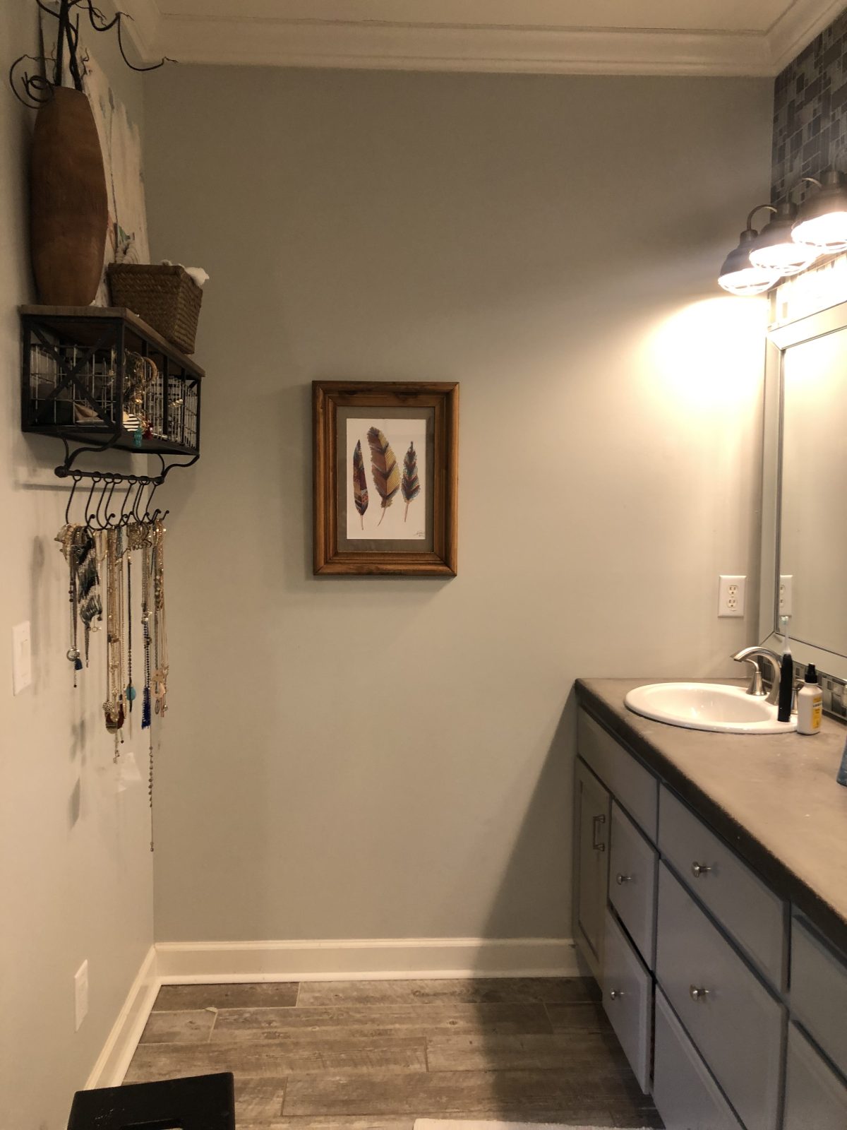
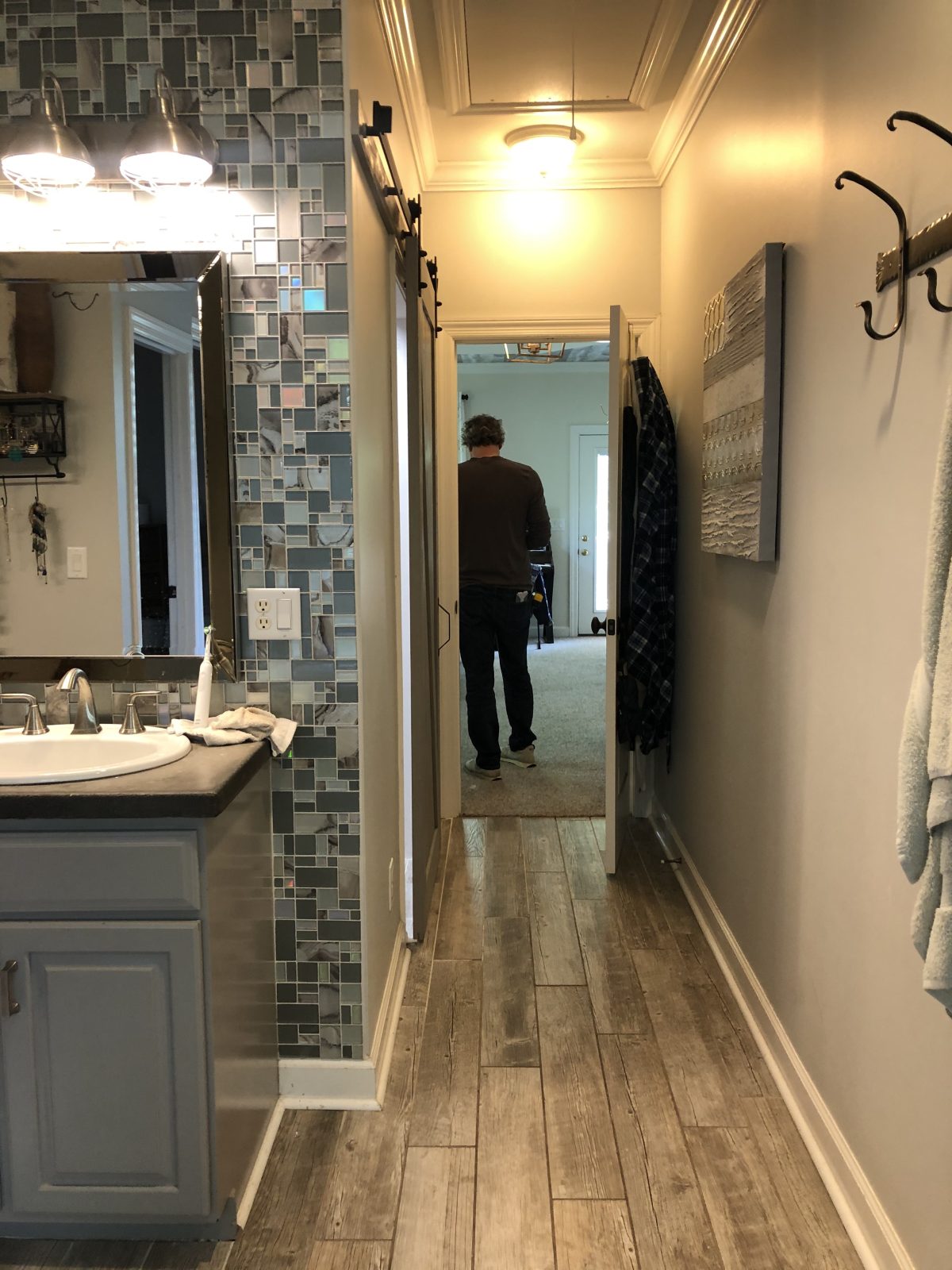
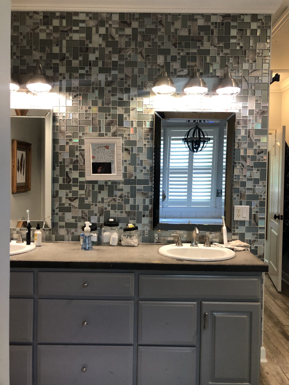
But first, here’s a glimpse of that before.
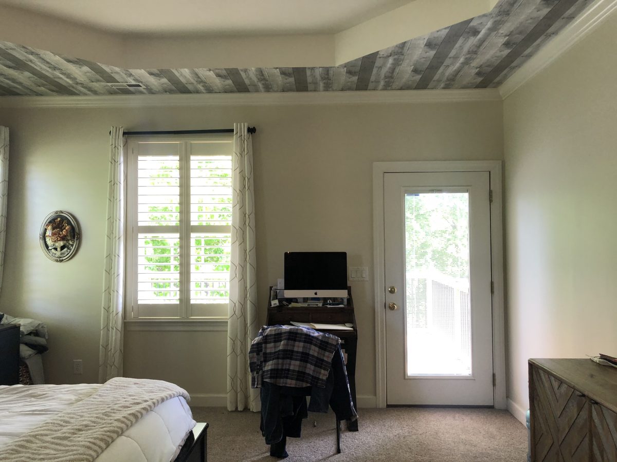
Previously, their bedroom ended here. It led off to a small deck. But they already had a sitting area for the whole family, and were looking to expand their main bedroom. They needed space to spread out, and this offered the perfect opportunity for them to do so.
So we were more than happy to help them pull it all together.
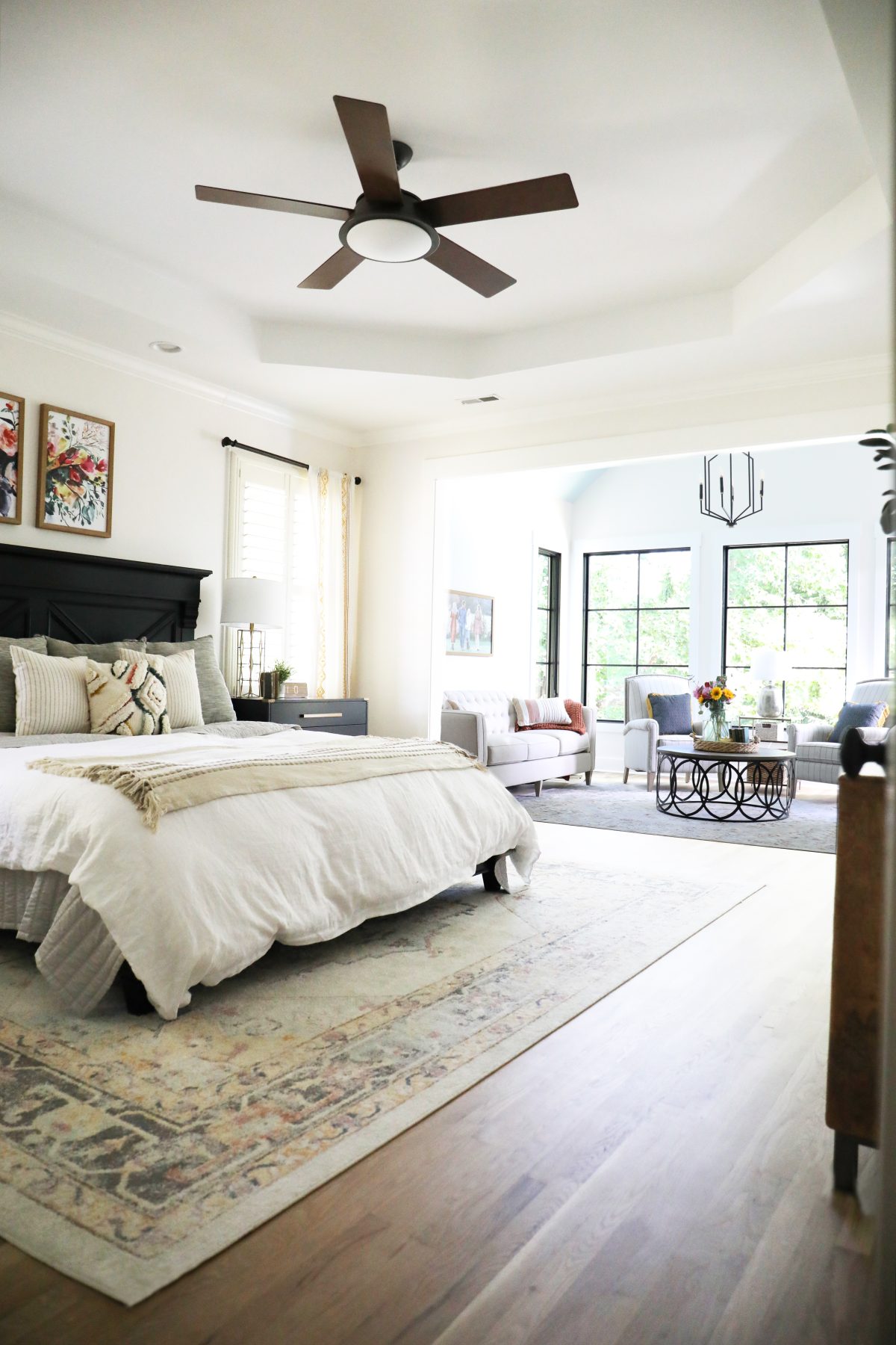
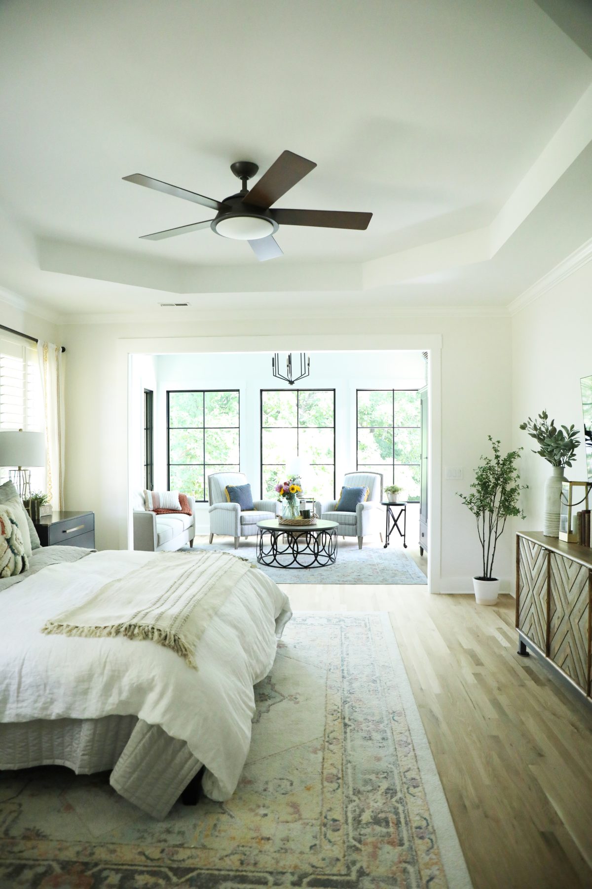
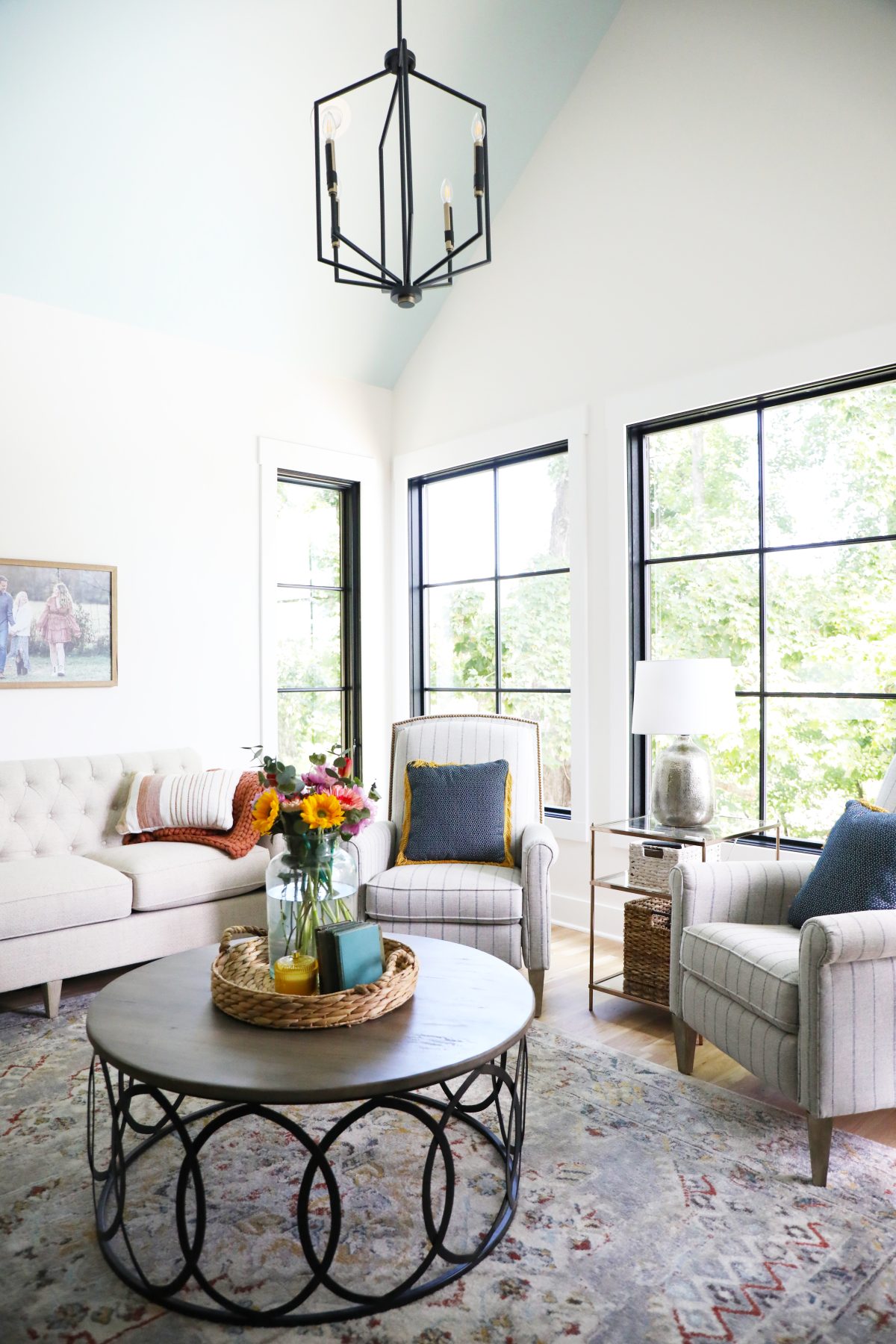
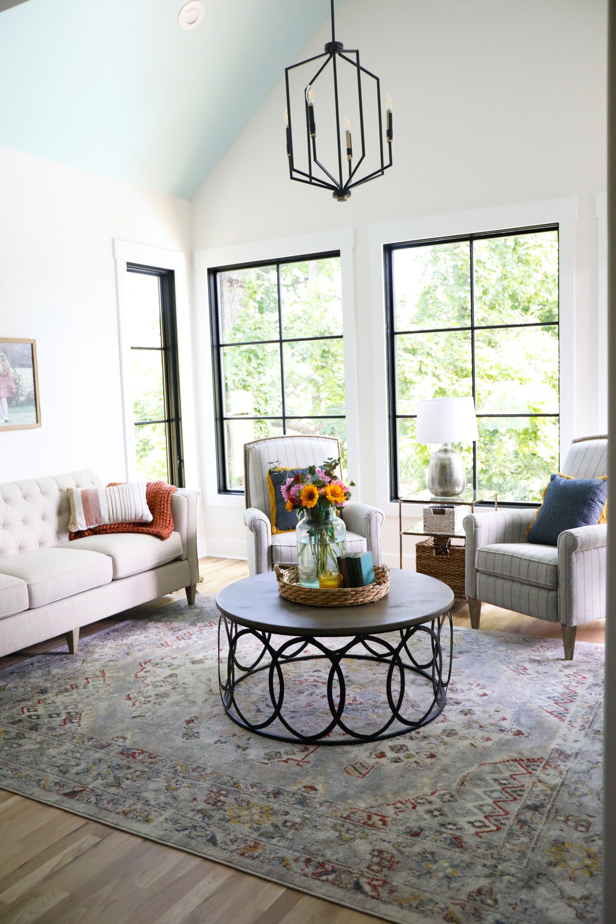
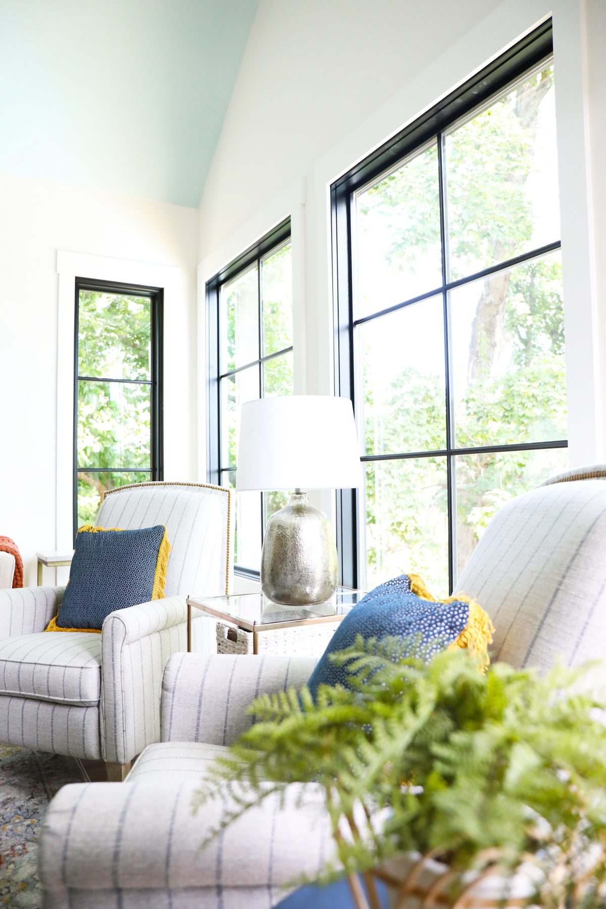
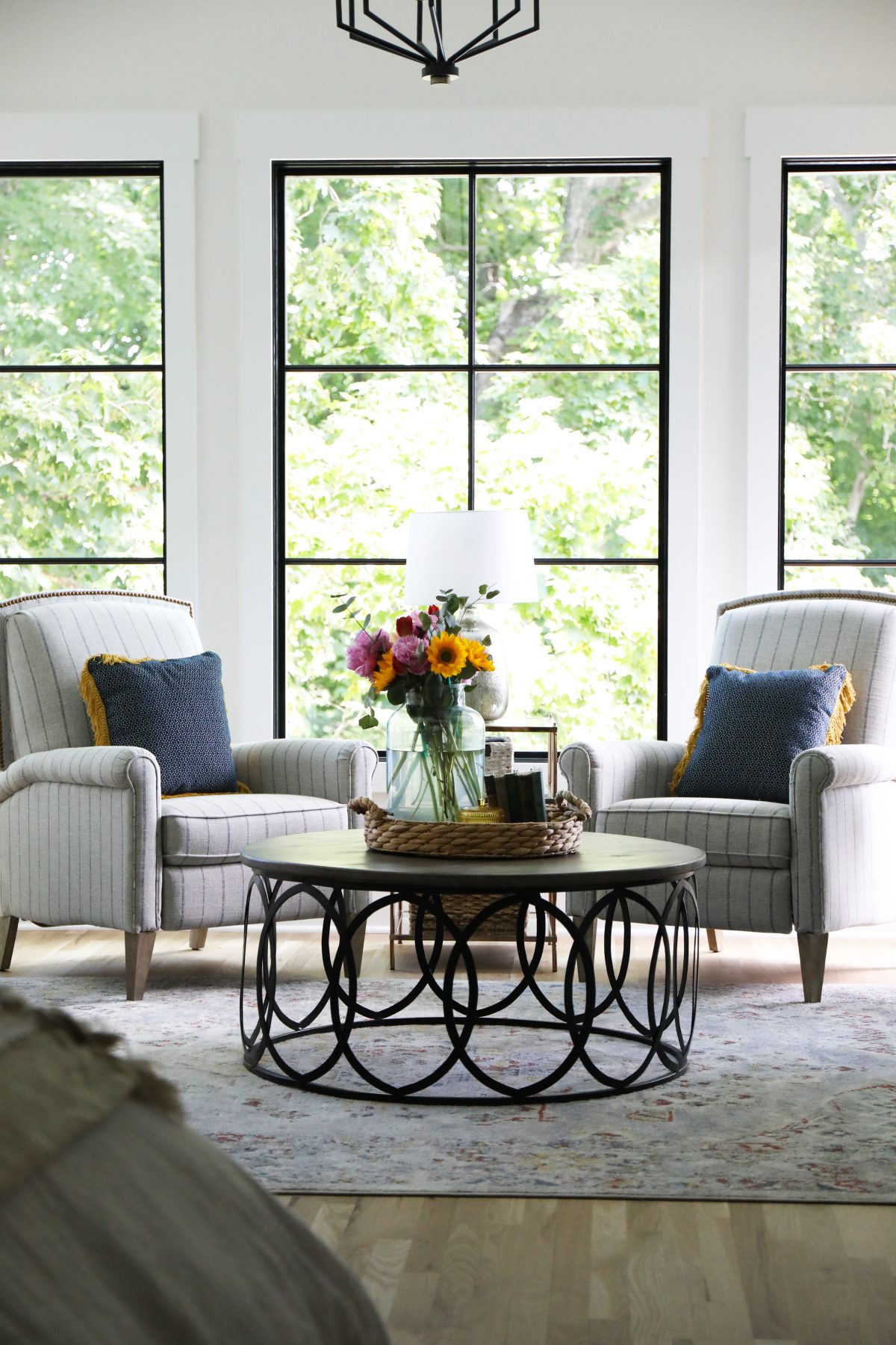
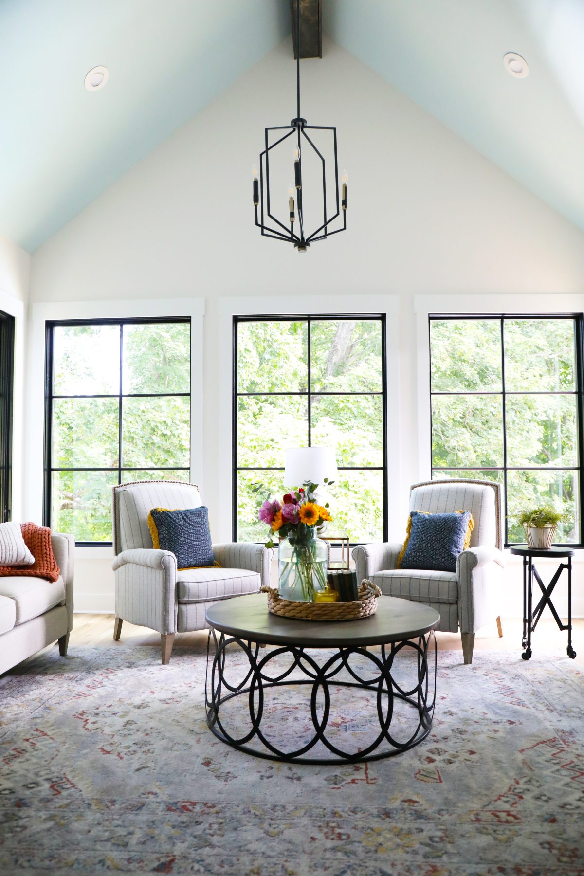
We adore the way that this room feels now! It’s a lovely sitting area for morning coffee and catching up on those emails. Or quiet conversations at night doing absolutely nothing. And those views! We love that the windows are wide open, but everything feels so private because right behind them, is a lush wooded area.
We also helped deck out their existing bedroom furniture, by freshening up the space.
Sitting room sources:
Storage: Our clients were looking for added storage, without taking away from that open space feel. This armoire was the perfect solution to keep everything open.
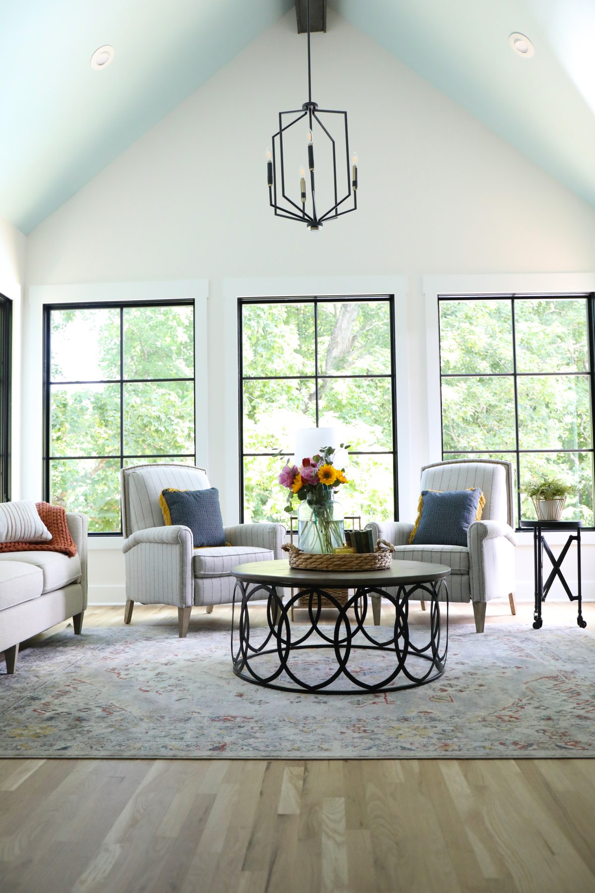
Ceiling + wall color: And that A-frame ceiling really changed the entire vibe, with an amazing hue of Tidewater Blue. Walls = SW Marshmallow
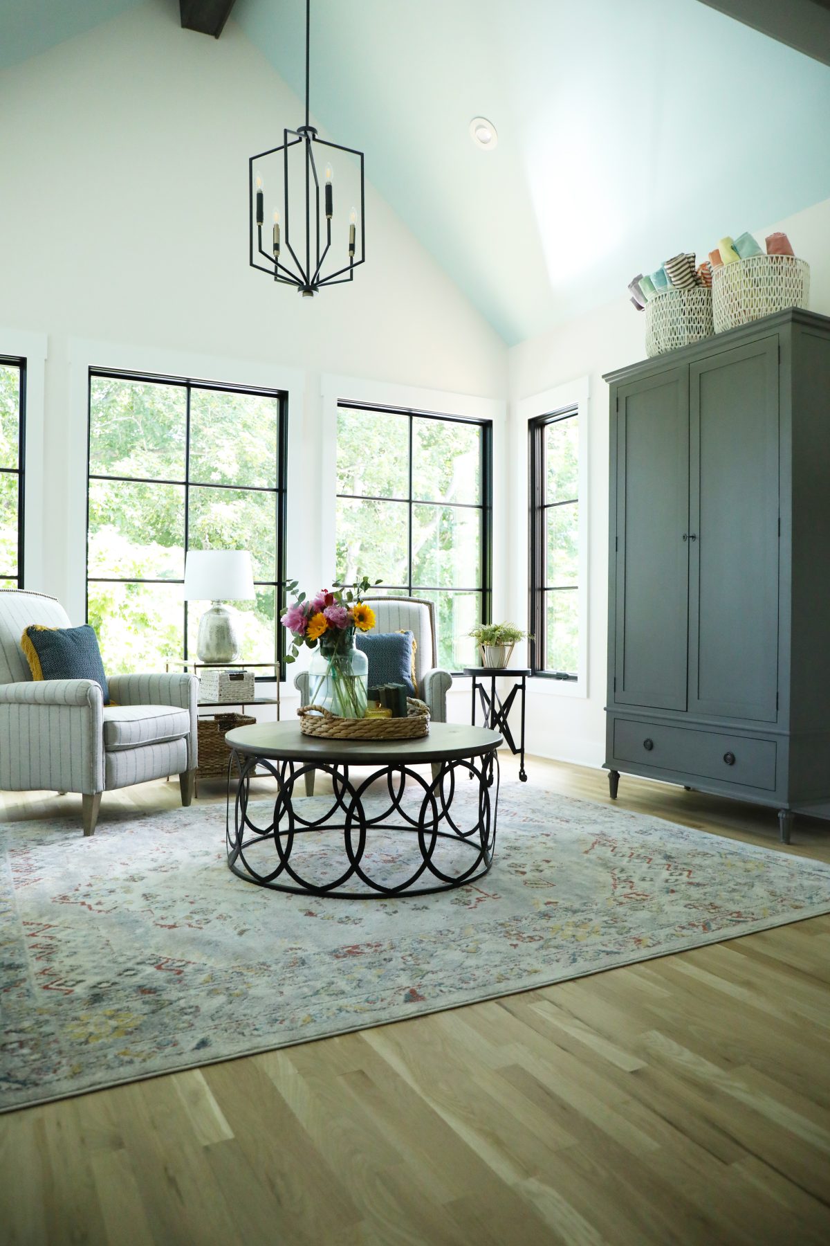
Chandelier: Per usual, the entire room is enhanced like icing on the cake with Kichler’s Armand Foyer Pendant in Black and Bronze. We adore the stark, modern look with sharp lines and amazing contrast. It truly lights up the space with real character at night, too.
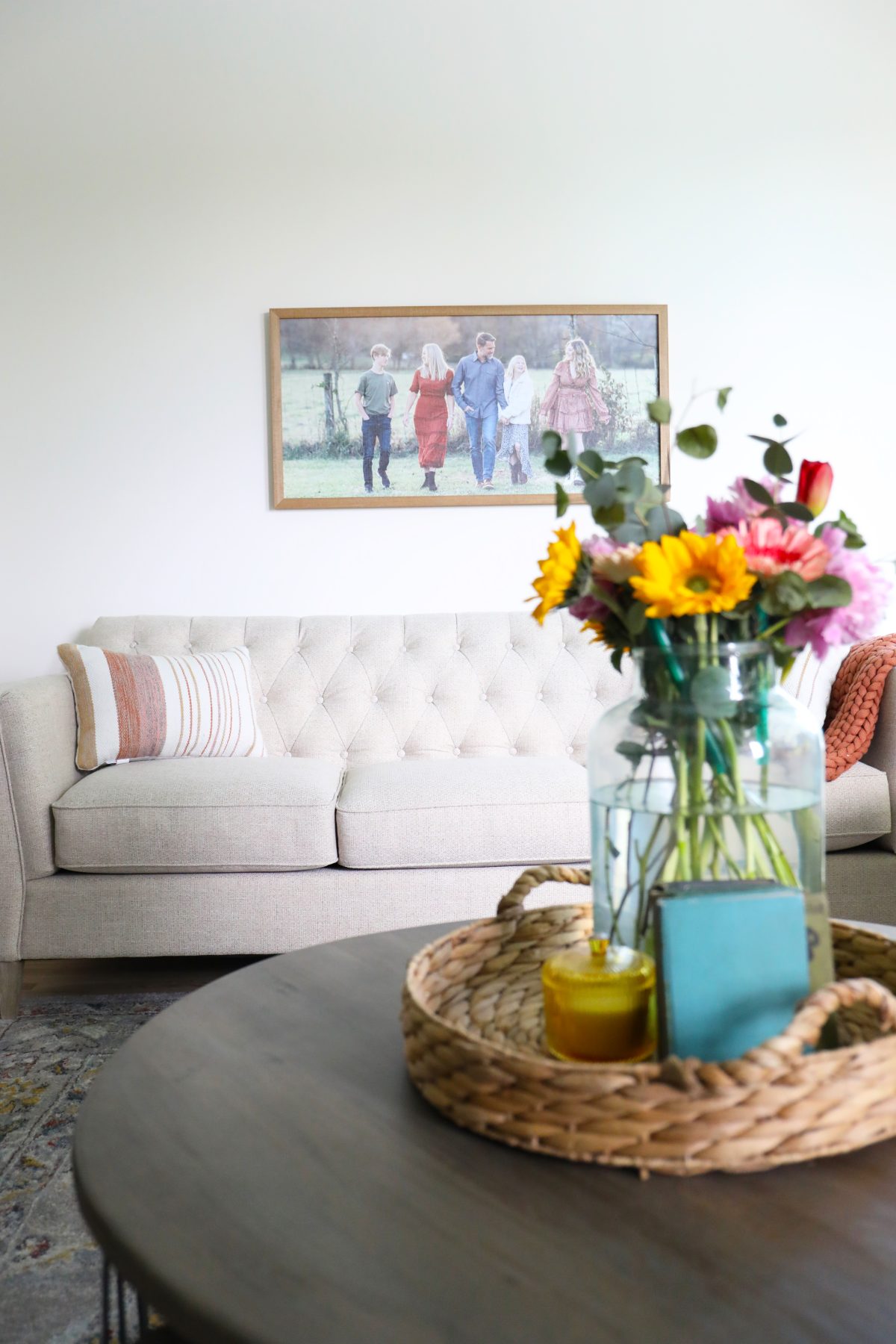
Sofa + Chairs: Are custom designed from La-Z-Boy. They were looking for a set of recliners, and these {The Chandler} are a lovely streamlined look. If they look familiar, we have similar ones in our own home and love them. All their high leg reclining options here. It’s a great option for the recliner in a modern take. The Alexandria loveseat was perfect in a linen finish for their space. Both of these options are fully customizable.
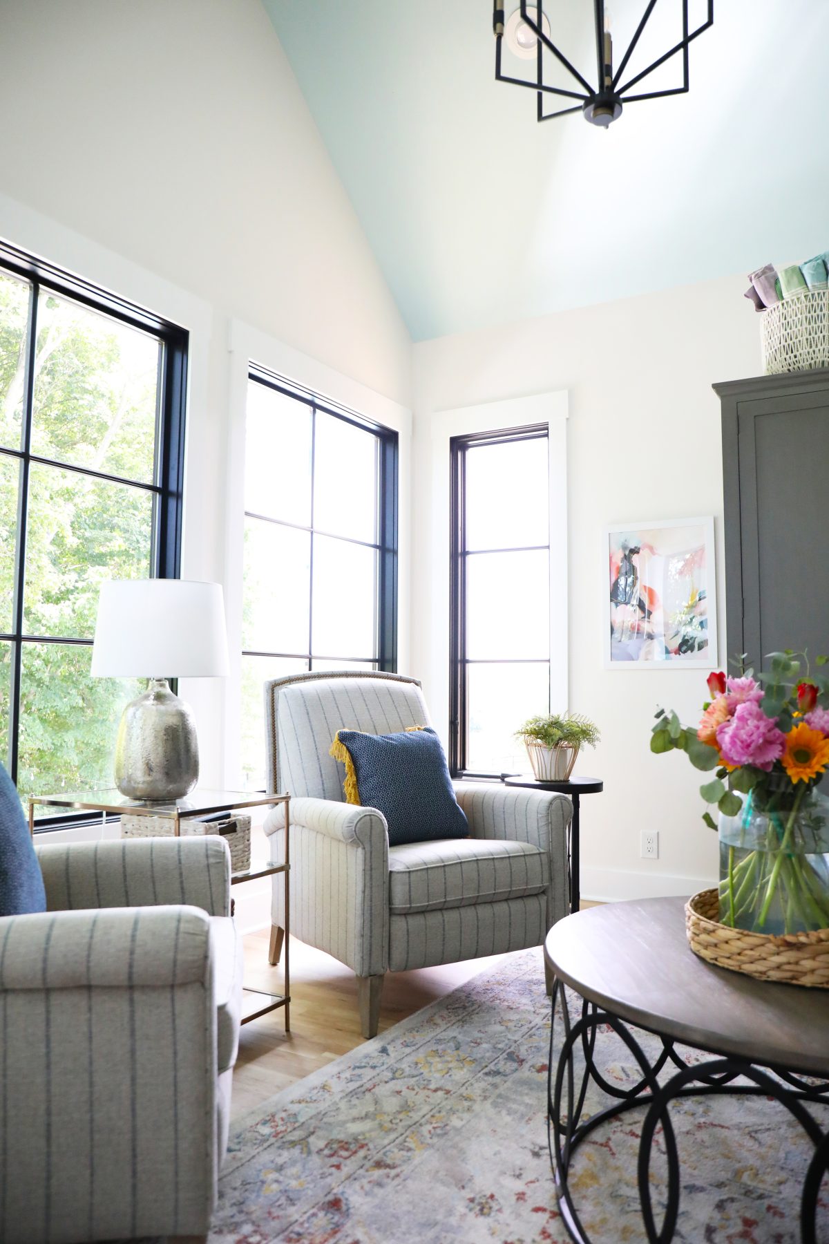
Side table + lamp: A touch of metallics, here + here. {Small circular side table purchased locally}
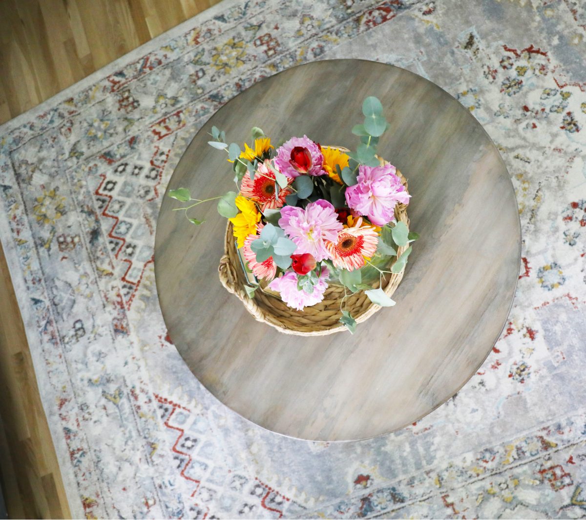
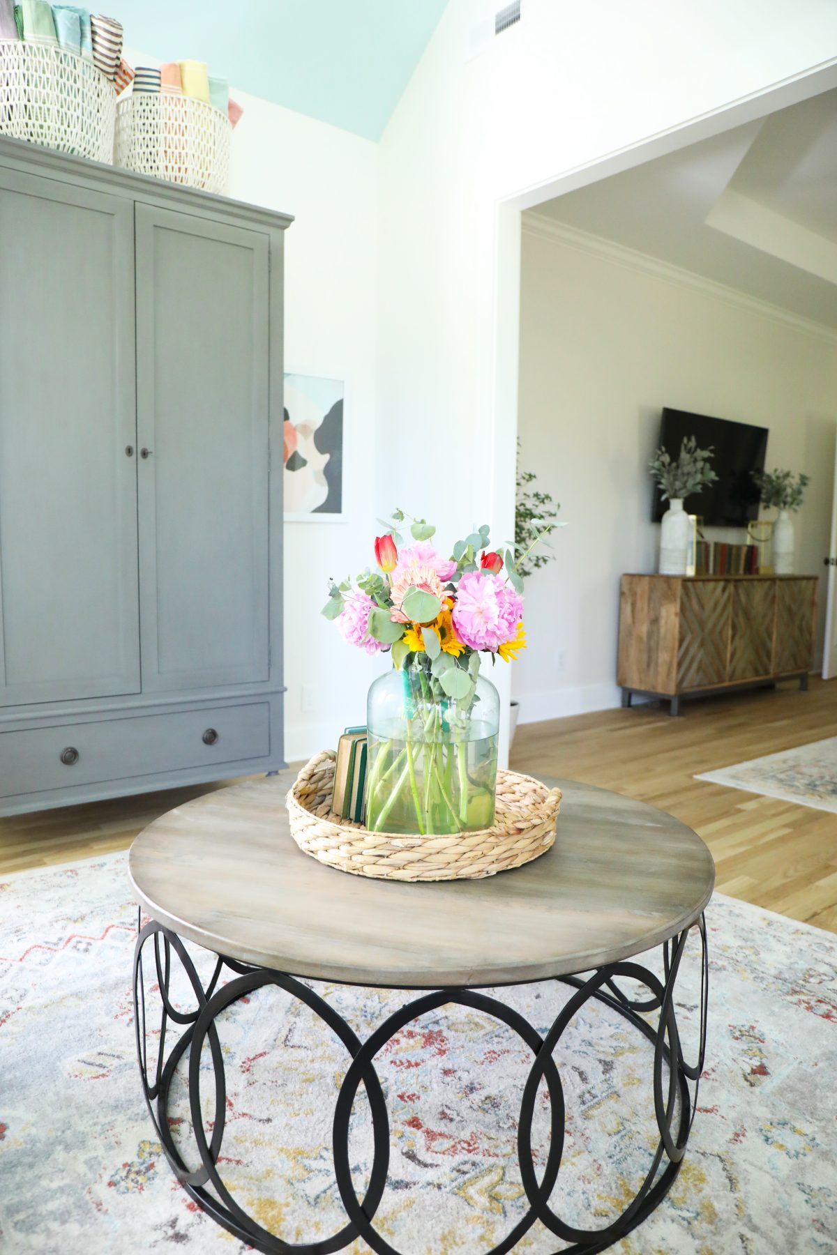
Rug: It was fun to tie in both rugs for both spaces. For the sitting space, we used this to match up with the one under the bed.
Accent pieces:
throw / baskets / pillows on sofa /abstract art
Bedroom Sources:
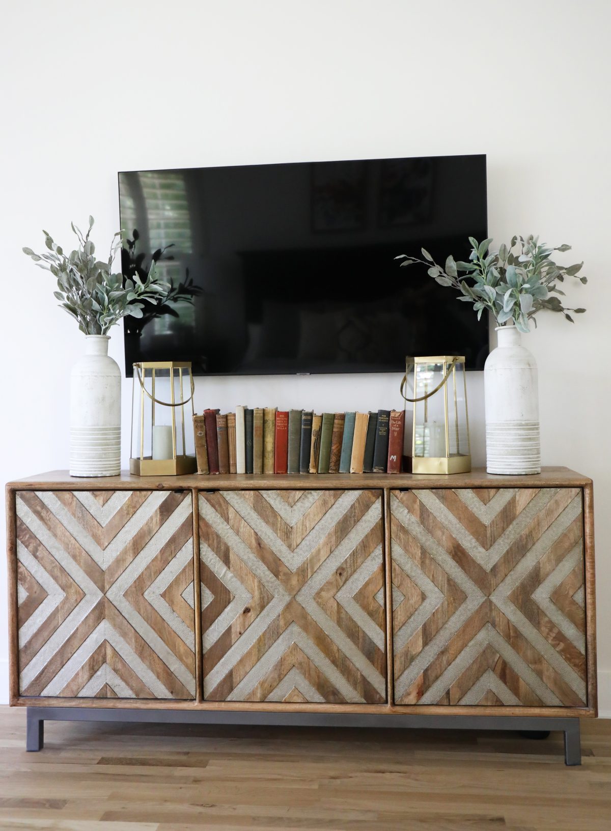
TV stand – hooker furniture – sourced here
We added old books for color, these adorable brass lanterns + vases {similar} + faux eucalyptus for a cool, natural accent.
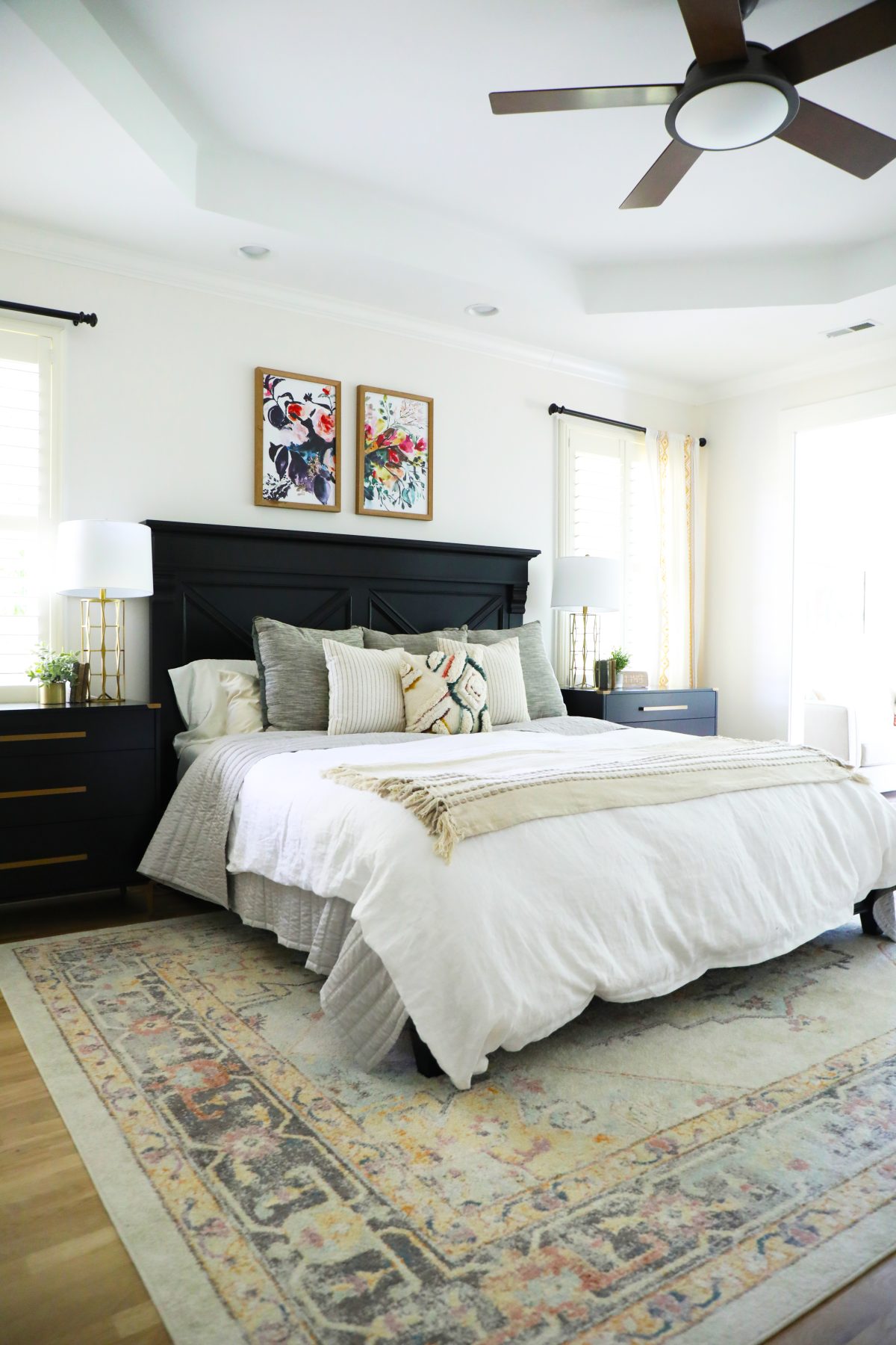
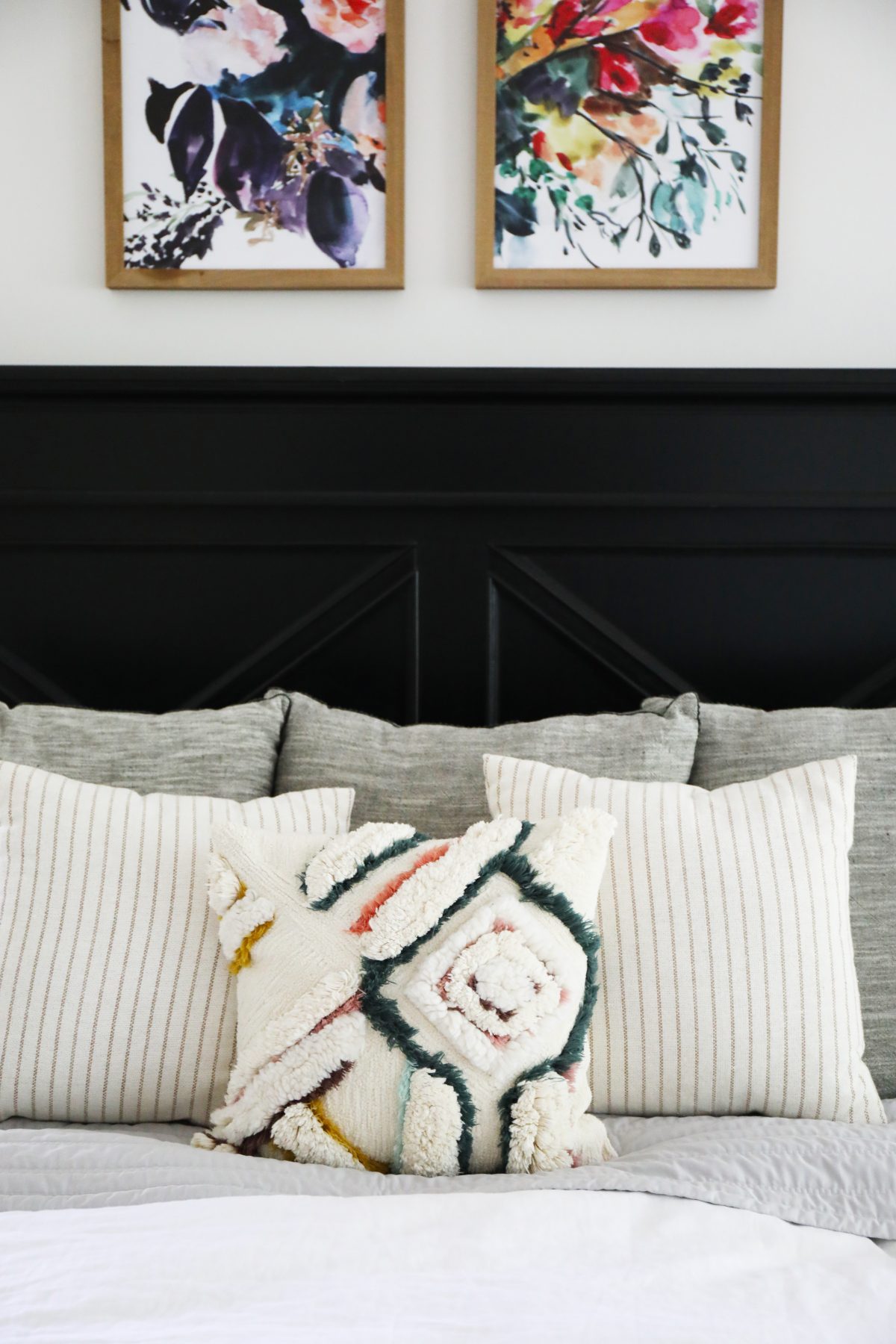
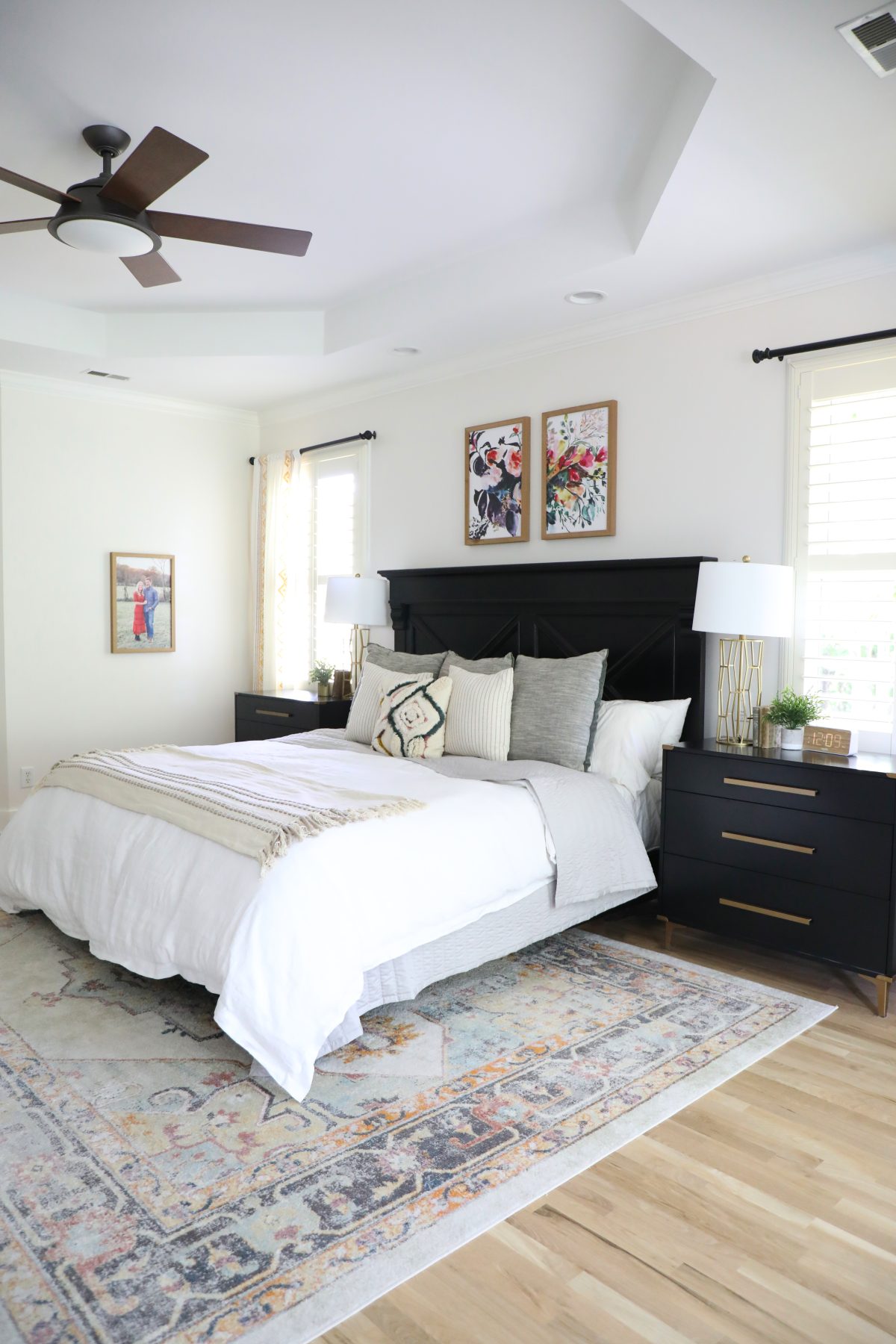
Art: We loved adding this art over their bed to bring in more color for their space, tying in all the bold black with the lighter tones, beautifully.
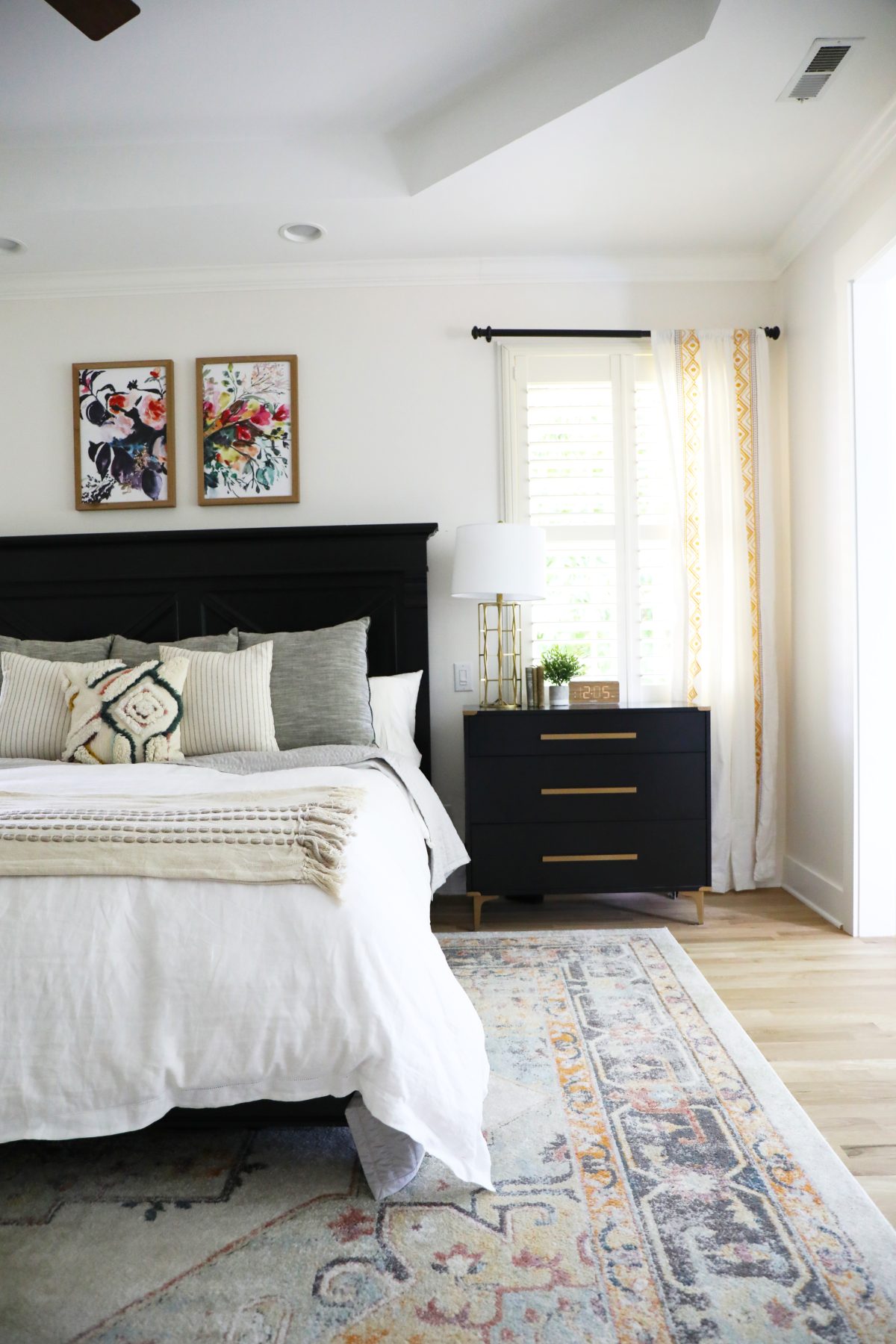
Curtains: These curtains added a soft touch on each side of the bed.
Rug: Again, we were going for great contrast with the black and bringing in soothing color. This rug tied it in perfectly.
Bedding:
Duvet / quilt {similar} / large pillows / stripe pillow / colorful pillow / throw / lamps {similar}
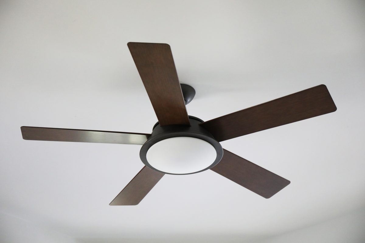
Fan: Since their sitting area had a chandelier already, this amazing Verdi™ LED ceiling fan from Kichler has the perfect, modern look for their bedroom. I think because I grew up with the {80s} version of ceiling fan designs, I was always a bit reluctant to add ceiling fans. Seeing Kichler’s beautiful modern options changed that.
But wait until you see the bathroom, because if you thought this new sitting area was pretty great…
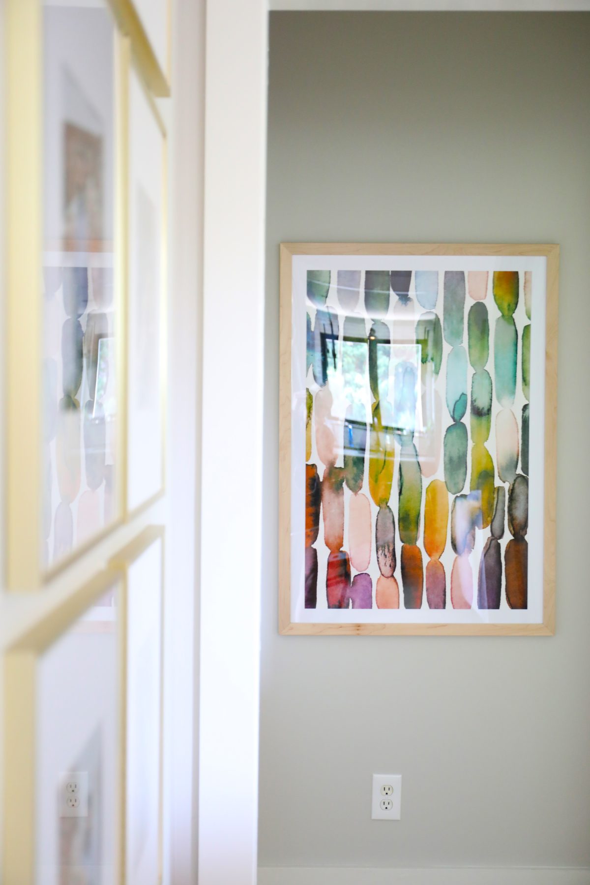
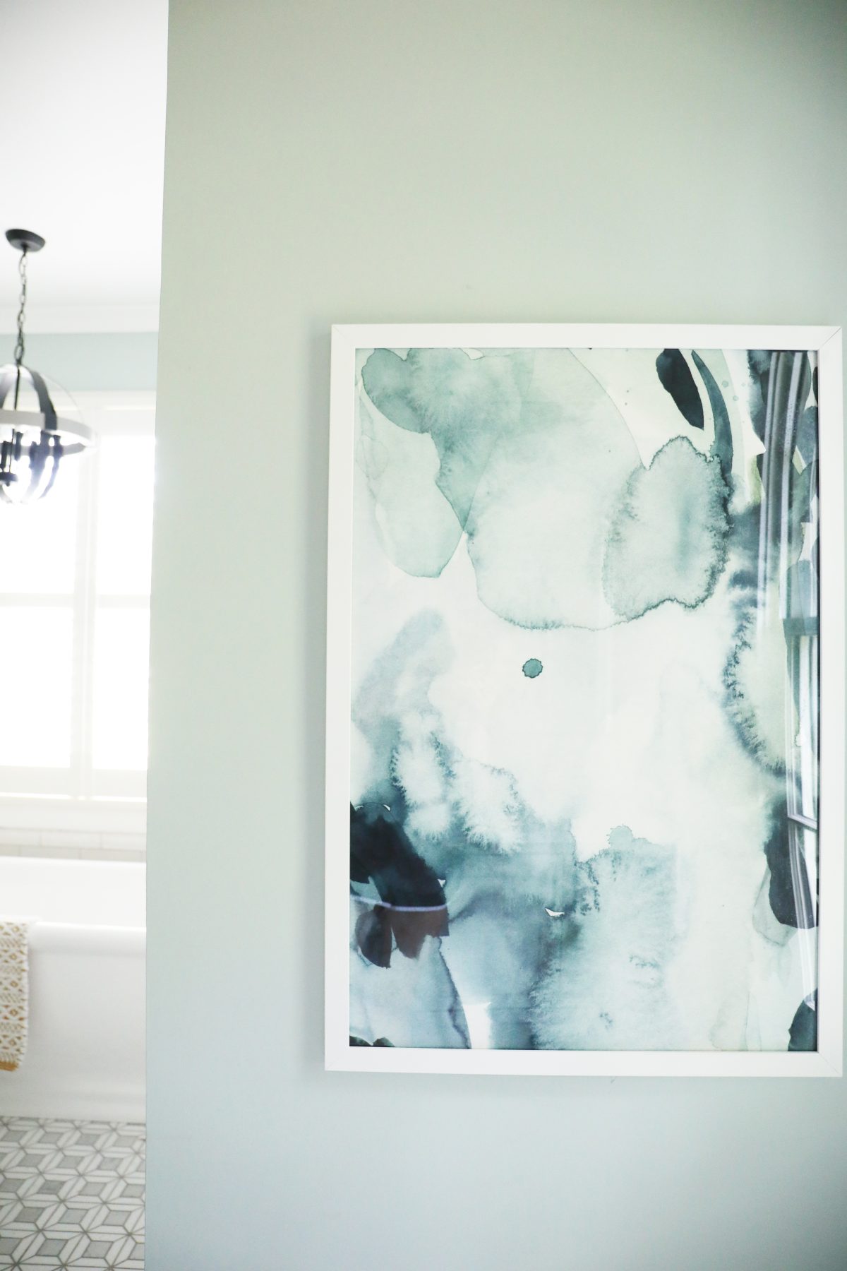
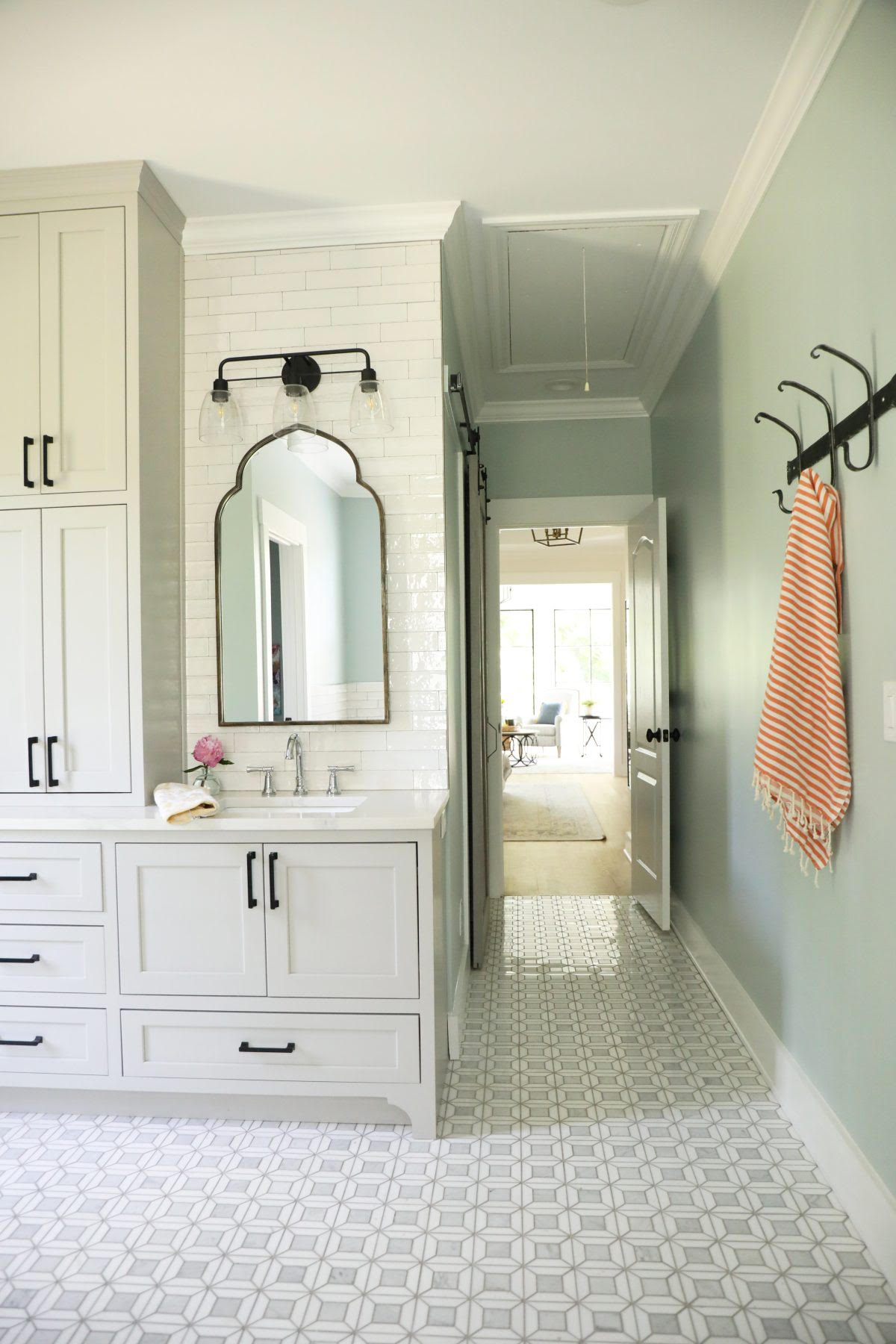
Hallway Art: I had to include this shot of a great abstract art piece we sourced for their hallway. This artist has some great finds!
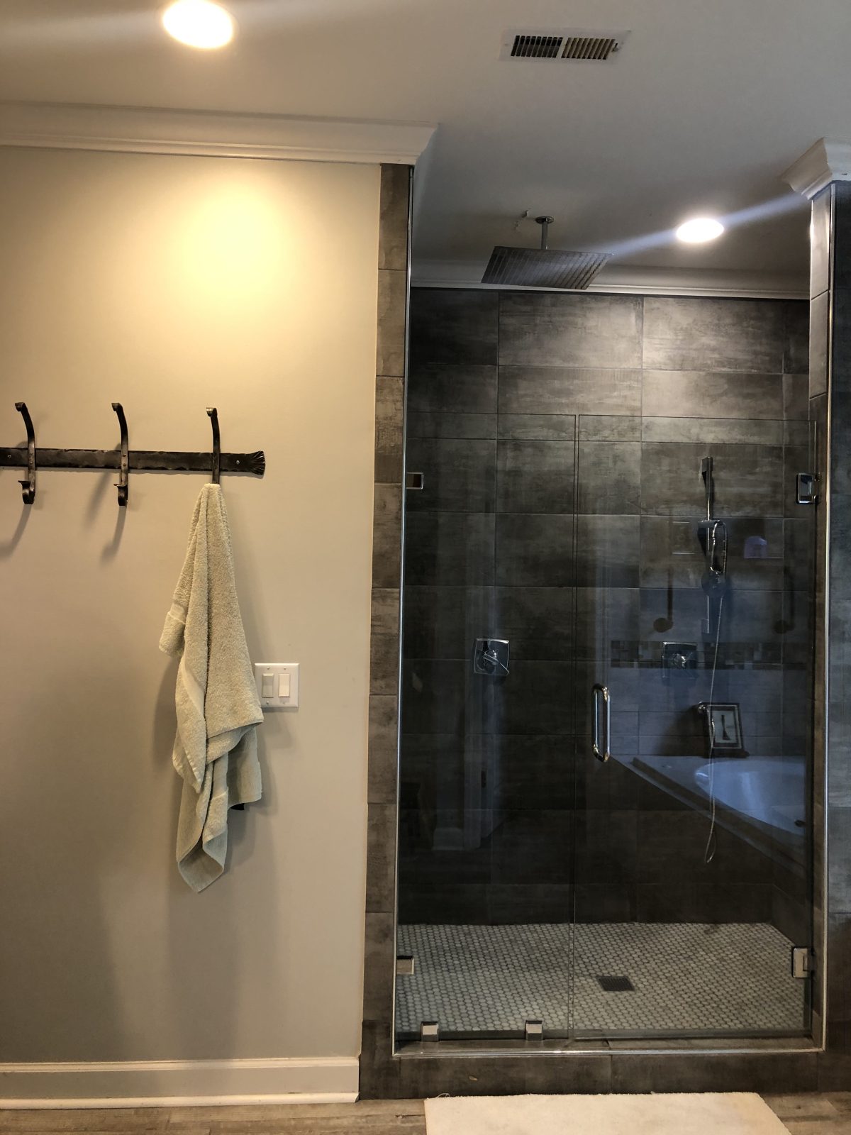
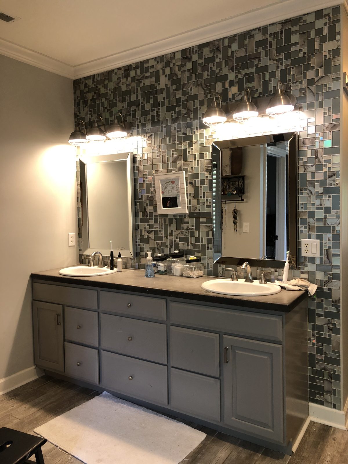
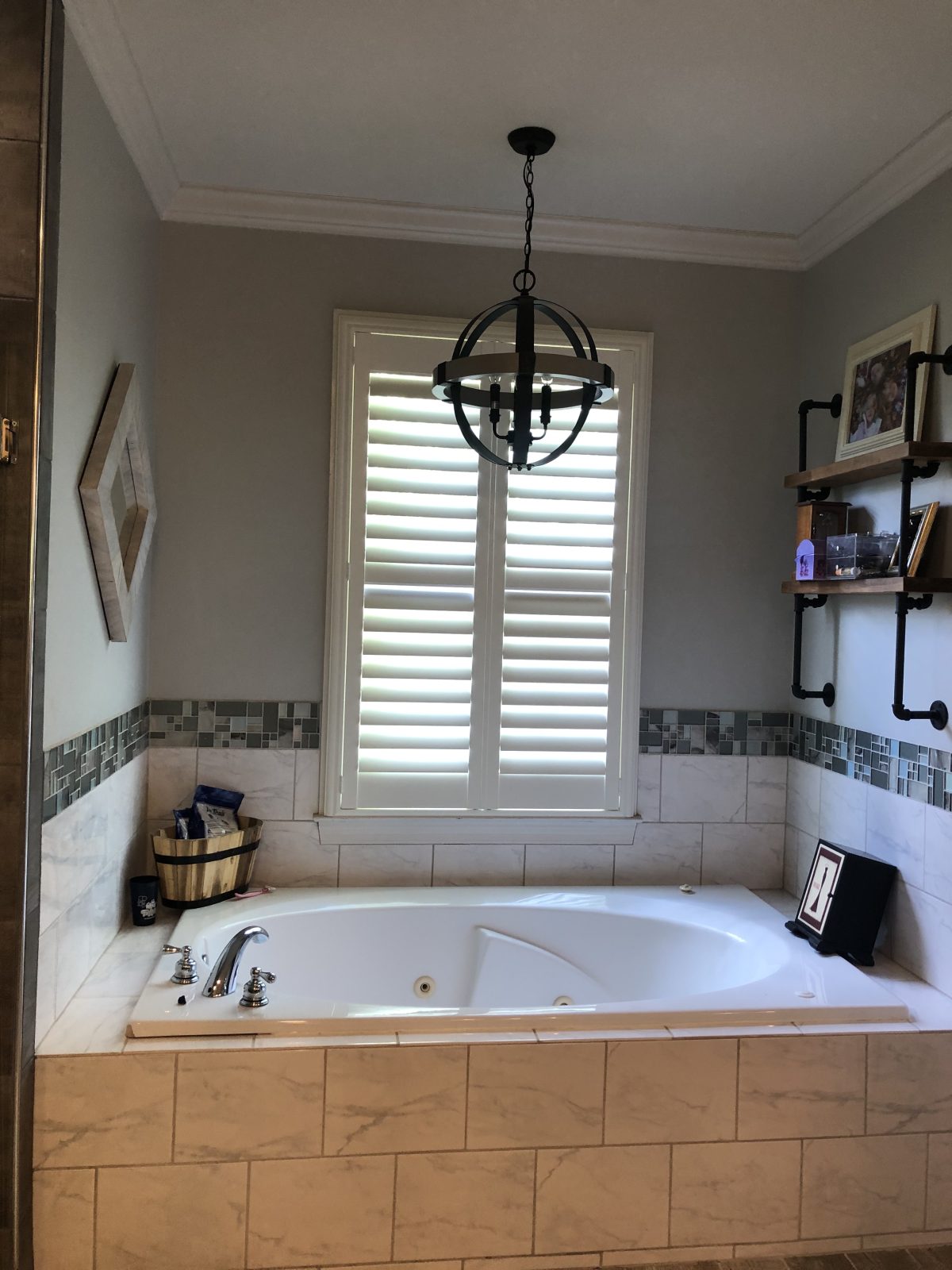
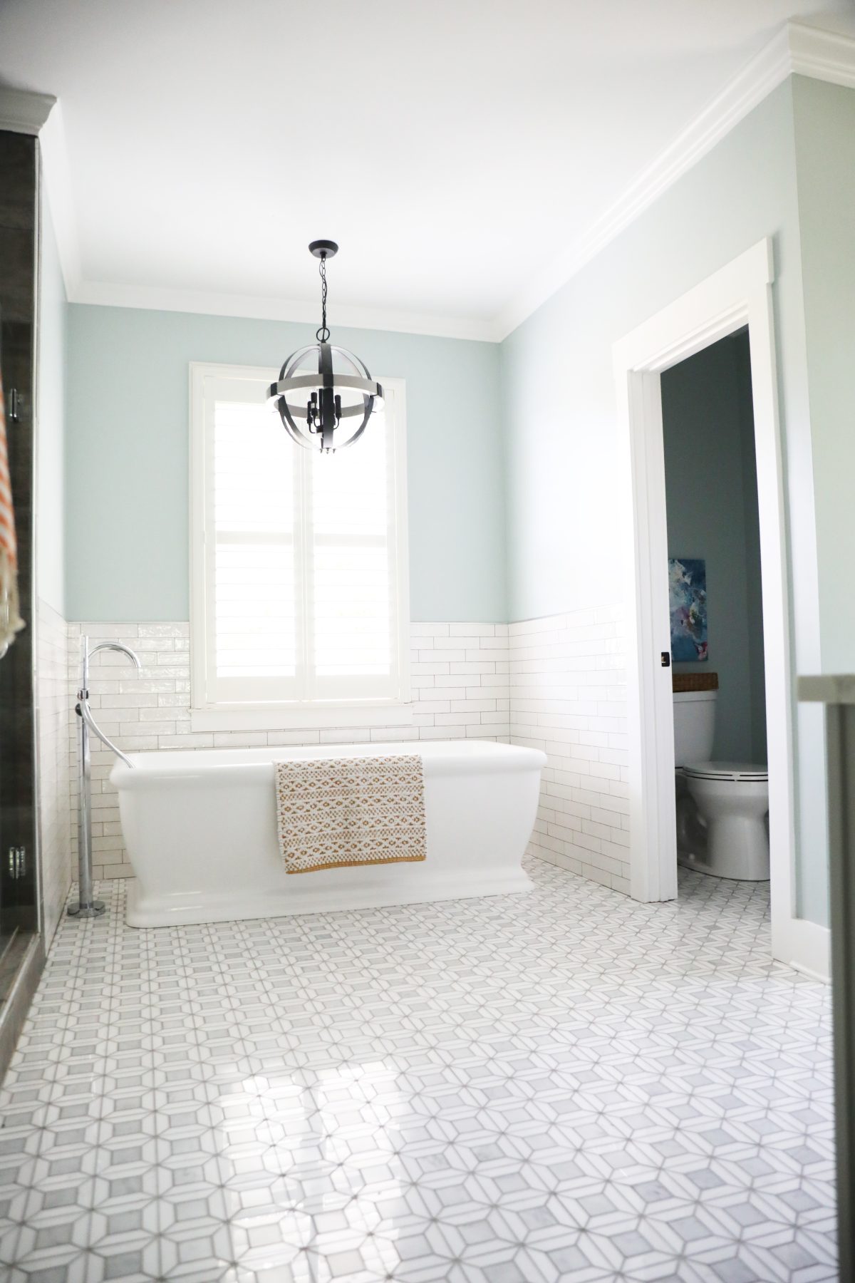
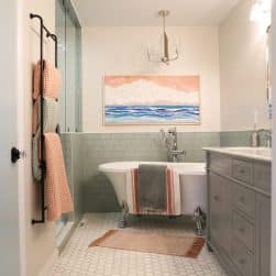
In their bathroom, they were ready for a complete overhaul, but wanted to keep their shower tile, since it was recently completed. The challenge was matching up something to go with the existing shower, with a completely different aesthetic to freshen it up. Every design is completely different, and this is an example of how sometimes things aren’t moved, but just changed.
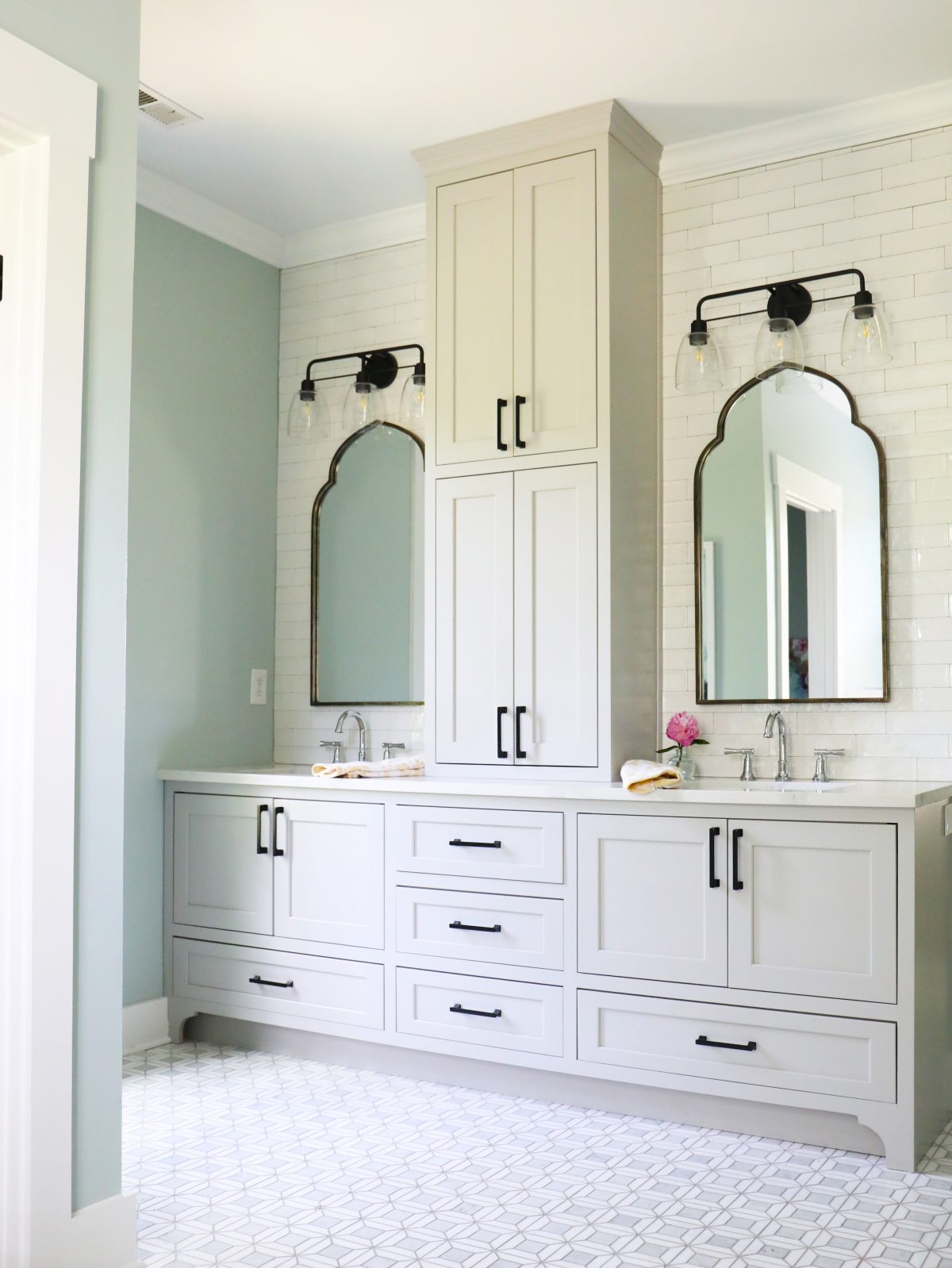
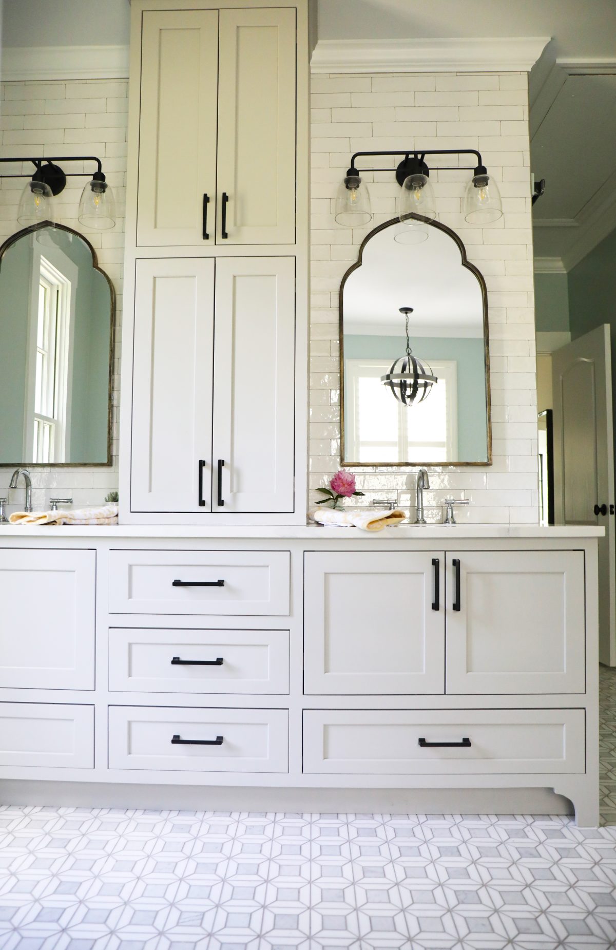
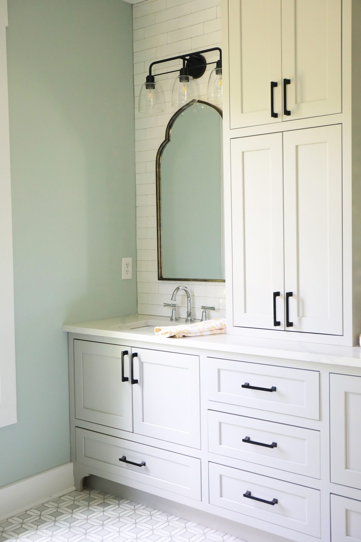
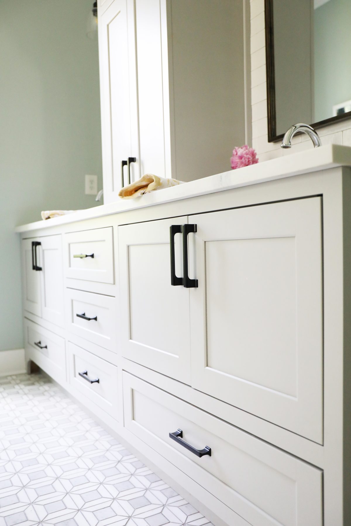
We loved designing this vanity to fit nicely within their space, while adding lots of storage. It paired nicely with these gorgeous tile choices from Jeffrey Court. But wait until you see the before to understand what an impact it made… {More on the tile below}
Bathroom Sources:
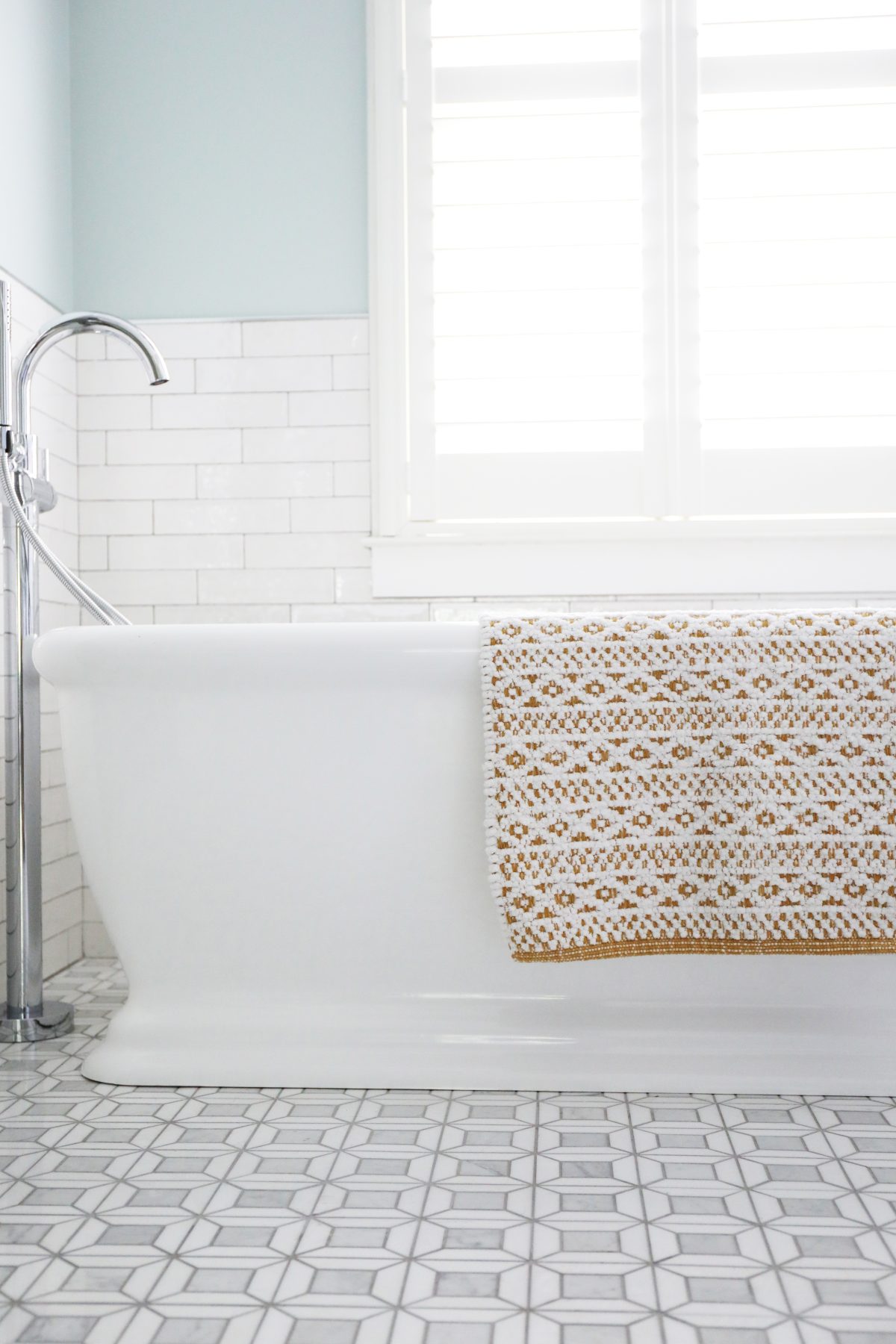
Bathtub: A freestanding tub was just what they needed for updating this space. Its classic lines lend to cleaning it all up. We love this shape, and how it’s definitely the focal point of the bath. {Rug from here}
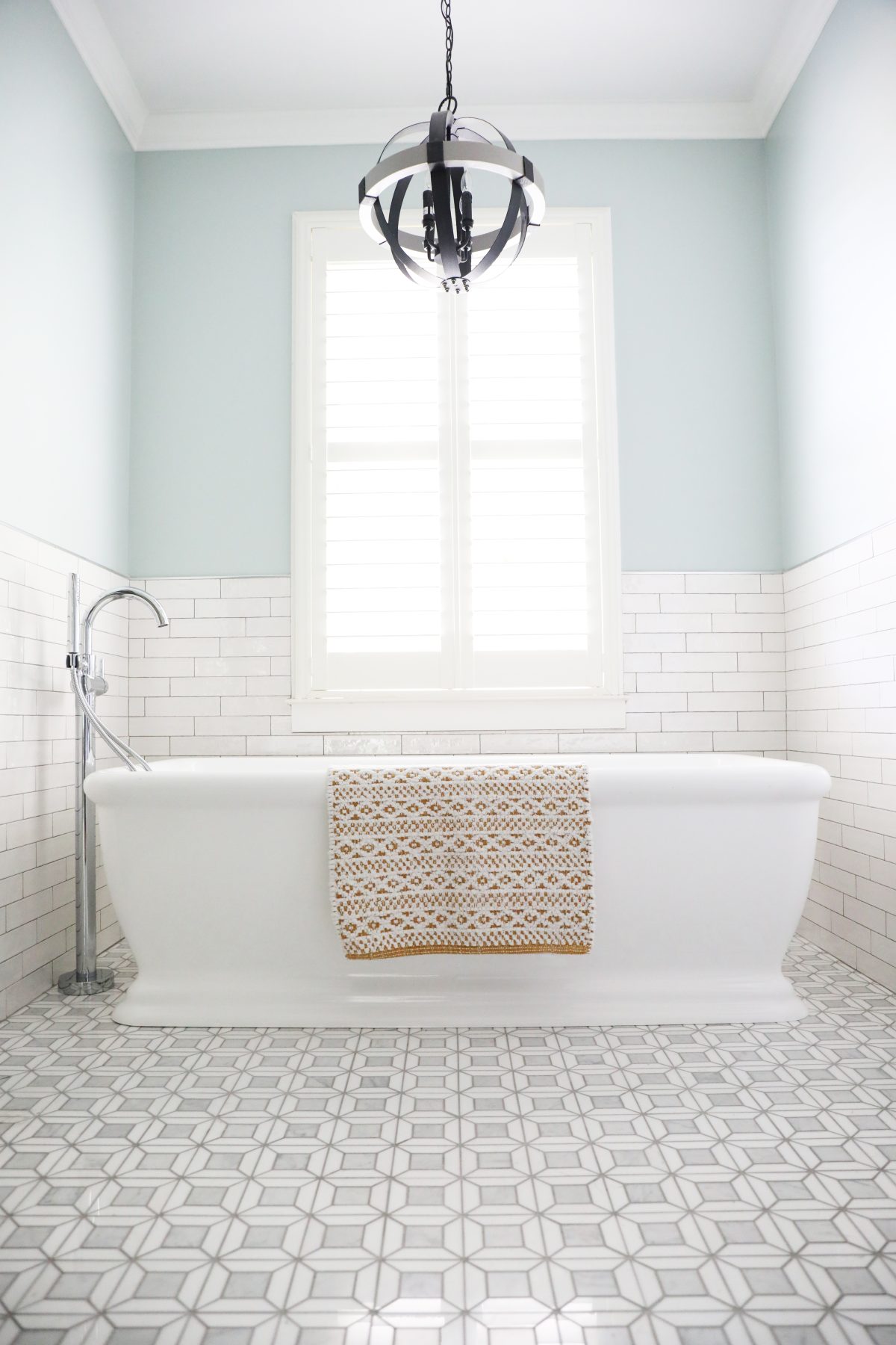
Isn’t it crazy how a change in the design will just make a space feel larger?
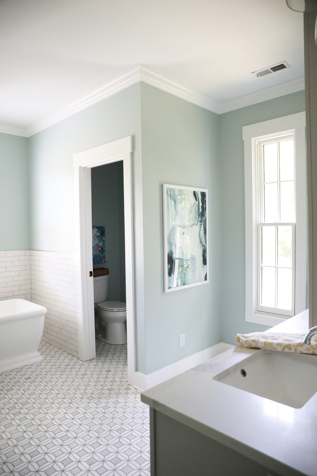
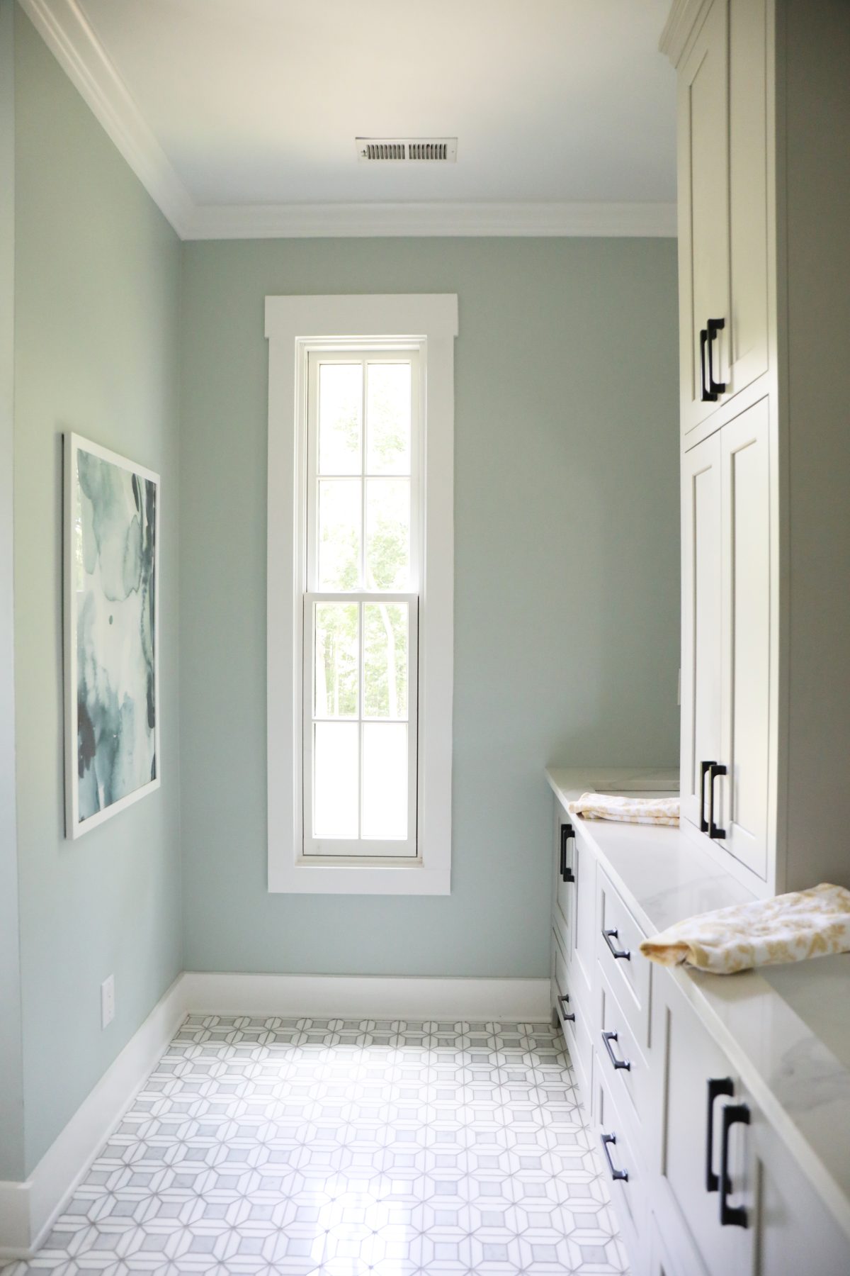
Wall color: The soft wall color is SW Rainwashed. The perfect hue for the fresh take on this bath.
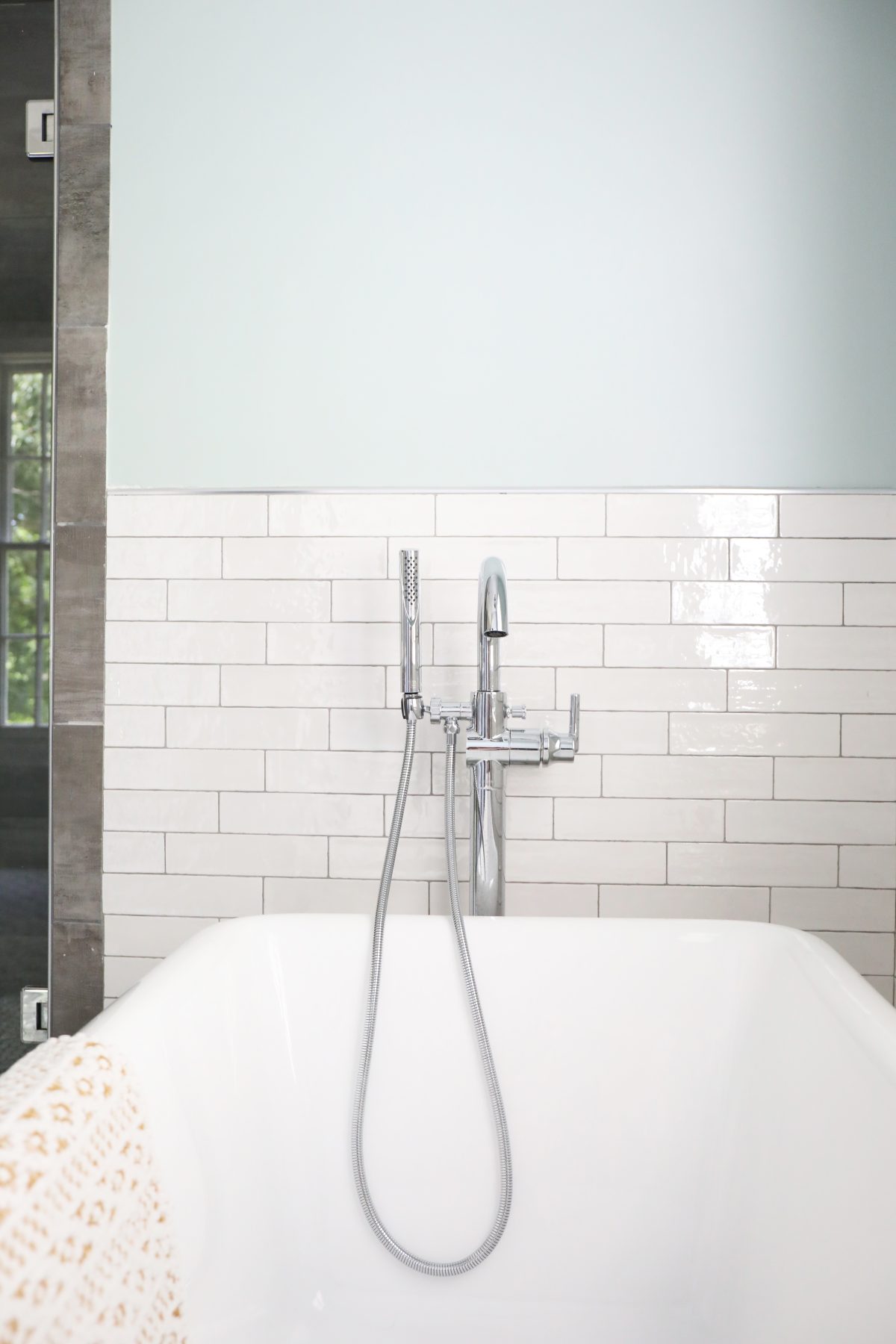
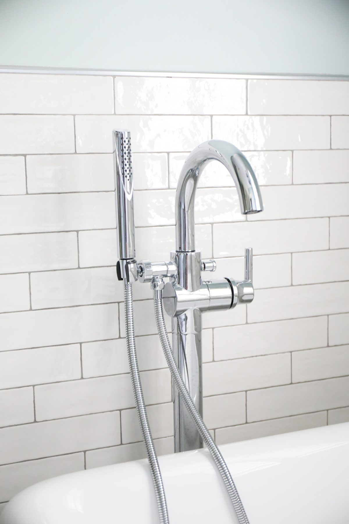
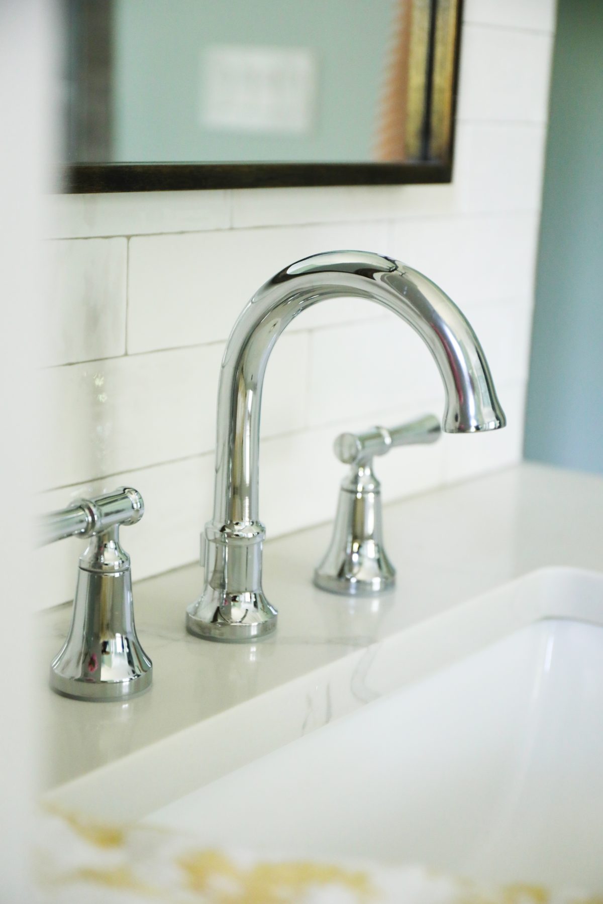
Tub Filler: The Delta Faucet Tub Filler definitely adds a modern edge, while also bringing in that spa feeling. We went with the Delta Single Handle Floor Mount Tub Filler Trim With Hand Shower In Chrome. It includes a full body spray, perfect for hair washing, cleaning off pets, or even cleaning that tub.
I love that they come complete with “Soft, rubber Touch-Clean spray holes” which allow you to easily clean up all that icky water build up that seems to gather over time, with just the simple touch of a finger. So smart.
It also helps that it’s the dependable brand name in Delta that we love, while looking so sharp, too.
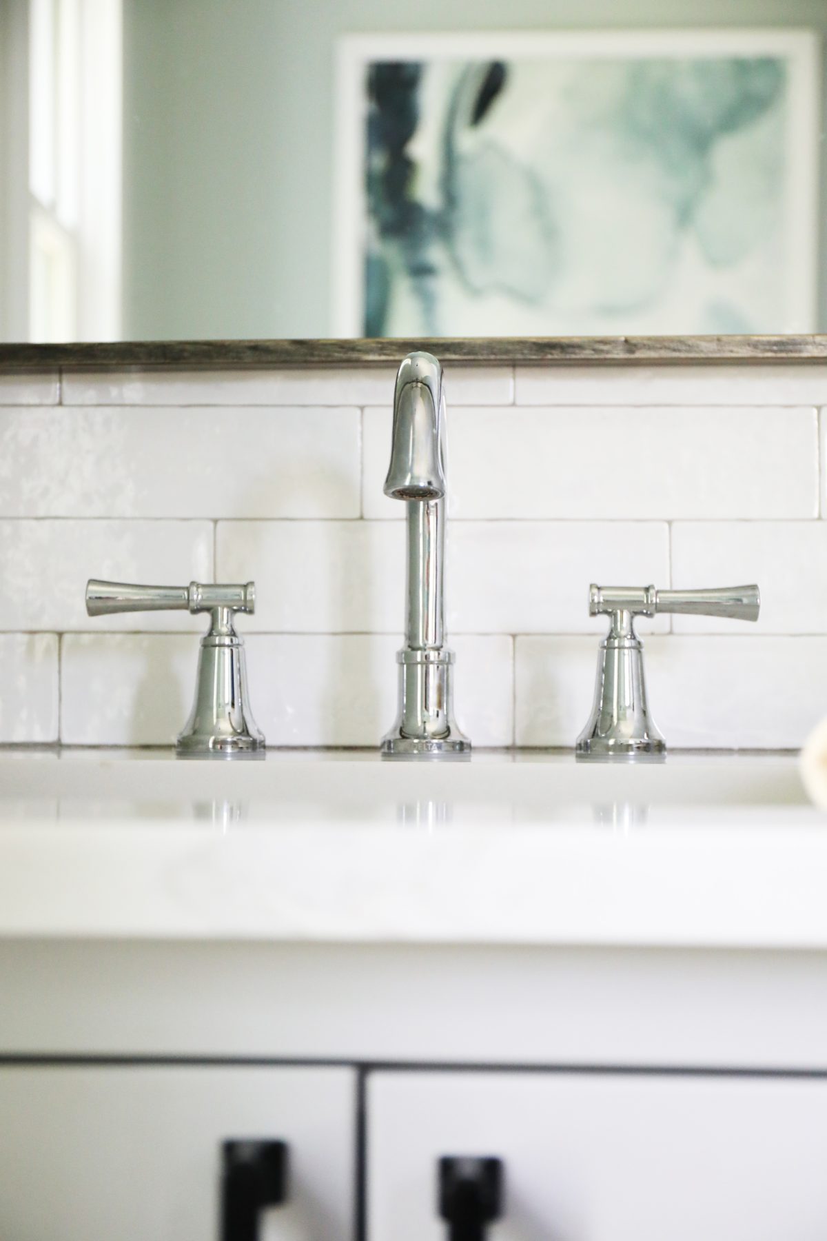
Faucets:
Nothing beats a good old-fashioned Chrome finish! There’s just something about this look that keeps a space both timeless and modern. Especially when combined with these lines. Again, we were tying in those already-existing shower elements, so it was a fun challenge to make it all look consistent and intentional.
I’m to the point in my life, where it’s all about the little things. I love that it’s covered here.
Bathroom art: We love sourcing Etsy for amazing artists. This print was perfect for her space.
And it’s all in the details: This little window did so much to open up the space and offer more natural light.
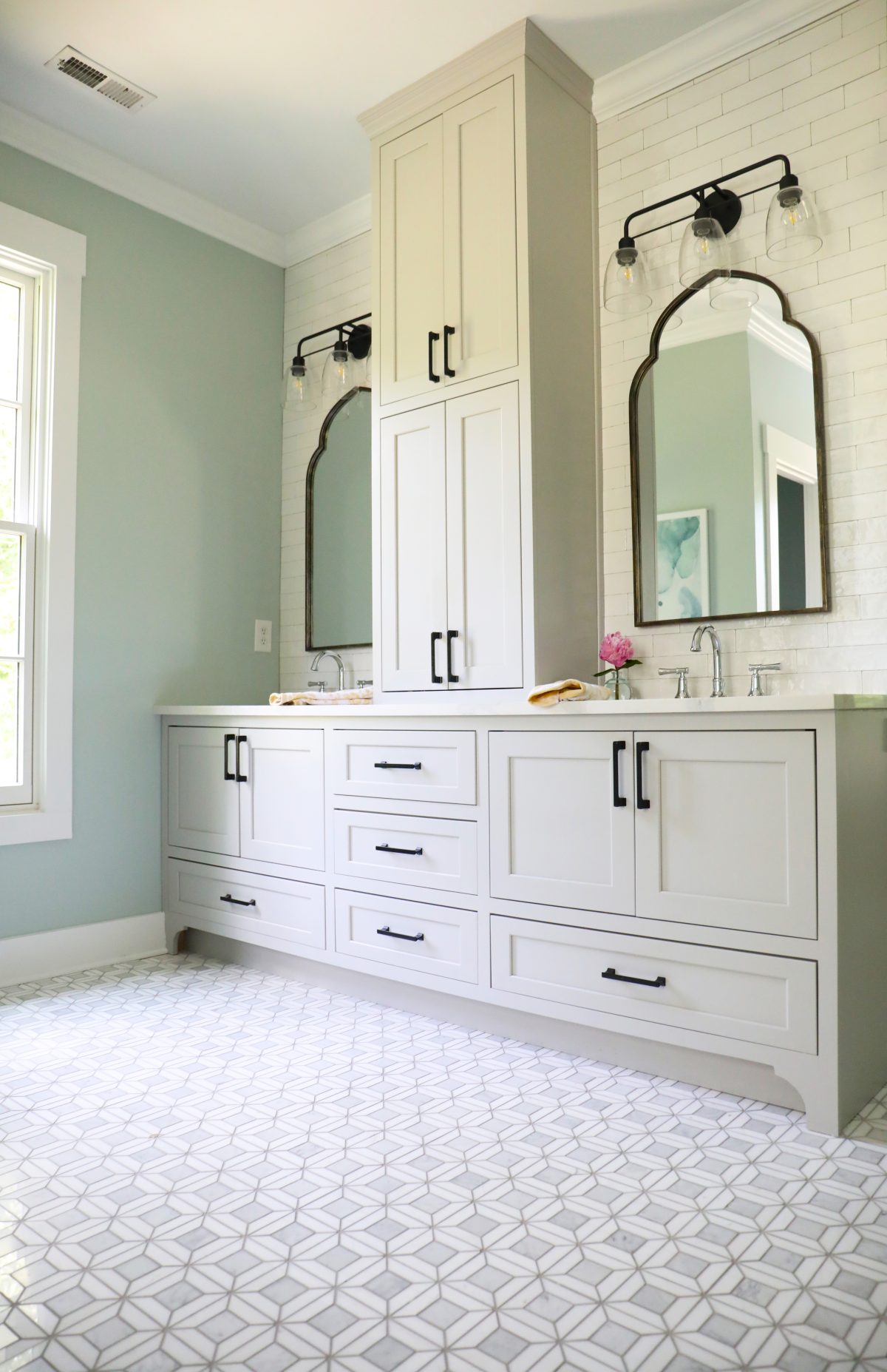
Tile:
Of course, Jeffrey Court is what brought so much of this space to life.
We selected Cotton Blossom, from our own favorites to lighten and brighten their walls in a classic way. Their hand mottled look with this tile will never get old, adding a soft edge to that solid subway tile design.
For the floors {which are also heated now – a big wintertime bonus!} we added their Doheny Thassos White Basket Weave Mixed Marble Wall and Floor Mosaic Tile.
I have to say, my shoddy photography doesn’t do this combo justice in their space, but the look is just gorgeous. It sparkles, you guys. I would never get tired of this space.
Hardware + Mirrors:
This bathroom is the perfect example of mixing finishes. It makes the bath feel both modern and organic all at the same time, and we adore the way they all came together in the space. Hardware via Liberty.
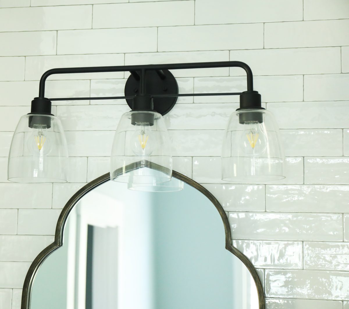
The Mirrors tie it all together beautifully.
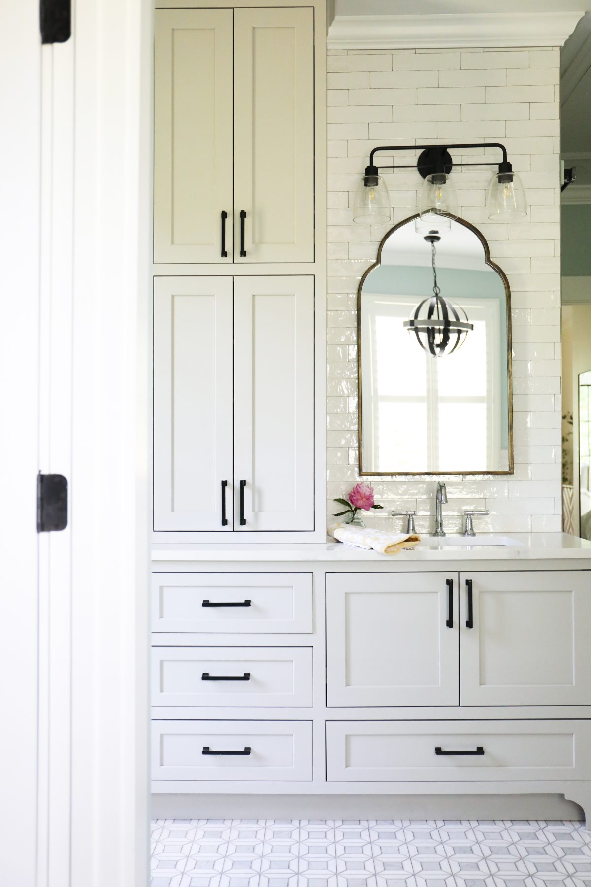
Vanity Lights: Let’s talk about those gorgeous Vanity lights, because Kichler does it again. This refined utilitarian design in their Meller Vanity Light bring in so much understated beauty.
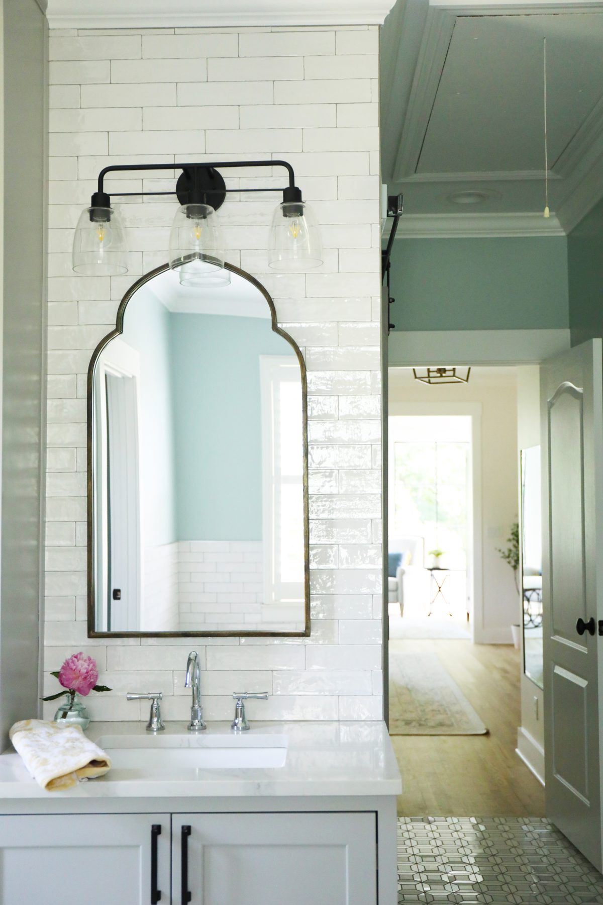
I also adore the way this view has now opened up into their sitting space!
We adore the entire thing.
So what are some of your favorite elements about this space? We hope you’ve enjoyed this little tour today.
As always, let us know if you have any questions.
Have an inspired day!

Great post