psssst…. shop our spaces here!
Hey guys! We’re thrilled to be here today for another {much overdue} installation in this fun series!
If you’re just catching up or catching on to our series on using color in your home, we were so thrilled to {re}launch this series . We dove in with the basics + where to begin. Then we covered some color FAQ’s and why neutrals “read” a certain way. We were thrilled to cover rules you can break, and then common mistakes to avoid when choosing paint in our last post.

Tricia wrote:
Thank you sooo much for this series. We are in the process of remodeling an entire home. My husband just recently retired and we’ve decided to remodel his childhood home and move there. The two descriptive words that came to my mine are: comfy and clean. My favorite colors are blues (turquoise) greens, and oranges (coral). My thoughts in our renovation are to keep the overall color pallet (walls) of the house in a couple of neutrals and than add all the colors. However, I’m struggling on how to do that!!! Could you please address this? I’ve always navigate towards beige walls – thinking grey was too battleship : ) and depressing. How can we paint all the room wall in similar colors that flow and than add my favorite colors. We’ve already decided on white kitchen cabinets with a white counter top (itty bit of grey) and a light green/blue backsplash (Sonoma stellar -aquarius) with a blue/green accent trim (Sonoma Vihara Ichika- iridescent). Thanks again! Have a FANTASTIC day! : )
We’re so glad Tricia wrote in with this question, because while it has some specifics, and neutrals can be tricky, we do love the idea of building on them. But to build on them, you have to pick a good neutral, first. So, we thought we’d keep it simple, especially if you’ve checked out or former post on why neutrals “read” a certain way.
The topic of neutrals is truly all in the eye of the beholder. They will vary by the direction that your house sits and the amount of light it receives. They will read differently based on what you already have in a space. They will seem so different on a computer screen than in real life when you go to the store and decide to put it on your wall.
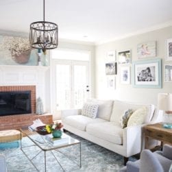
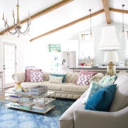
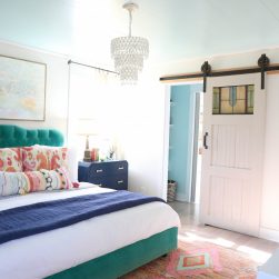
But we thought we’d share a great jumping off point. Neutral colors that we love, with great, neutral hues, that avoid “builder’s beige” and “battleship grey” while also providing that nice soft backdrop we’re all craving.
Some fresh soft hues and colors you may want to try, to start fresh with your own home color palette.
So without further ado, here are a few of our very fave neutral paint colors.
Divided into categories, of course.
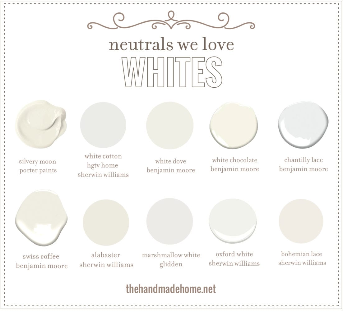
First up, white neutrals that we love:
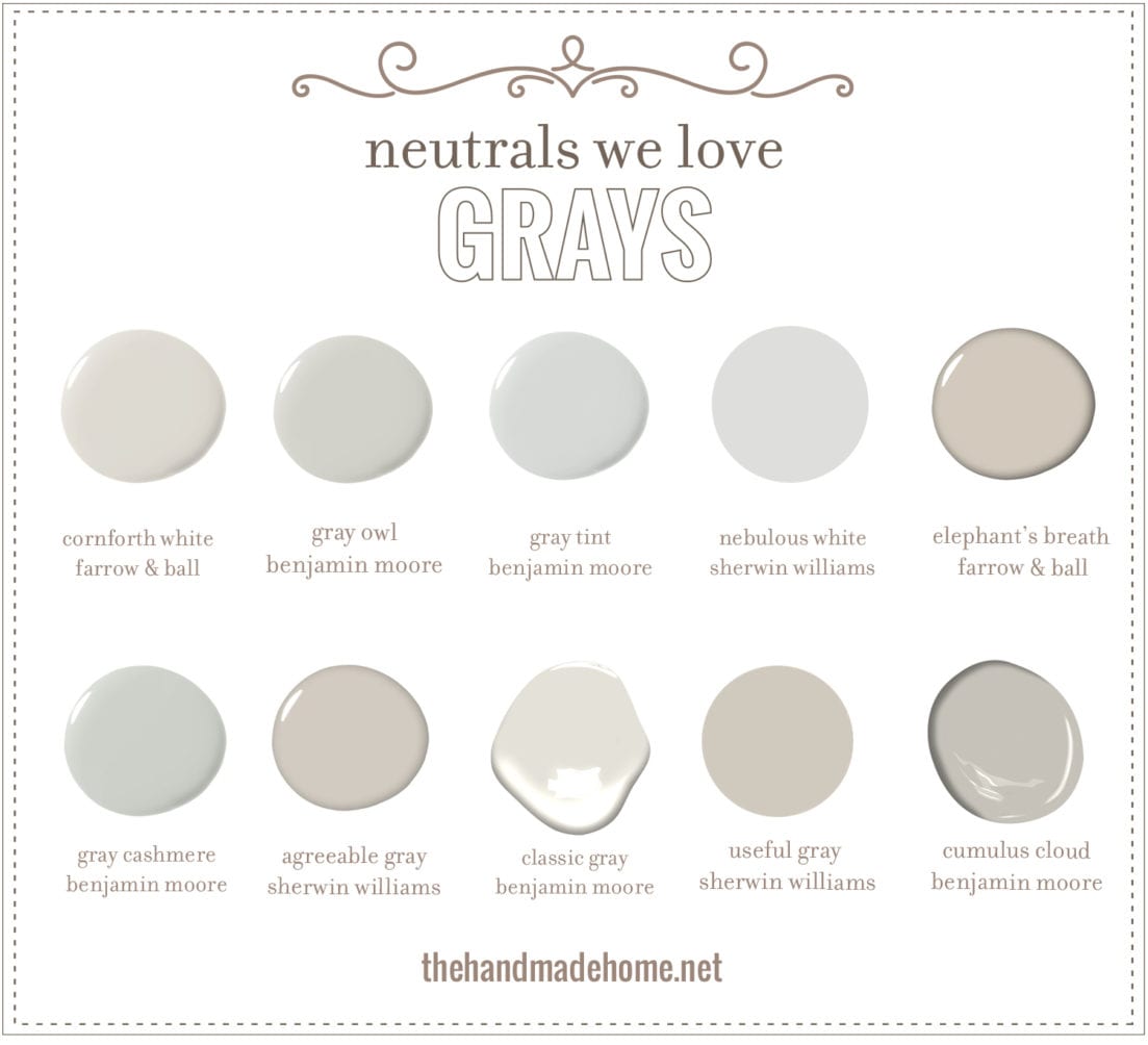
Next, gray neutrals:
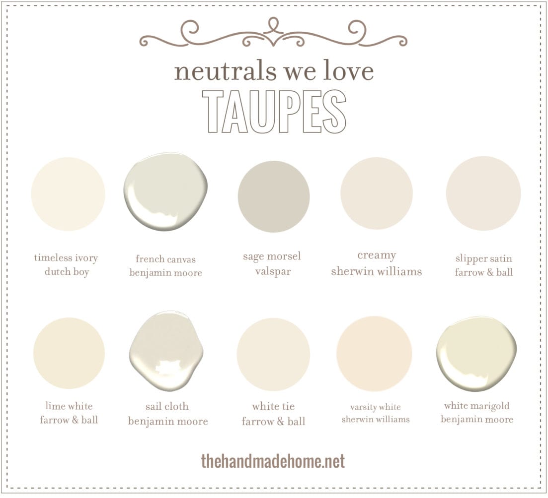
And finally, taupe and cream-based neutrals!
As always, let us know what you think. What are some of your very favorite neutrals that you love to build on? Some of your very favorite tried and true?
We’d love to hear your favorites, and the colors your pair with them! – We’ll be covering some of our favorite color combos in the next post.
And as always, what is something you’d like to see us cover in this series? Any burning questions on all things colors? Let us know!
Have an inspired day!

Thank you so much for posting these color ideas! We are in the middle of trying to decide on colors now. We moved into a gorgeous 1958, 2 story home 2 years ago and have begun trying to decide how we want to update it because it is still very 1958!! Our only design obstacle is our walls. Our home has very real and gorgeous (mostly) tongue and groove hardwood walls. As in Cypress, Juniper, and Maple. All have a light stain color and are mostly natural in color. We also have BEAUTIFUL #2 oak hardwood flooring all original to the house. There is some drywall and wall paper that we are taking out and replacing do to plumbing leaks. That said, I’m really struggling with whether we should paint any of the wood walls. The main walls that we’d paint are the foyer, up the stairs, and the living area which are cypress. The reason I feel we need to paint those is because the stain has turned an orange color and there are impressions of pictures frames and wall hangings faded into the stain from years past. Would you recommend painting these walls or should we just decorate around them?? I feel almost guilty for considering painting that kind of wood! Any ideas would be greatly appreciated!!
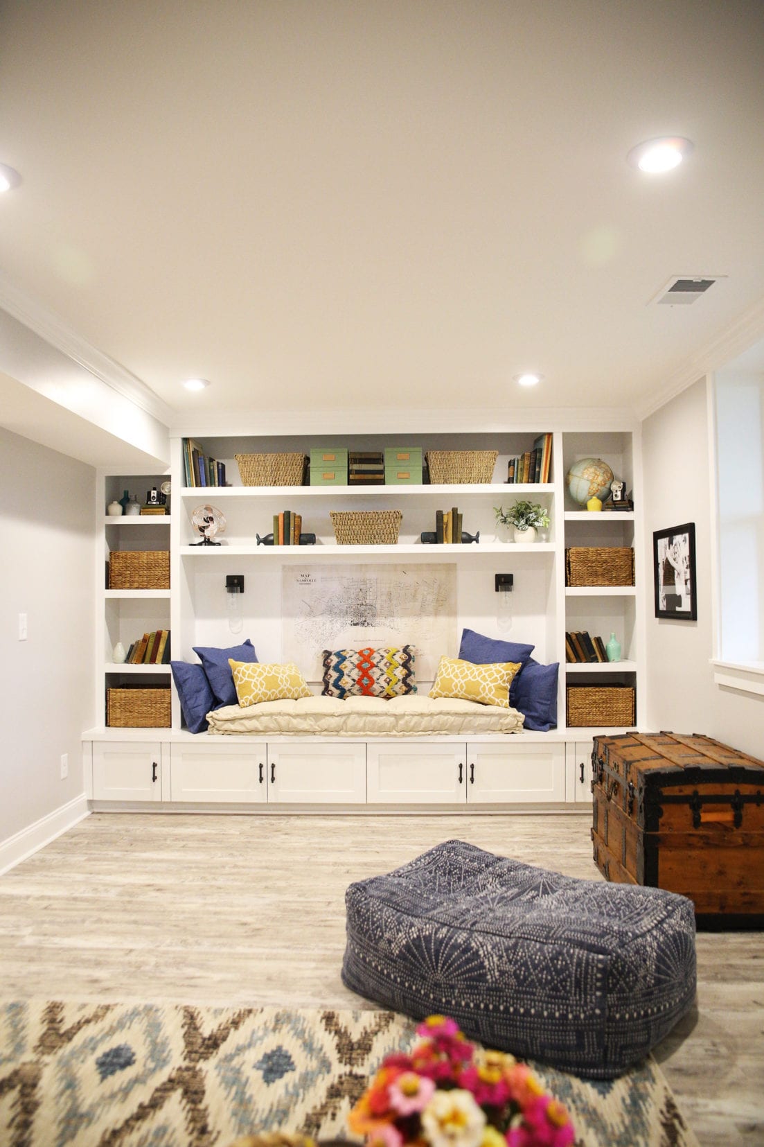
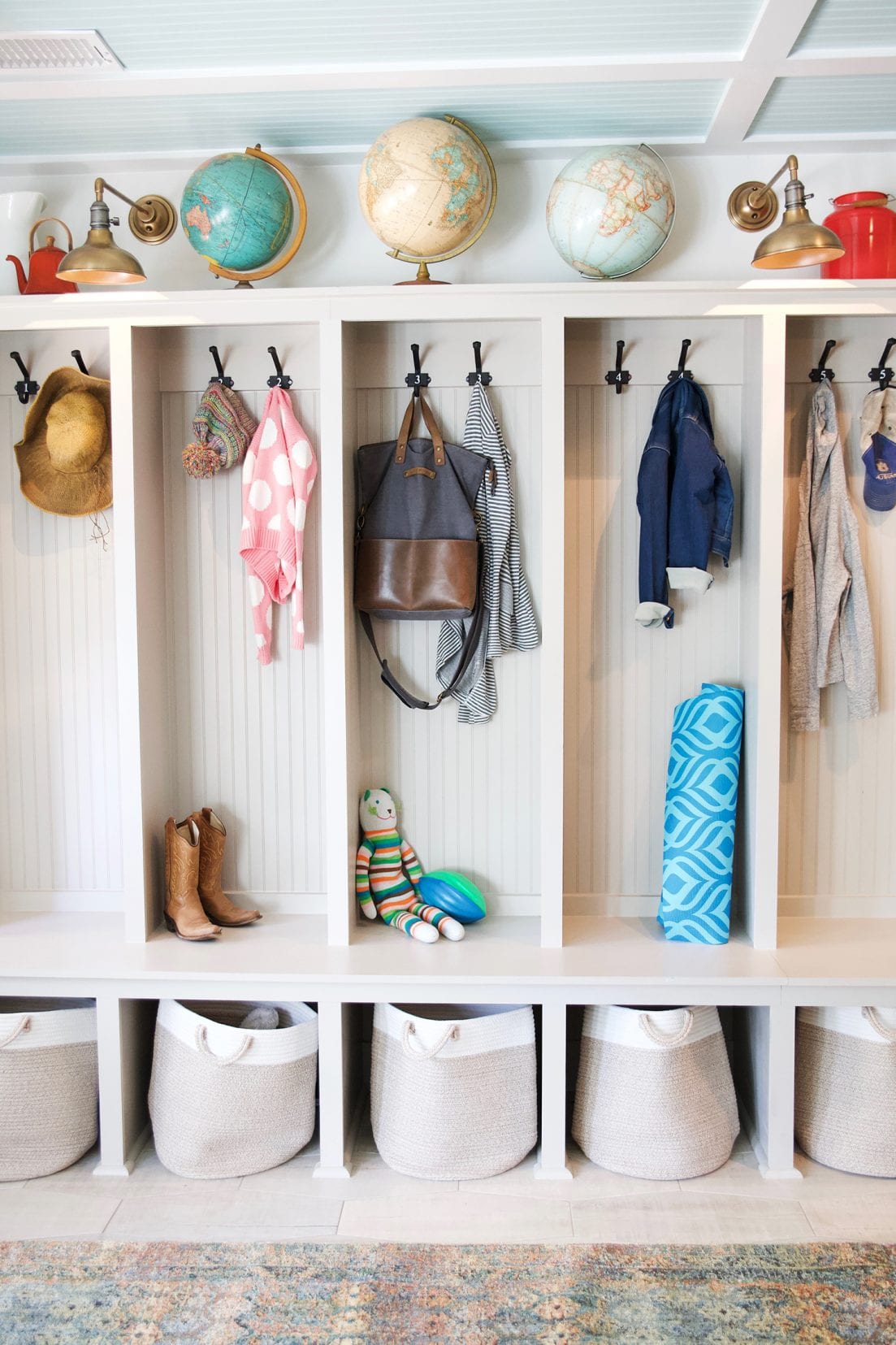
I’d love to know about that rug in the photo with the ‘lockers’. Do you have another photo showing more of the rug? Do you have a brand name or a website for it? Thanks!
Hey! All the details for this space can be found here – with more photos. I hope that helps! https://www.thehandmadehome.net/2018/04/crusty-basement-no-more/
So many beautiful neutrals! Thanks for the ideas. My question…we’re preparing our house to put on the market and many (alright, most!) of the rooms need repainting after 20 years of living here. What colors do you suggest for a quick sale? Most of the current colors came from the Eddie Bauer line of Valspar paints that Lowes carried years ago, so lean toward beige, tan and caramel colors. My biggest question is should I paint my barn red kitchen? It has maple cabinets and Giallo Veneziano granite. There isn’t a lot of wall space, but the red is definitely a statement! Thanks for any advice you can share.
I used Repose Grey from SW on my walls throughout the house. It has a faint beige/tan undertone in certain lights, but it’s bright and airy. I love it!!!! We have the classic bright white trim (semi-gloss) and I’m using navy accents. We love the color!