Hey guys! We’re thrilled to be here today for another installation in this fun series!
If you’re just catching up or catching on to our series on using color in your home, we were so thrilled to {re}launch this series . We dove in with the basics + where to begin. Then we covered some color FAQ’s and why neutrals “read” a certain way. We were thrilled to cover rules you can break, in our last post.
Today’s topic? Common mistakes to avoid when choosing paint! We’re sharing common mistakes that we see people make, and how to avoid them to make the right call when you’re staring oh-so-crosseyed at those paint chips. So let’s begin, shall we?

• Don’t: pick your paint color first
We see people doing this all the time, anxious to make a choice, and get started.
Then there’s the other side of the coin: We also run into this often with what we do, in the realm of all things construction, so it always feels a little bit backwards with what we’d usually recommend under the perfect circumstances. We understand the debacle of needing to book painters so that it doesn’t ruin your furnishings after you’ve moved in, codes requirements… and so much more. It’s different for everyone for different reasons.
The problem is, it can be hard to then plan your decor around a committed paint color. Choosing it last…That does seem like a better option, after all.
Do: Let your room speak to you and give your space time to be planned.
Consider all the elements you’ll be bringing into the space. If you are going with a big project like full-on construction, make sure that you choose a lot of light, neutral colors that can easily be changed later if you change your mind.
Which brings us to…
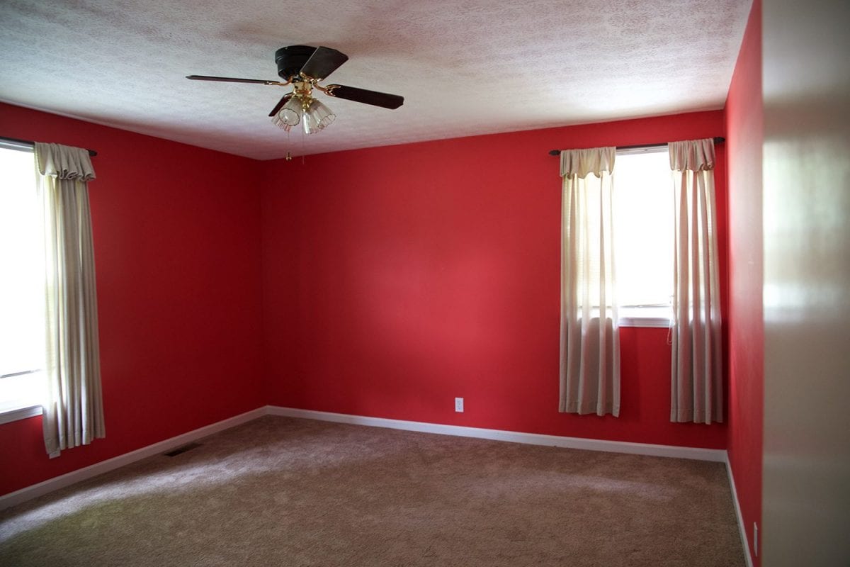
• Don’t: pick a color that is too saturated for your walls
Don’t get us wrong… we love bold color.
We covered the basics of color, and why colors read in a certain way in this post here. The problem usually arises when people don’t consider the overall impact of a color in a space, just our first point… but with darker colors. They can be left feeling overwhelmed with their color choice, and unsure of what to do if they haven’t considered the rest of their design.
People tend to run into problems when the color is darker and bolder than they initially intended.
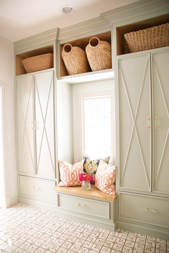
Do: Lean on your color knowledge.
It can make things easier in the land of choosing from that color swatch. All of it can be a little intimidating, and if you default to choosing a lighter, less saturated color, we can almost guarantee you’ll be happier. Leave the darker colors to a lot of your accents around your space. Let them play together, and use repetition to strike a balance in the space.
Think in terms of hierarchy and let the room work together to convey the colors you’re looking for. The answer isn’t always in an overwhelming color, but in the way the entire design comes together. Add depth and interest with the elements of the space so that it doesn’t feel like you’re fighting with yourself.
You’ll be glad you considered the over all design.

• Don’t: forget the rest of your house
Maybe the darkest black and then the lightest blue in the very next room, won’t be such a good idea unless you’ve considered how their tones will play together. All this is relative, after all, depending on the colors you choose.
We love the idea of being bold with color choices. But what we love more, is when more than one space is considered in establishing a constant and thoughtful flow in the home.
Do: Think about how your home flows
If you love colors on your walls, fantastic! Just be sure to consider how they flow, from one room to the next. We’ve talked about this here before, but how each room works together is an integral part of how your home feels.
Let it speak to you and consider the environment before making the color call. You can do this through repetition, and using color in different ways in different spaces. We also love the idea of unifying it all with neutrals and natural elements, too.
It can do wonders for the home and transitions from one color, to the next.
• Don’t: Just hope your color choice will work itself out
Once you are comfortable with the color and your choices, it becomes like a second instinct, so we say go for it.
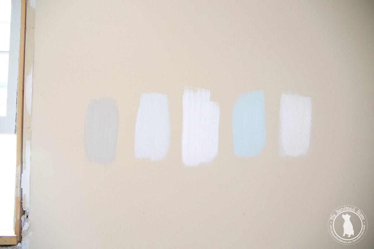
In the meantime, if you’re in doubt, samples are there for a reason. Unless you’re extremely confident in your choice, if you’re making a guess you should definitely consider how it will feel on the walls.
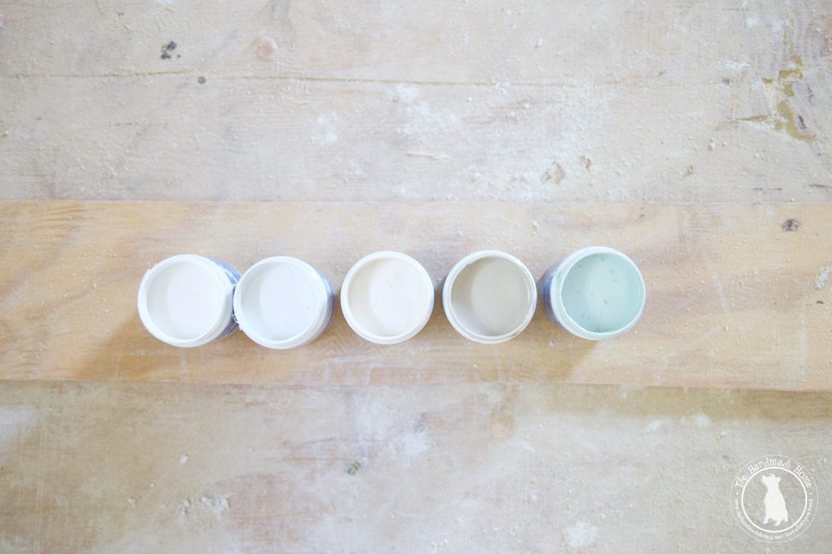
Do: Try out samples
Consider the rest of your space, its entire design, the lighting throughout different times of the day, and so much more.
That means grabbing a few samples when in doubt, at the paint store. Try them out on those walls. Paint can change colors on a whim, so we definitely recommend trying them out, before committing.
• Don’t: ignore the finish of your paint
Example: Don’t go for high gloss on a ceiling
Yeah, this one kind of has nothing to do with color, but it’s something people don’t consider sometimes.
At least once upon a time, I didn’t. In our very first house circa 2005, I had an idea that I wanted to paint all the walls. They were gorgeous colors and I was oh so excited. I think I was pregnant, and my brain was mush, and we went to the paint store to see all things paint. Somehow, we had all of our colors mixed in high gloss, and I was mortified.
If we’d used them, our house would have looked like a shiny easter egg from the 80’s with all the colors to boot. Ya live, ya learn. There were definitely some lively lavenders and beautiful blues. No, I’m not using alliteration on purpose, it just is what it is.
Short story long, we had to have all the paint remixed and done again in a subtle eggshell.
Unless you want them to see every single imperfection {especially in an old house} glossy on a ceiling… that’s never a fun idea.
Do: Go for for a nice eggshell for a barely-there sheen.
Certain finishes are appropriate for certain surfaces. We would reserve gloss for things like trim in a house. Consider that when you choose your final finishes and paint colors.
It can make a world of difference in your finished product.

We hope you’ve enjoyed this little edition of The Color Guide!
What are some things you may have done in the past, that we can learn from?
Any advice for anyone else here to learn more about picking paint colors?
We’d love to hear!
Have an inspired day!


Thanks for another very useful post. I’m enjoying this series. My favourite advice came from Young House Love when they suggested picking a slightly grey tone of the colour you want. I was amazed when I used Hale Navy how grey it was and how blue it was once it was on the walls.
This series is so great. Thank you as always for knocking it out of the park, it’s really put things in perspective when choosing colors for my home. We’re in the process of deciding on a new color scheme now because I’m so ready for a do over. This is perfect!