Hello all you wondermous people. Let’s dive right in, shall we?
Fill in the rest of this sentence with two of the most important, descriptive words regarding your physical home. If your home can’t be anything but two things, what do you want them to be?
My home is _____________ and ____________.
For example, I’ve pondered this for a bit, and my answers are happy + clean. Those are very important to me, as a mom raising young children. No, I gave up on perfect a long time ago, obviously. But I do appreciate a clean and happy home. I like for it to appear clean, even if it’s not.
Keep your answers simple. Hold on to that, until the end of this post.
What is it about color? It’s the biggest choice we can make for a space. Whether we withhold it, or go all the way, It has the power to evoke such emotion, from large statement pieces or simple pops, paired with unexpected combinations. The entire wall, a large piece of furniture, or carried out in our fabric, it’s kind of a big deal in terms of establishing the feel of a space.
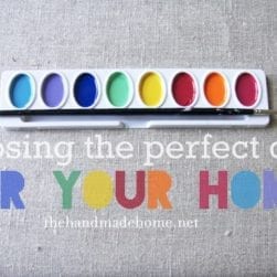
With the spectrum of endless possibilities, it can also be a little daunting to make such a commitment and bring color into our home. It’s all about the right tone. And one of the keys to setting that tone, is finding that ever elusive, perfect color.

I’m super excited to begin this new series with all of you today. While we’re wrapping one up in the next few weeks, I’m ready to dive into another. The concepts of art, and why they apply to our spaces are something that has really drawn me into this world of interiors. Color Theory is no exception.
One of the most frequent questions I receive from some of you awesome people are requests for help in choosing a color for their home. I also get a few questions on which colors I recommend together, and why. It can be a {surprisingly} complex little system. Sometimes people ask me questions, and don’t even realize their hang up in the room has to do with the color. I love to answer questions about it, but I also love the idea of equipping others with the knowledge and confidence to make some of those decisions on our own. The key to conquering it only requires a little base knowledge.

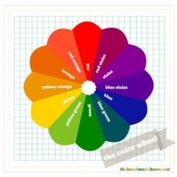
{Nerd alert} Sir Isaac Newton Invented the color wheel in 1670. While it appears to be a pretty little wheel on the surface, and I’m all yay for ROY G BIV! Unicorns and rainbows and Care Bears! It’s really a complex system based on lots of words and terminology that will honestly make your eyes cross the more you think about it. Art wouldn’t be art without a little math + science, after all. {Yes, it does pain me to admit that.} So we won’t dive in too deep, but if you ever wish to read up on more, it truly is fascinating. Color is one of the multifaceted tools that we use, and can be extremely complex in nature. Over time, it can become instinctual if we learn how to fine tune and use it for our advantage. From the beginning, there’s actually a lot to be gleaned from the basic rules of color.
So today, We’re diving in head first. Some of this may be a rerun, or a total jog of the old memory, if you will. Some of it may be completely new. Either way, there’s a lot more to it, but it will serve as a nice springboard for our future posts.
It’s great to make decisions based on instinct. It’s also wonderful to sharpen our instincts with knowledge to push that proverbial envelope a little farther.
We all have our favorite colors. We know which ones we’re drawn to, and which ones appeal to us…but do we know why? We know which colors seem to work together, but how? Here we have a basic reference point for any of you wondering about what might look great with brown and orange…{Thought about sea foam green?} Or why the hot pink red combo is feeling a bit intense. Think of this as a basic outline, a reference point, to look across the color wheel from your original color, for suggestions on what group to use. From there, dive into those paint samples and start thinking of pairing some great combos. Think about why those orange curtains look amazing in that blue room, or what you can pair with yellow to give it more pizazz. {Yes. I just wrote pizazz.}
 A basic knowledge of color can go a very long way when planning a space. We’ll be touching more on that later, but beyond the basic color wheel, colors are all based upon a certain psychology. Depending on the culture, that psychology may vary. For instance, I love that red, in China, stands for luck. Or in India, purity. But the basis of color has been proven to affect the human mind. For instance, blue slows the metabolism. In our American culture, it all conveys a certain message. And whether we realize it or not, we’ve been subjected to it in various marketing schemes all our lives, with color at the forefront of companies and their many tools for making the sell.

Have you thought about letting the colors in your home speak for themselves? Because whether we’ve realized it or not, they kind of do. Colors have a way of creating an environment that we don’t realize we’re creating, until they’ve established the feel of the room. I love the idea of using different combinations, ideas, and symbolism in a space.
So back to our original question: what are your colors in your home saying about you? What do you want your colors to say? Take your original question, and fill in those blanks based on the main color elements you use in your home. For instance, if you want your home to give off a fresh feeling, are you going with lighter and brighter selections? If a feel of history and heritage are you working with those darker shades? If your room is too overwhelming, what can you substitute in from the other side of the color wheel? Which colors really speak to you and why? Are you using them as a whole to communicate something about the people who live there?
So, with lots of fun ideas up my sleeves, I’m super excited to tackle this subject. Spill it. What are your two words? And what other things would you like to see us tackled in this series?
Any specific questions you have regarding color? Shoot away!

A very exciting series!
My two words for my home were “clean” and “comfy” … I am drawn to light blues, whites and grays with touches of bright color (like in accent pillows, flowers or books)… it will be interesting to see what colors I’ll need!
OK, so super impressed here. The color psychology is very interesting and I need to get to work on my house. It’s mainly beige with some olive green…I know, awful and reminds me of camoflauge! Sad to say, I picked the colors myself when we built the house but I had no clue what I was doing. I was playing it safe. Time to change that! And I am painting my daughters room light gray. It’s first on the list. Thanks!
My house would have to be “bright” and “welcoming”. I’m just itching to paint some more walls in my house…just waiting for a burst of energy (for this pregnant lady) and a can of paint! haha. I’m looking forward to reading more about your color theory!
you are funny. i mean, i loved the color explanation but…you are also funny.made me LOL a couple times.
Hmmmm… my original words were “rustic” and “warm”, meaning that I hope our home is inviting and creates a sense of coming home to those that enter. But I also love your word of “clean”. We have greens, turquoises, and blues in various shades spread throughout our home peppered with a lot of neutrals and browns (we have a lot of reclaimed wood pieces).
I think this is fascinating, and I’m so glad you’re sharing your design nerdiness as I’ve been thinking about how I like color in “theory” (especially vintage-inspired patterns) but sometimes I wimp out from adding some bright cheer to our home so it can get really blandy mcblanderson.
You’re the best!
Is there a complimentary color? I’m either being a grammar nerd or really showing my ignorance, but I thought it was complementary colors instead of complimentary colors. I know the spelling makes a difference in definition, but I can’t be sure about its use in the color wheel. (Although I do like the idea of complimentary colors: “Orange is simply your color, dear!!”)
All that aside, fabulous post about colors. One of the best I’ve ever read in fact, and I love the color guides. Thanks for the thoughtful post. I’ll be evaluating my home’s interior colors if anyone needs me.
I love color. My words are calm and inviting. I am looking forward to this subject. I am always contemplating what color to paint next, in which room. It is fun to think about the feelings that come with all the colors. Figuring out the right combination for each space, but also that the colors flow from one room to the next is also important. I could talk on and on about this and all the fun things I have done and want to do. Thanks for doing this!
My two words are updated and traditional- that also describes the people that live there =)
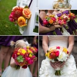
Love this post! My two words were warm and beautiful (clean would have been my next one:)). Also, where is that gorgeous room with the tomato red curtains from? I didn’t see a source and would love to pin it. Thanks Ashley!
Hey Linda-its original source is linked above the photo. Thanks!
happy and bright…I think I’m accomplishing it. Orange dining room, yellow and green kitchen. Beautiful blue bedroom.
As for that orange. I have always had an orange dining room. One should always eat in an orange room…
Great topic! It has me thinking.
Sounds like it’s going to be an amazing series! Can’t wait!
My house says “Rental” and “Don’t care.” What I want it to say is “Happy” and “Fresh.” I’ve started a little bit, painted the entryway with gray and yellow stripes and the living room with one wall a light teal and the other three a robin’s egg blue. They are now my favorite rooms in my house!!! I’ve also noticed that a lot of the color in my “accessories” are peacock colors or complimentary to peacock colors. It’s not because I have a particular liking for peacocks, but I think it’s because they are the colors that I love most to wear because they are right for my coloring as well as bold. I love bold colors! So somehow that has translated into the things I decorate with.
Thanks for this post! I will be eagerly following along!
I picked “warm and inviting”, however I feel like I’m drawn to homes that are more light, clean and crisp. In our living room, we have red couches, super light green walls, and pillows/curtains with stripes of red/orange/yellow and green. I feel like it’s just a lot of color and it’s just not tying together correctly. My instinct is to add more neutrals – creams, browns, tans, but I’m not sure that will really solve my problem. Any thoughts?
OMGoodness!! i’m so excited about this little series. Love color, need WAY more of it. My entire house is tan, save three walls and the kids rooms. Boring…for me, at least. My two words were classic and comfortable. However, if I can have two more, I also like colorful and creative or calm and collected. All c’s, not sure what that’s about. I was wondering what your favorite neutrals are for making colors pop. My kids playroom in the basement as well as our den are completely without windows or natural light of any kind. I was thinking of painting them a pale cool but not institutional grey to help brighten each space and highlight all the colored accessories I hope to put in. What are your favorite greys that you’d recommend?
How fun! My two words would be organized and functional. My backups would be healthy and safe.
I just found your blog two days ago and fell in love. Now you are doing a series on paint colors? It feels like nothing short of destiny. I am currently slave to the paint chip wall of any home improvement store I walk in. My paralysis stems from a) the color I need to pick will be in the major living areas of the house b) it will touch a wall from the kitchen (which I made the mistake of painting first and with a very tricky blue/gray/green hue to boot) and c) I have light tile floors which have a slight marbling that is hard for me to coordinate with.
I can’t wait for the rest of this series!
Also, my words are ever changing but I would have to pick “relaxing” and “fresh.”
So much great info! I just painted every single room in my house and it was stressful choosing all of the paint colors – but I am beyond happy with how it turned out.
My two words are warm and cozy. It’s how I want anyone who comes in to feel – so they can be comfortable immediately and just start relaxing!
clean & airy.
by airy, i mean coastal, beachy, washy, shades of whites & blues & greens & tiny hints of ivory.
i live on the east coast of canada and i’ve always been drawn to the coastal/cottage type of scheme.
we’ve lived in our house for (at startling, i can’t believe it!) 18 months now. we have done very, very little work. we’ve done the kids’ rooms – i have two girls, ages 6 & 8. it’s hard to instill my own philosophies into their rooms because they have their own little personalities and quirks.
we have *so* much work to do with the rest of the house. new bathroom fixtures, new paint jobs, new blankets, new throw pillows, new this, new that. we have very little decor accessories. a lot of furniture – and not a lot of the tiny things that make a house a home.
despite being drawn to the airy look, i’m also drawn toward family history and heritage. i haven’t started displaying any of our family photographs yet – i’ve got an amazing collection, dating back to the early 1900s. but…i don’t know how to incorporate them into the ‘airy’ house feel. they have a very rustic, vintage, historical, and warm feel to them. i have no idea how to tie the two styles together, hence the reason i haven’t started yet.
but i’m getting there. i’m learning that things don’t have to be perfect – they have be ME. US. our own funky personalities on display in our home, whether mismatched or not.
i’m getting there!
i’m also hung up on having colour ‘flow’ throughout the house. choosing one or two colours and sticking with them so that there is consistency. but, again, that likely won’t happen when i’m attempting to incorporate two opposing styles. i have to learn to look at it this way – colour is FUN. creative. inventive. it speaks.
My words are “inviting” and “cozy.” I would be very interested on some tips for adding color to LARGE spaces. My home (which my husband bought before we married so…not what I would have chosen) has a very open floor plan. I’m not afraid to go bold with color when it’s more or less contained in four walls, but our kitchen/den/dining room/living room are all one space with a few walls breaking it up in the middle. There are so many resources for decorating small rooms to look bigger, but how do you take a huge room and make it cozy? And I’m craving color–bold, saturated color. How can I pull that off with so many spaces combined? I’m really looking forward to this series! Thanks so much!
So my words would be inviting and cozy. My dining rm is red orange. My kitchen is newly painted ” edamame”, which I guess is yellow green, but also has a hint of blue ( would that make it just green???). Can you over analyze colors?? So my family room is currently a great yellow, a darker yellow. I have an inspiration piece that has those three colors plus a dark pink on a black background, which i love! But now I don’t like the yellow so much next to the green. I’m wondering what to paint the Family room. I love my DR color next to the green. Would it be weird to paint my FR that same color and reserve the ” gold” for the entry spaces?? Would love some insight and am looking forward to the next installment!
How funny! My answer to the question was “Warm & comfortable”. The colors I have are deep blue, maroon, green, and amber/gold highlights.
The two words we chose were colorful and modern. We love the application of color theory to interior design. Of course, we may be biased but we believe color to be the most important choice in any design.
hi, im a newcomer to yr website, sounds interesting about your color theory. my house is under decoration, my words would be “botanic” and “comfort”, im planning to use light olive green, white, light grey, blue shade…maybe too many colors?
Hey Tracy! I don’t think you can ever label something until a. you know exactly where and how they will be used and b. the exact shades of the color. I mean, you could easily do something like this and pull it off well! I also think it also depends on what YOU’RE comfortable with. Look for ways to tie it in. If it’s what you love… if you feel like you’ve always loved it and always will… then I’m not sure it matters at all! ;} I hope that helps.
My two words are calm and refreshed but I’m bored with blue!