
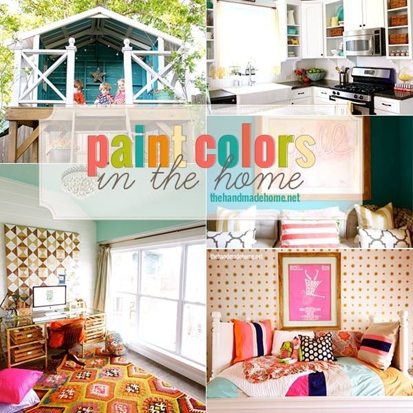
paint colors in the home {2015}
 We’ve received a few questions lately about our favorite paint colors in the home, and I was all, trying to be efficient and point said question-askers in the right direction.
And then I realized our old post was a. a little out of date and b. maybe it was time to corral them all together again, with some updated photos and questions from awesome readers in the past. And then came to the grim realization of c.

But if you decide you do, you know where to look. Right?
So let’s dive in! Are ya ready?

If you’ve been reading for a while, then you know we purchased this home a few years ago (8 and counting) in a bit of a hurry, as our first home sold faster than we thought it would at the peak of all things real estate. It’s been a great ongoing project, once we decided to let go of perfection and all those self-imposed rules to do what we loved. We didn’t pick anything out for this home, but have had an absolute blast making it all our own.
We’ve slowly lightened and brightened over the years – A testimony of the power of paint. A little bit of color love can go a very long way.
So without further ado, our colors!

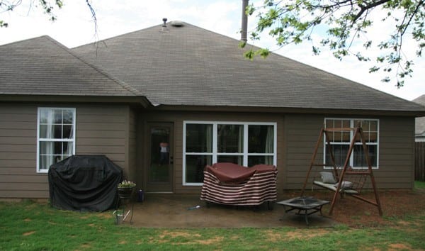
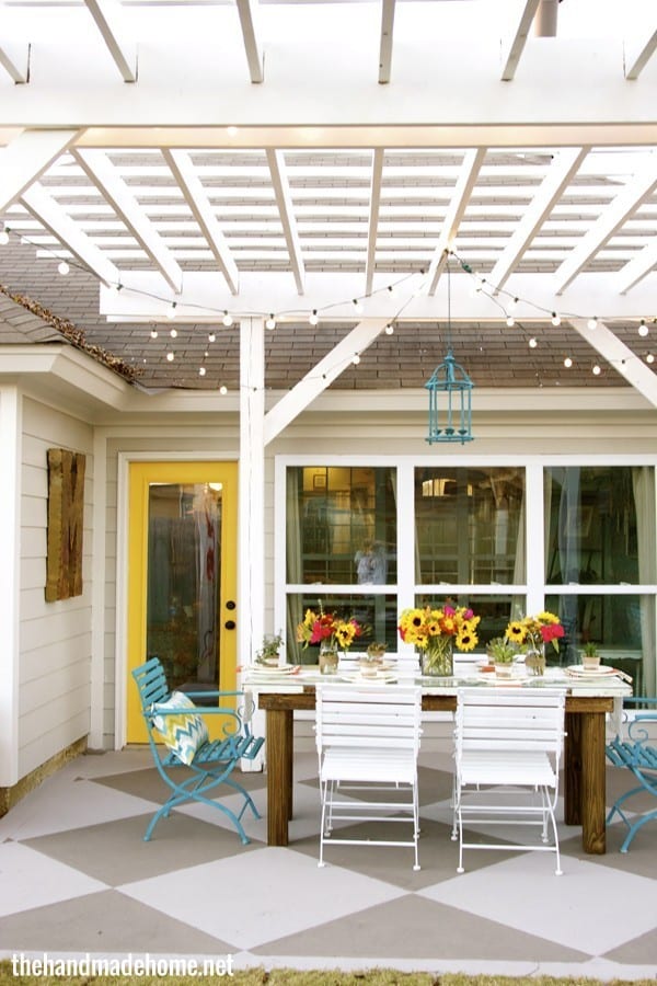
On the outside: House: Benjamin Moore’s Cumulus Cloud • Trim: Benjamin Moore’s Classic Gray • Door: Benjamin Moore’s Corn Husk • Pergola: Benjamin Moore’s Chantilly Lace
PS embarrassing confession: No one can really see the back of our house whilst also viewing the sides and front. Except our neighbors who we’re pretty sure already think we’re a few cookies short of a Chips A Hoy Bag. We never painted the sides and front and it’s still UPS brown. Shame Shame, we know our name. And all that’s about to change, so stay tuned!
Tania asked: I would love to hear your thoughts on how to make an entire house feel cohesive. …We are remodeling a ton, and I want different “vibes” for some rooms- for example, I feel I can get a little moodier with the guest room, and want more calming for our own master. Yet I want the entire house to feel cohesive- even if I want some rooms to be painted white and some gray and some navy!
That’s a great question. One of the best ways to make your home feel cohesive is through color. You can have different styles throughout your home, but if you see subtle repetitious color, that’s the ticket. I’m not talking about paint only. We use a lot of the same colors, in different ways.
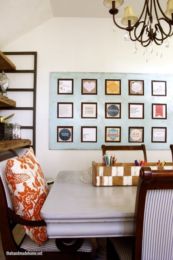
The same white you see on our kitchen cabinets, is the white on our living room walls, is the white on Emerson’s bed, is the white on the boys’ dresser… you get where I’m going with it… Or the blue you see in our tree house is the blue on our coffee table, and similar to the blue in our playroom. The green in the boys’ closet is the green on the coffee table. And in various frames and smaller pieces throughout our home. You can even use one main color repeated often, and then bring in fun splashes of different variations throughout. We deepen the impact with things like fabrics, accessories, and other elements to bring in colors that make it fun and up the interest.
You can have all kinds of fun patterns and funky items, but as long as you bring in hints and touches of a unifying color in different ways… you’re golden. This has happened naturally over time for us, too, in the form of a budget, and leftovers sitting in our garage. It can come in handy when you work creatively with your limitations.
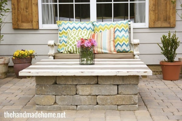
• Concrete color: Benjamin Moore’s Bear Creek + Willow Creek• Stain color for raised garden box + shutters: Minwax’s English Chestnut • We sealed everything with Thompson’s Water Seal.

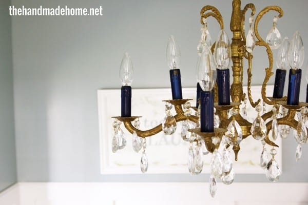
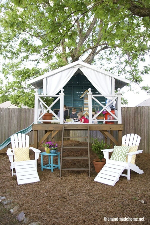
Hideaway: Benjamin Moore’s Calypso Blue + Cumulus Cloud
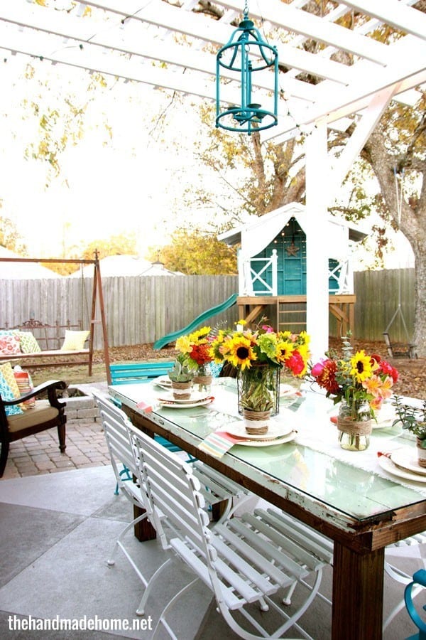
You can read every single post for our back yard transformation, here. It took us a while to get there, and it’s made our home feel so much larger…
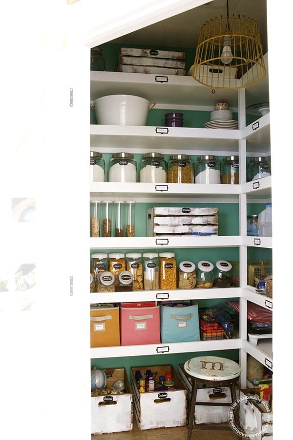
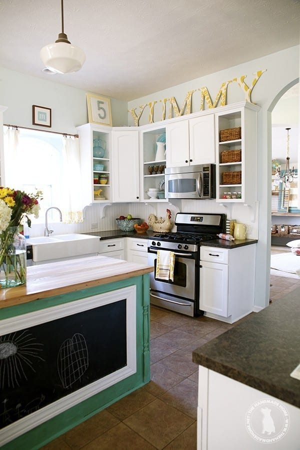
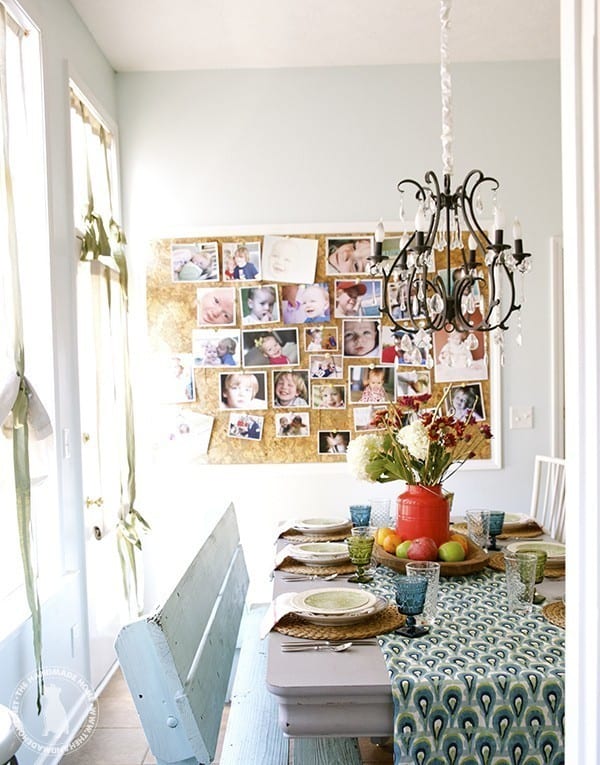
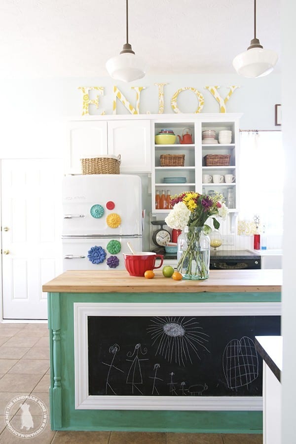
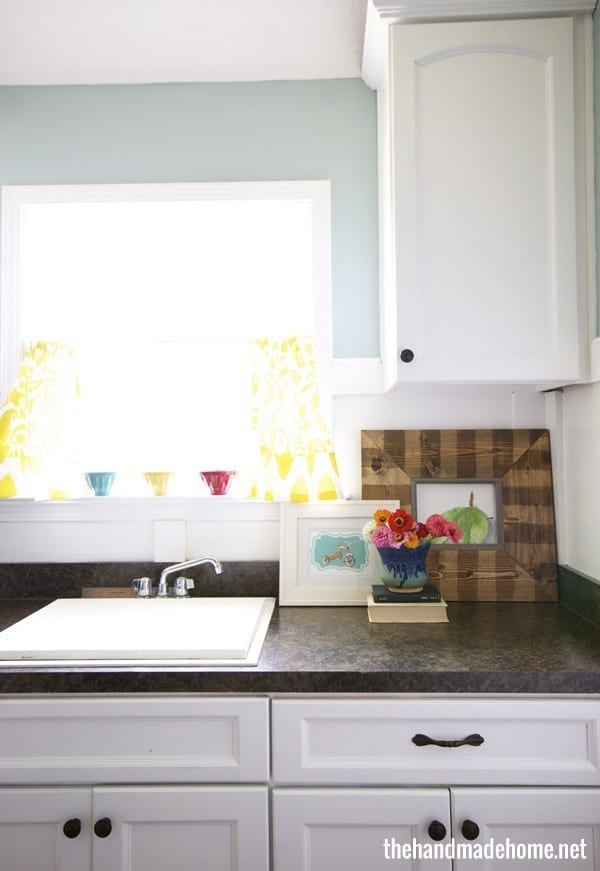
 In our Kitchen we gave it a quick refresh late this fall: • Benjamin Moore’s Whispering Spring {walls} • Chantilly Lace {cabinets and backsplash} • Medici Malachite {Island + pantry}

Elizabeth asked: You guys seem really brave {in a tasteful way} with color. You’re not afraid to have fun. I’ve been a little gun-shy, and don’t know how to make it carry through well. Do you have any recommendations on being bold with color?
I think that being bold was a gradual process for us, as well. And that’s totally normal. It started with small changes around our home, like pillows. I hated the dark colors in our living room, so I started with learning how to sew, so I could easily update with pillows and bright fabrics. And when we saw what a big change that could make, and how it was so worth it in the end [even when I did make a few mistakes] I was ready to be bolder with other things.
We changed our kitchen over to a farmhouse look, and stopped pining away for that “next house” and after that there was no turning back for us. Before I knew it, we were breaking the “rules” left and right because we realized a. how much fun it was and b. how much we seriously enjoyed our home because it began to reflect us.
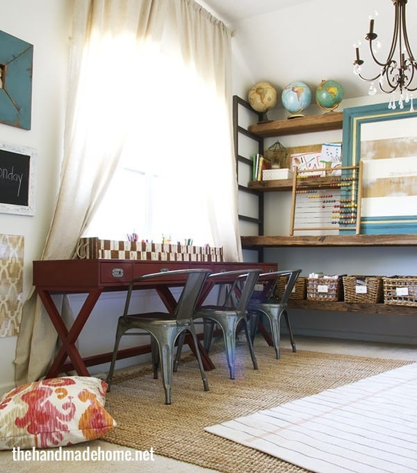
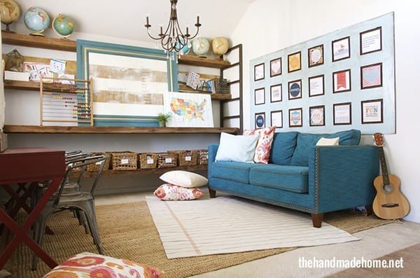
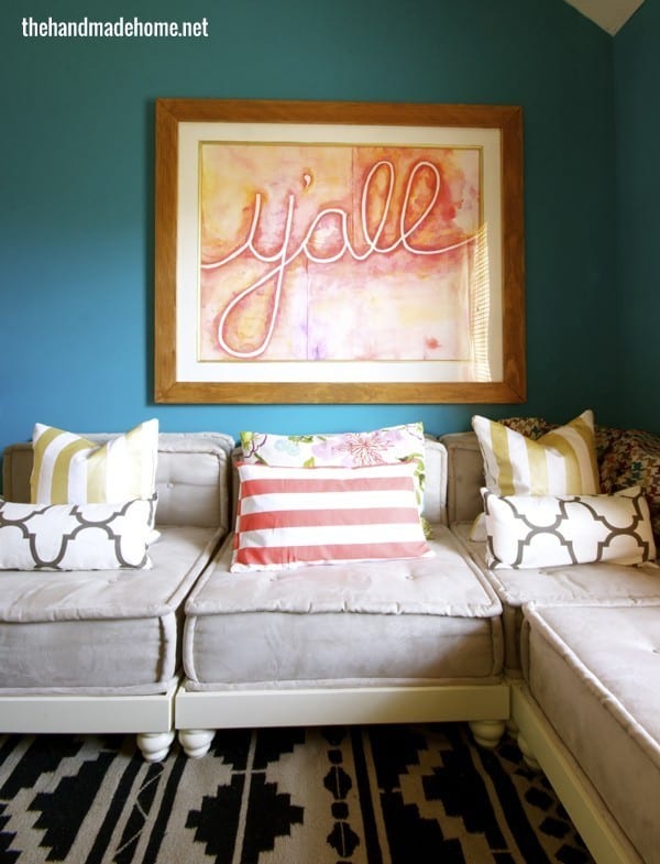
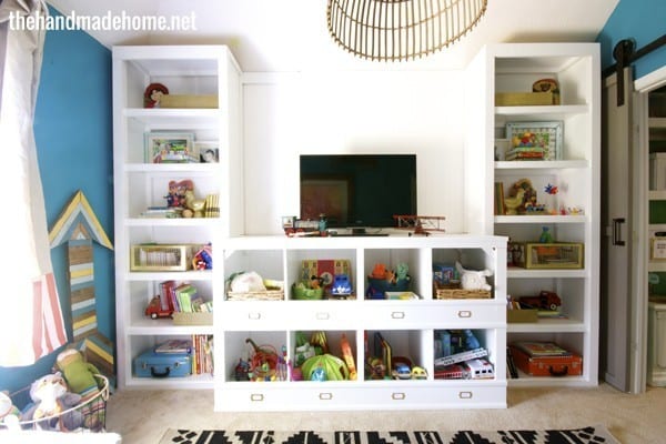
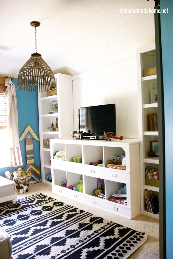
The key to being bold with color, is finding a tasteful balance within the space. For instance, with our island… the green was honestly a bit more teal than we originally intended. But I sat on it for a while, and realized it worked for us, because it was only in small doses, and it actually worked in such a light kitchen. The blue sofa in our homeschool room works well against white walls and great heart pine wooden shelves, because they contrast nicely and play well together. We love the bold blue in our playroom, because it has a lot of white to tone it down a bit, along with textures in fabrics and rugs that bring two extremes together.
It’s all in the way you bring it together as a part of a space.
Every time we change something in our homes, we start with an inspiration that motivates us. In your next changeover, try to go bold from the beginning as your key element or muse for your space. Then design the room around that. A lot of times, people tend to go with something fun as an after thought, and that’s where it can get them into trouble if they’re not taking balance and contrast into consideration with their designs.
Pick a Pinterest board to play with ideas, and see how much more easily things can fall into place when you’re working with fun decisions as a design element from the beginning, rather than compensating for a choice you aren’t too sure about. Let it be your muse for created spaces, and see how you can play with that in the element of contrast to balance it out. You’ll be surprised at how fun it can be.
Over time, it’s second nature.
 Tiffany Asked: Is there a particular reason you use Benjamin Moore’s paint most often? Just curious if they have more colors, better paint, you like their name…etc.
Actually, we just love their colors. We have a paint deck, and I love choosing from what they have. Sometimes we use their brand (their paint is thicker and very nice) but it’s also pricier. So sometimes we take the paint swatch and have it mixed at a cheaper source like a local DIY store. To each his own, but every little bit helps, and we can stretch our budget farther that way. We’re starting to branch out a lot with other brands, too over the past few years. Go with what you love!
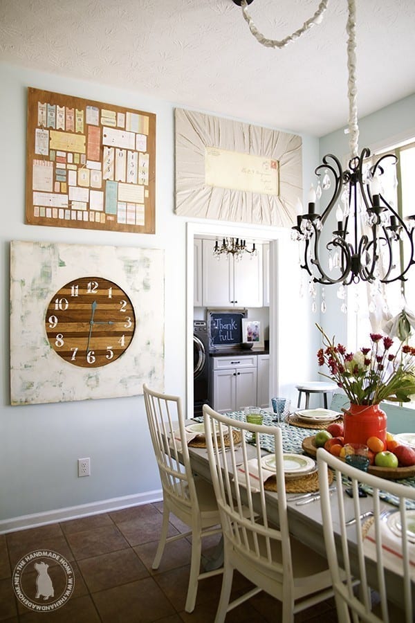
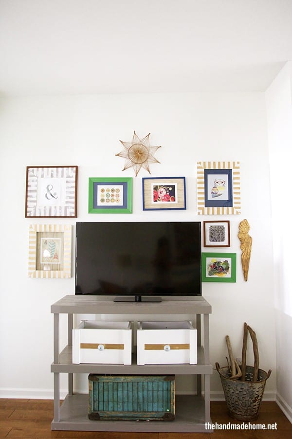
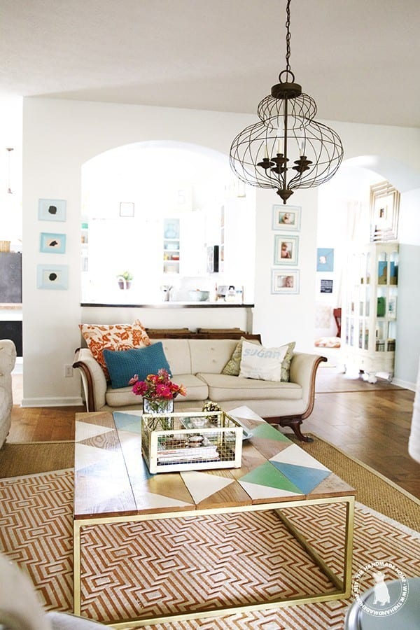
In our Living Room: Chantilly Lace
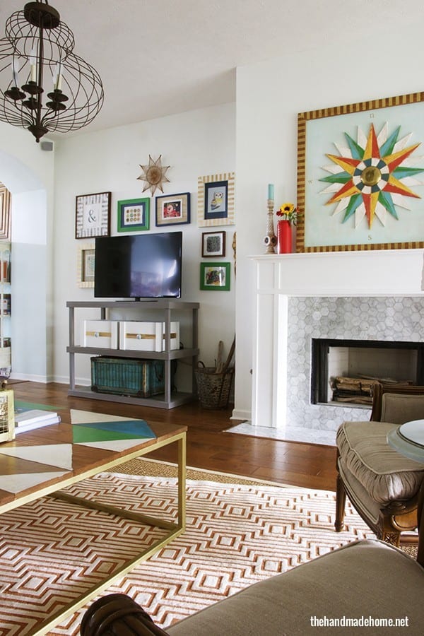
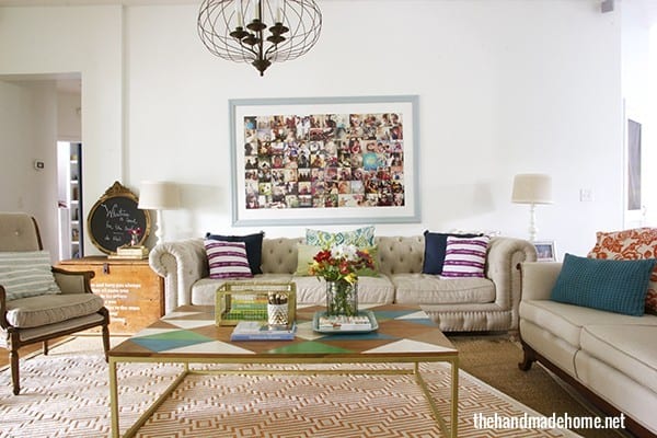
In our coffee table you’ll see splashes of a gold leaf, calypso blue, chantilly lace + once upon a time. Sometimes, I struggle with choosing colors based solely on their names. I think I missed my true calling in life.
Jennifer asked: You have a lot of white in your home and I love it. I’m ready to go for it because it looks so easy to change out your color schemes on a whim. What finish do you use, and do you paint the trim as well? What about the ceiling?
We use an eggshell finish on all of our walls (with the exception of a few – like Emerson’s space, you’ll see a flat white with a gold color that shimmers-to bring out the contrast and metallic properties in that accent wall) But an eggshell finish makes those little smudges (see: offspring + sticky fingers) easier to clean and touch up.
When we went for white, our old trim looked a bit dull because Chantilly Lace is a nice soft white, but brighter than our trim color. So we painted the trim as well and it kept things simple. I left the ceiling because they’re stamped {gross} but they’re so high, you can’t really tell.
Every situation will be different depending on the ceiling color, but the rule of thumb is that when you look up, the ceiling in general will be darker. This is because of the way the eye works with lights, etc. So we decided to cheat, and skip. You may try your walls first, and see what you can get away with.
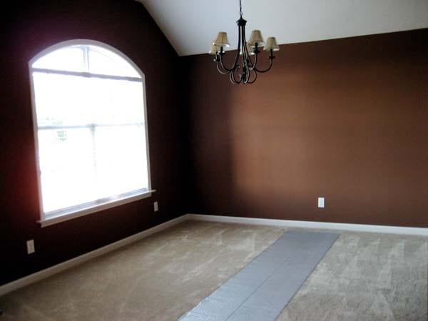
This dark cavern was transformed into our home school space, and we have Berh’s Irish Mist on the walls. It’s a softer grey (really borderline white) and it changed the entire feel of the room.
The entry way here, though the color is very bright in this photo, is Benjamin Moore’s Whispering Spring {same as the kitchen – a light blue}.
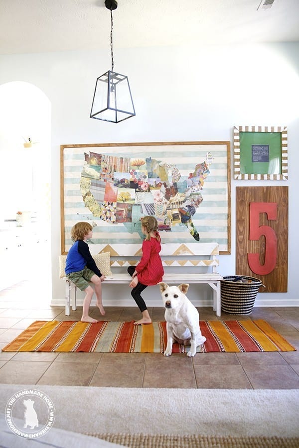
Read all about our handmade map, here.
Tiffany Asked: Do you have any rules/guidelines when deciding to paint accent walls? Do you even paint accent walls?
To each his own, and it all depends on what you like.
Our home doesn’t have many accent walls because the spaces are so open and walls are limited. {You’ll spy one in Emerson’s space, and one in our playroom, but the wall is covered in shelving and bead board. I guess that’s more of a shelving wall. Maybe you could count the homeschool wall as an accent, as well} I guess we like to do more with it than “just” a color, so that it flows well with the space, whether it be shelving, board and batten or a fun pattern.
At the end of the day, I think all of this depends on the space and the effect you want it to have. You can use them to make a space feel cozier, bring a real punch to an area, or even calm it down.
As far as a few things to consider: 1. I say just make sure there’s enough contrast to make it noticeable. A wall with wallpaper or a stencil is always a fun addition on one wall, without completely overwhelming the space. Or a navy blue on one wall with the rest white and calm, adds warmth without taking over. 2. I try to work with colors that are at least compatible. For instance, I wouldn’t use hot pink and tangerine together, unless you want the entire space to vibrate. Give the eye space to rest, by toning down one to contrast with another, so that their hues are no longer on the same intensity level.
These are just a few things I consider when thinking about a space. But I also never say never because rules are usually meant to be broken… you just have to understand them first. ;}
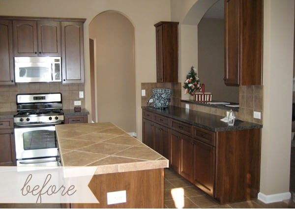
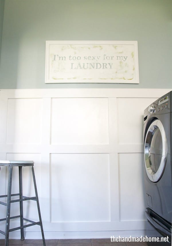
Our laundry room… before
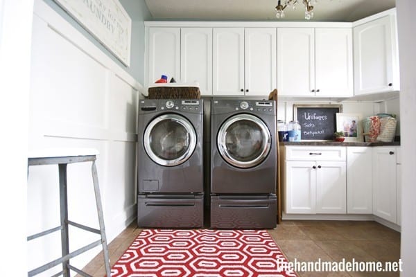
And after: Chantilly Lace + Wedgewood Grey
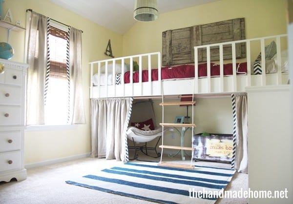
The boys’ space: Chantilly lace {the white on their furniture} + Behr’s Buttercup
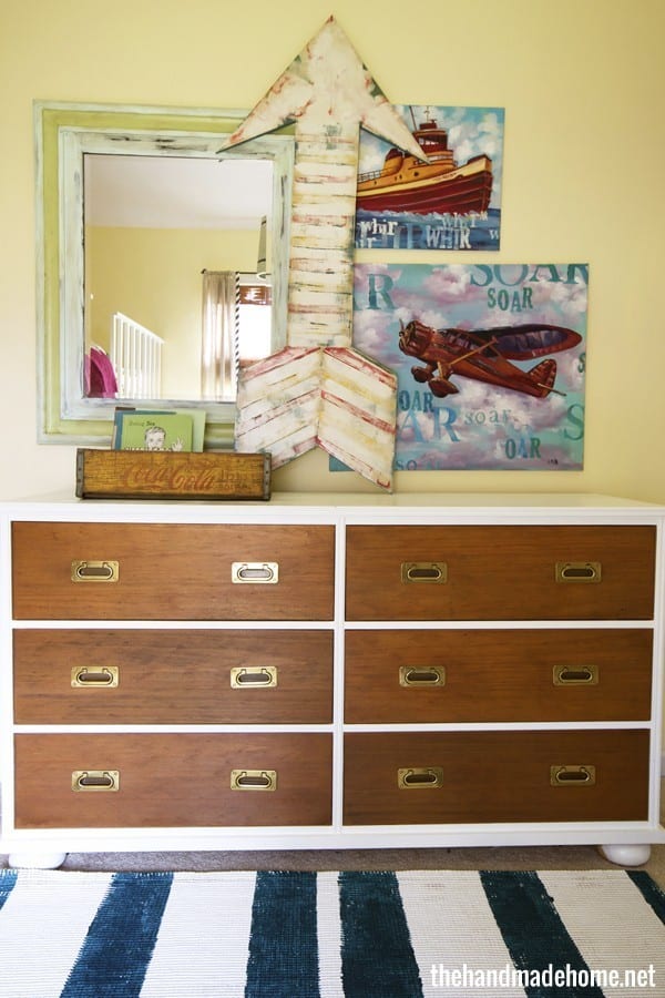
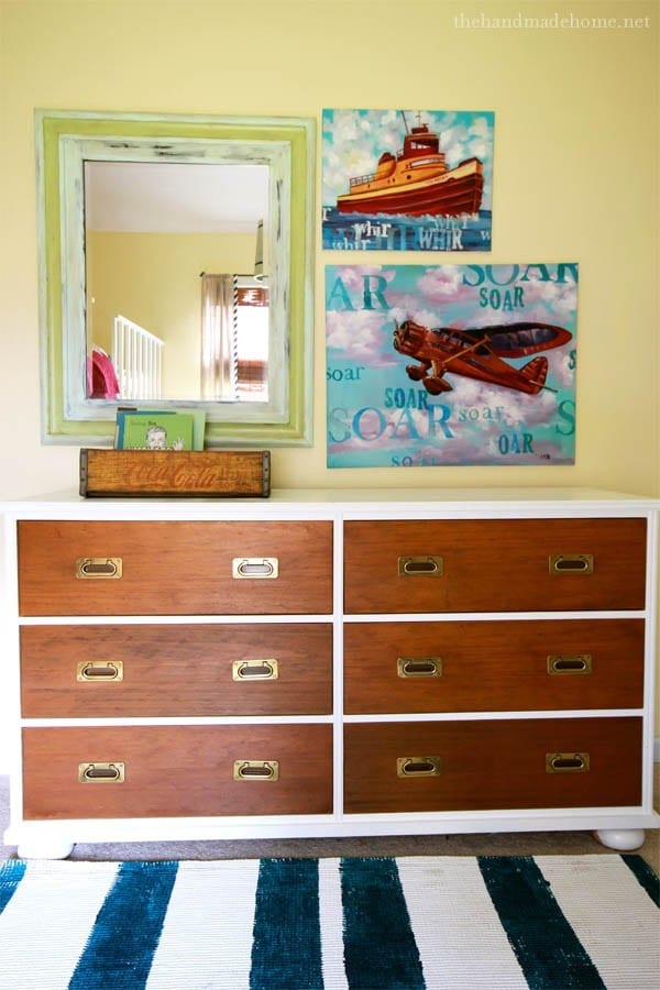
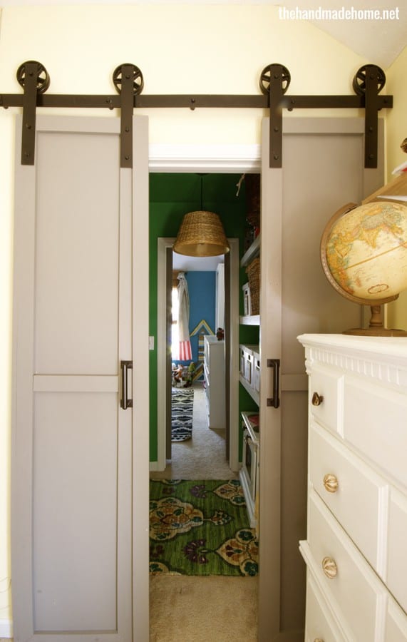
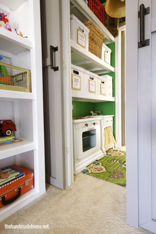
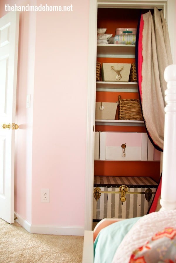
The closet: {doors} Benjamin Moore’s Eagle Rock + Once Upon a Time
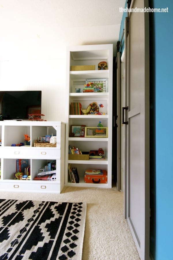
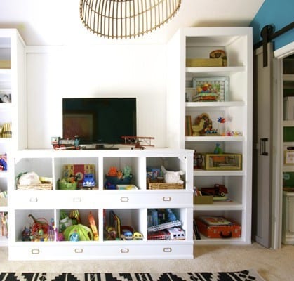
The Playroom: Pacific Palisades {very similar to calypso blue} + chantilly lace {shelving}
Tiffany asked: I am deciding on what colors to paint my little home. (My color scheme is similar to the colors of your website). I was planning on adding accent walls for punches of colors (teal in the living room, pale green in the stair-way, and a sunny yellow in the kitchen specifically), however my boyfriend keeps kindly reminding me (ahem–nagging perhaps) that we’ll be able to see the different colors as we walk through the spaces. (I believe what he is getting at, is that spaces flow and he doesn’t want our home to look like a pre-school). In my mind, these colors compliment each other, and are repeated elsewhere in our decor, however I also don’t want our place to look like a preschool. How/where do you draw the line between over-the-top-in-your-face and the cheerful/fresh/put together room I want?
I keep saying this, but I guess it’s because it’s the rule I stick with that always works for me: I think that the key is finding a balance with it all. You don’t sound like you’re going to paint an entire room in bright green, and another in bright blue, without any type of break between them. Take into account the entire space, rather than just wall colors. I guess the key for me, is like you said, sprinkling them throughout in other elements like your furniture and fabrics.
But also? Never underestimate the power of white and wood tones. I actually use a lot of it with all of our spaces. I tend to sprinkle it all throughout my home because I love the simplicity, cleanliness and calm it brings. They contrast nicely with those bright colors I also love. I have chantilly lace and a touch of stained or natural wood (in some form) in every single room. Because I love it, and I love the feeling it brings to our home.
I once thought you had to unify your home by keeping it all in the same tone, but I no longer think that’s the case. As long as you use a calming color with the brighter ones, and in such a way that it stays prominent, you should be fine. Pair those brights with a lot of neutrals like white or grey or some other choice. You’ll enjoy them more over time, because they’ll give your eye a place to rest and strike a nice contrast. Pick a unifying, neutral color along with a pretty wood tone that you love, and apply liberally.
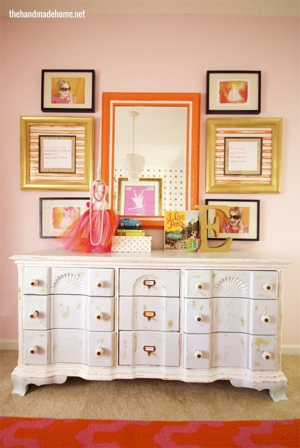
For Emerson’s Space: Chantilly Lace and Cotton Candy I love this pink.
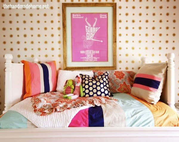
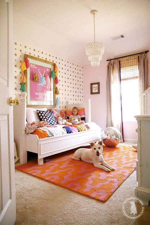
Along with shots of an aqua color similar to whispering spring (dresser), gold, navy blue (rustoleum spray paint) and orange in her closet (and mirror): Tangerine Melt.
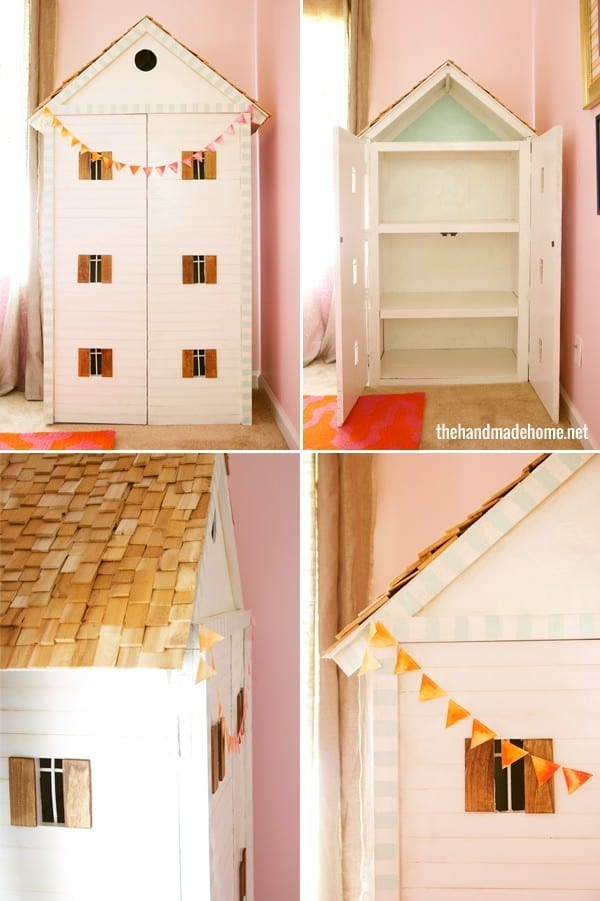
{read more about our dollhouse diaries, here}
Our bedroom: The wall colors are Benjamin Moore’s At Sea {666 – scary}
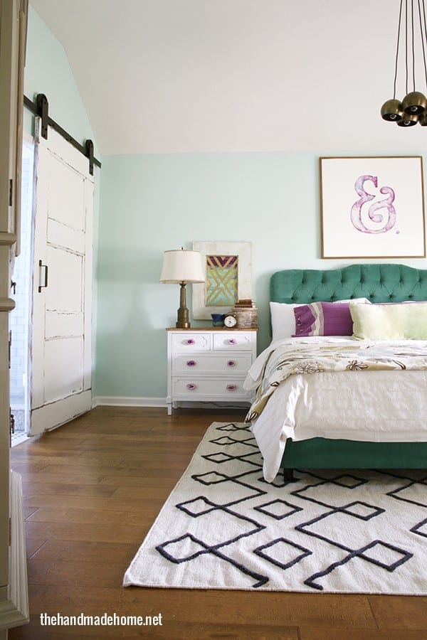
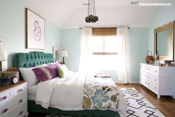
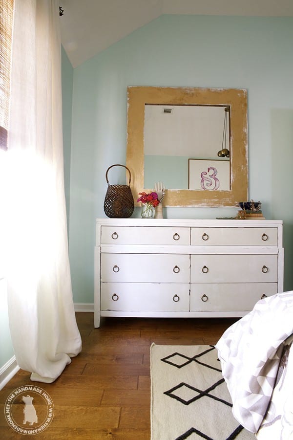
And our bathroom: and Lake Victoria for the bathroom {668} our favorites.
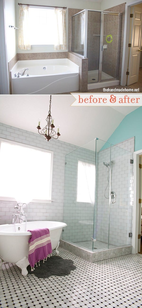
For our closet, we used … I can’t seem to find what we used. But it was like a toned down version of the bathroom/bedroom in a world of blues. Because you know us and blues.
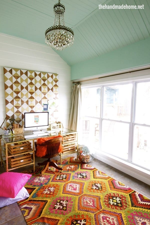
For our Studio: Chantilly Lace + Robins Nest
Anna asked: I love the colors in your home. They make me swoon. I feel like you have such a good eye for color. Where do you get your inspiration?
Thank you so much! I hate my generic answer. But I’m a sponge. Anywhere. Everywhere. We let our kids inspire a lot of choices that we make, and we let them steer a lot of our decisions. But you never know where you’re going to find a great idea in the grocery aisle with fruit placement, or nail polish in the beauty section. Magazines. Websites. Fabrics. Fashion. It’s everywhere. Here’s a little post I wrote with a few suggestions you might find inspiring, here.
And you might enjoy this series on color theory {You can find them here + here}

{and here.}

Sometimes it’s fun to look at them on a basic level before deciding on how to use them in our homes!
{To read more about a specific space, click here.}
We truly hope this helped with any questions you may have… be sure to shoot us any color questions here.
We’d love to help!
Have an inspired day!


You have a fascinating, beautiful, warm home. I love your taste!!
Thank you so much, Ruth! ;}
Love all your colors. Such A Bright AND Cheery home. I have to get busy painting. Thanks for the inspiration
.
Thank you, Carol! ;}
Thanks for the updated color roundup. 🙂 I always pick up some new trick/tip when you roll these out, so keep ’em coming – lol
Random question: How are you liking/loving/regretting (say it ain’t so!) your sliding barn doors? Do you find they give you enough* privacy/sound muffling? I want to replace our laundry nook bifold doors with a barn slider, but the Hubbin thinks it won’t be enough of a sound break (because the bifold doors do such an excellent job? NOT.)
Thanks!
(*I realize “enough” is an extremely subjective measurement but my brain is jello today and I couldn’t come up with a more accurate term. ;p)
Thanks so much, Bonnie! I’m so glad to know these help! It makes it worth our while!
We have two sets of barn doors (three, I guess, actually) two on the playroom closet, and two on the boys’ closet {A walk through to their room when we busted out the wall-sound is not an issue} and then on our bathroom. I guess it depends on what you want… If I want a lot of privacy, I can shut the door to our bedroom and it’s as quiet as it’s going to get in our house. Barn doors do not really offer a lot of quiet, but with our home layout it is what it is, and for me it was worth the visual appeal. ;}
For what it’s worth, we took the door off our laundry room a long time ago to open up the room and give it more space. We run the washer/dryer all the time and it’s right off our kitchen which is next to our living room {HE, if that makes a difference} and it has never bothered us. We watch movies all the time with it on and after a while I think you get used to the background noise. I guess it all just depends on your home layout and preferences… but I always go for visual appeal {Guilty} over the sound thing.
Sorry if that answer was vague and unhelpful – but short story long – no regrets on door changes. ;}
Girl you are amazing! I love your house so much and this post was really helpful and inspiring. I am doing some color changing but my biggest hesitation is painting the pale beige wall a white. I LOVE white but my husband is a bit more hesitant about it. There is no separation in the walls between the kitchen and the den area and the kitchen cabinets are already painted a white so he is afraid it will just be …. WHITE. I think it would definitely brighten it even more and give more of the cottage look I am seeking. It is a 1950’s 1400 sq.ft. ranch that already had some updating and our budget this late in life doesn’t allow much money to be spent. All that to say thanks so much for the post to help me along. Your house is delightful and would be uplifting no matter the mood you were in when you entered. As I have said, your kids are the great beneficiaries of your talent.!! Love your tastes!
Aall
I love it all. The boys room is so cute. I hope my place will look nice like yours though I am not so good at DIY. I am making attempts though! You should be proud of it!
Thank you, Rose!