Pssst: It’s a sale! Take 10% off all our fabric with the code fabric10 at checkout!
Jess wrote in recently, and asked this awesome question:
…I love your fabrics and all your ideas. You always tend to use them fearlessly and in a way that ‘goes’ in your house. Neutrals are a big deal right now but you’ve stayed true to yourself with fun colorful versions in spaces. You definitely do your own thing. This is what makes your spaces so unique and it really works. It is spring and I’d really love to switch it up a bit, but I struggle. Any tips for working with fabrics?…
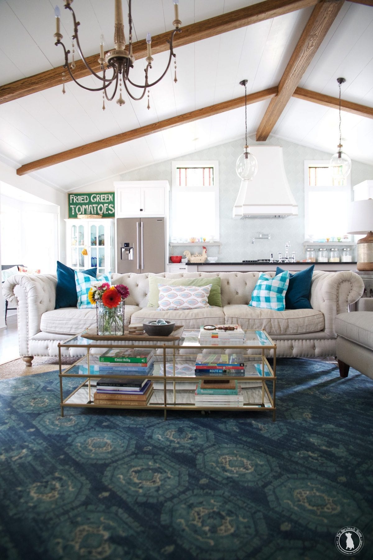
First of all, thank you Jess for your sweet words! We truly enjoy the spaces that we create, so that means the world to us.
There’s something about warmer weather that just makes us happy. Spring and all its changes are here, and switching out a pillow or adding a few flowers get us all nest-y in the house to welcome it with open arms.
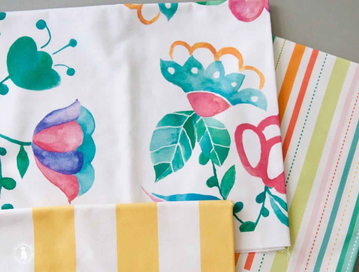
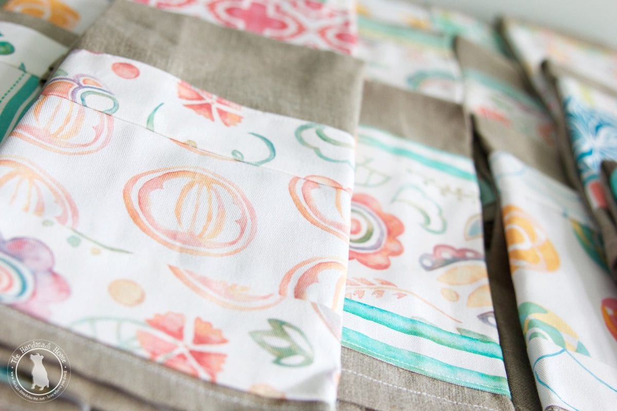
And since it’s the season for all things freshening up – we thought we would share our favorite {Oh so simple!} tips and tricks for working with fabrics {along a few of our favorite fabric combos from the studio}!
When it comes to fabrics, there are a lot of things that work and don’t work… a lot of principles to stick to that help with the entire element that can really make or break a space. It can be kinda complicated, and intricate and frankly, overwhelming… if you let it.
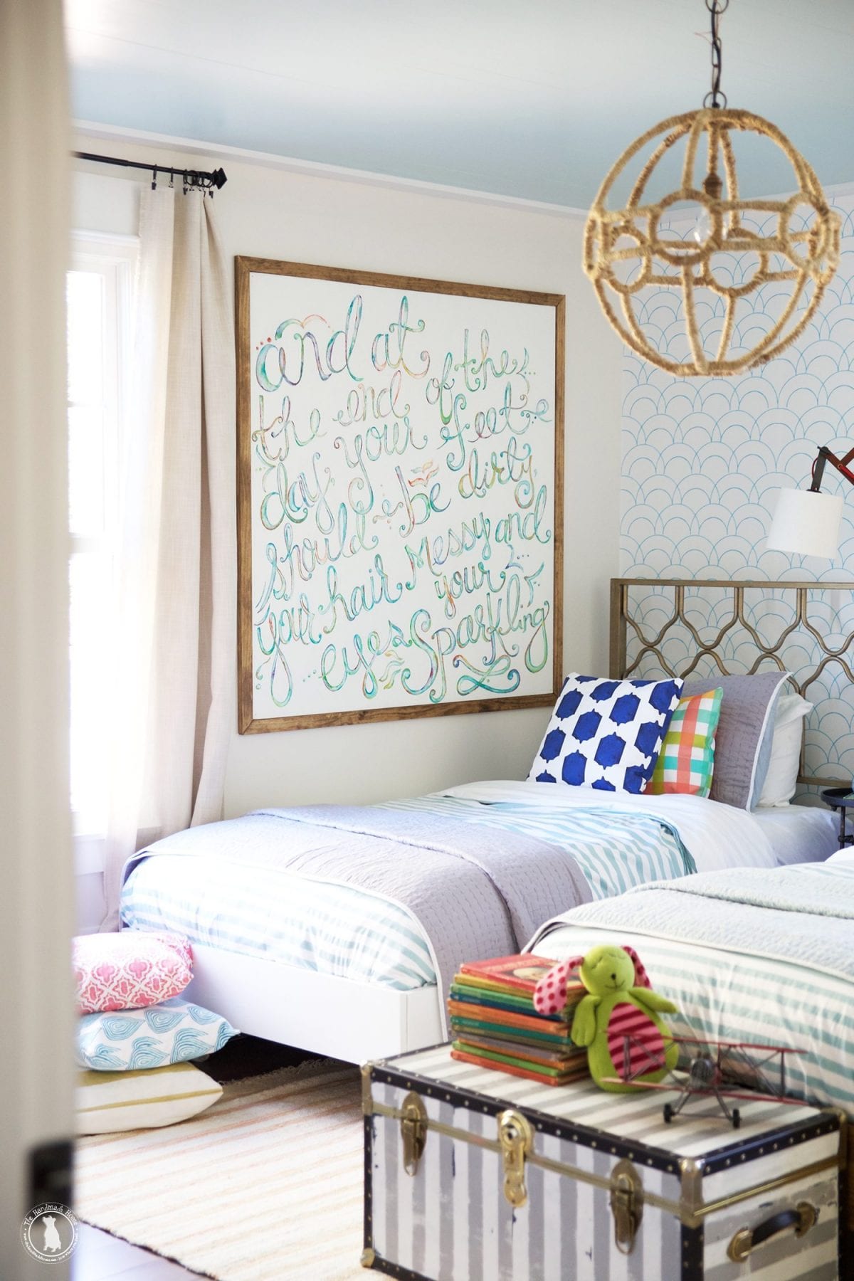
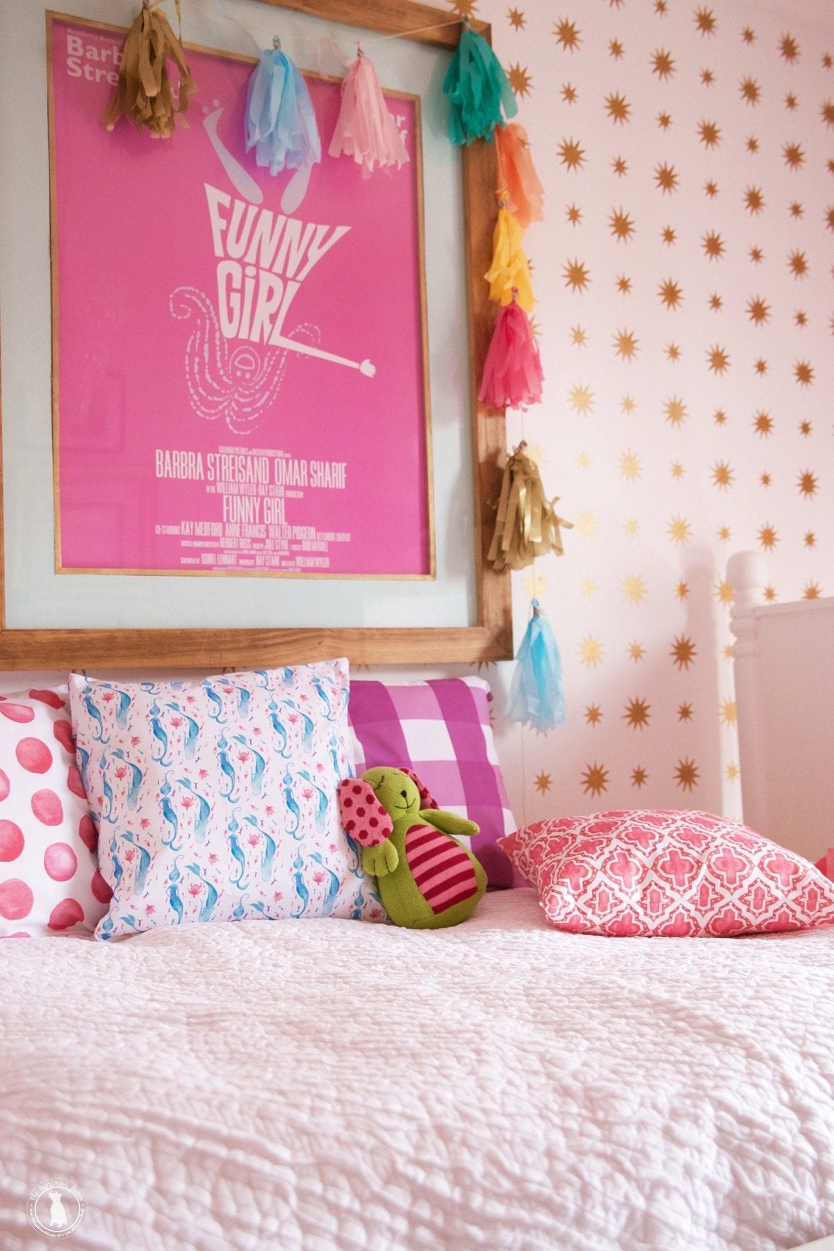
We don’t believe that working with fabric needs to be complicated. We also believe that you can use a little of the unexpected, and can just “go” to work. In other words, they don’t have to be just monochromatic or matchy matchy, in order to create a beautiful space. Those elements are awesome too, but it’s like changing out of a business suit and into your yoga pants for your house.
Long live the yoga pants. In blue ombré, if we can pick.
Live and stretch it a little.
We think the most interesting of spaces are the ones that combine a little of the unexpected together.
Here’s our number one rule we like to stick to when it comes to combining fabrics:
It’s all about contrast.
Good story, you may be saying. What does that mean?
We’re breaking it down today, to three different tips to remember – plain and simple.
Here’s three different ways that we apply that principle:
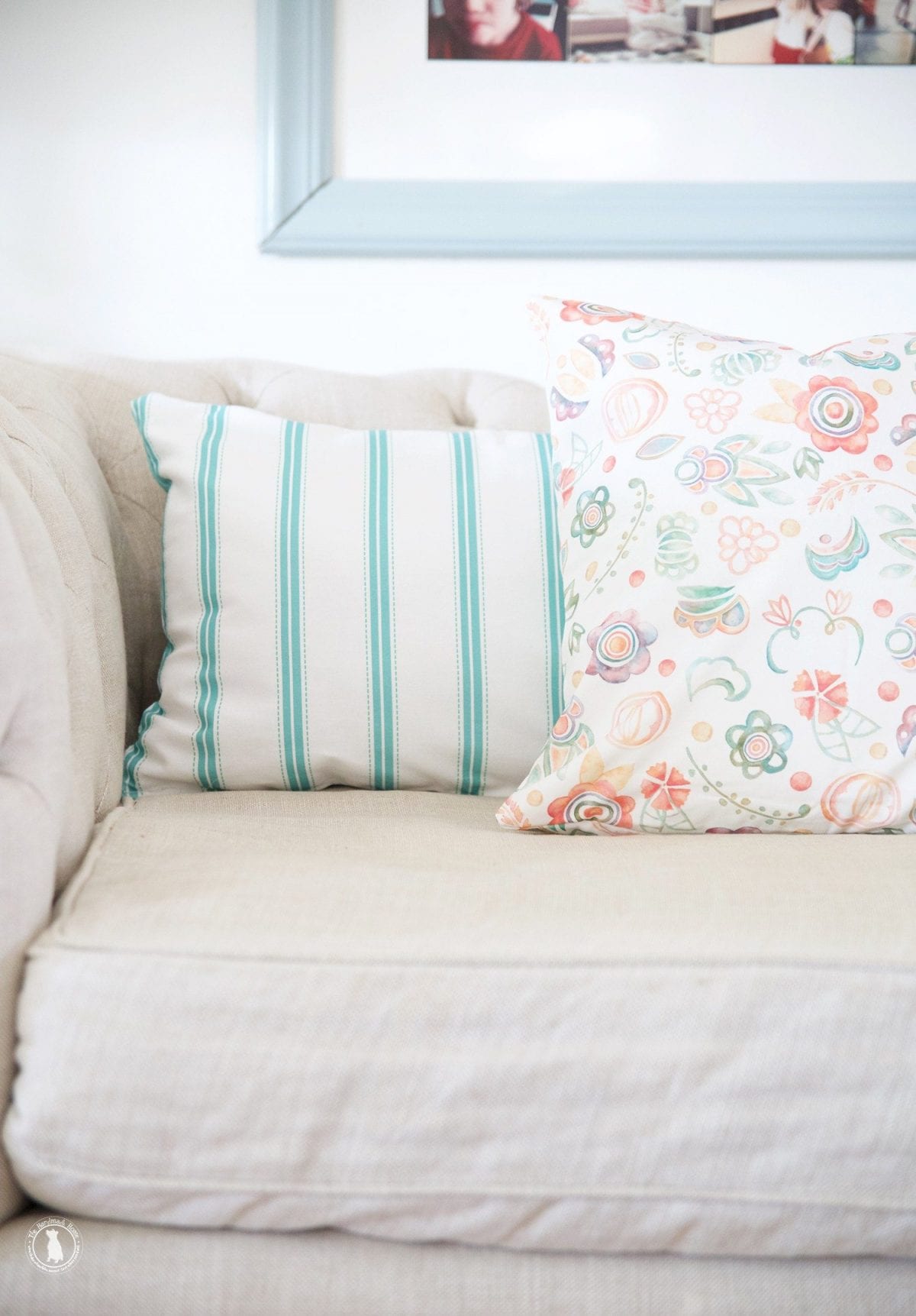
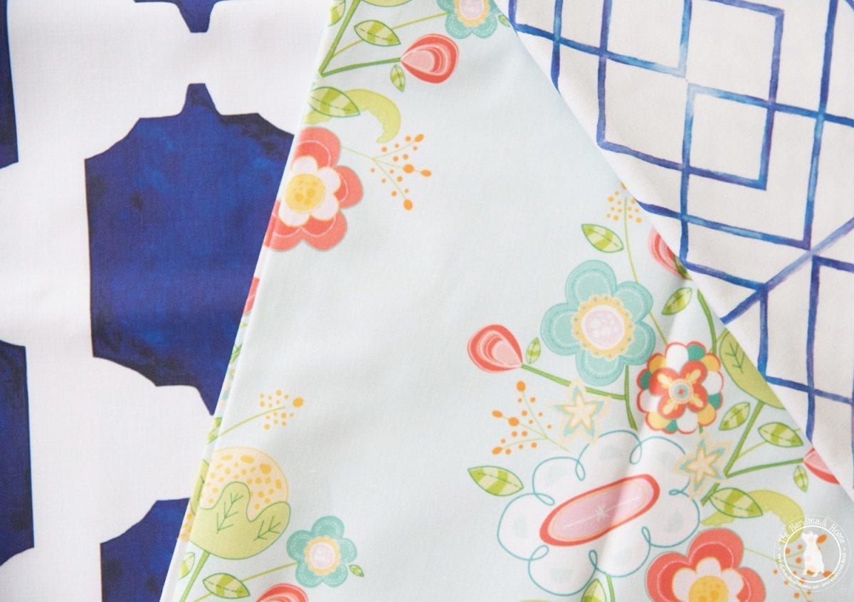
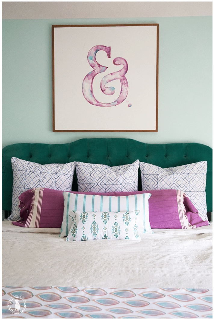
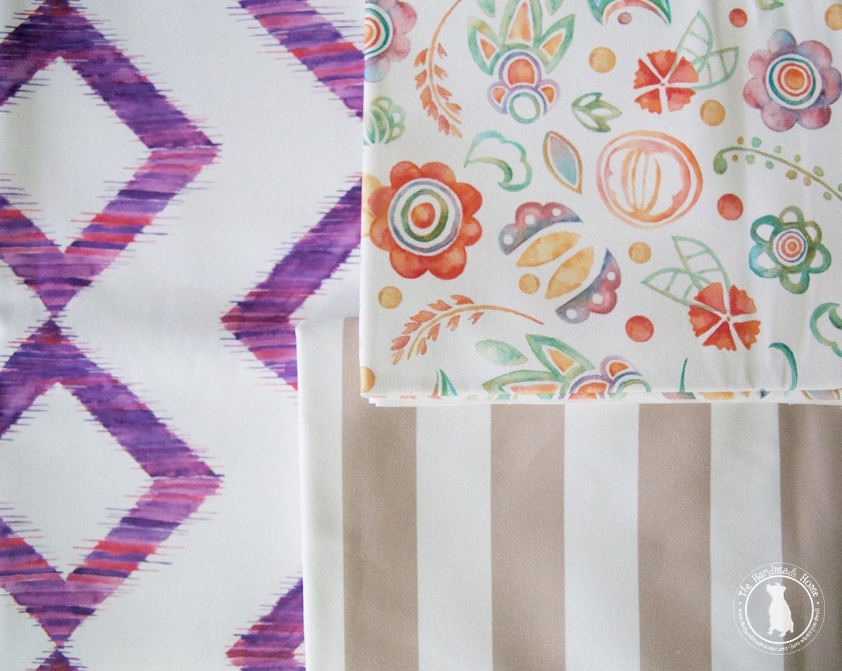
1. Dark + Light
It’s always fun to add two ideas that work well together because they play off each other in terms of opposites.
Beyond the basics of dark and light, think of how that can be applied to fabrics. Bring in some interest with color and its application in pattern and tone.
Think of the idea of the depth in your colors that you bring in, along with what works well along with that.
Or the intensity of one design contrasted with the simplicity of another.
All of these ideas combine the dark and light concept… and they work because they contrast.
That contrast brings balance.
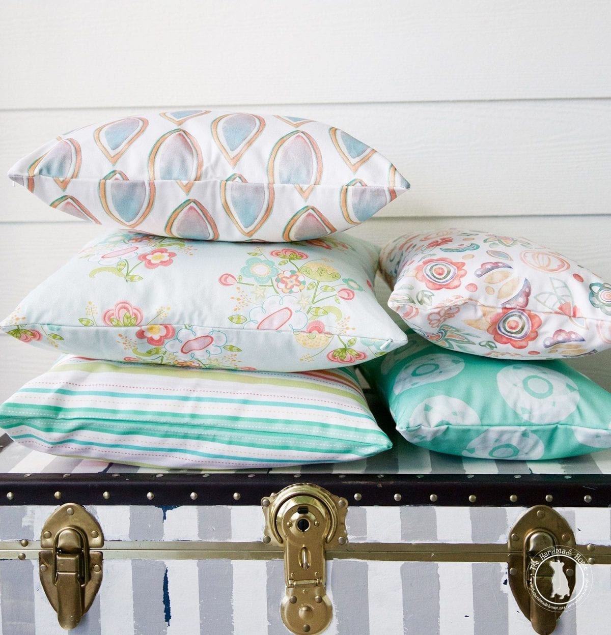
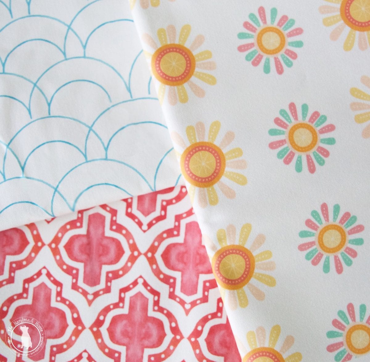
ticker tape parade + a trip to the carnival
the clock is ticking + blooming genius
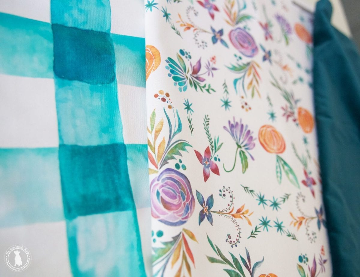
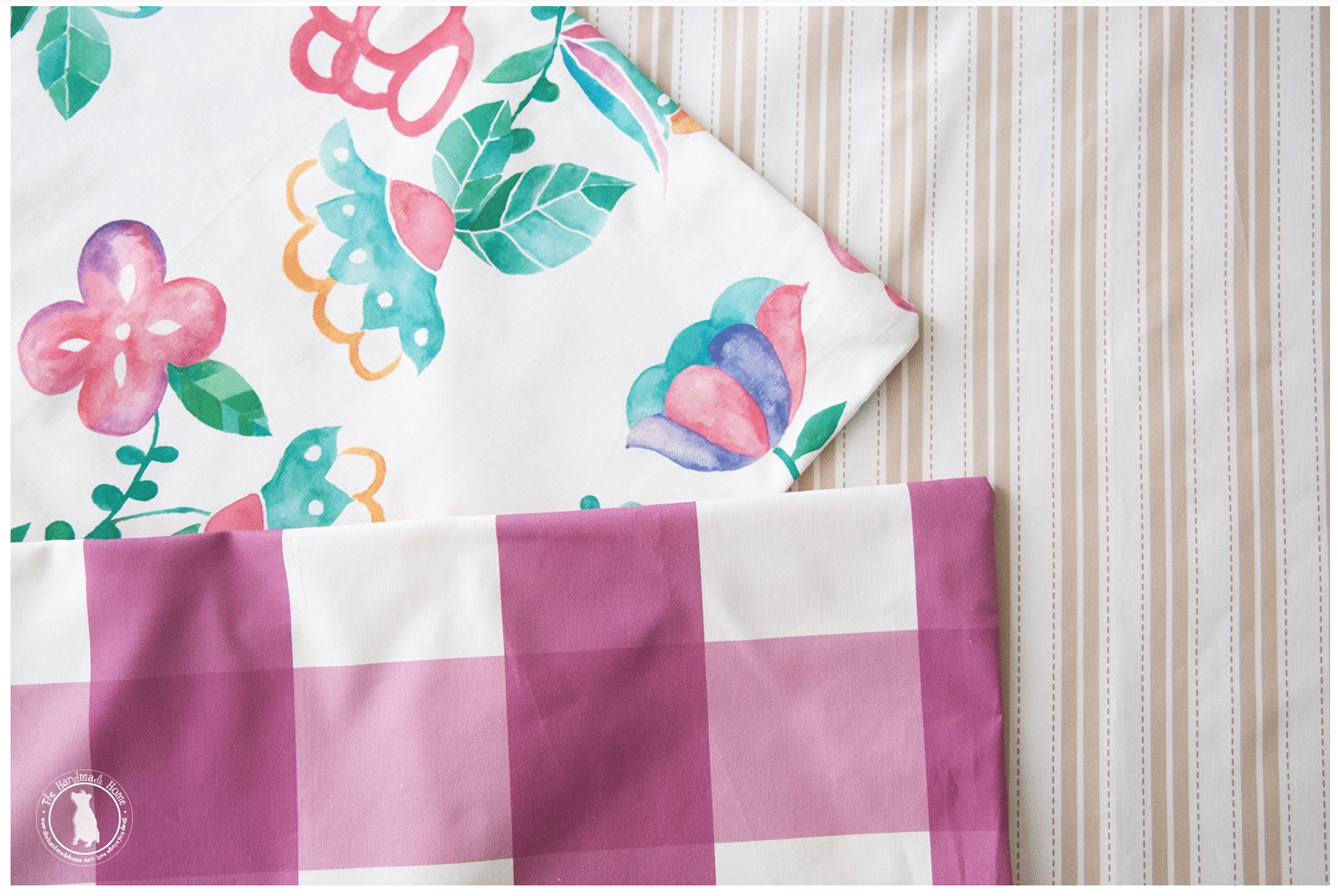
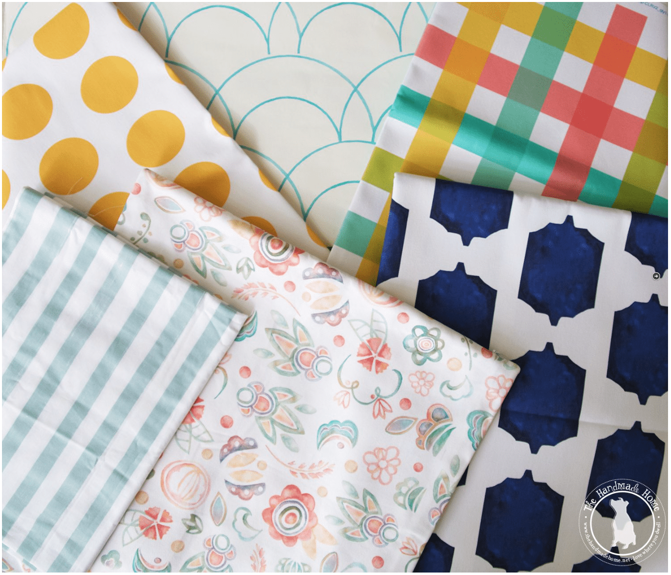
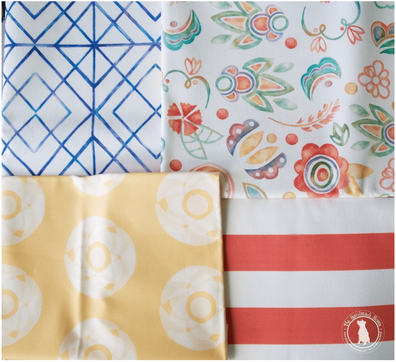
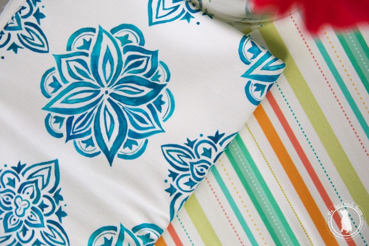
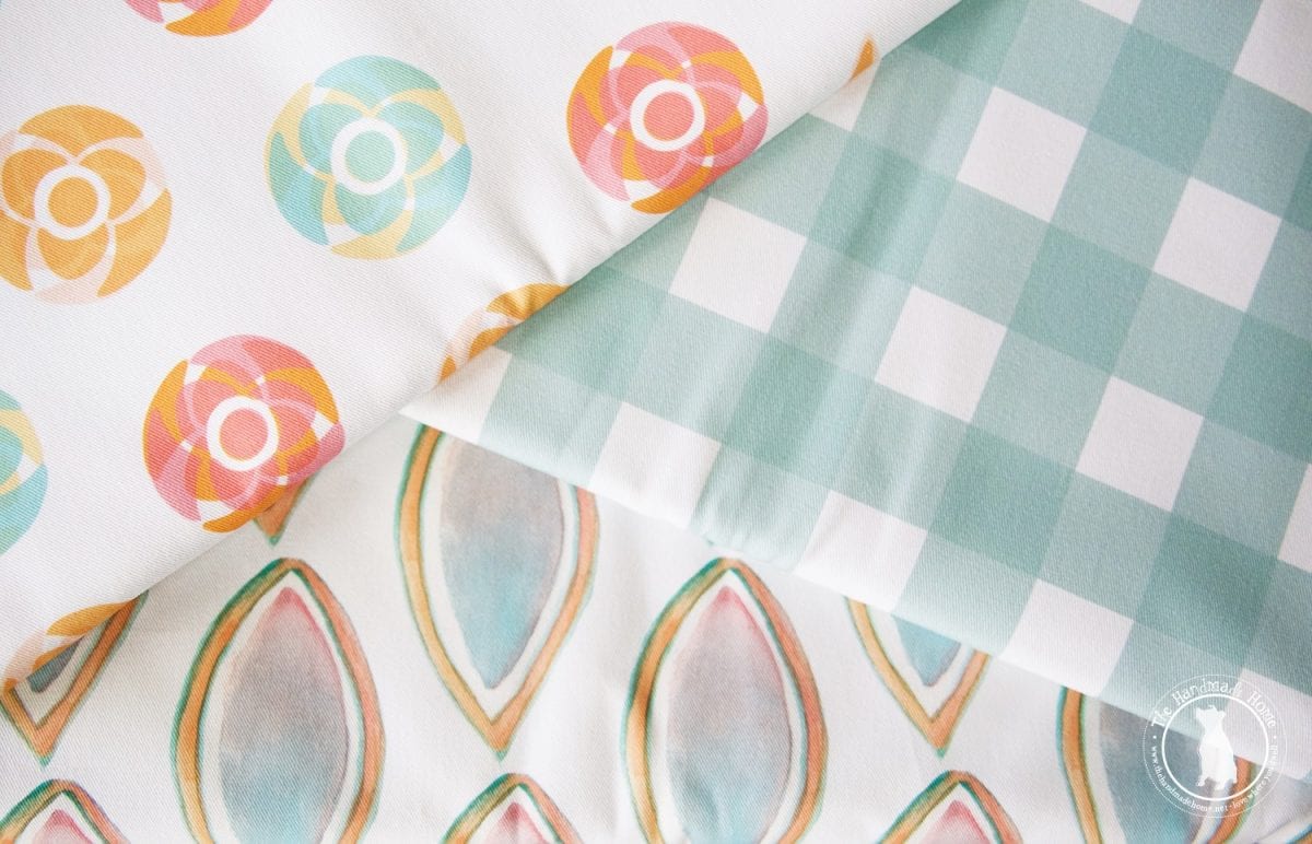
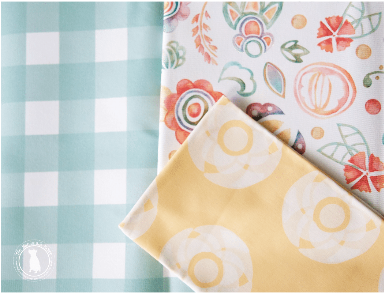
2. Geometric + Organic
The timeless relationship that works in almost every single application, are geometric and organic patterns. It’s true what they say… opposites attract.
Use a clean, sharp design combined with a more organic, natural pattern.
It’s fun to watch the two play off of each other and pair nicely because of their true opposite attractions.
When in doubt, bring in a solid for a third element. It can offer another hit of color, or a fun dose of texture… or both. There are so many possibilities!
checkmate + falling for florals
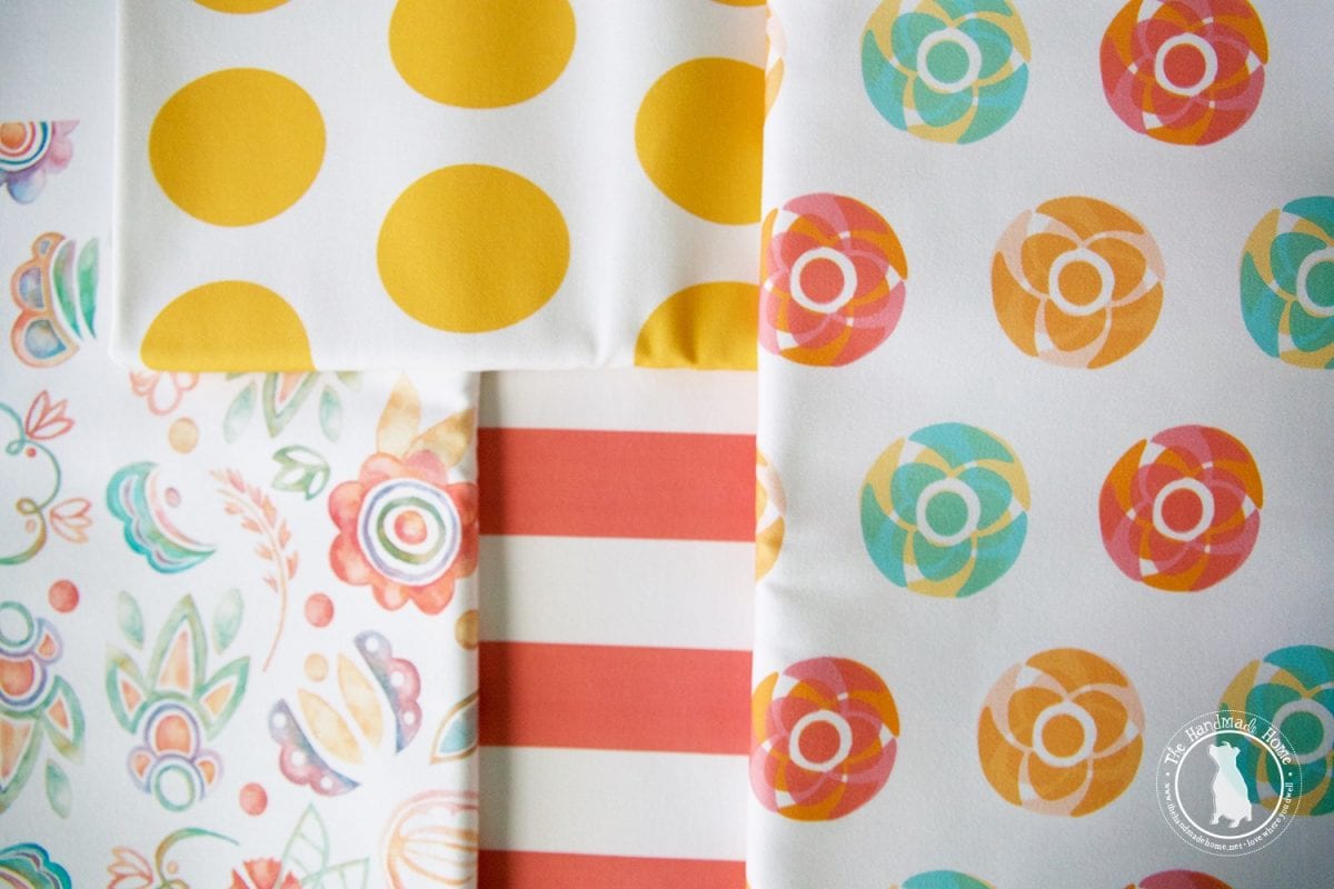
blooming genius + spotted in yellow + a change in stripes {in brick} + everything is coming up roses {in multi}
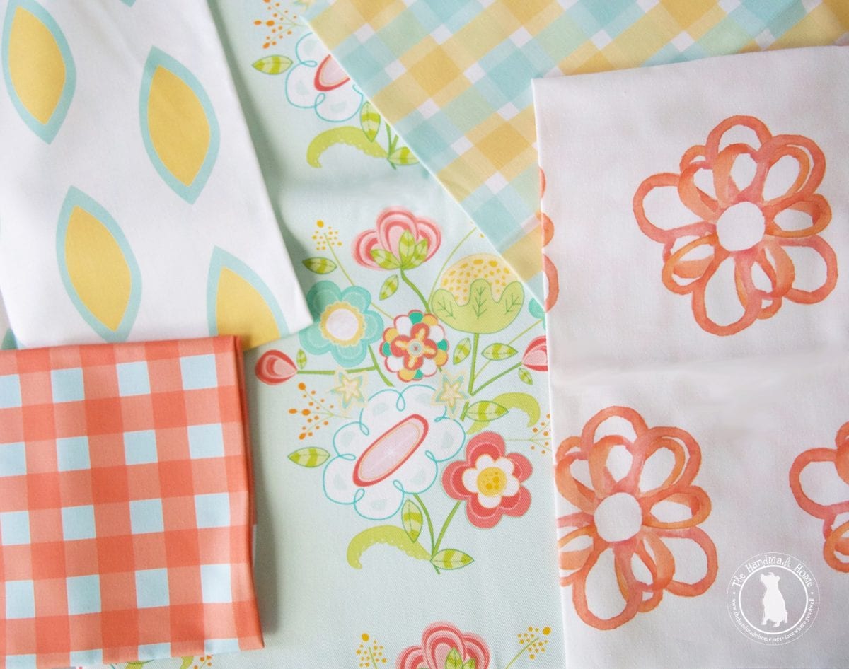
lemon drop + just peachy + may flowers + checks and balances + you’re a peach blossom
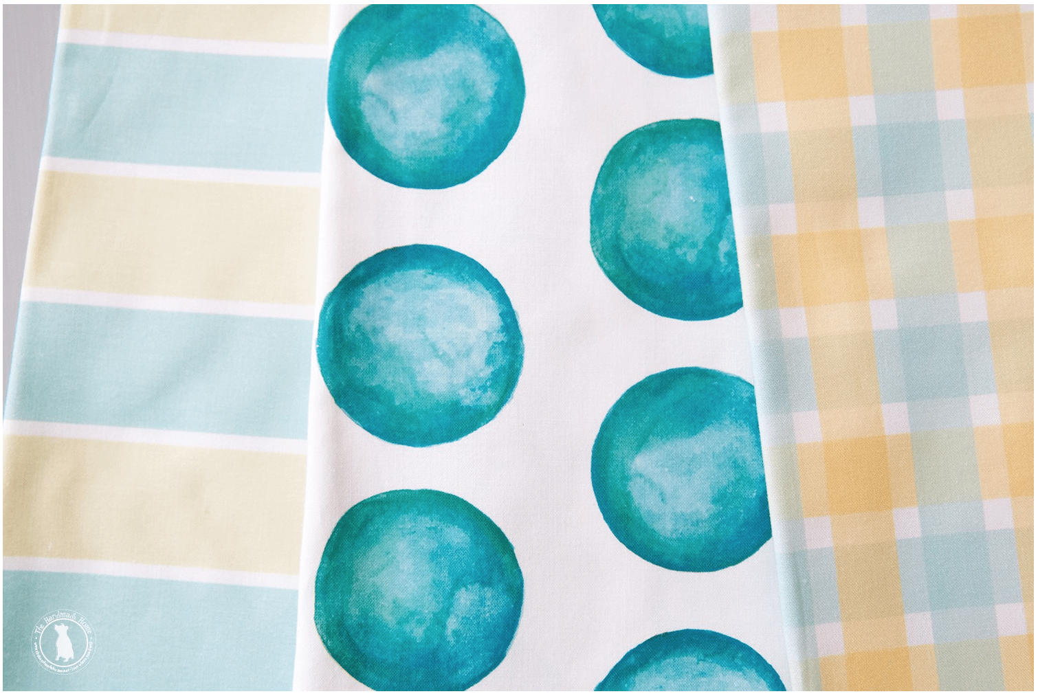
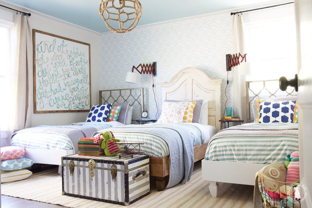
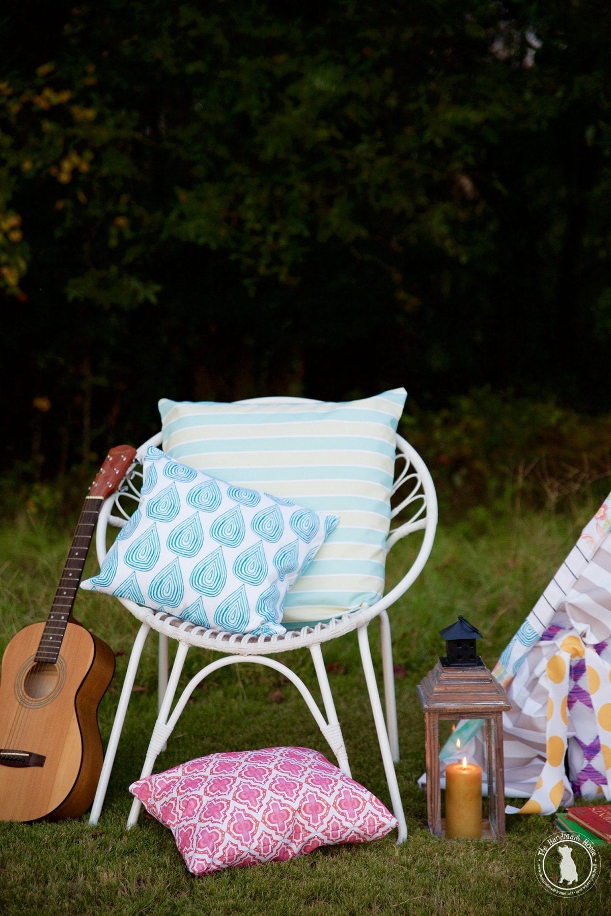
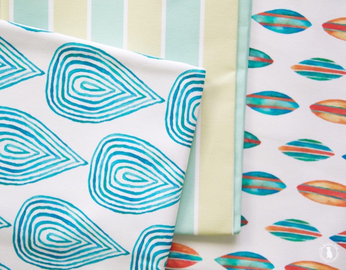
3. Large and Small
Experimenting with scale is always a fun idea when it comes to fabrics.
And you can apply this to the two elements above, too. For instance, below, we pulled out a bold {geometric} buffalo check for our large, with a small {organic} mermaid pattern.
And then we threw in a big polkadot for fun, too… and of course trip to the carnival works, because pink.
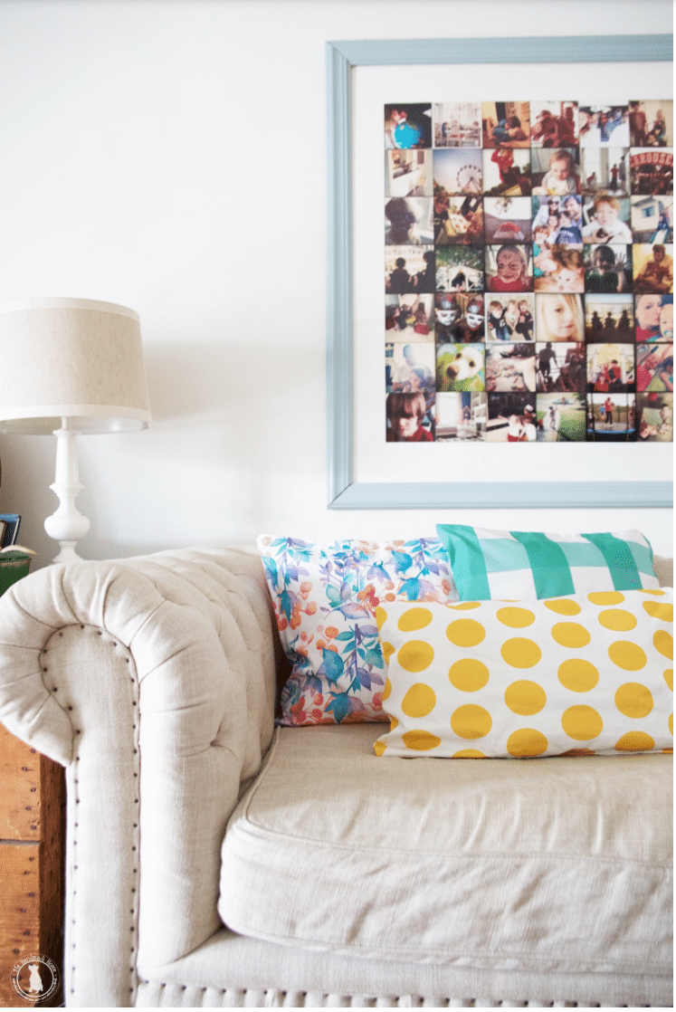
do the polka {blush} + mermaid lagoon + call your buffalo check {plum} + trip to the carnival
The three elements when it comes to contrast, are interrelated in really fun ways.
And if you look for just one of these little elements, you’ll usually find other relationships within them, too. There are timeless principles of design that apply time and time again, and work to bring balance to a space. Before you know it you’ll be recognizing them in your own spaces that you truly love, and know why they work so well.
Of course, as always, we think that the key is truly having fun. Do what you love in your own home. That’s really all that matters.
checkmate + proud as a peacock
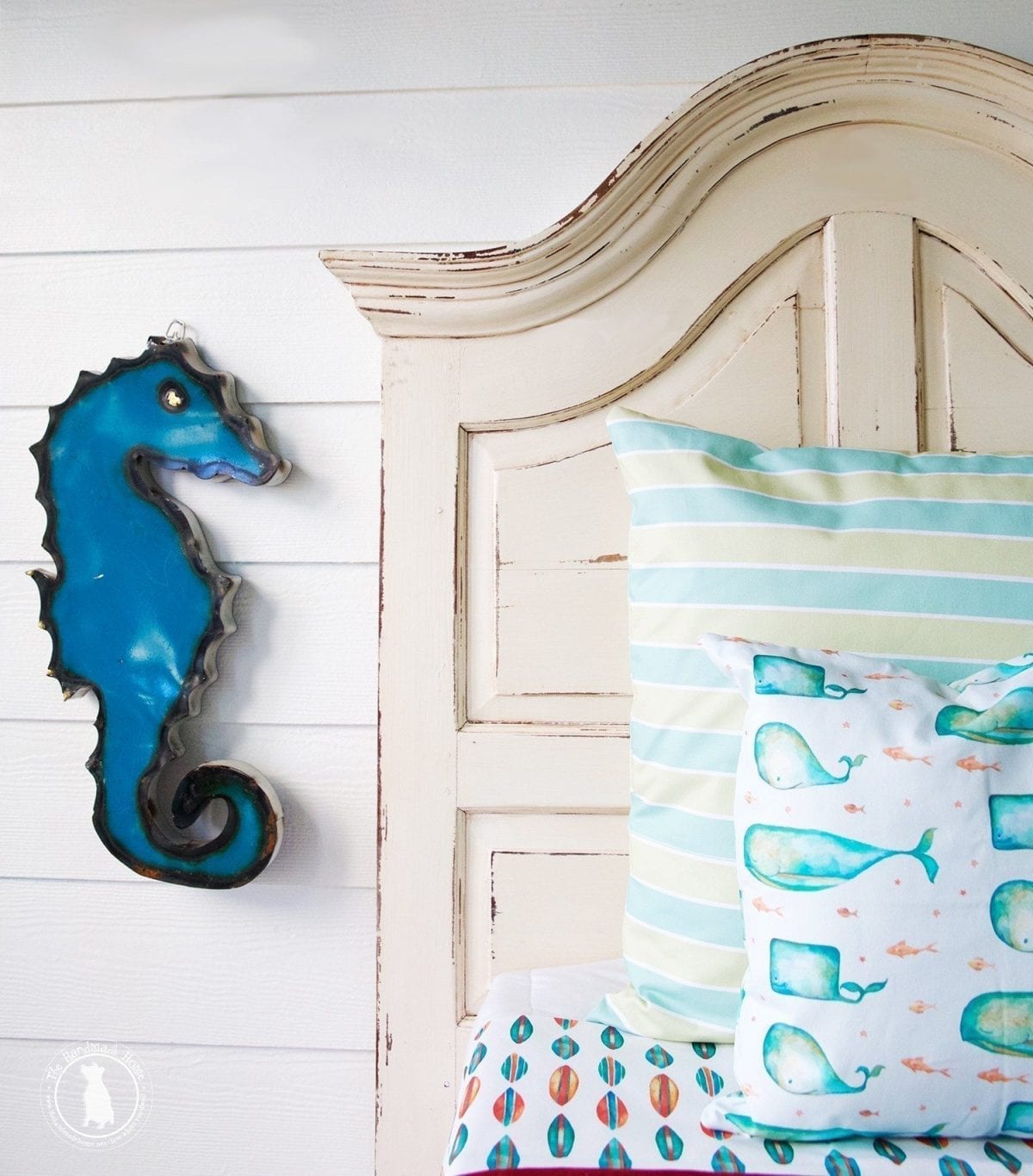
We’ve found a few of our very favorite spring combos from the studio, {because we’re terribly biased like that} and love the idea of applying fun colors and unexpected combos with our very own fabrics. They’re all designed to ‘go’ in keeping with the collected-over-time notion of a home, and reflecting the true artist that lives there.
Be sure to check them out + don’t miss out on the spring sale! ‘Tis the season to mix it up!
lovely in lapis +may flowers + geometry lesson
pretty little beanstalk + call your buffalo check {plum} + the clock is ticking {cool khaki}
a change in stripes {aqua mint} + do the polka fabric {aqua} + checks and balances {citrus plaid}
geometry lesson + emerald revival
plaid you could make it + lovely in lapis + {cloud nine wallpaper} + blooming genius + spotted in yellow
geometry lesson + blooming genius + everything is coming up roses {in lemon} + a change in stripes {in brick}
dahlia love this fabric + ticker tape parade
everything is coming up roses {multi} + pleased as plaid + proud as a peacock
cloud nine + garden sprouts + a trip to the carnival
pleased as plaid fabric + everything is coming up roses {in lemon} + blooming genius
may flowers + checks and balances + you’re a peach blossom
right as rain + a change in stripes {mint & aqua} + ride the wave
pretty little beanstalk + a change in stripes fabric {lemon} + ticker tape parade
We hope you enjoyed a little inspiration today and some fun spring colors!
Check out more of our fave combos here in the fabric section of the handmade home studio!
Pssst: It’s a sale! Take 10% off all our fabric with the code fabric10 at checkout!
As always, be sure to share your fave studio finds with us with the hashtag #thehandmadehomestudio we’d love to see!
Have an inspired day!


I always love your use of fabric and pattern – you guys are so talented when it comes to combining bold patterns! These are great tips – I love combining florals with geometric prints. 🙂
Fun blog entry! I like the names of your fabrics, and I LOVE the Cloud Nine wallpaper–stunning!