
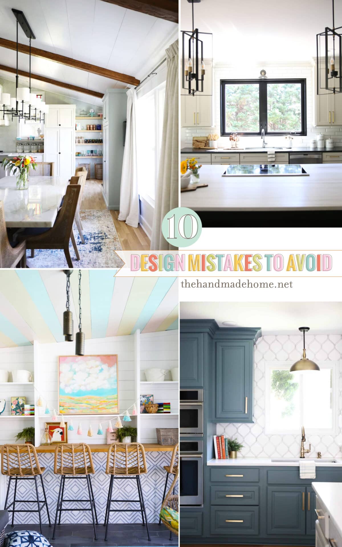
10 design mistakes to avoid
A sweet reader, Sandra, wrote in and asked this very smart question, and I decided to give it a bit of a re-visit today!
…You guys are always pretty positive on your site, and I get the whole ’embrace your home as your own’ philosophy. I appreciate your stance. But now that we’re ready to take on a remodel, I am curious about what you see a lot of in the ‘easily avoided’ category. Are there common things or design mistakes I can look out for to help our home look better in general? Maybe this is an odd question but I think I am so overwhelmed with what I want to take on, I’d like to look out for them as a guideline…
This is a really interesting topic, and I thought we’d revisit it here. Obligatory disclaimer: We’re hesitant to cover “mistakes.” Mainly because we all make them, we believe in learning from them, and in doing what you love. Nothing makes us twitchier than those clickbait articles that show other people’s work as examples of what NOT to do. It’s giving rude. No home is created equally, and no statement can ever be blanket when it comes to design. But there are a few little issues we see happening over and over again that we think you can avoid because we love to help where we can. 10 Design Mistakes to Avoid, because sometimes, it helps to have a guide.

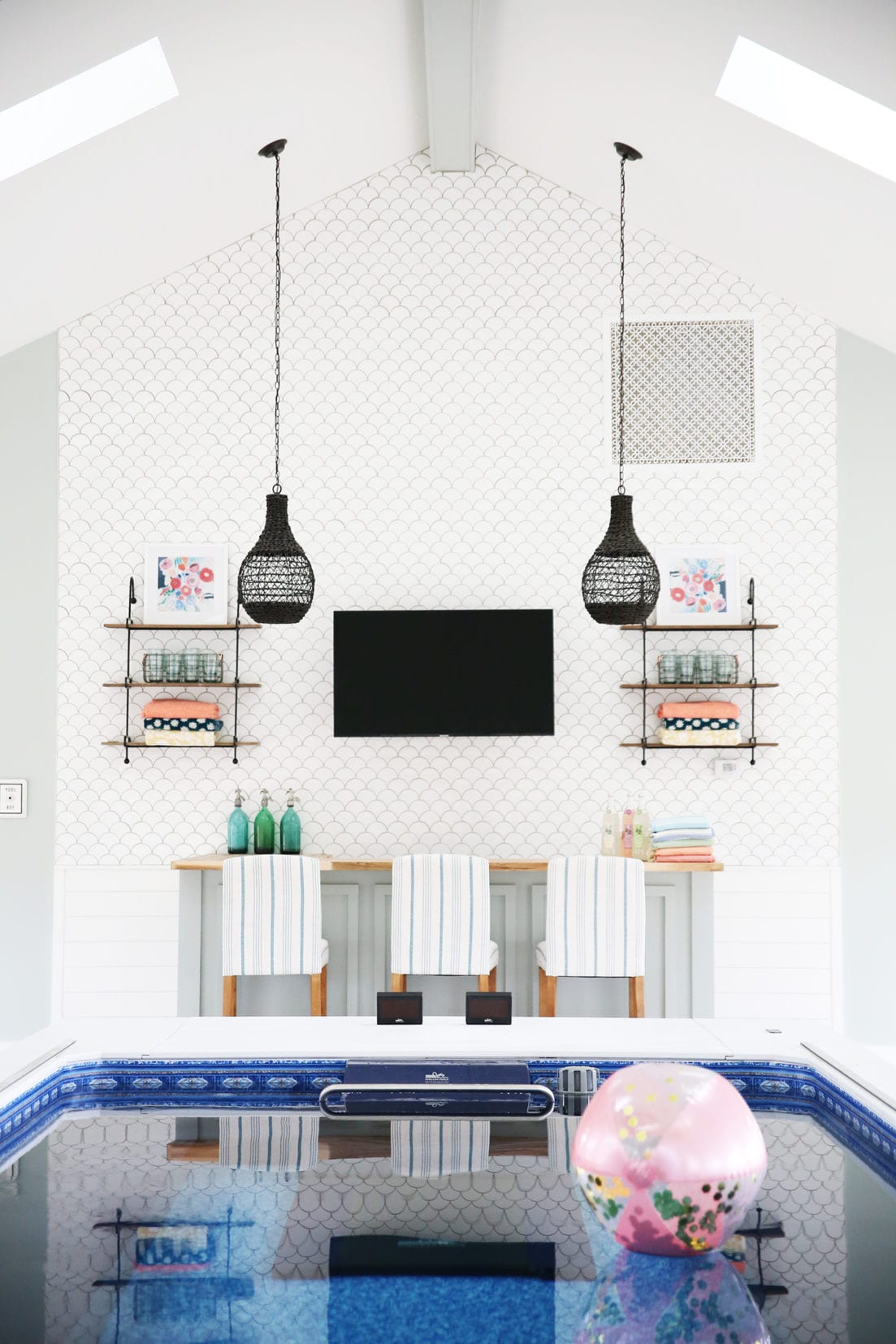
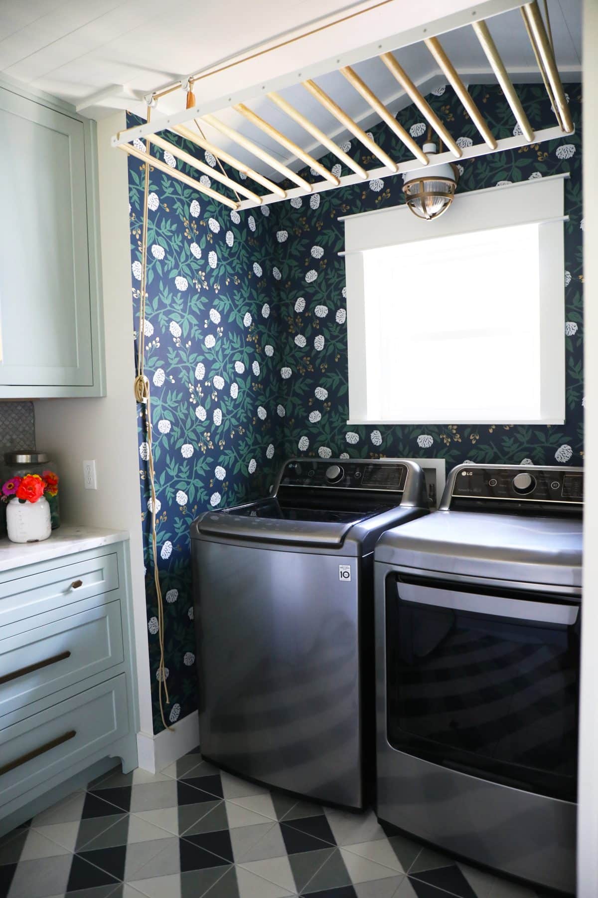
1. Easy decorating mistakes to avoid: Awkward Breaking Points for Tile.
Always look for natural breaks in your tile placement. For instance, in a kitchen, if you have a wall with open shelving, take your tile all the way up that wall. Or fill it in around the cabinets all the way. Unless the tile is just stunning on its own and it works in the space, {there are exceptions} don’t make bad design choices because you want to be cheap about it.
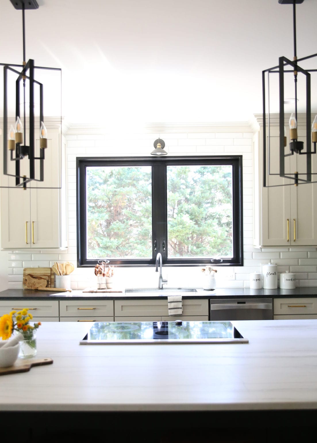
Let me say it again for the people in the back: Don’t make bad design choices because you want to be cheap about it.
We take them all the way up into the showers and cover the ceilings, too. Not only does this help with leading the eye up and simplifying everything visually, it also helps with potential water damage.
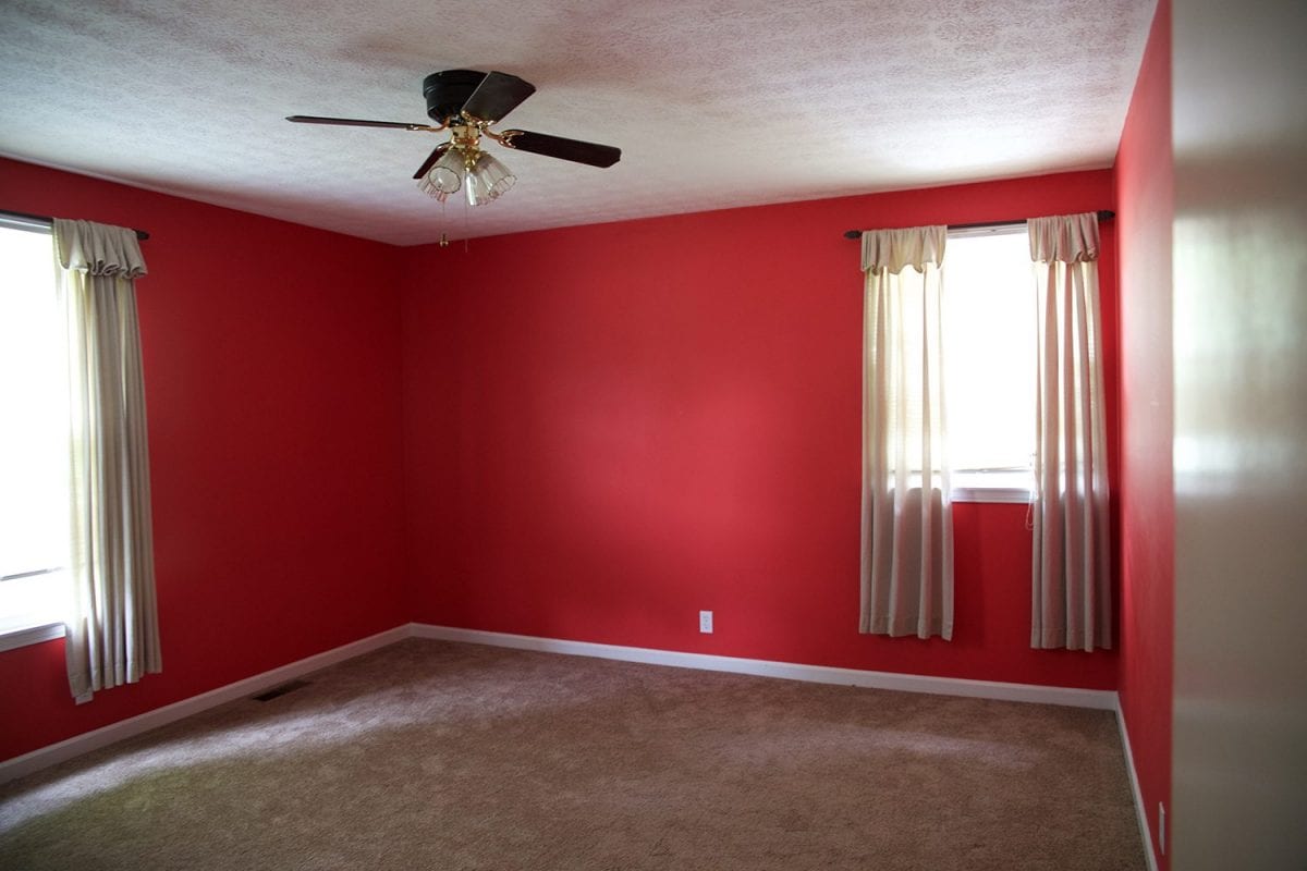
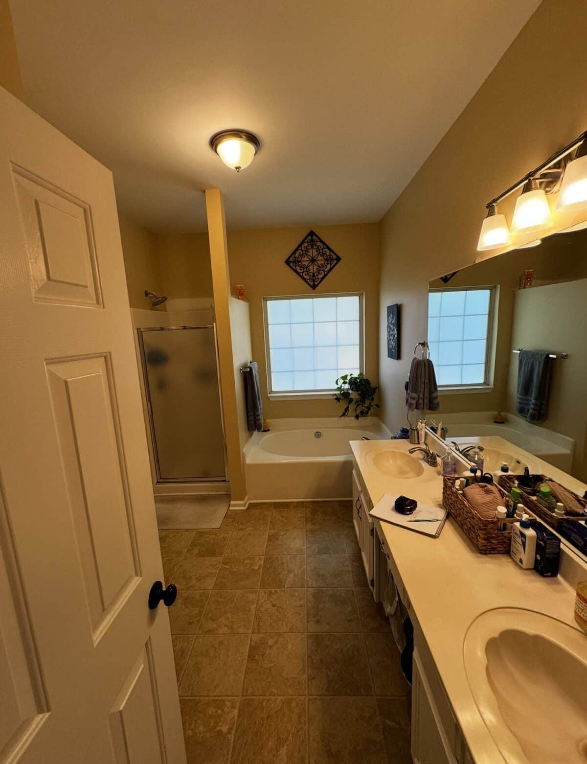 before
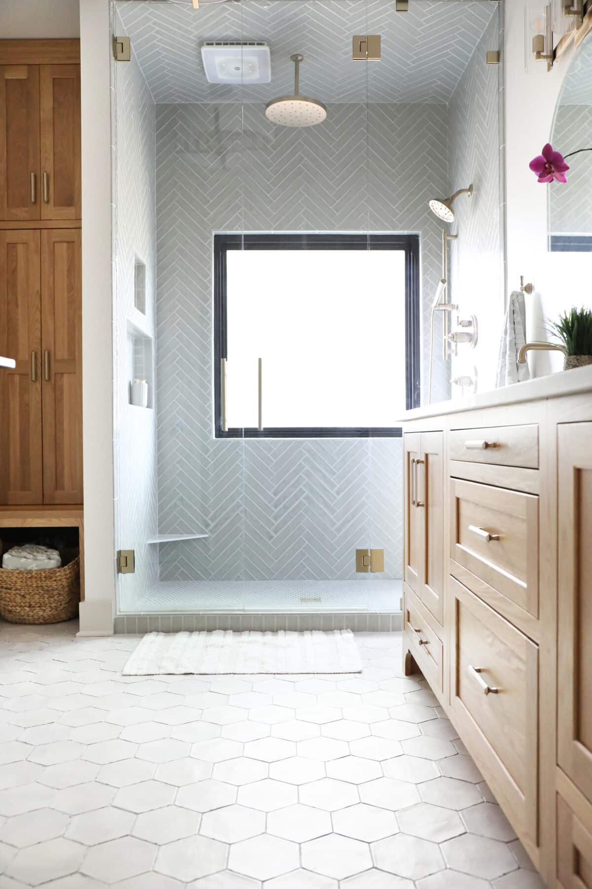
When in doubt, question yourself. Am I trying to save on labor cost here? Will this make a bigger visual impact? Is it really that much more to take it all the way? We really wish people would stop making their own made-up backsplash stopping points oh-so-awkwardly. Just fill in the whole wall and it makes more sense that way, visually.
Rant over.


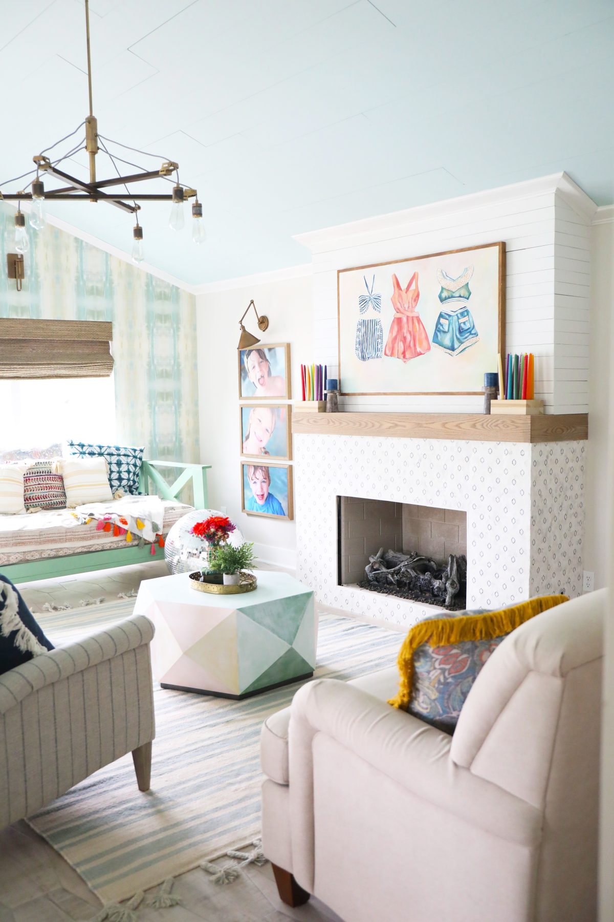
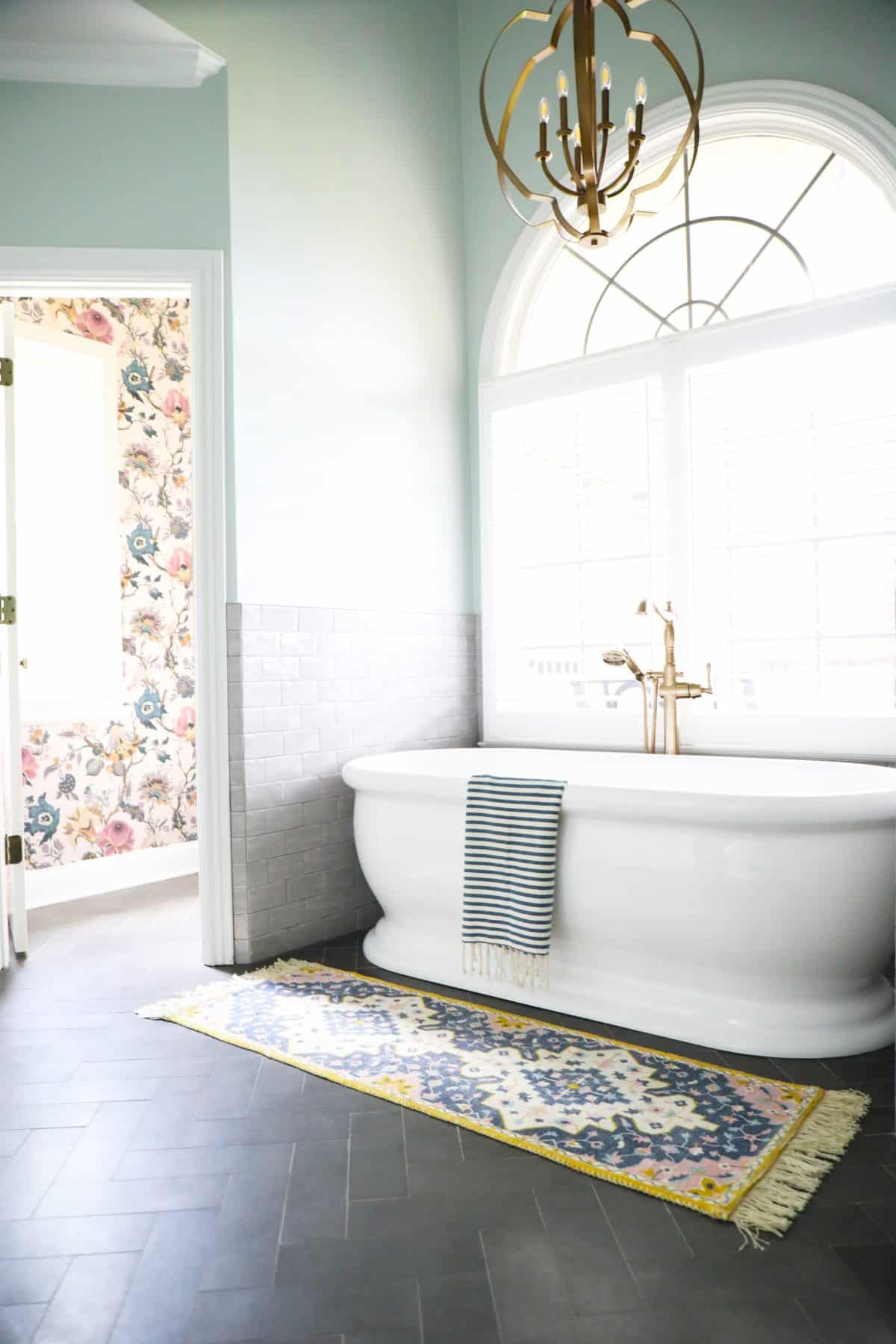
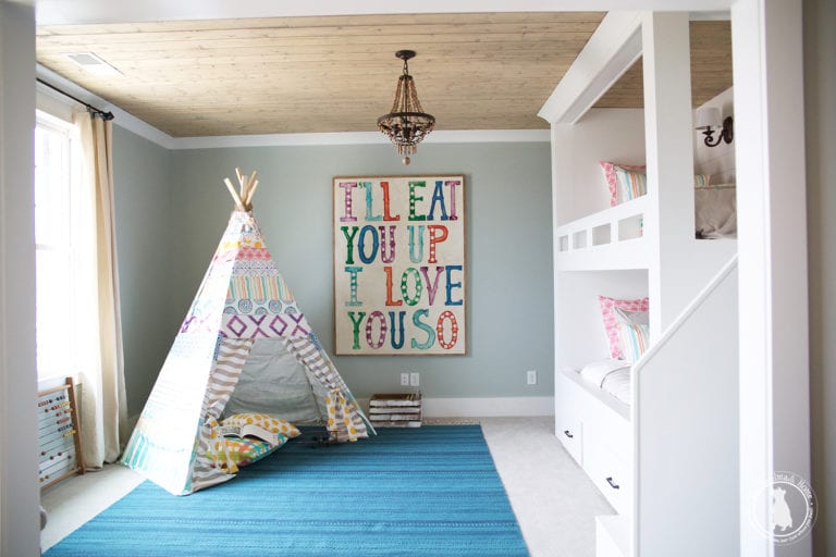
2. Easy decorating mistakes to avoid: Stop Ignoring Your Ceilings.
There are way too many homes out there with stamped ceilings, and since it’s 2026… it’s time to remedy that. This is a splurge for your future to-do list, if you haven’t tackled it already, and it’s a beautiful detail people often overlook.
It’s subtle, but it can make a huge difference in how you feel about your home. When you wake up in the morning, what’s the first thing you see? Smoothing out your ceilings is a great way to bring them up to date.
And… There are more options than smoothing them out.
Add planks. Add a color. Add wallpaper. Anything. Just consider the ceilings. They add so much more. Sometimes, a smooth white ceiling is all a space needs. But remember your options and get rid of the stamped and textured stuff. Don’t ignore that 5th wall.

We’ve lived in houses with both stamped and altered ceilings… and we can tell you firsthand, they make a big difference in how you feel about a space.
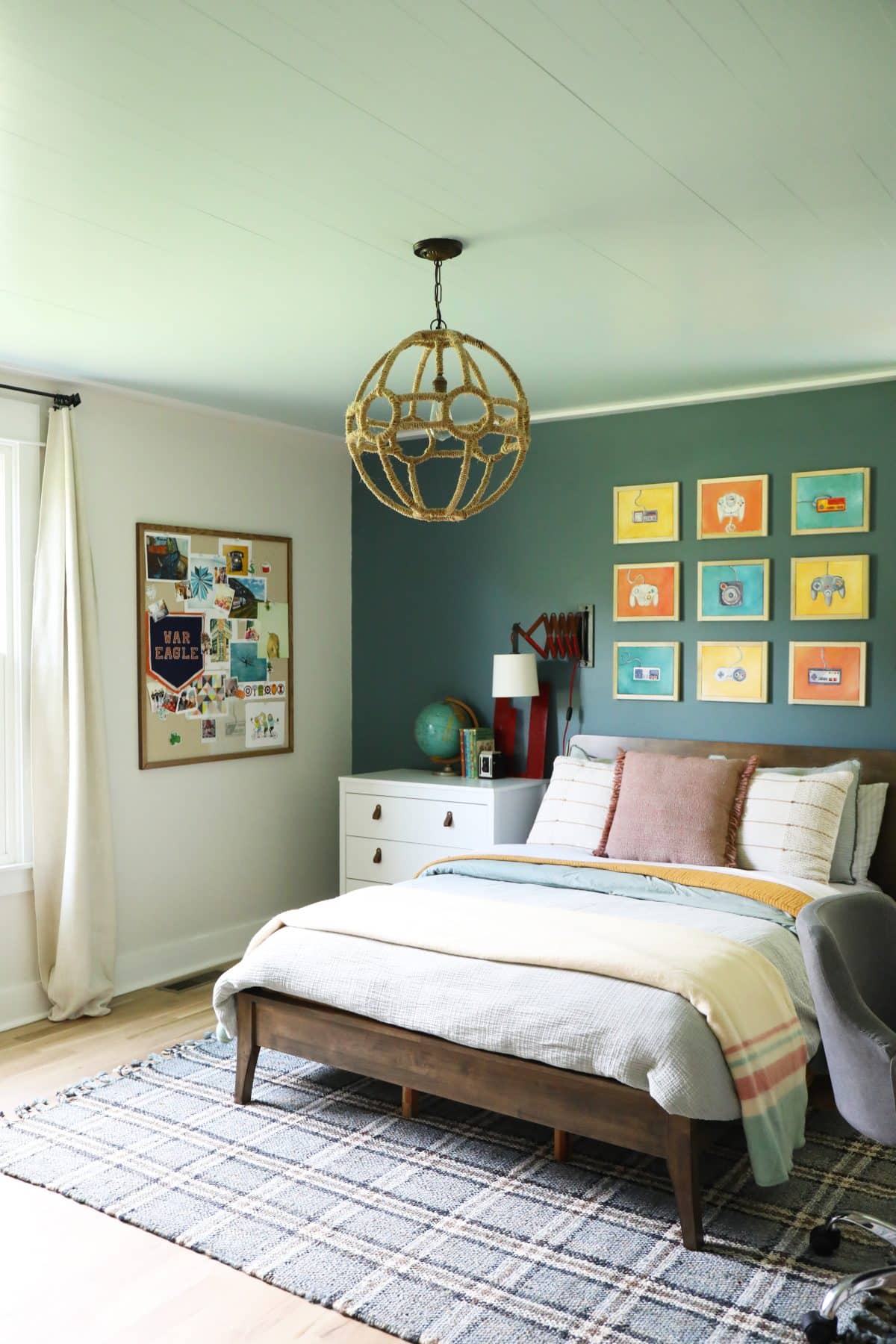
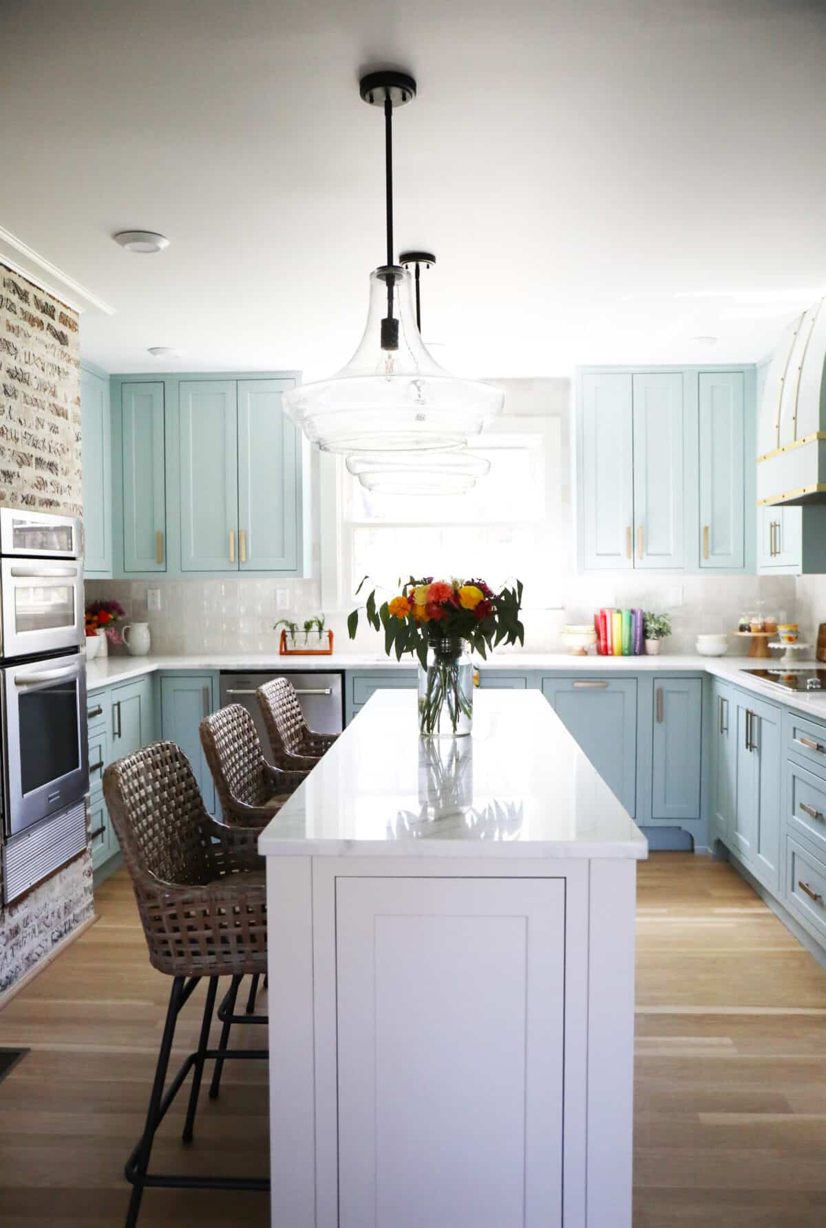
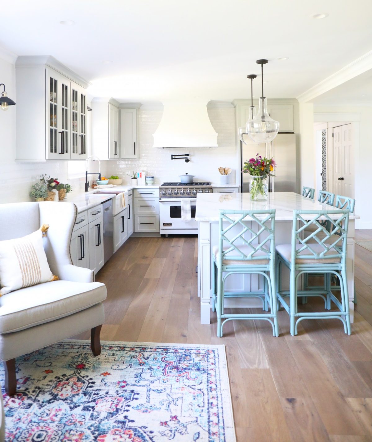
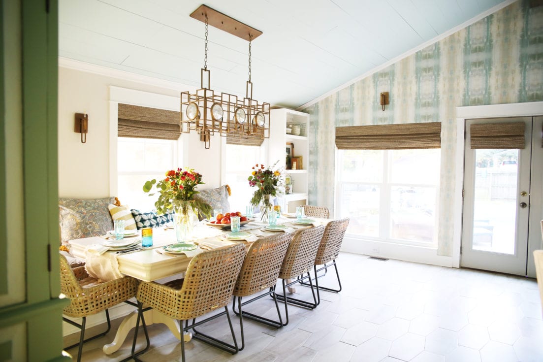
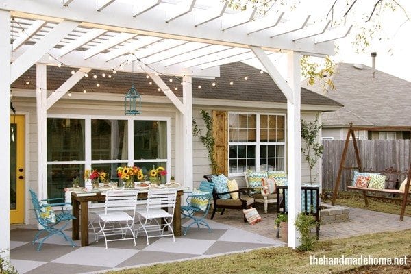
3. Easy decorating mistakes to avoid: Missed opportunities with Lighting.
Or skimping on it, period. Lighting could be a category of its own. It’s the best ambiance you can have in a space and the easiest to layer, too. See our posts about why are boob lights, here.
Three things about missed opportunities with lighting:
a. Missed opportunities with layering: from canned lights to lamps, there are awesome options in a room to make it multi-dimensional, especially at night. We love all the natural light we can get through windows, but in those darker areas, we’re especially grateful for the opportunities to create good lighting.
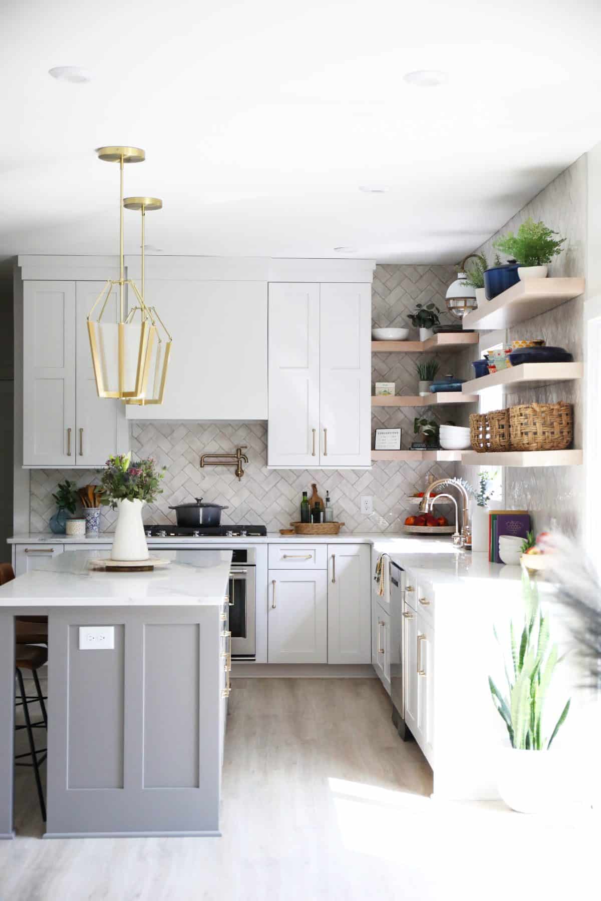
b. Going too small. This isn’t 1995 and your pendants in your kitchen {hello builders everywhere… are you listening?} don’t have to be oh so mass-produced/tiny. Or anywhere, for that matter. Stop thinking small when it comes to lighting. Do what you love.
And a little note added here: Even if that means you love tiny lights, just make sure you have multiples.
c. The wrong heights for hanging: We always say eyeball it and go a little lower than usual, since every space is different. But not too low. It can get tricky. Here are a few guidelines we use when in doubt:
For pendants over countertops + chandeliers over tables: at least a 30″ clearance. It’s just a good rule of thumb to go by, but do what’s comfortable to you, since there are always exceptions to the rules: take our own kitchen, for instance. Our ceilings are high, and our lights are large, so we have a 45″ clearance above the countertops, and they work.
Bonus point: Way too many people have higher ceilings (think two stories high) and just stop with the light, wherever it lands. Add an extender to the light, so that it actually hangs above the table, not twenty feet above your head. No one should walk into a room and wonder why light flies so high. Hire a professional electrician to help with that, so that it doesn’t look, well, kinda botched.
There. I feel better now. Someone needs to tell the truth. It’s the little details that can go a long way.
4. Easy decorating mistakes to avoid: Going Too Small with Rugs
5. Easy decorating mistakes to avoid: Defaulting to Trends
Okay, hear me out on this one. Trends are all about perspective, right? And what goes around definitely comes around… and we don’t really believe in trends, anyway. See: Chevron in the Taj Mahal. But stick with me. What we’re talking about here is defaulting to the cool thing because you’re not sure what else to do.
Here’s an example that may seem familiar to a loved one who really needs an intervention: Just because your neighbor’s sister’s brother painted their walls and ceilings black doesn’t mean it’s the best fit for your home. Try to make good, solid choices you won’t tire of in five years. Ps. Black everywhere is the new excessive shiplap is the old paneling from 1975. This was just supposed to be an example, but there… I said it. Do what you love because you love it. Not because you think it’s what you SHOULD do. Douse your angry mob torches, please.
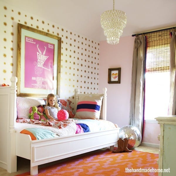
6. Easy decorating mistakes to avoid: Leaving Out the Details
Too many people are afraid to really go for the accents. This is your opportunity to bring in fun color and personality with what you love. Don’t forget the rugs. Fun colors. Wallpaper. Vintage finds. Pillows. All those personal touches in the space that make them yours. They’re what make a home, a home. There are too many spaces that stop with the basics, and the rest are left for later. Only, they never really get around to it. Add those personal touches, and you won’t be sorry. It doesn’t have to cost a fortune to be beautiful.

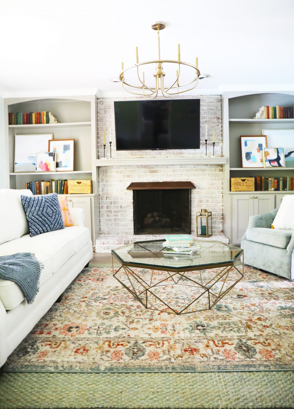
7. Easy decorating mistakes to avoid: Hanging art too high.
There’s nothing more tragic than seeing a wonderfully finished space with beautiful art on a wall placed too high.
Here’s an easy rule I stick to: Just remember that the average height for a woman is around 5’4″. And that art, in general, should be around eye level for that person. This way, you ensure that everyone can see it. Not just the tall people.
Most art museums hang their art at exactly 57″. Which is, ironically enough, exactly where my eye level hits on a wall. Guess how tall I am?
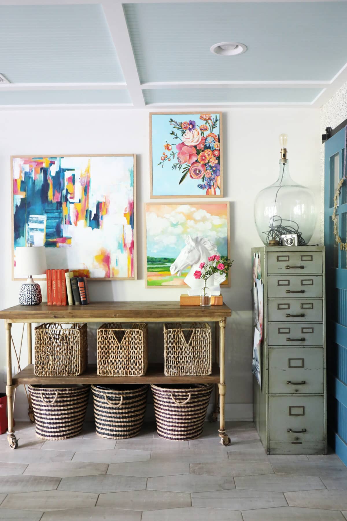
So keep it at a comfortable height and stop going so high. Exceptions, of course, are multiple hangings, gallery walls or pieces spaced over taller items like buffets or shelves. But nothing drives us crazier than art placed waaaayyy too high over a bench or sofa. Stop with that gap, y’all.
Bonus: OR, using it in the wrong scale. Don’t be afraid of your art. When in doubt, go large. Larger art is never offensive. And if it is, that’s probably the point of the art… ha.

8. Easy decorating mistakes to avoid: Unrealistic Expectations
Now that I’ve covered little things… let’s talk about timelines and working with professionals.
When working with a designer, from timelines to cost, TV is TV for a reason. It’s fake. Just know that any photo you see from us has MONTHS of hard work {blood sweat and tears from errrrrebody} and legit laborious process behind it.
So, always be ready to adjust your expectations. Things don’t happen in a TV commercial, and you can’t do that kitchen for under 5k. We’re real with our clients from the get-go, instead of lying to them just to get the job. So adjust your expectations, and things will be much easier, whether you’re taking it on yourself or working with a professional.
For more on this little topic, be sure to check out this series.

9. Easy decorating mistakes to avoid: Not Trusting your Designer

10. Easy decorating mistakes to avoid: Letting “the rules” Paralyze You.
Now that we mentioned some “don’ts,” let’s mention some “dos”. Because the last thing we wanted to do, was overwhelm you.
Do what you love! Don’t let the rules paralyze you and hold you back from doing what you want to do in your home. That’s it. We hope those little tips gave you a little guidance, but at the end of the day, we want you to love it, too.

These are just a few guidelines that we wanted to share to help along the way with the little things. As always, let us know if you have anything you’d like to add, or specific questions you’d like to see covered!
Have an inspired day!
I think I am in the boat as your other dear reader – while I’m inspired to tackle projects in multiple rooms, I’m most worried about messing with any “flow” of rooms or colour scheme.
Great post! Do you have a source for the white,grey and yellow geometric runner in the kitchen pic #1?
excellent advice! both my husband & I love ‘improving’ our home both in remodeling & decorating & are about to embark on a new adventure. It is especially important to allow a stager to advise when selling even in this crazy market, it will be to the sellers advantage to up the ante. Thank you again!
Just read your Sunday morning story and I enjoyed it. I have 2 bath In my 1982 to home to redo plus repainting whole house. The guest bath is complete. During my choosing paint and surfaces, I got so sick of friends pushing the HGTV gray. I did what makes happy and it looks great.