Hello lovely friends! We hope you have had a fantastic week. TGIF!
Have you ever noticed how you can have something in your home, and it can sit there for years, and then one day it’s as if your eyes have been opened and you’re suddenly completely annoyed by the miserableness that is said item?
You’re all, What was I thinking? How did I allow such an abomination into my home? You want to throw it through a window after you burn it, if you don’t decide to coat it with five layers of oh so redeeming spray paint.
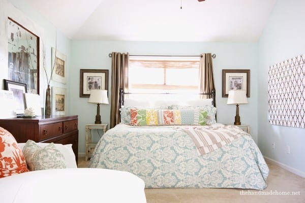
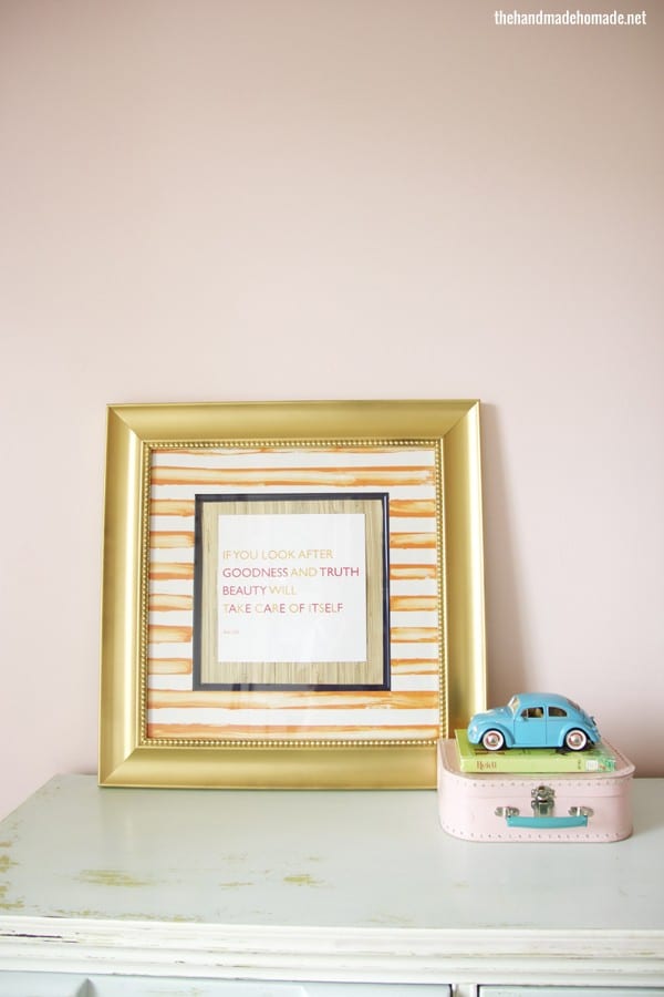
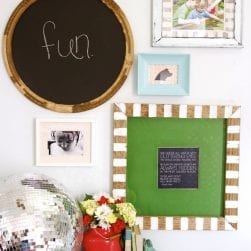
When we spruced up our bedroom, I decided to move these frames. The two you spy on each side of the window. It was if I woke one day and realized the errors of my ways. How much I suddenly despised them.
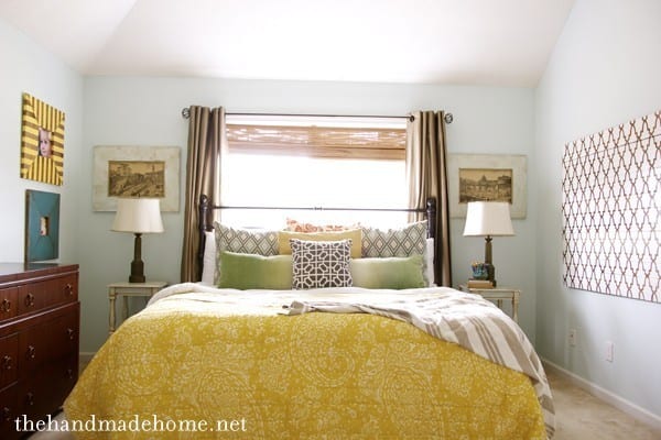
So they were replaced on the wall until I figured out what to do with them.
I scored these frames on sale at one of those big box stores when I wasn’t sure what my personal style was. I still wanted my home to rock the dark 1999 bombay look, in 2001. Because I thought that was what any good home owner was supposed to do. You know, spend lots of money on pricey looking frames that everyone else had. So when we spruced up our bedroom again, and I noticed suddenly how dated they were…
I couldn’t get them off my walls fast enough. {I was also appalled by the price tag which was still attached on the back – even though I scored them for more than half off.} Though the art was a little on the generic side, I decided they were salvage worthy and would be a great fit for Emerson’s room redo.
So with an arsenal of a plan, a printable, and some spray paint, I took on these little beasts.
 They received quite the makeover. Stay with me. I know I’m scaring some of you.
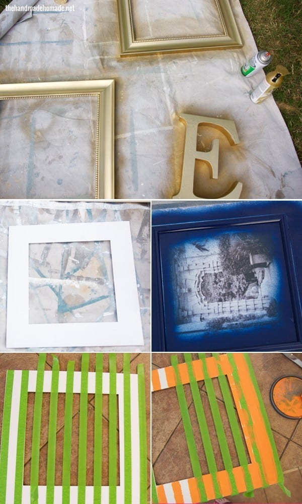
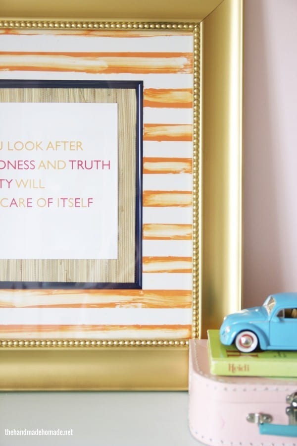
We started by whitening up the matte with a quick spritz of white spray paint. This took them from creamy off white with a contrasting vein work to a cleaner white. And the frames got a fresh spray of gold. Then I took the innermost part of the frame (which was totally attached to that rocking photo) and gave it a spritz of navy blue. I just went to Home Depot and grabbed up three of the most basic colors in Rustoleum: Navy, White, Gold. The kind you always look at, but aren’t sure if they’re worth giving a go. But I was feeling lazy.
After adding orange stripes (Tangerine Melt by benjamin moore – confession: sometimes I struggle with staying unbiased towards colors once I read their names) and distressing them a bit by wiping away, I added a small piece of leftover grasscloth wallpaper to the centermost part. I simply measured, cut and hot glued. After I gave the glass a good scrub, we put it all back together again…
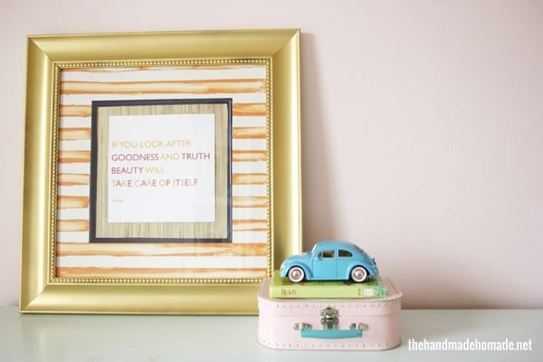
Tada!
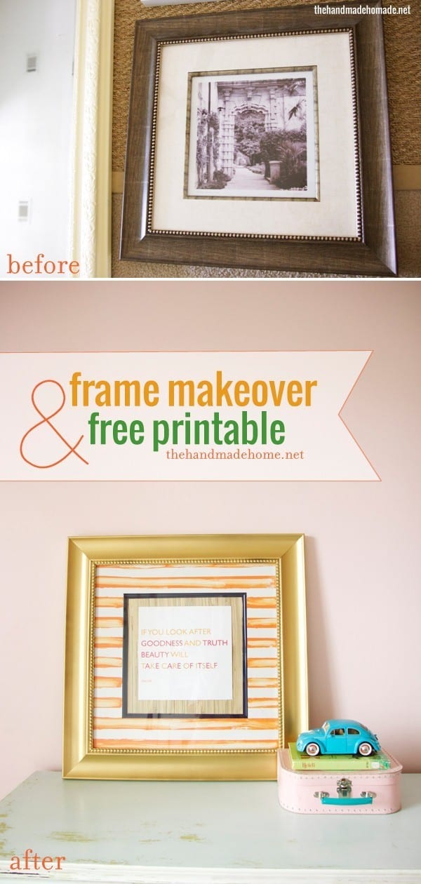
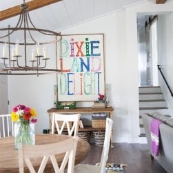
I stumbled across this quote the other day, and thought it would be absolutely perfect for Emerson’s room.
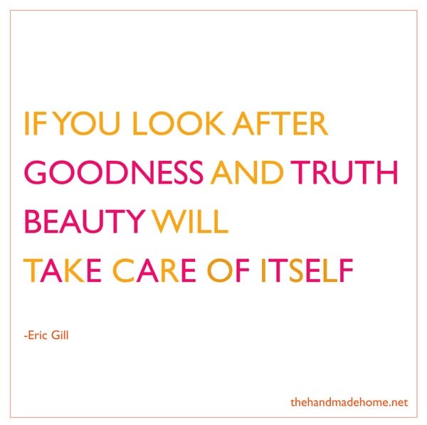
I believe a great space is all in the meaningful details. I want my children to be surrounded by photographs reminiscent of wonderful times, sweet quotes, and inspiring art. It’s the personal little details that make us who we are, after all.
I just feel like this quote couldn’t be more true. Even if at the time, the author of said quote was referring to something entirely different. ;} Typography lovers everywhere enjoy.
I’m still deciding on the contents for frame no. 2. But in the meantime, it’s made over as well.
And yes, we went pink with her walls again! Pink can be scary, and I caught myself shuddering a bit when that first coat went up. Pink is always two shades brighter from the paint chip to the actual wall. But this time the room has a bit of a twist, and it was per her request. Also, she won’t have a pink room forever so we may as well embrace it. This is just another sneaky peeky of her space.
We’re going at a snails pace, but as long as we don’t stop, right?
I’m adoring the pink and orange and blue all together. I can’t wait for you to see it in her space!
Want your own version of this print? You can have a 9 x 9 square or an 8 x 10 print by heading over to our feebies page, now. ;} Just look for Goodness + Truth (with the size) Simply click, save, print, and display!
Insta-art. Just for you!
Have an amazing, beautiful day!

Wow… yeah you scared me quit a bit with the orange and blue… thought you were pulling some football colors out… was very worried…
But it came out quite well! Thanks for the freebie!
Haha! I promise it will be very subtle once it’s all mixed in. More pink and gold than Auburn. ;}
Oh my word I’m so in love with these colors. I can’t wait to see the entire space. Hurry up! Kidding. Kidding. 🙂
Oh how fun! I love this quote. Thank you for the freebie!
I love this printable, so very true! And yes, as long as we just keep swimming ( I am thinking of Dorie when I say this) that is the most important thing 🙂
xo, Tanya
twelveOeight
Such a pretty quote! I adore that frame. You define drab to fab. 😀 Cheesy, yet true.
Very cool. And I totally get the paint name crush. I am often swayed to a paint colour on a strip, or between strips, by the name of the colour.