
girls room makeover: simple elements for a big impact
A sweet reader wrote in the other day, and asked if we use formulas for different spaces that we design. We thought that was a really great question, and have to say, it all depends on the space. It’s a definite yes for the “formulas” question, as in always. But it depends on which formulas for which space. We apply design elements, from color theory and texture, to contrast and balance. A little bit of everything goes behind what we do. Some of it has become to instinctual over time, we make design choices based on these principles and don’t even realize we’ve applied them, until later.
Since we have this pretty little girl’s room that we’re oh so thrilled to share today a-la a fun install for a client, we thought it would be fun to share some of our favorite elements that go into a child’s space, and share how we applied them here. {We’re sharing sources today and some of the links contain affiliates}
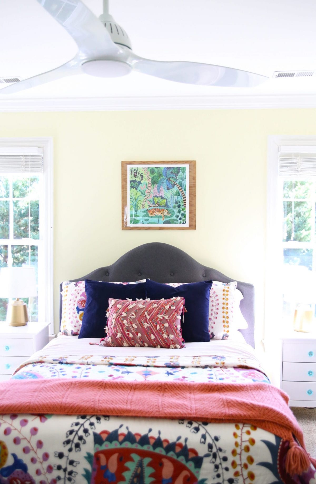
This space is for a tween, and something that we hope will grow with her. So we brought in some of her very favorite colors, along with her love of animals to make the space bright and fun, while also working hard for her.
We love the way it all turned out oh so fabulously! Here are a few of the ways we used various design elements in this space, to spruce it up for our sweet little client. {We’ll refer to her as L.}
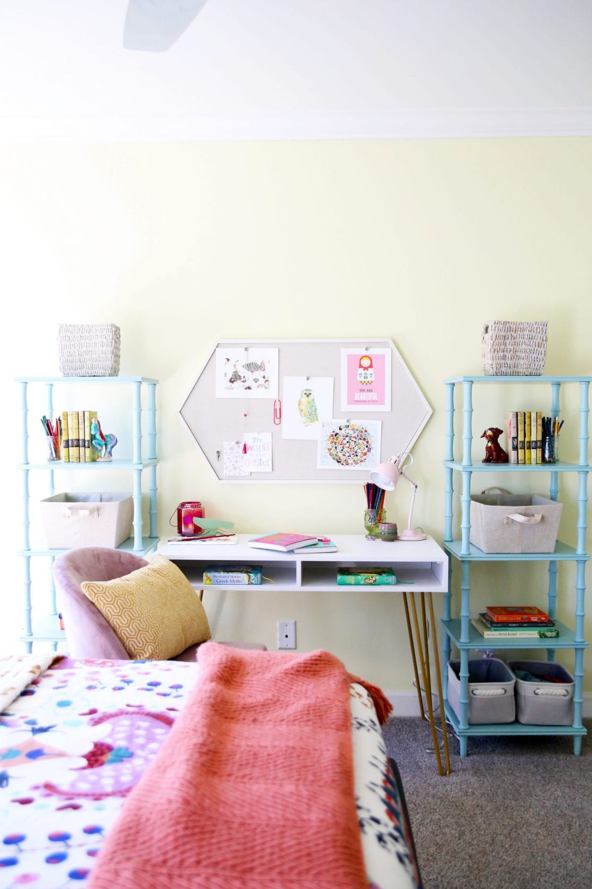
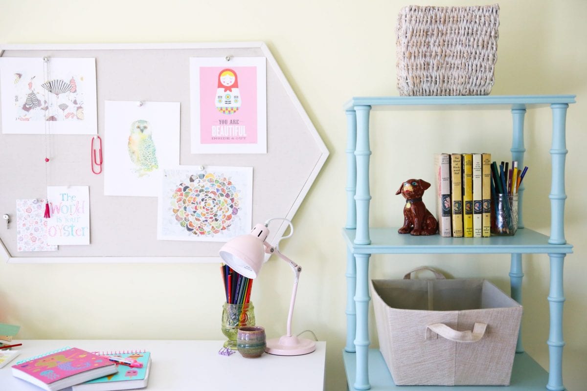
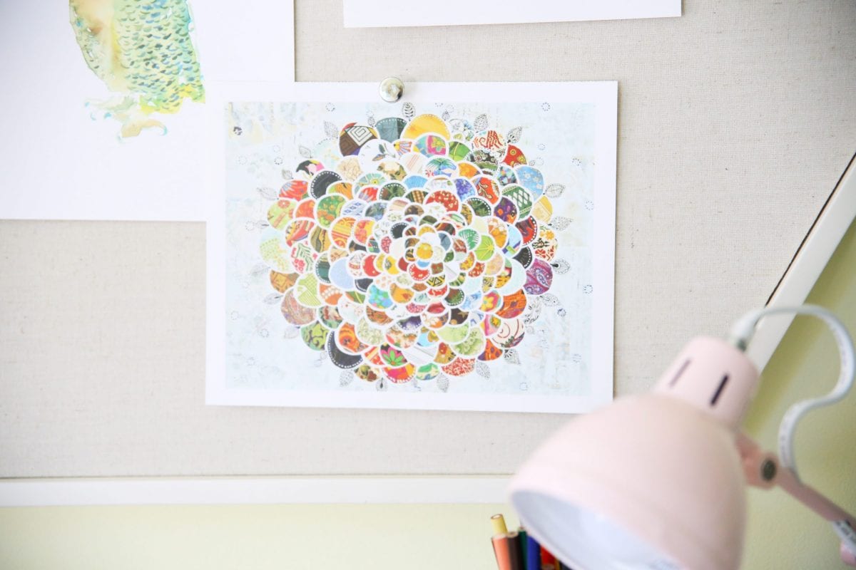
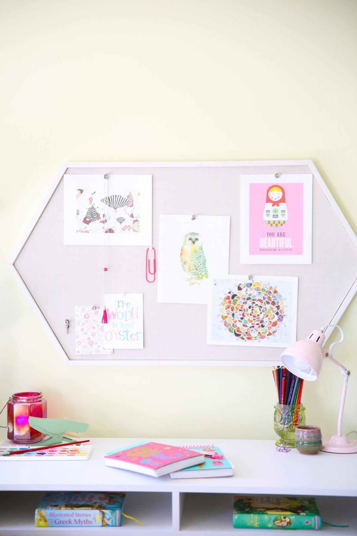
Desk area: Scale + Balance
L needed a desk area in her room, for homework and study time. She had limited space in her room, and her mom found this simple hairpin desk for a great price. We also knew that she needed some storage in her bedroom, so we gladly brought in two etagere bookshelves. We love the way that we were able to work in the room to keep it both spacious and open, while offering a ton of storage options.
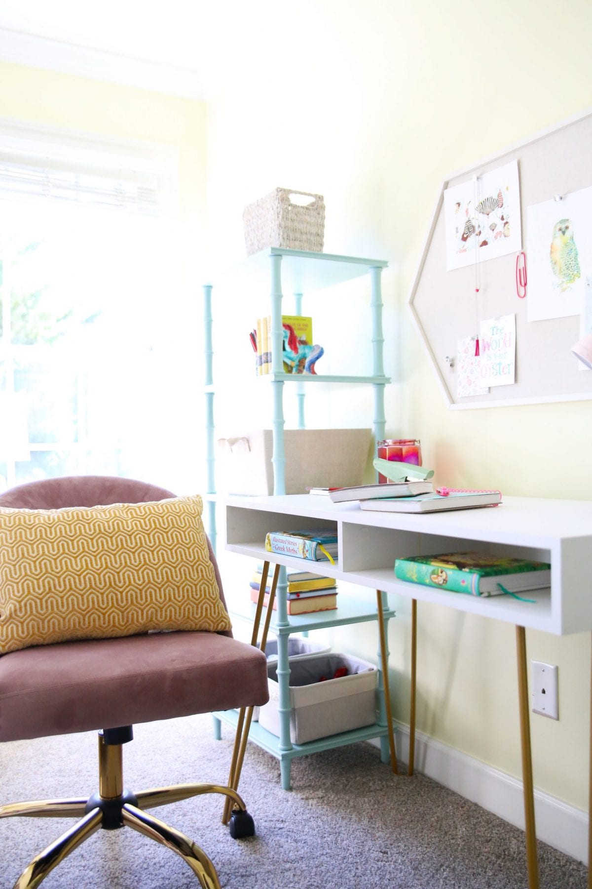
Her comfy desk chair was the finishing touch, while also pulling in some great tones from her bedding. We loved anchoring it all with this fun geometric bulletin board. + We enjoyed decking it out with some fabulous artists’ work from our book series.
It works perfectly in her room without being too overwhelming, and we love that it can grow with her!
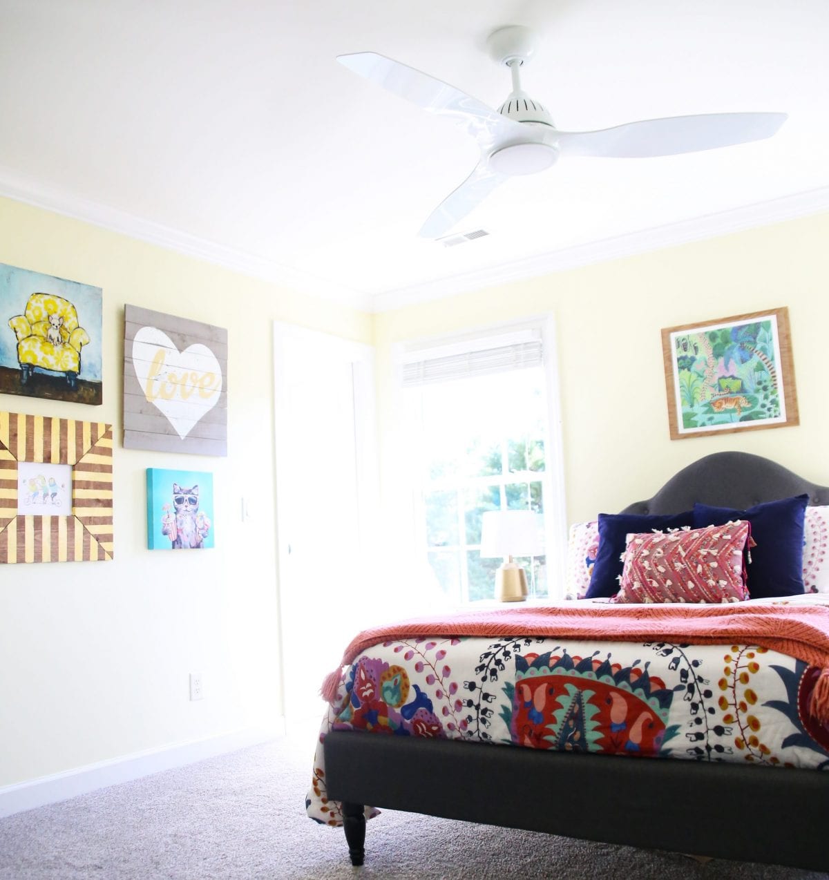
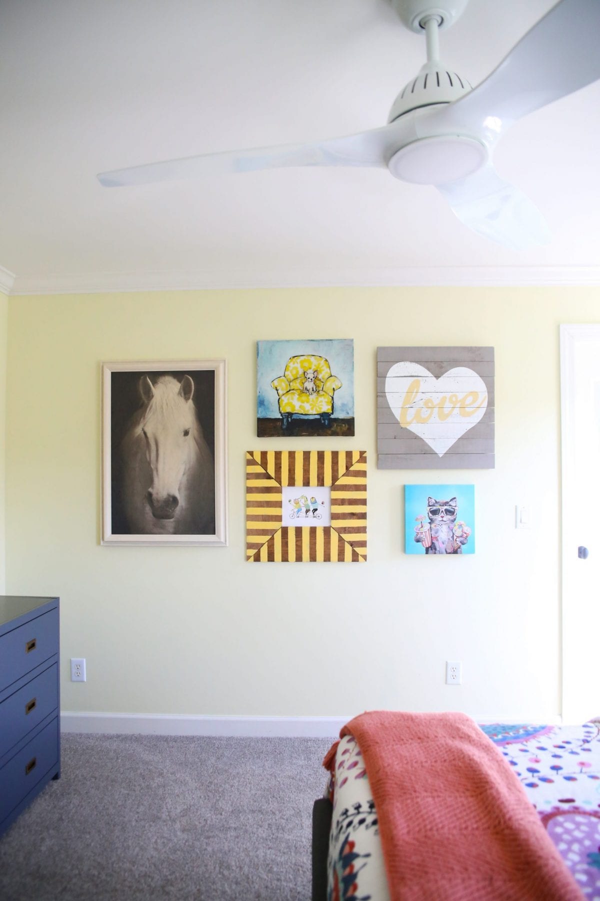
Gallery Wall: Hierarchy + Balance
A lover of animals, we knew this was important to work into L’s space. She was gifted this horse art recently, and already had some other pieces in her room which were previously hanging individually. We reworked the space based on the largest piece, and worked from there, bringing balance to the gallery wall. It’s not symmetrical by any means, but does feel somewhat equal on the wall, which is more appealing to the eye.
Hint: A common mistake when hanging art is to go too high with its positioning. When in doubt, go a little lower. Considering the scale of what we were working with, this was also important for the end product. She loved the look!
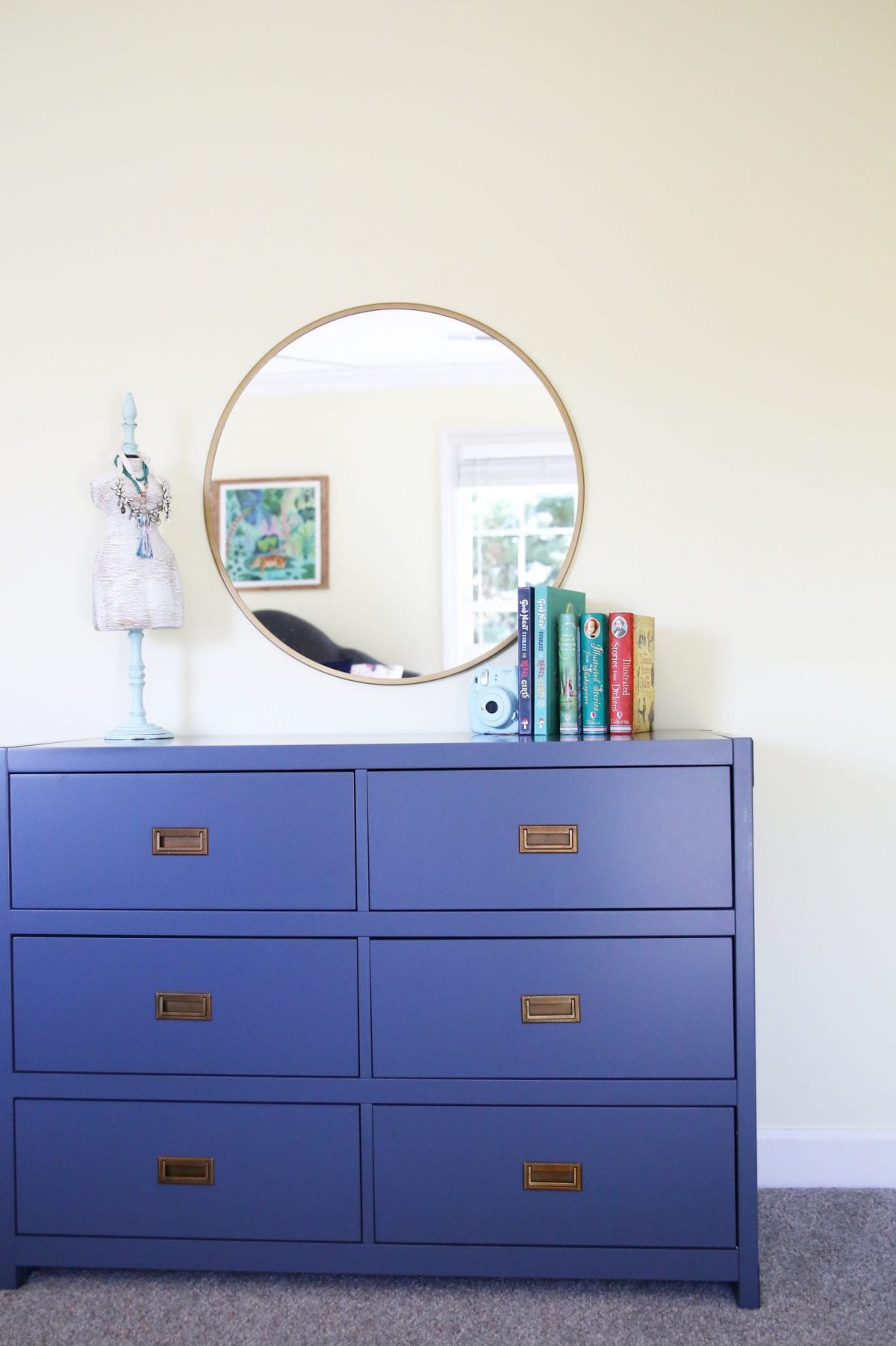
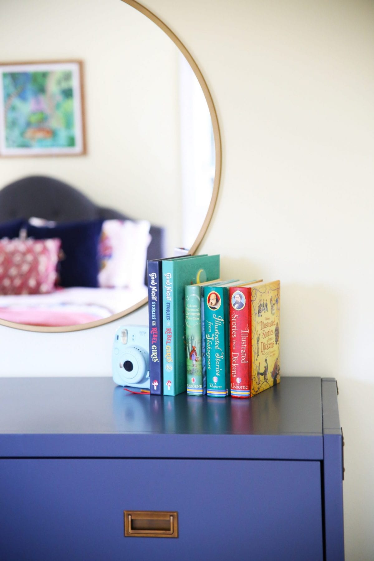
Dresser: {and desk and nightstand lamps} Repetition
We use this in various ways throughout the space when it comes to establishing a purposeful look in a room. A basic way to see this used would be with pattern, color and shapes. One of the ways that you see it here, is with the use of metallics.
On the bedside lamps, the dresser hardware, mirror, and desk area, you see brass. It’s a great way to keep elements in a room tied together, intentionally.
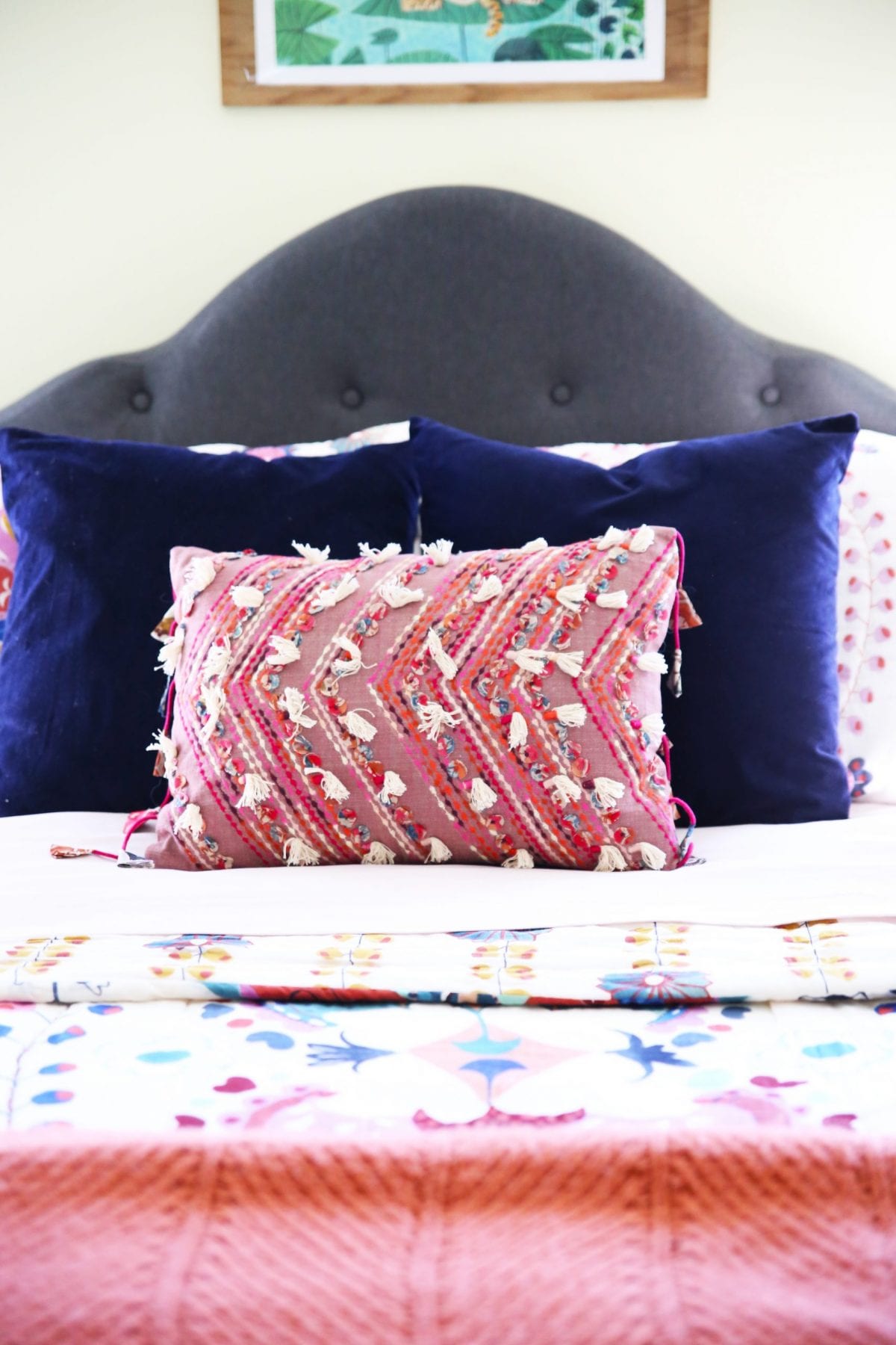
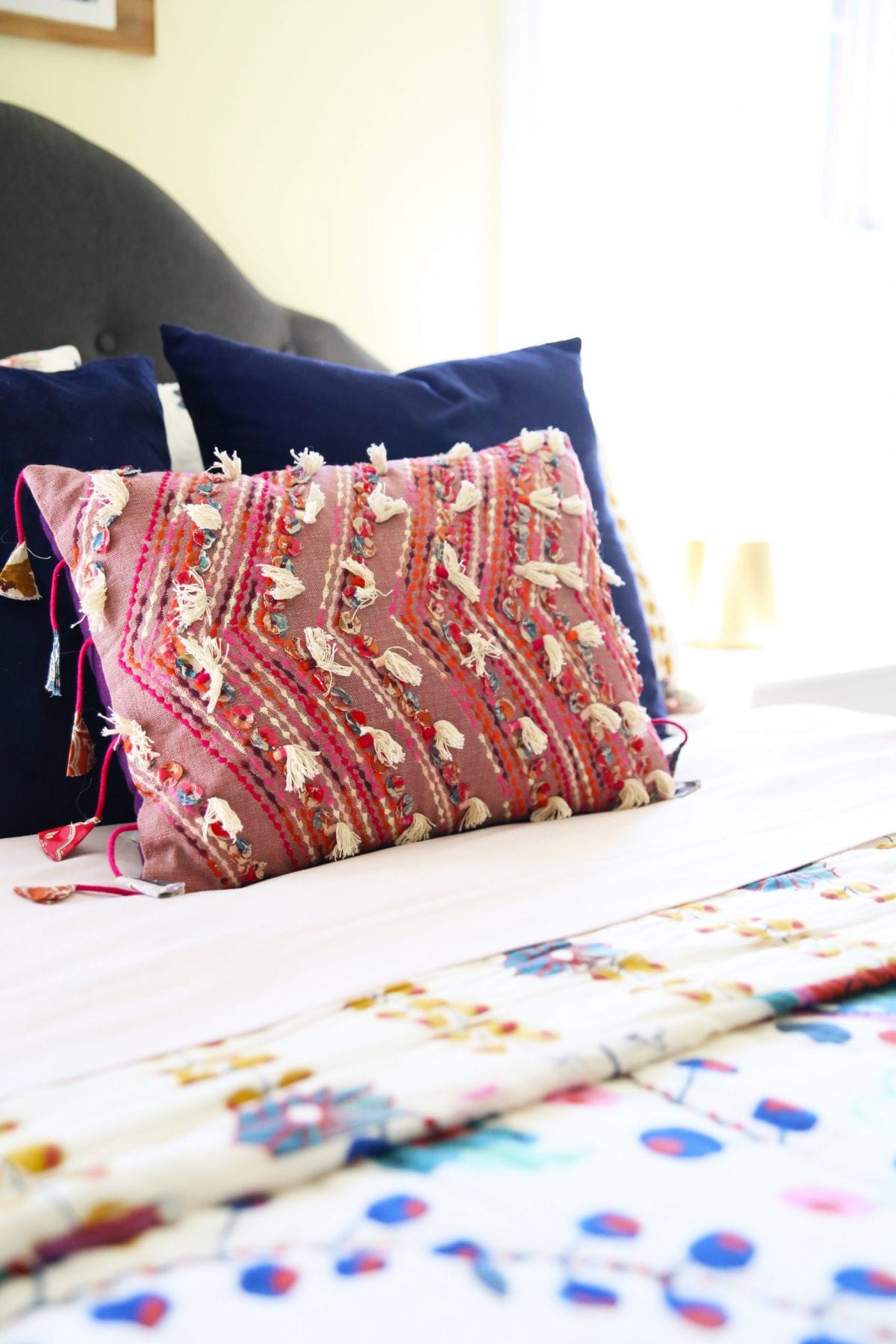
Bedding: Pattern + Color
The use of color in our spaces really can have endless benefits and applications. One of our very favorite ways to tie a design together nicely, is with the use of color.
One of our favorite ways we see pattern and color in this space, is in L’s bedding. The big bold hues were easy to repeat in ways throughout the space whether it be her desk chair, dresser, or a pillow. For busier patterns, we love pairing them with geometric for contrast, or simple solids. We did both here. Her blue pillows + yellow {similar} + lumbar pillow all use color in different ways to bring out various hues in the bedding. We simplified it again with the throw.
We love the way that it’s all anchored nicely with darker hues in her bed.
We love her desk lamp, found here!
We knew the space had to work hard for her, so we brought in practical baskets for corralling little things that seem to cause visual clutter and chaos.
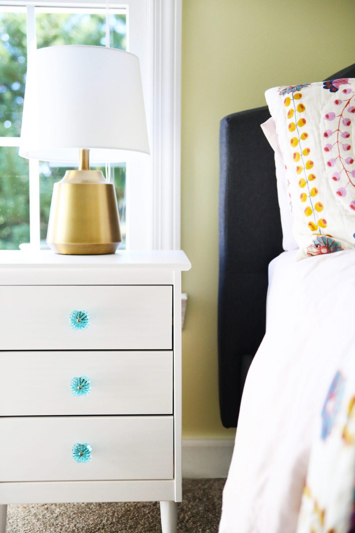
The bedside tables offered great storage with cute little knobs {similar} to add shots of color.
{More repetition – see what we did there?}
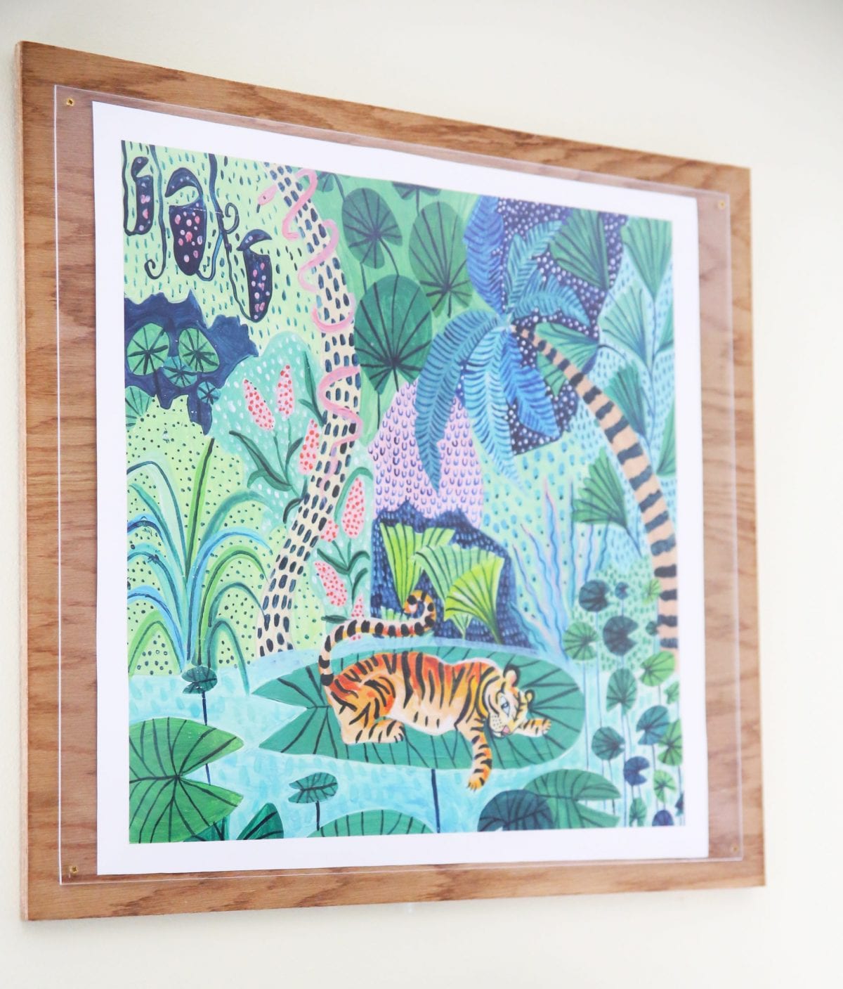
We loved topping off the bed with this awesome art – perfect since she loves animals and happens to be an Auburn Tiger, this one was perfection.
We used one of our simple frames here.
The way the entire space was pulled together with this fun color from Sherwin Williams was icing on the cake.
A bright and sunny package in the color Lily. I really am in love with this fun yellow.
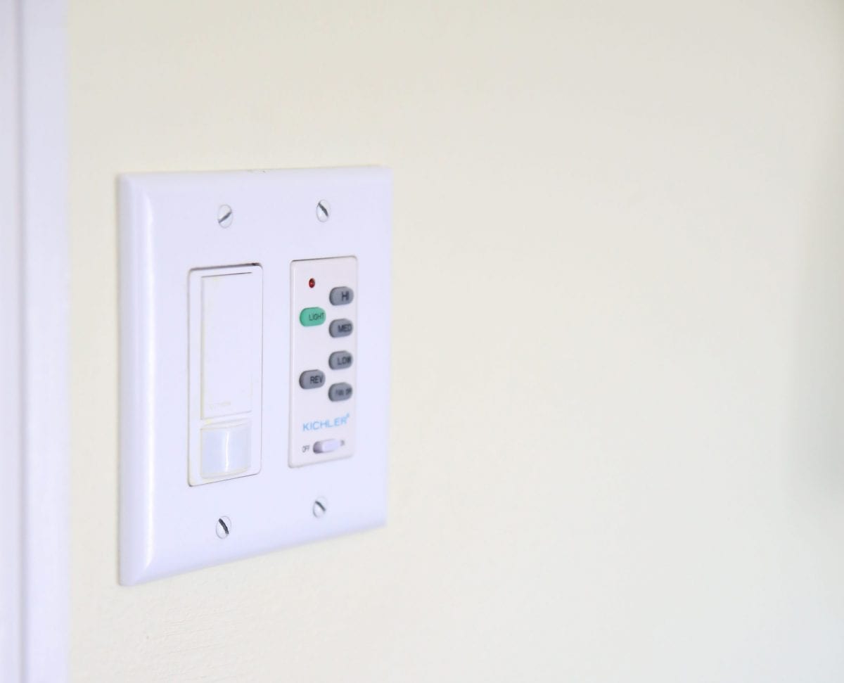
She definitely needed a fan for her space, and we love this simple modern look from Kichler.
Best described from their site:
This 60″ Jace LED ceiling fan in White offers smooth airflow and ambient light in a style that’s updated for today. The curved, sweeping blades add an architectural element to any room: traditional, modern or somewhere in-between.
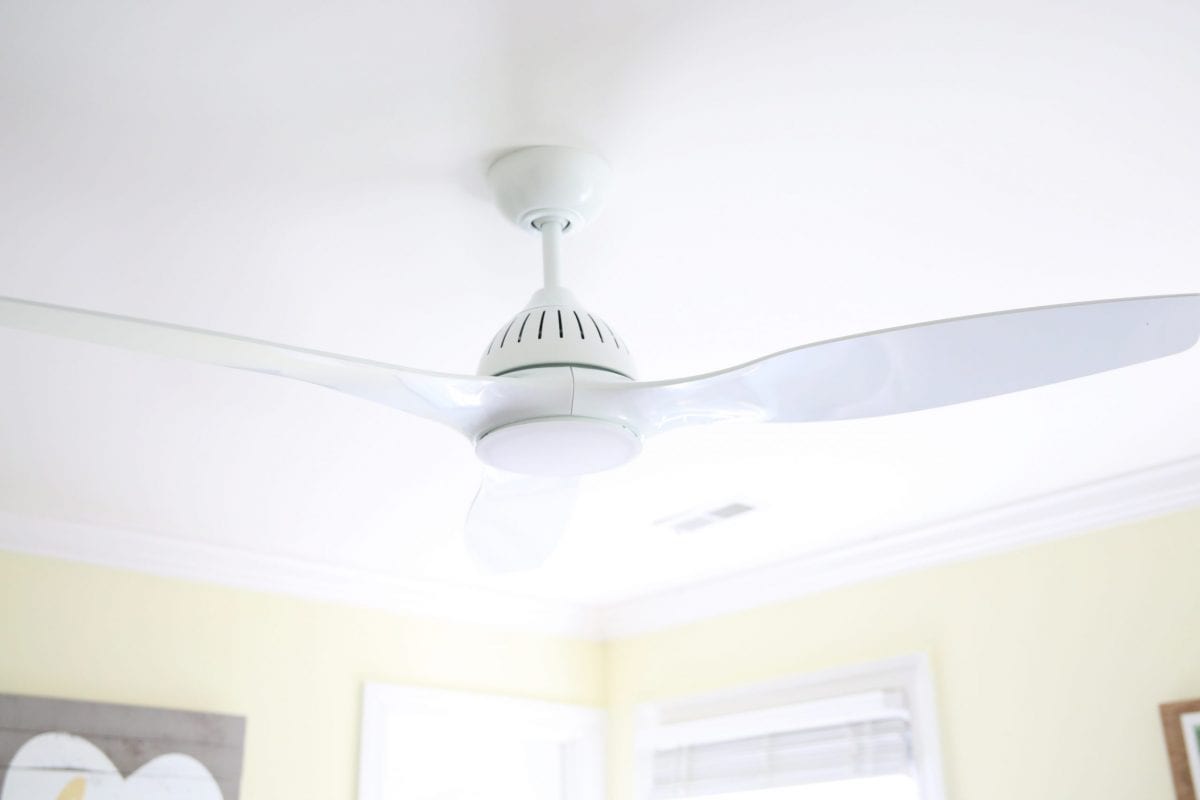
We love all the easy switch options that come with it, too. Gone are the days of obnoxious pull chains.
Available to purchase here, it’s a great example of how fans don’t have to be ugly.
We love the way this space turned out. So happy and fun and full of personality! She’s such a great client!
Thanks so much for tuning in today. We hope breaking it down a little in the design department was a fun way to look at it.
As always, let us know if you have any additional questions.
Have an inspired day!

Love this space with all the details ! Everything is amazing. The color is my favorite