the chapman lane project
When these sweet clients contacted us about their kitchen design, we were thrilled to step in and help them channel their creativity into a space for their family.
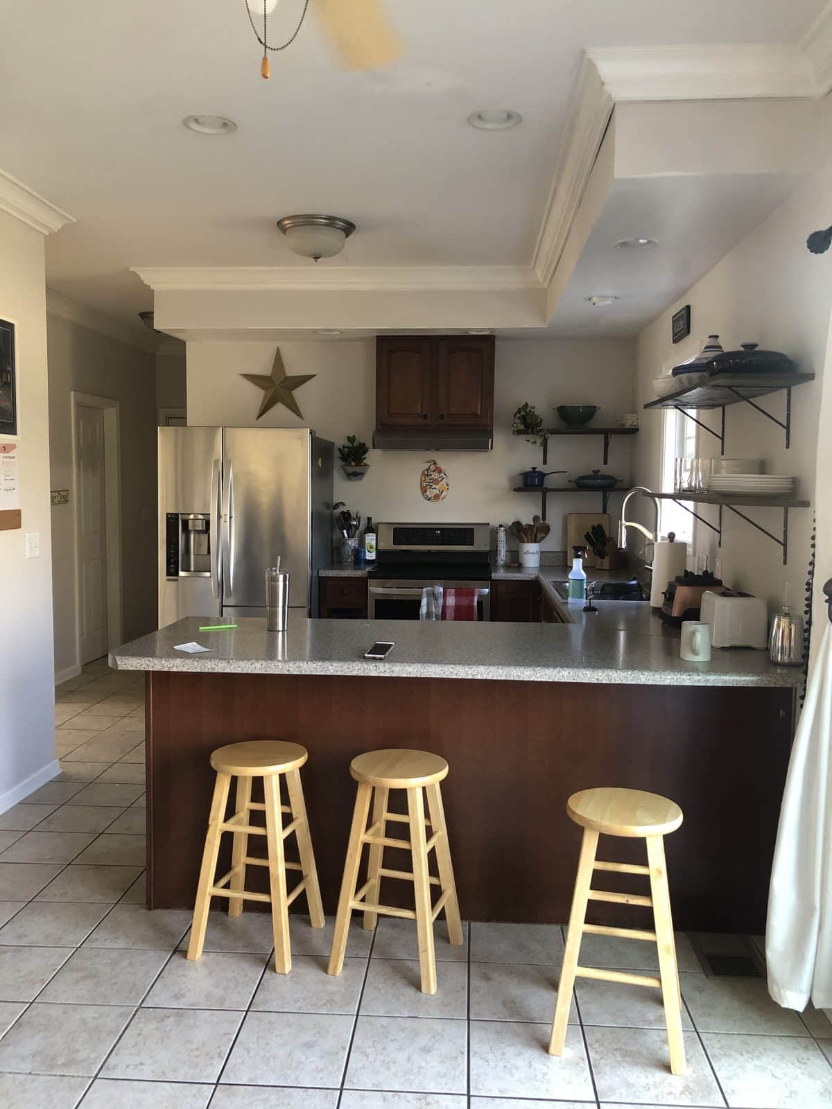
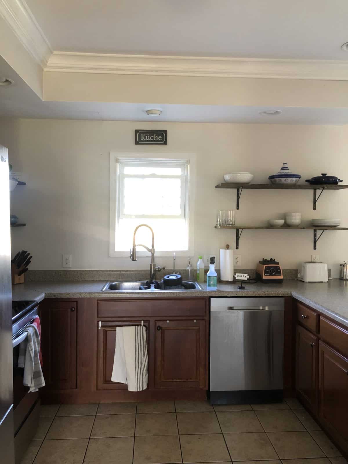
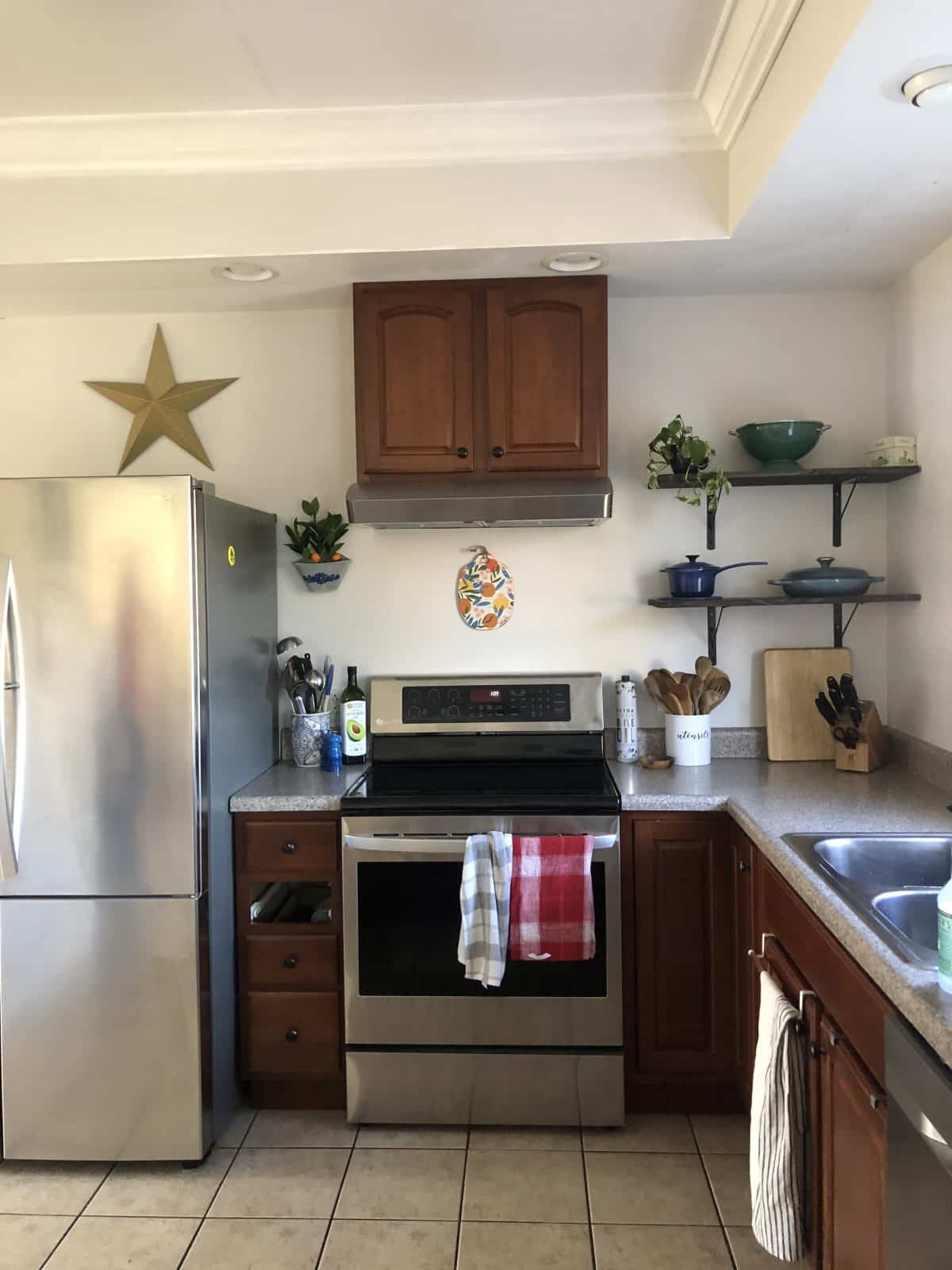
Here’s a shot of their kitchen before. As you can see, it was already a delightful home. It was just ready for a little update.
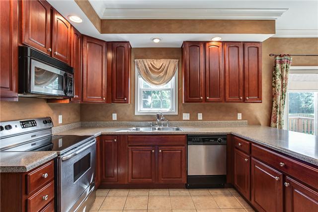
They’d already decided they were tired of those uppers, and knew how to open up the kitchen by getting rid of the super dark cabinets. Here’s a BEFORE the before, that I was able to dig up on the www. {Paint does so much and they’d come so far. Also these wide angle lenses on the real estate listing photos drive me crazy. Can we form a brigade to make it stop?} So they were already well on their way to changing this kitchen for the better.
It was really satisfying to update this one according to what they needed, so that the kitchen could work hard for their family.
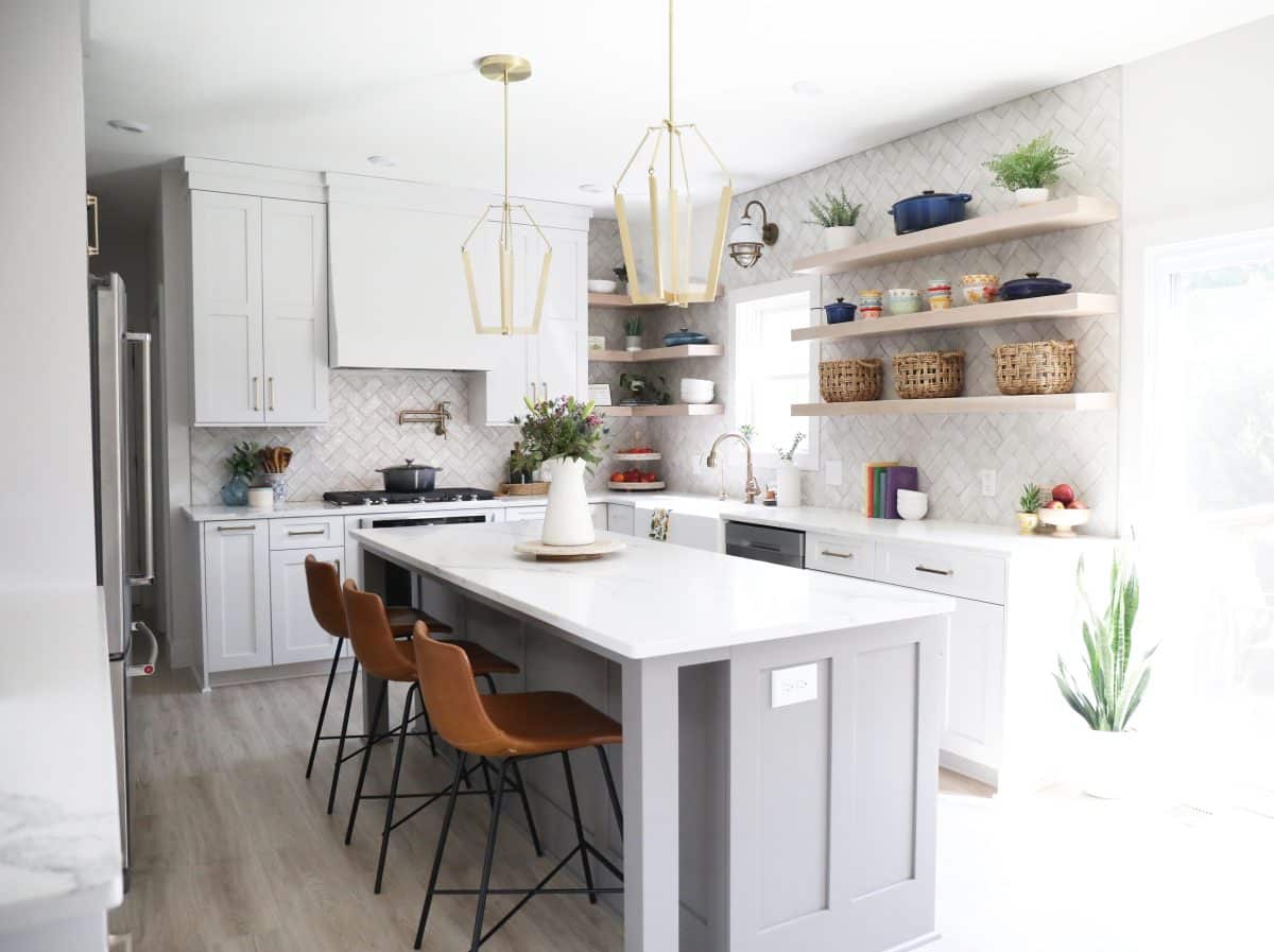
We all know that the kitchen is the heart of the home. This couple loves to cook for their family, and needed the space to change as more of a gathering spot, as well as a truly functioning one.
It was also wanting for a little more character, to truly reflect who they are as a family.
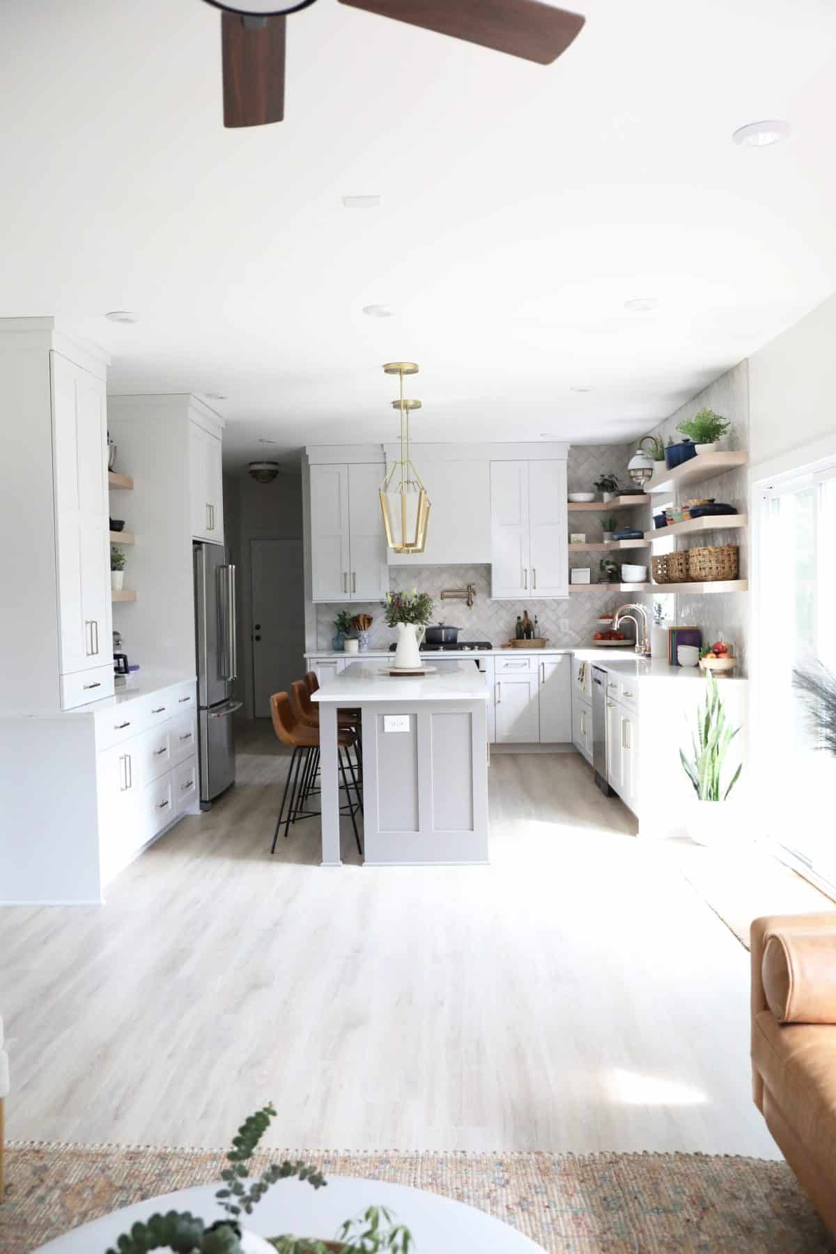
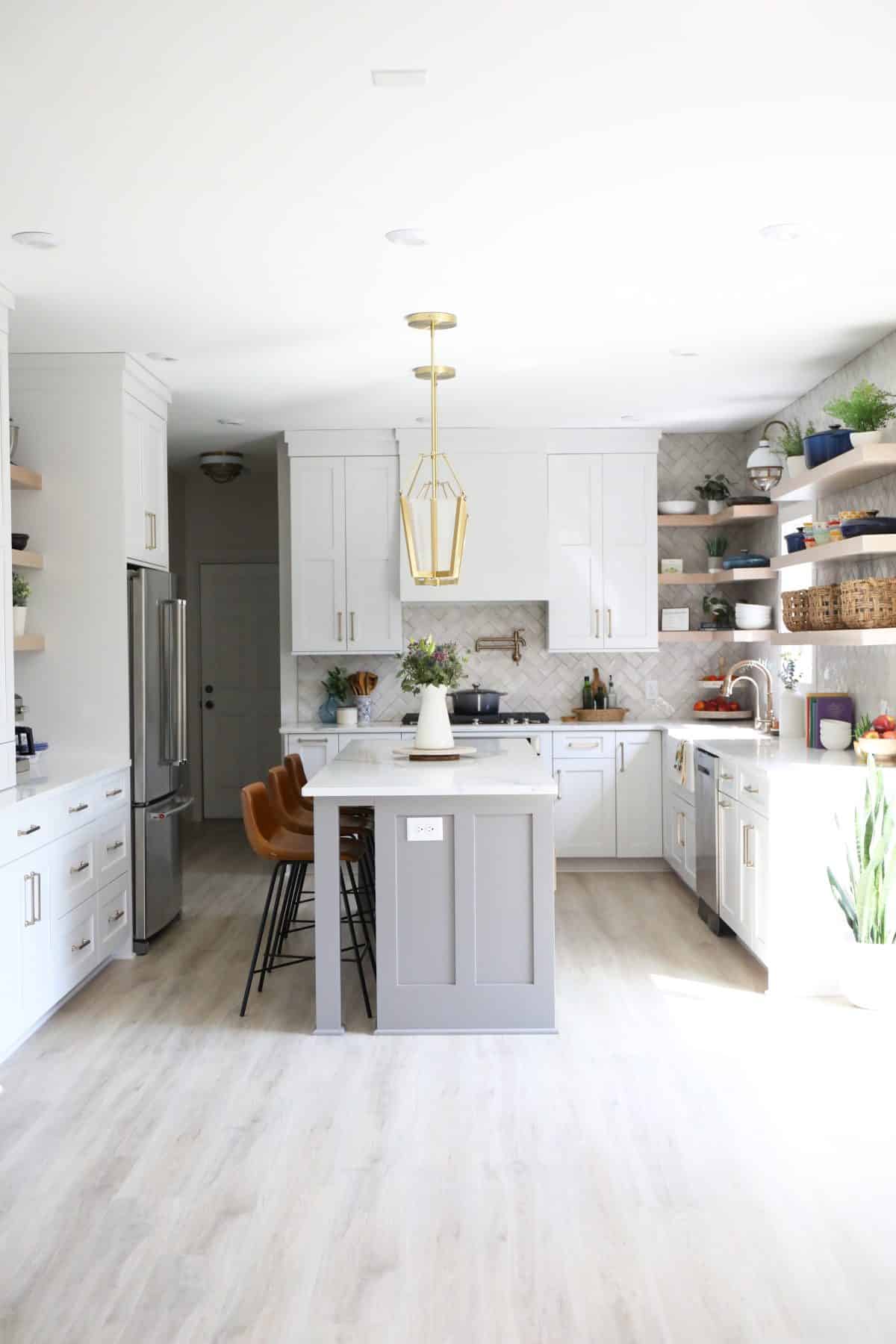
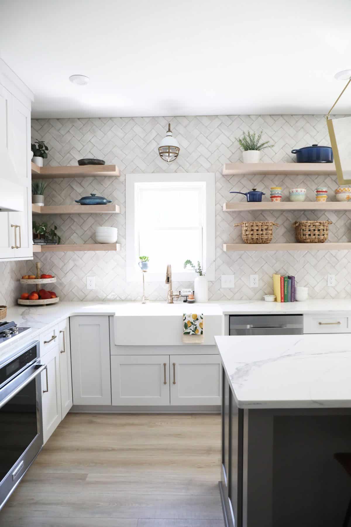
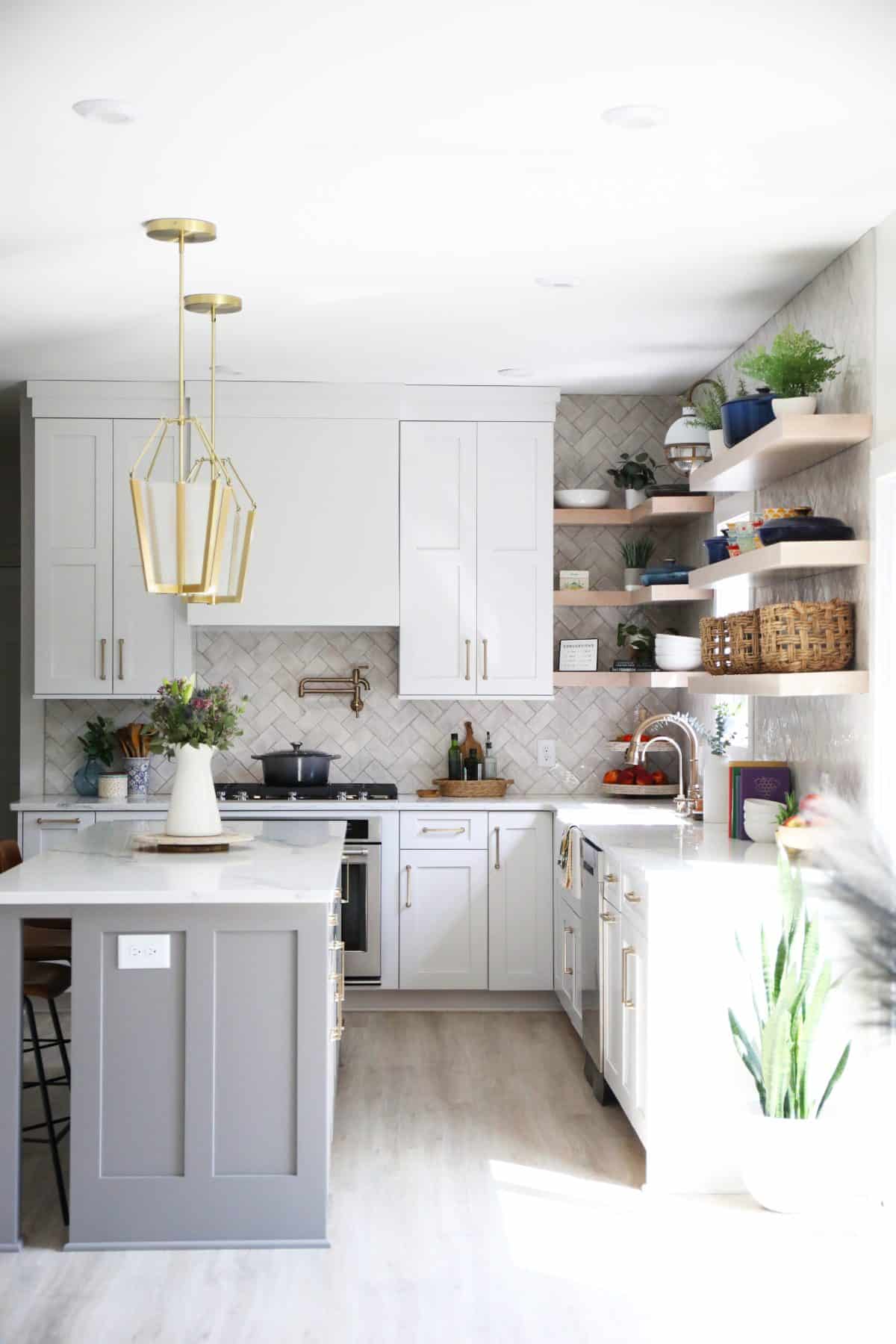
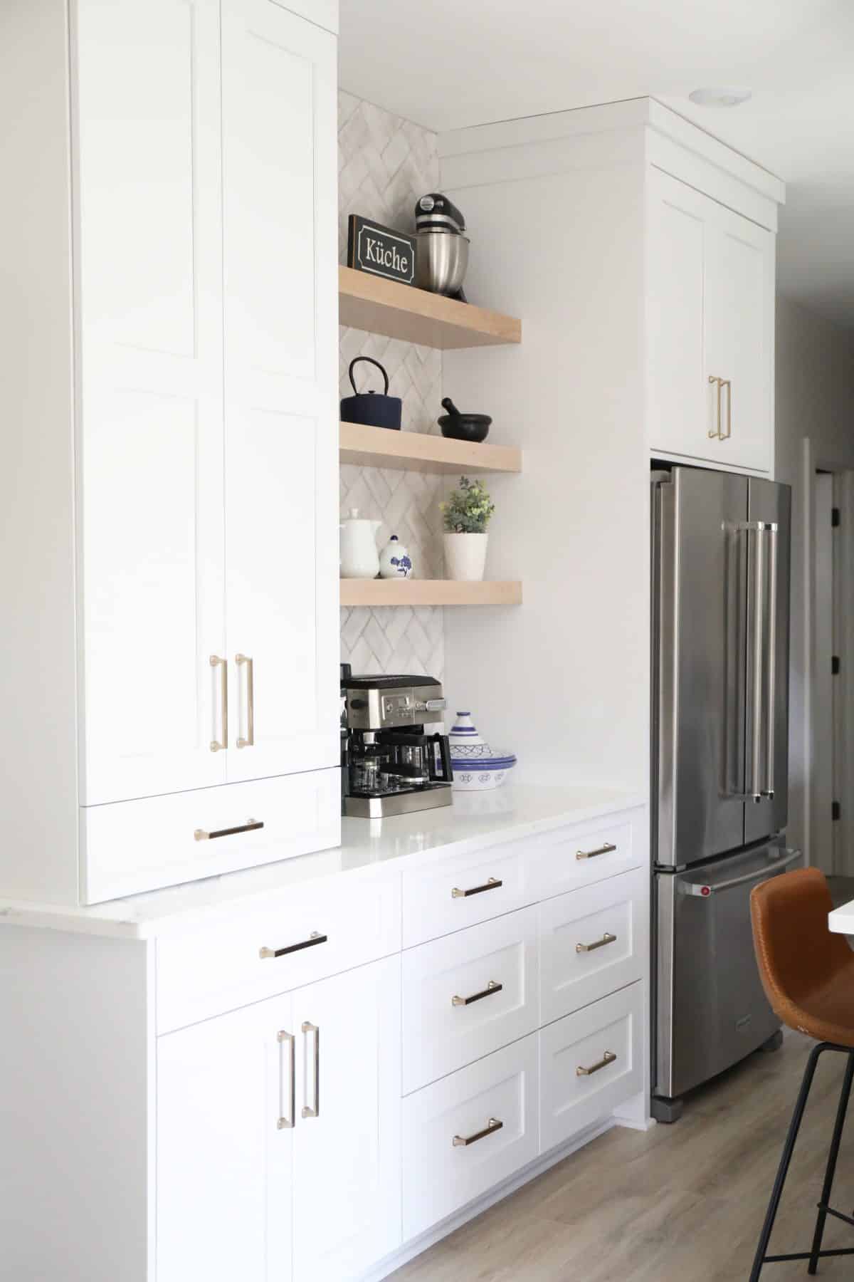
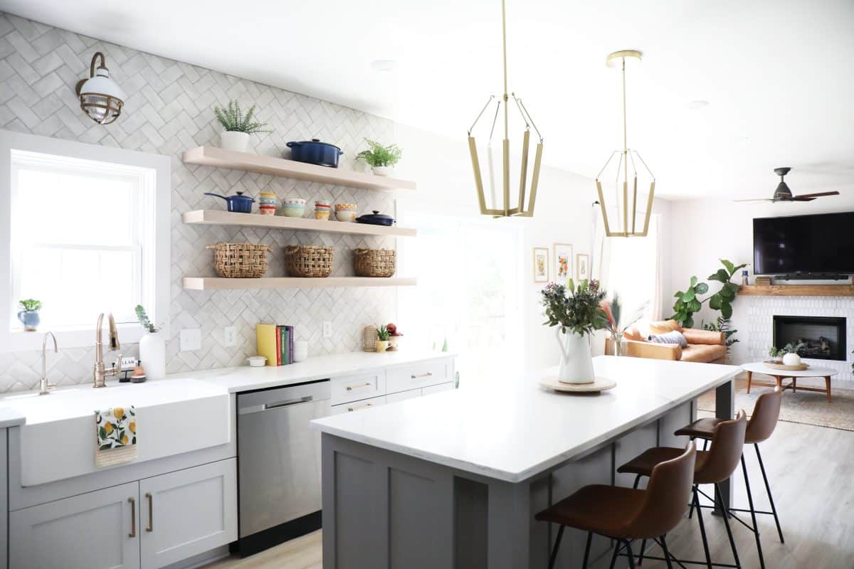
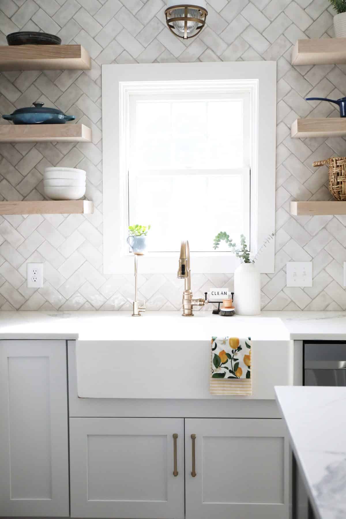
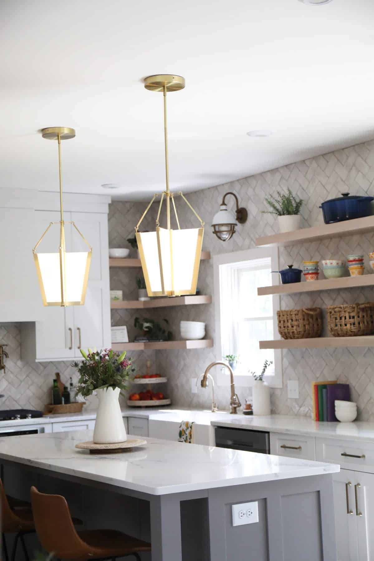
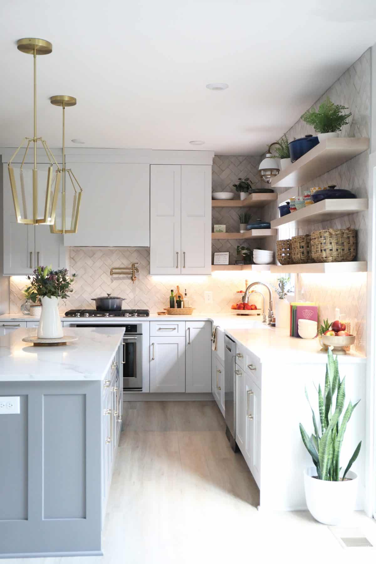
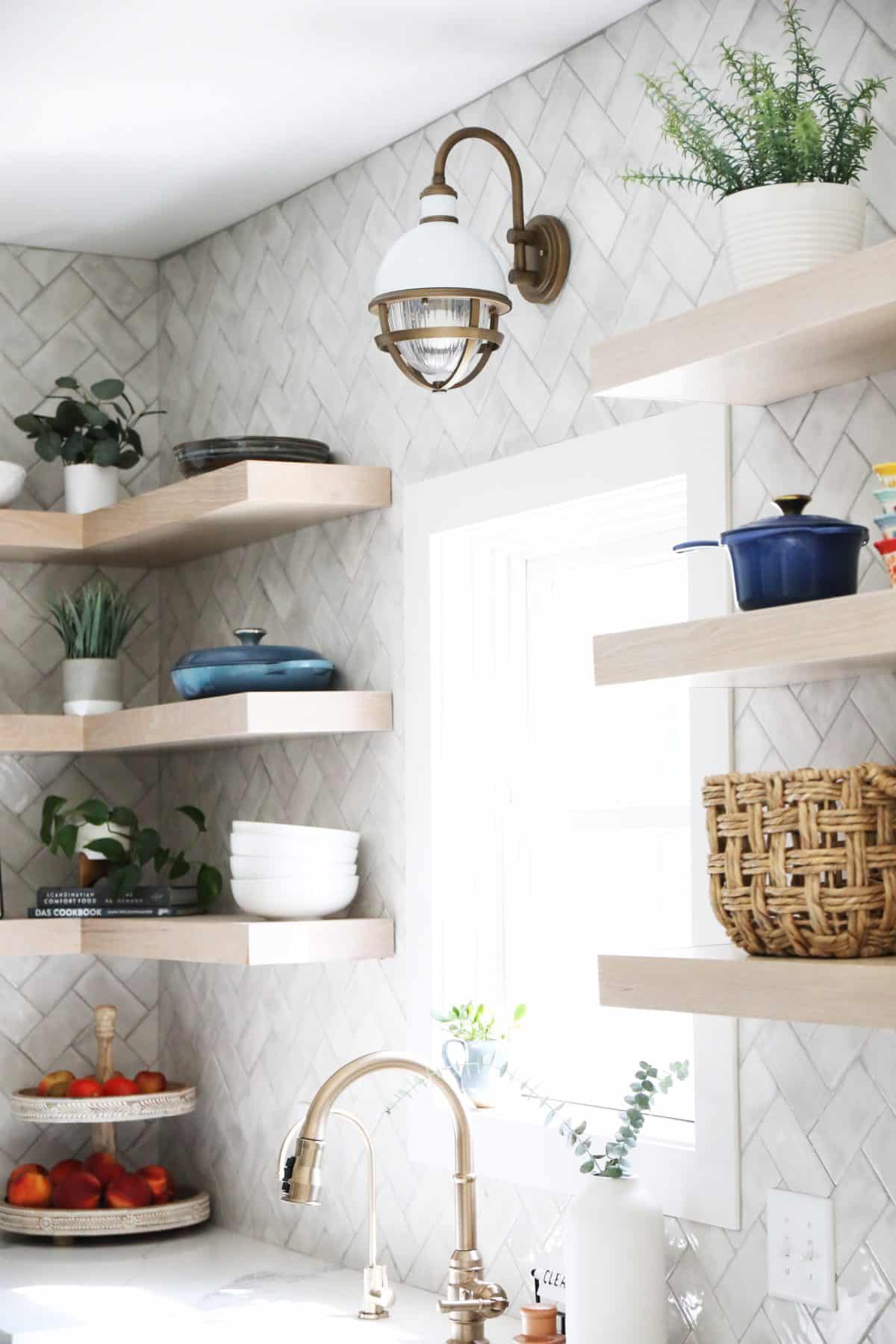
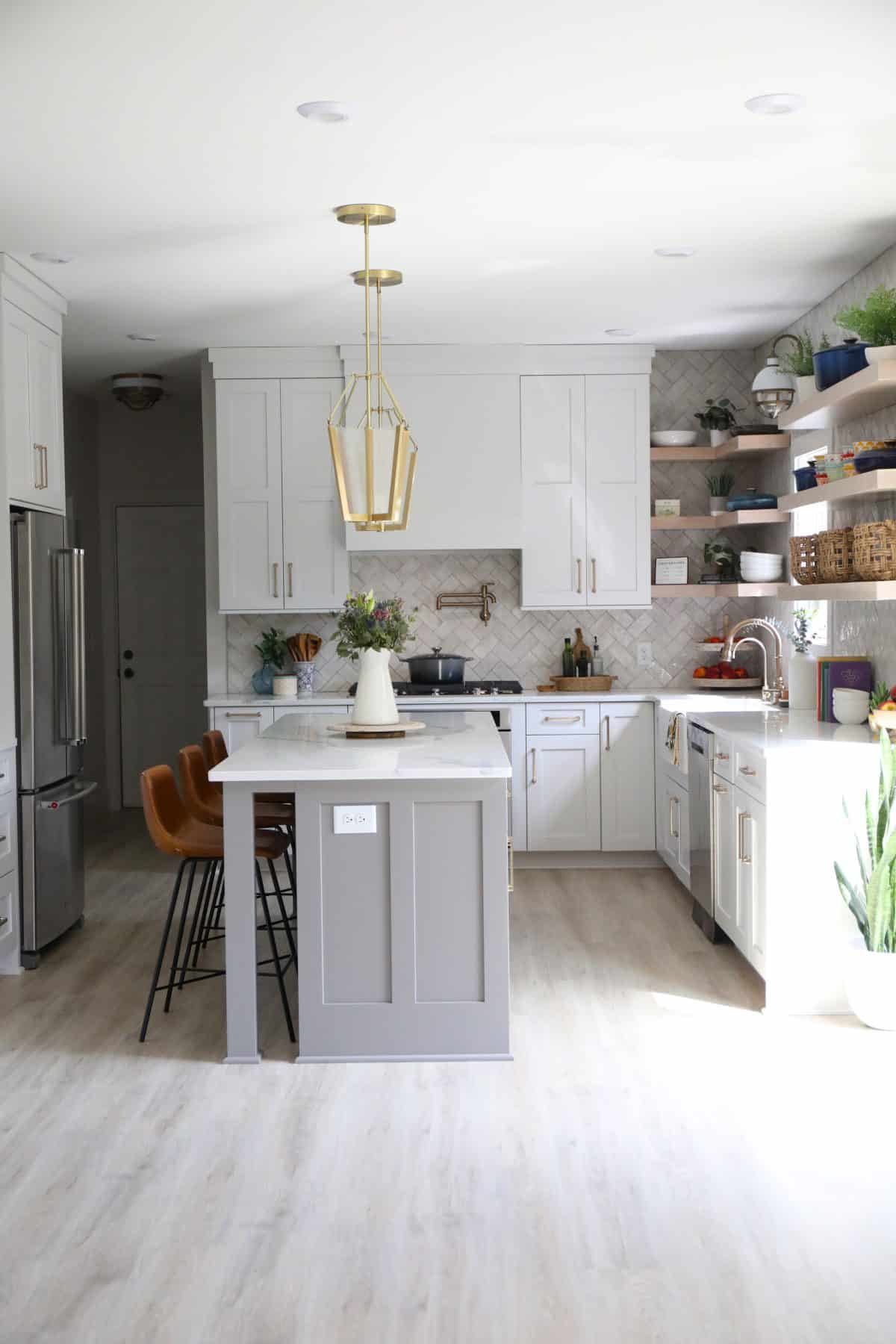
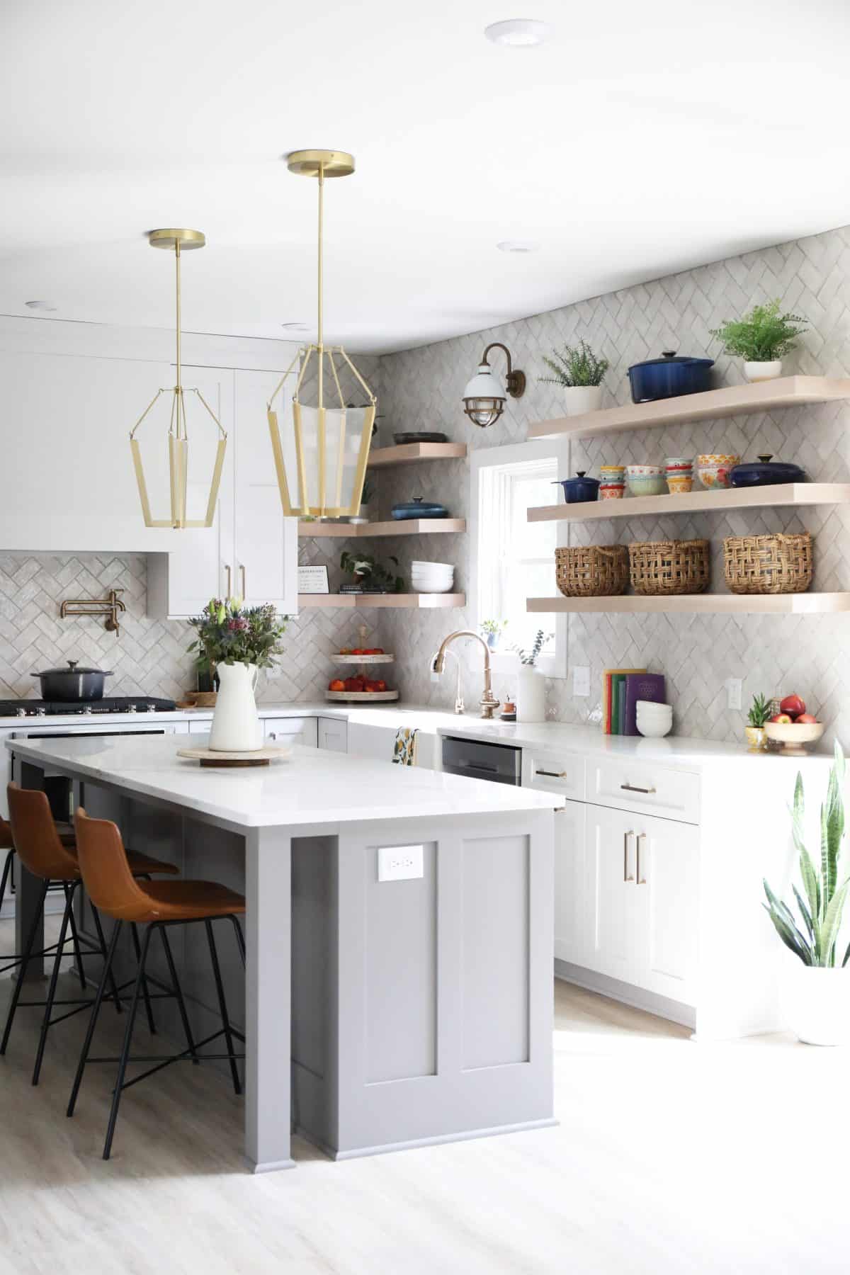
This wall is one of my favorite features! We opened up the space to get rid of those L-shaped cabinets, and provide a real working island for the space.
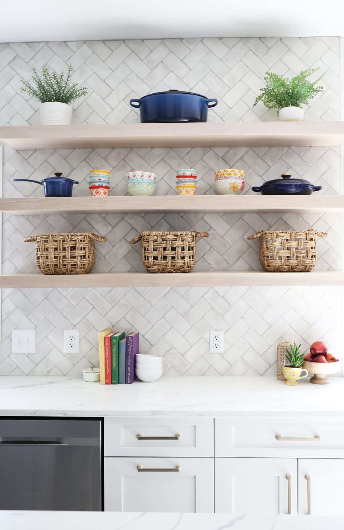
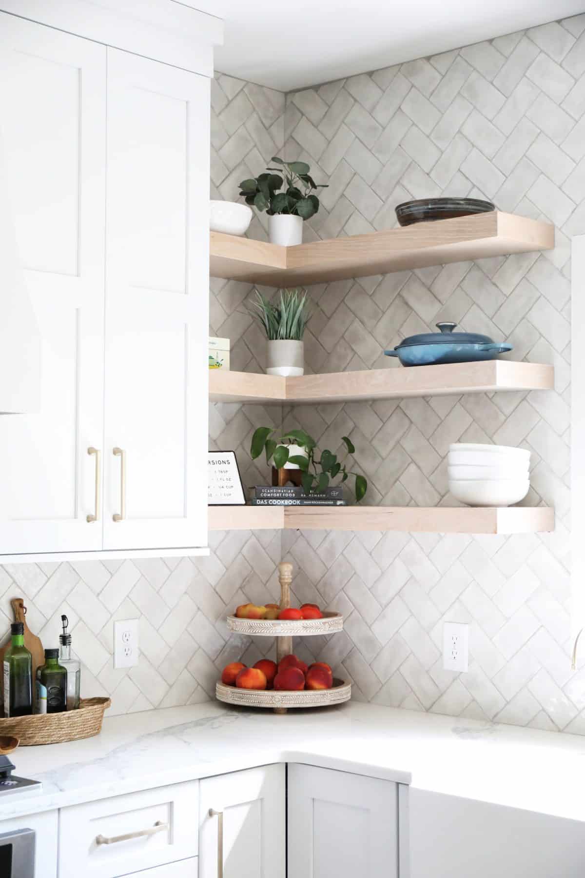
Because they gained so much storage in the island and other cabinets, they were able to open up this wall, with shelving for an aesthetic feature.
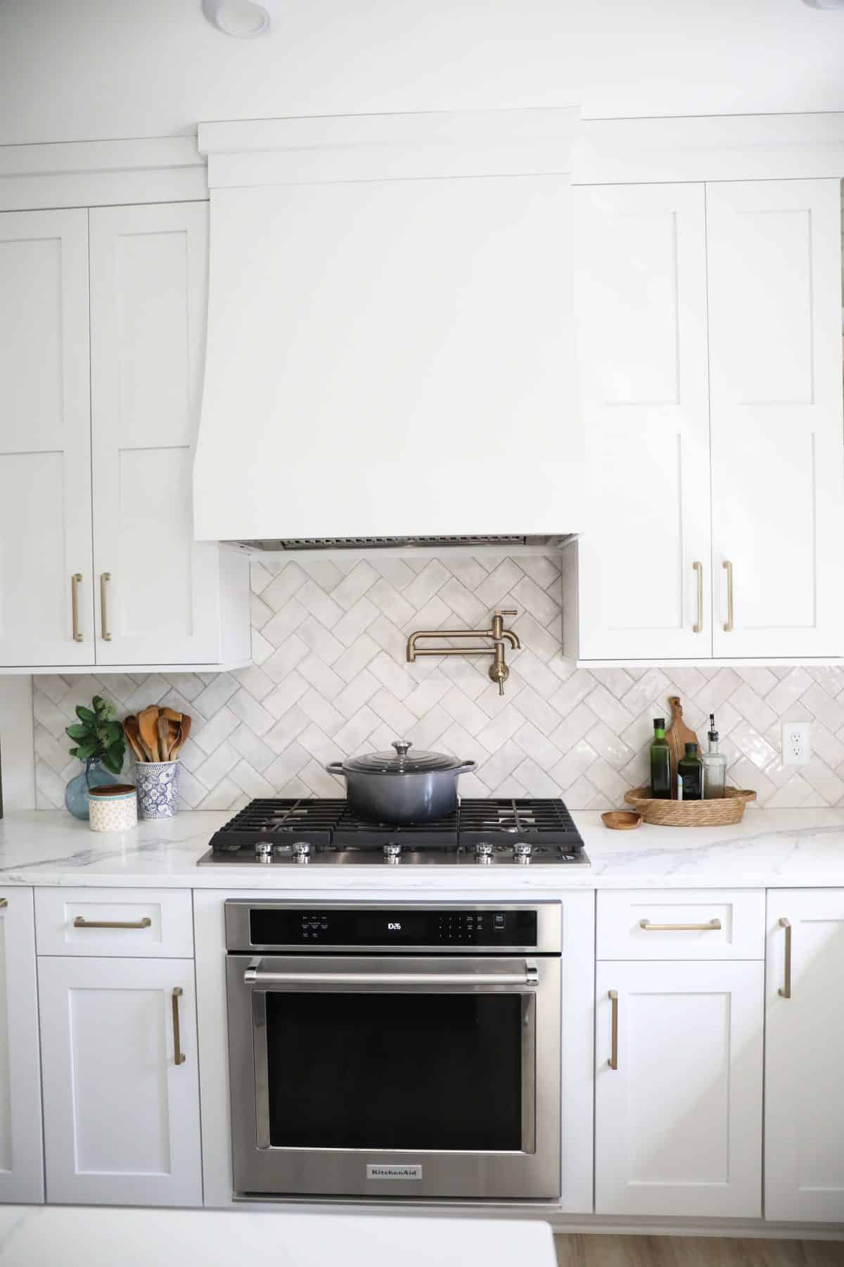
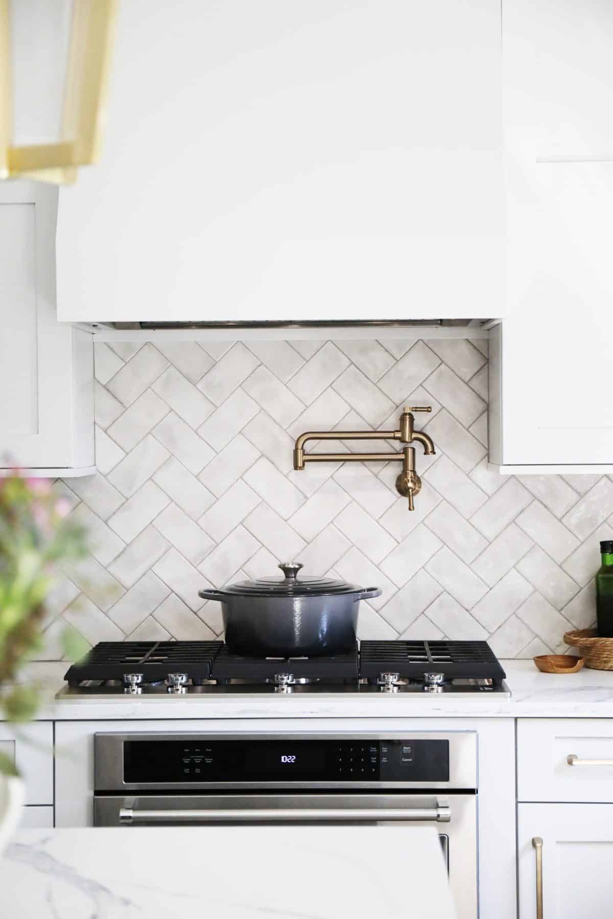
The built-in oven and cooktop combo now provide the right space to give them just what they need.
We brought in a little of that European charm and their love for gathering and creating meals together, in a new space for this family.
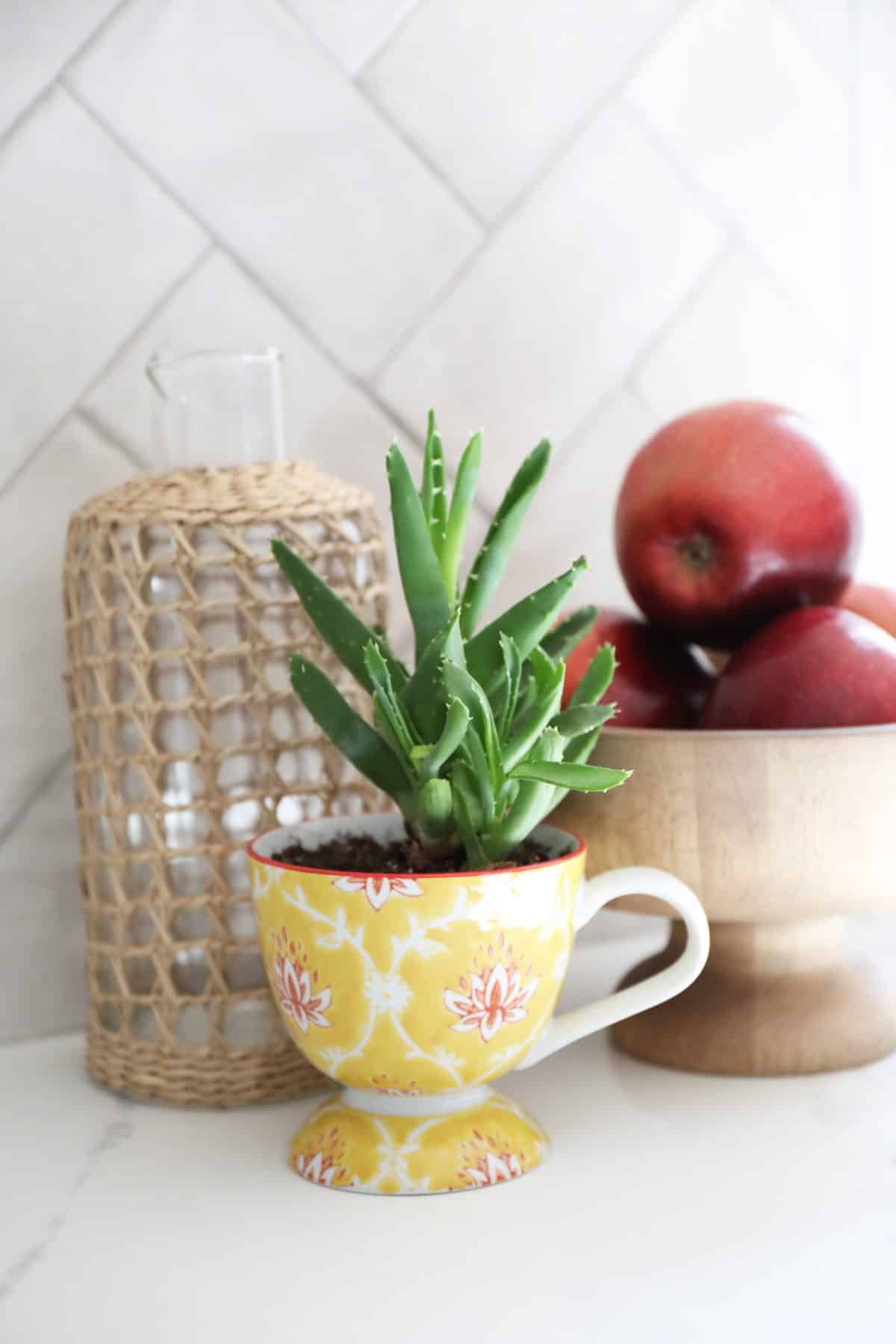
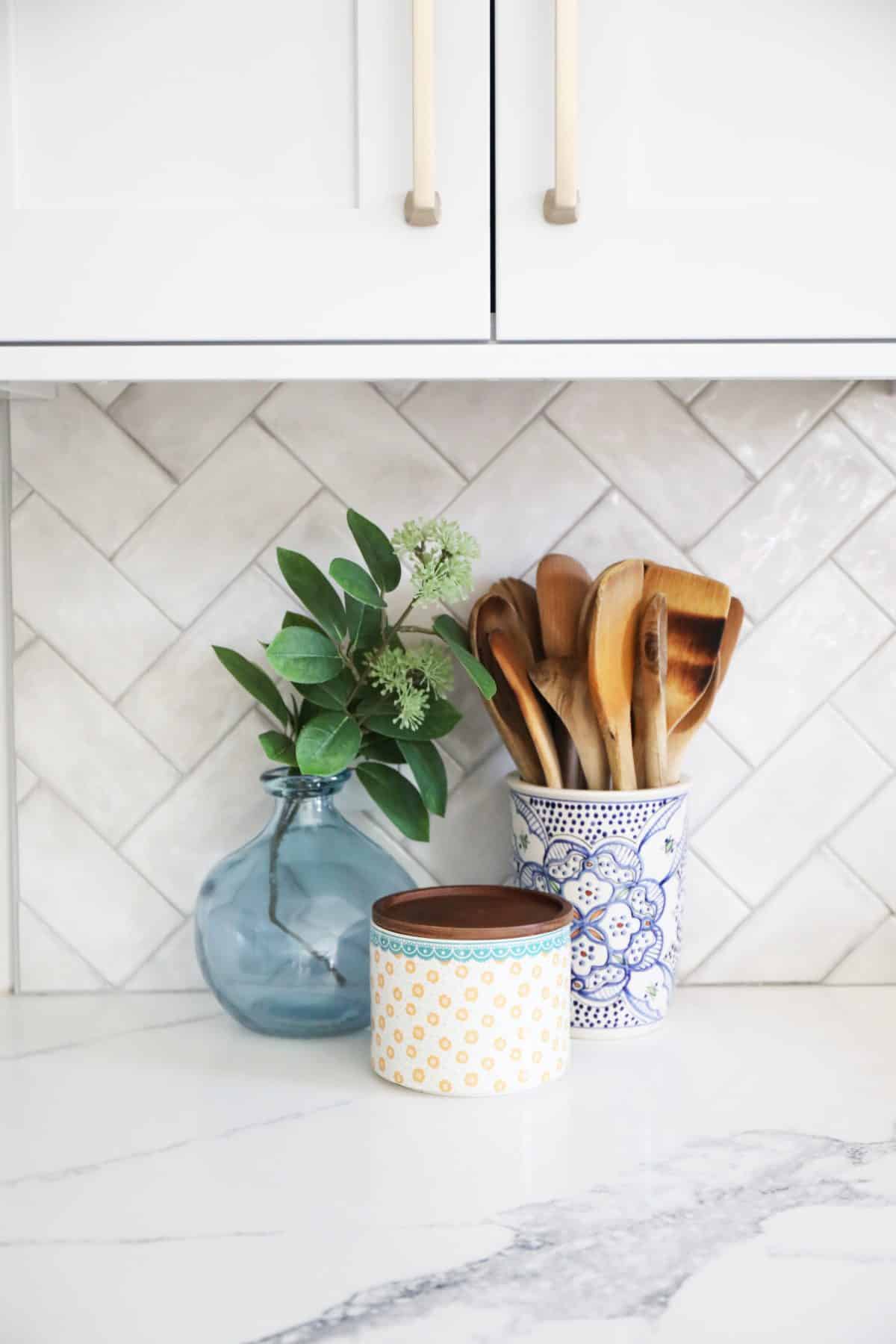
I’m adoring all the subtle details in this space.
Timeless with a touch of modern.
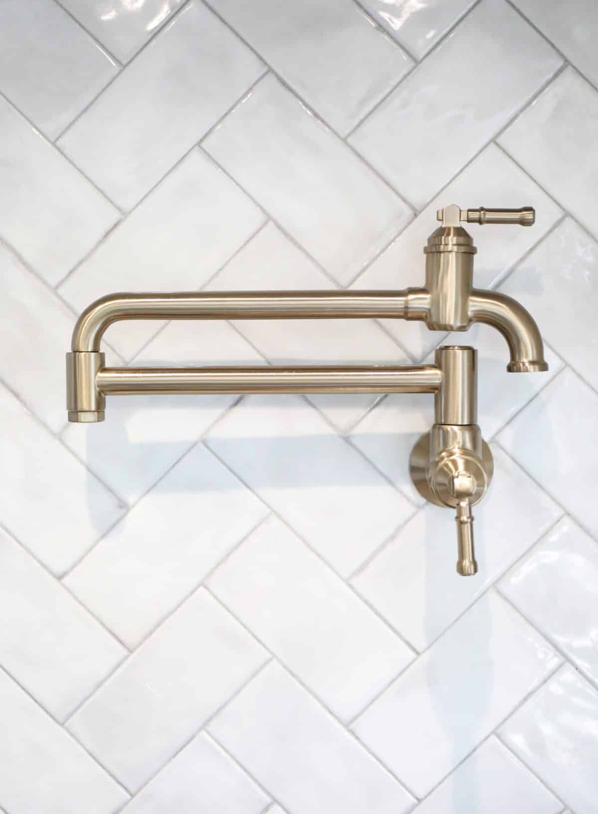
Just a side note, but if you’re ever wondering if a pot filler is worth it, the answer is YES. ALWAYS YES. I’m sharing more of the amazing product details in this space below, but just know that it’s functional jewelry for your wall.
Not having to haul the giant pot to the stove after precariously balancing and hoisting it out of the sink = priceless.
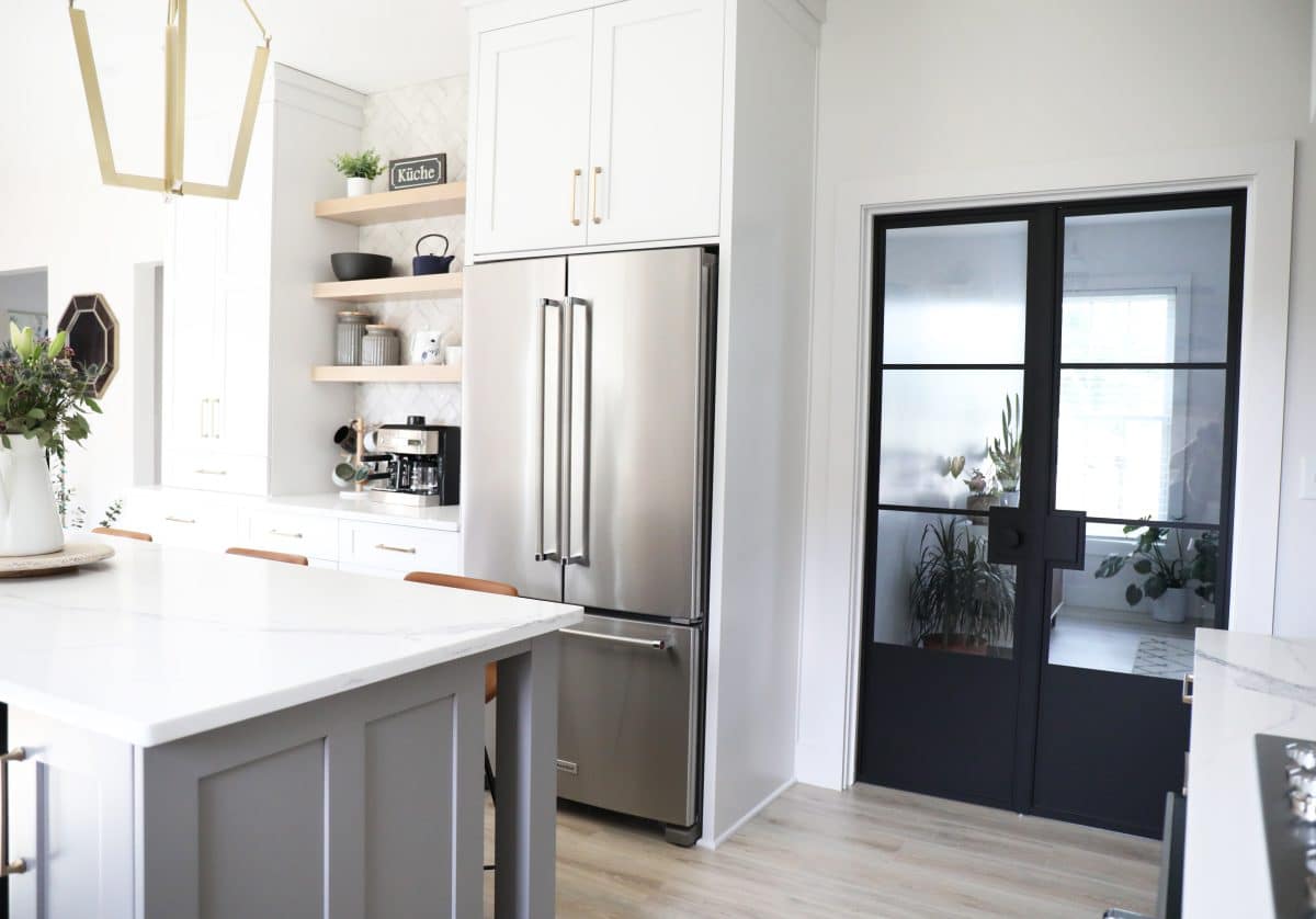
This wall is one of our favorite additions, because as you may notice, we were able to pivot on the fridge placement here.
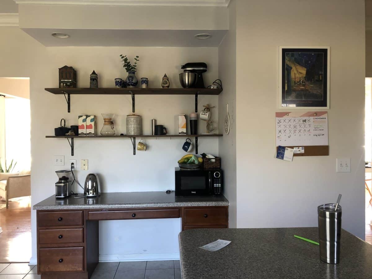
This was once their pantry, on the right with a desk that wasn’t really serving much purpose other than a catch-all. They were able to utilize more storage with useful cabinetry, as well as a coffee bar.
I mean, who doesn’t want a coffee bar? Yes, please.
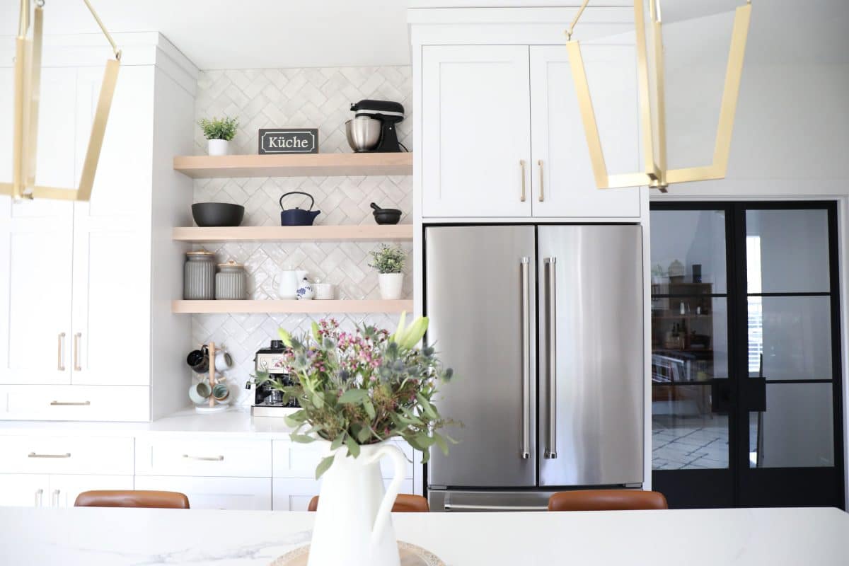
You may be eyeing that space to the right… we love how functional it is now.
Another side note: If you want an instant upgrade for your kitchen, go for a counter depth fridge. Do not pass go, do not collect 200 dollars. Use the second fridge in another space if you need more storage. It’s an instant space opener, remodel or no.
Hardware:
The hardware is from the fabulous D.Lawless. Their Mandara Pull in champagne bronze tied everything together seamlessly. We love the way they pop on those cabinets!
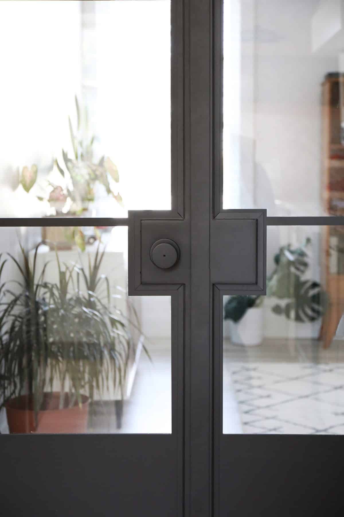
French Doors:
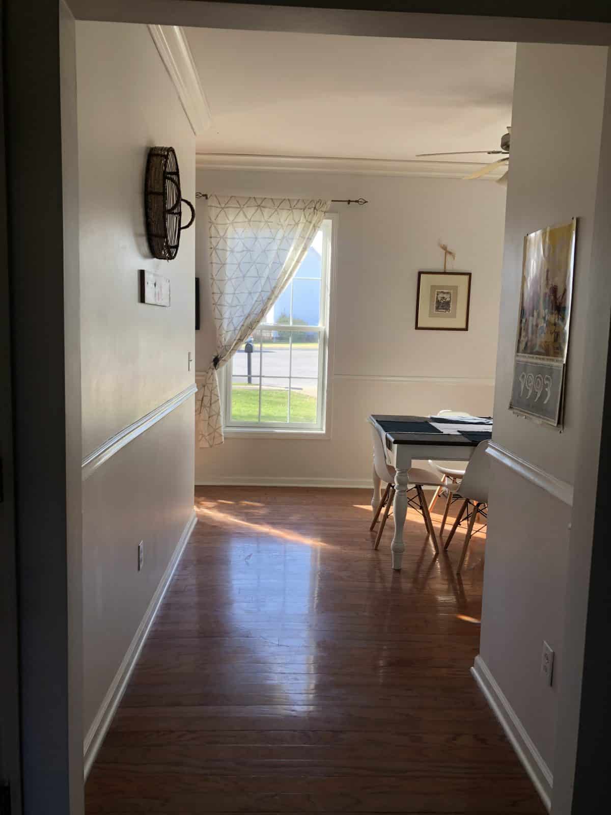
Adding this door via Rustica helped create a study in the home, where it was previously a walk-through room used as their dining space. One side was closed in, and the other now has this door as an entry.
Said dining space is now located on the other side of the living room, so it was good to create a much-needed home office for them.
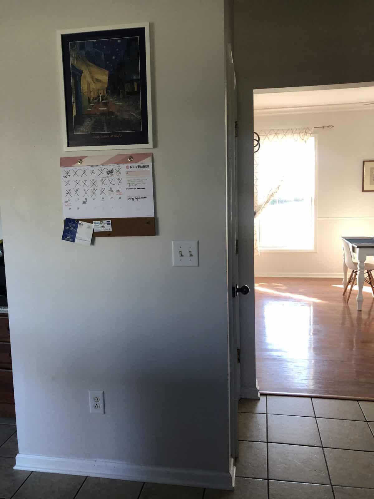
Here’s a quick view of that before. Just changing the floors made a huge difference in how large their home feels now.
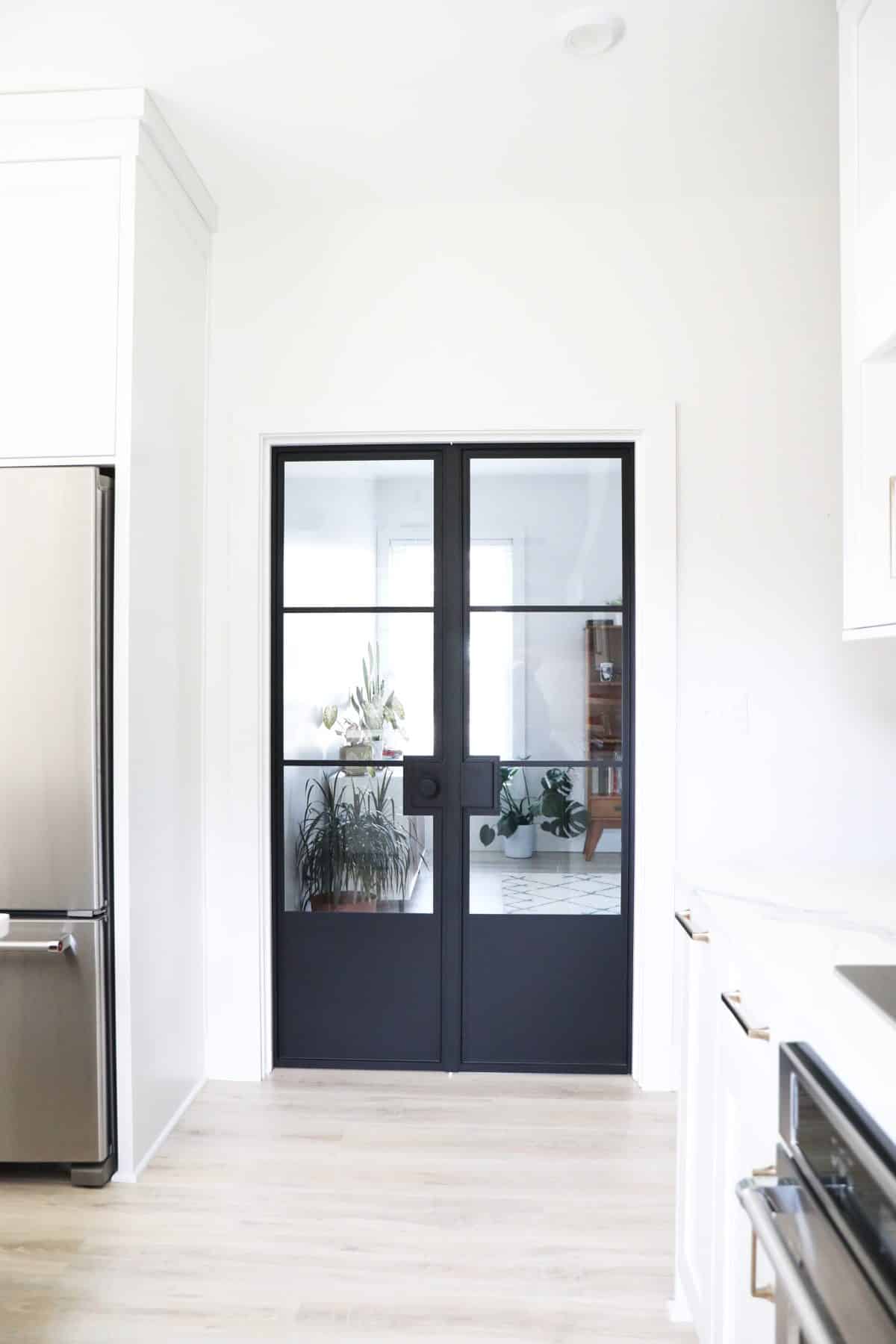
These doors are fully customizable and added so much character!
Here’s a view from the flip side, into the kitchen. Isn’t that just gorgeous!?
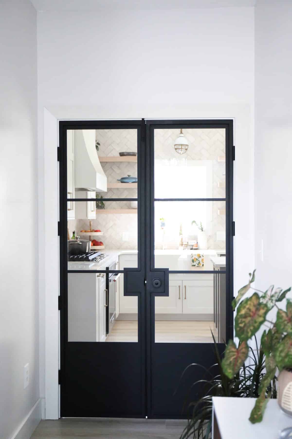
Their kitchen just feels so open and fabulous now.
Tile:
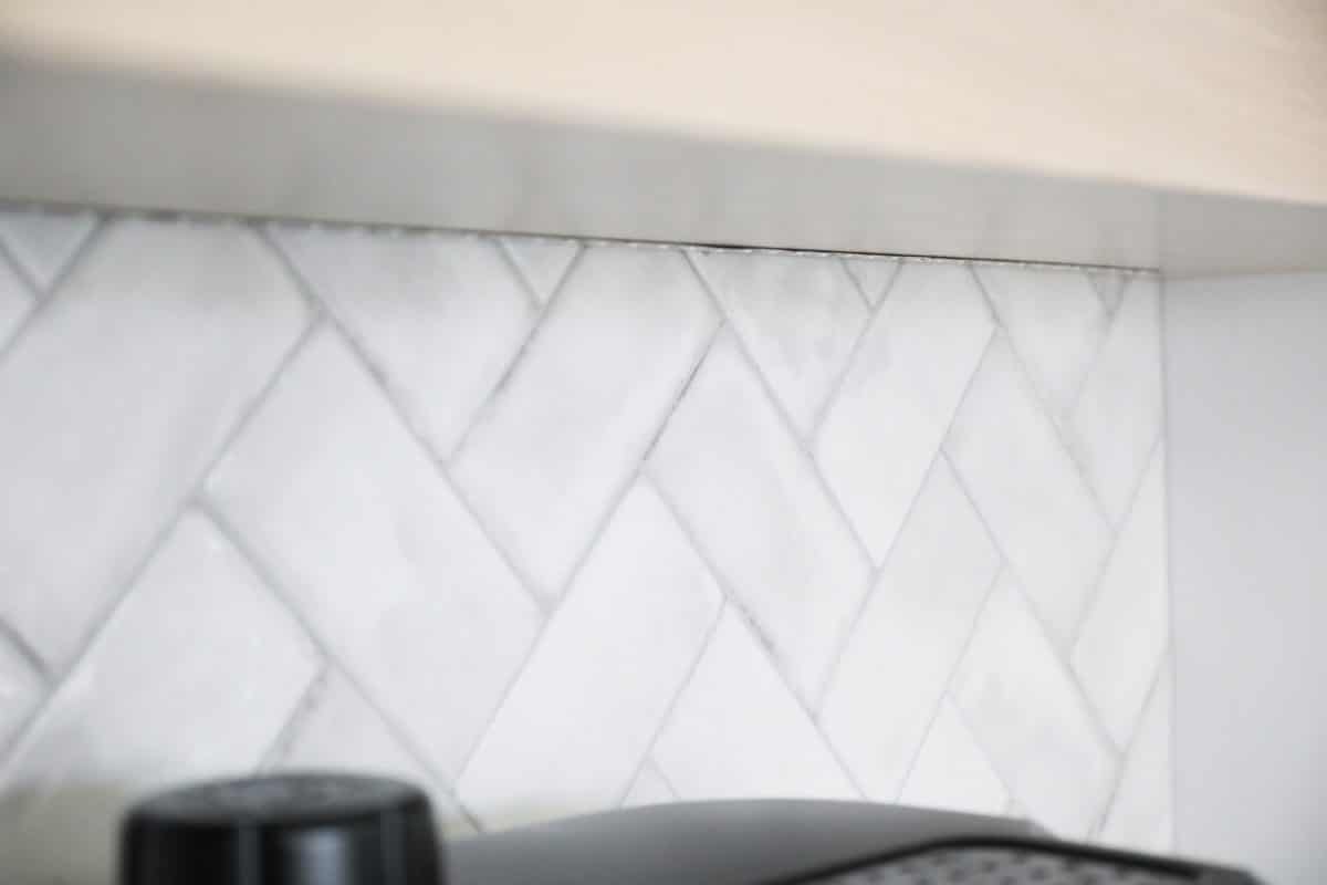
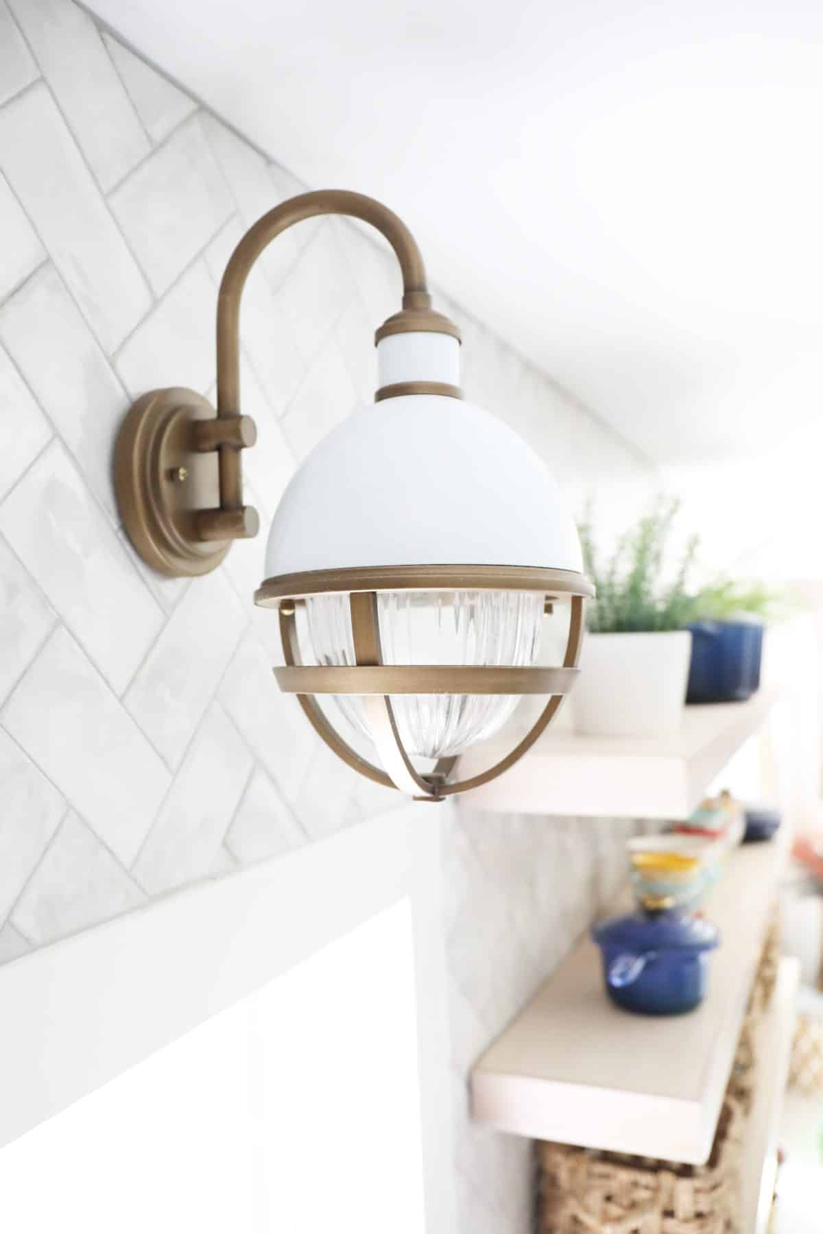
Their backsplash is from one of my very favorites from Jeffrey Court.
It has these beautiful, yet subtle variations that just make a space feel classic. We placed it in a herringbone pattern and took it all the way up to maximize its beauty and help the kitchen feel so spacious.
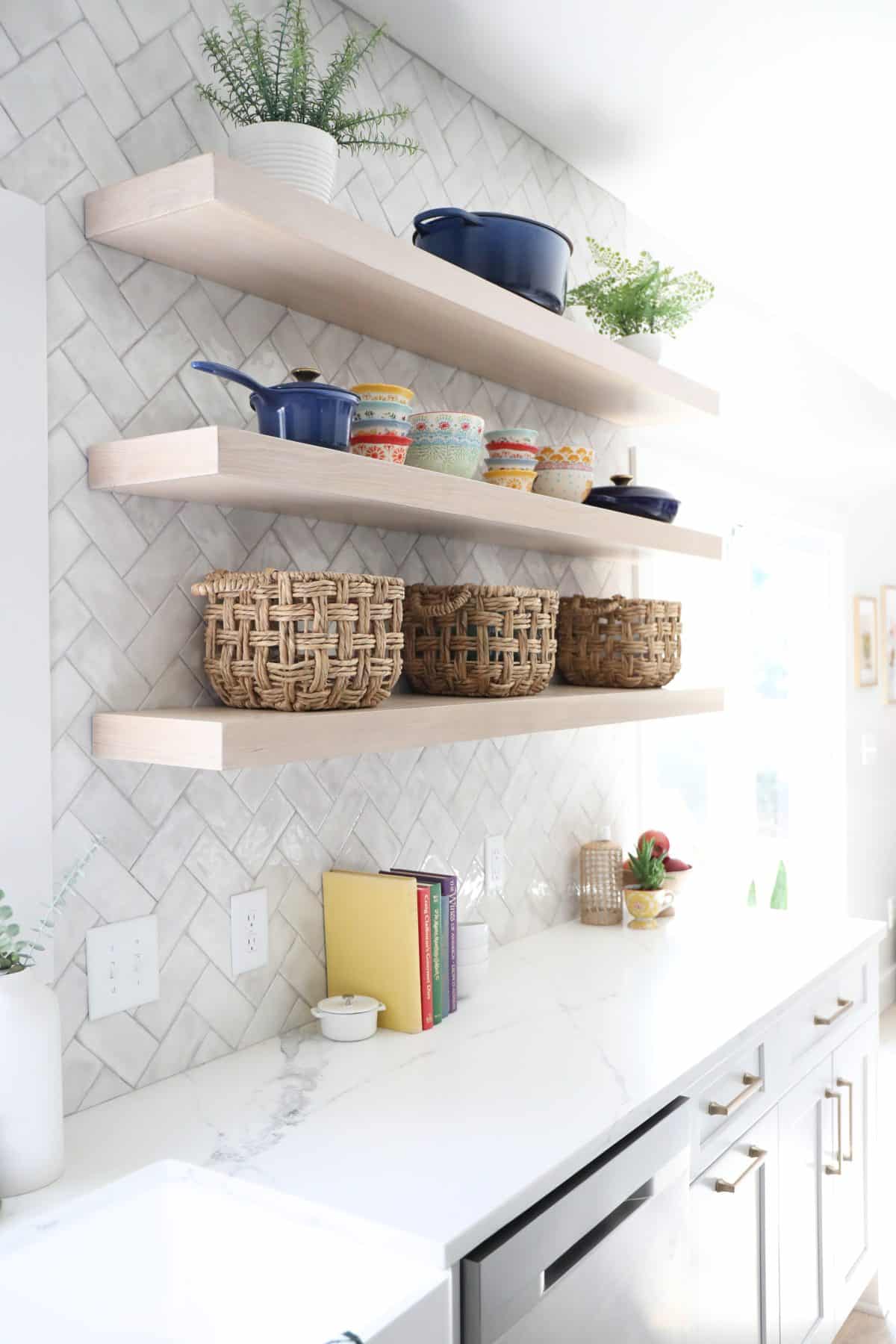
We love the way it plays so perfectly with the countertops {Quartz} + cabinet colors to really pull the space together.
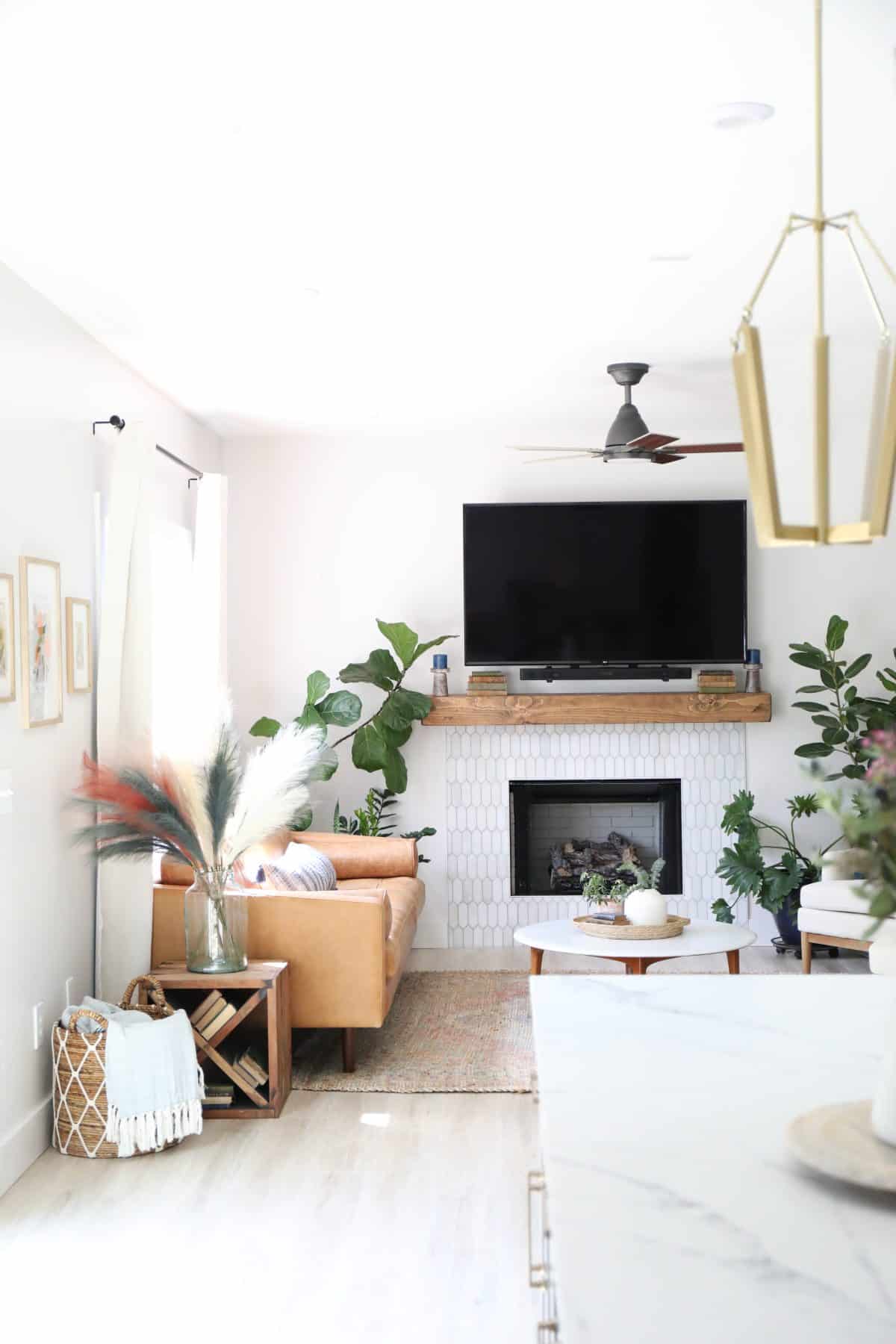
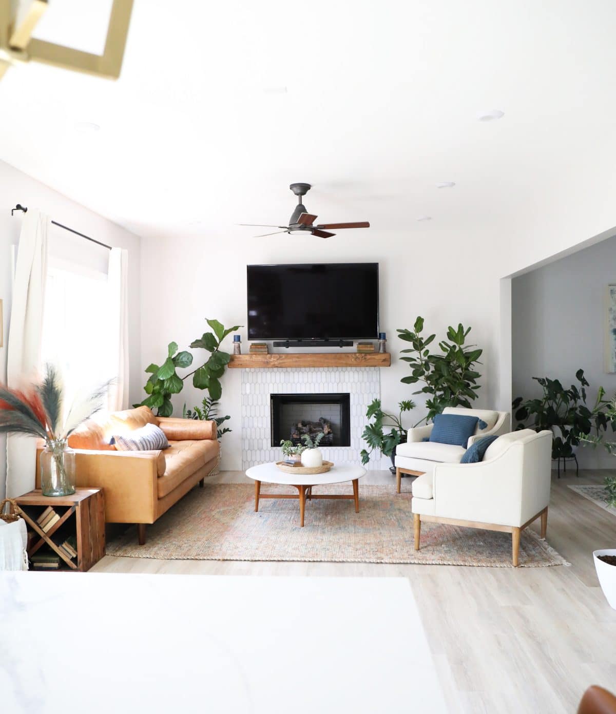
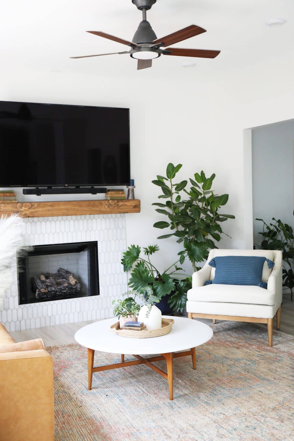
Their mantel in the living room also received an update, and we love the way it brought the space together.
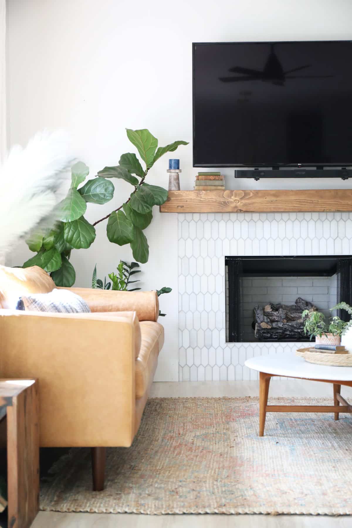
For the mantel, we chose Jeffrey Court’s Suburbs white picket polished marble. It holds such a gorgeous shape and subtle variations as well, we really wanted it to play well with the existing tile, and we love those classic lines.
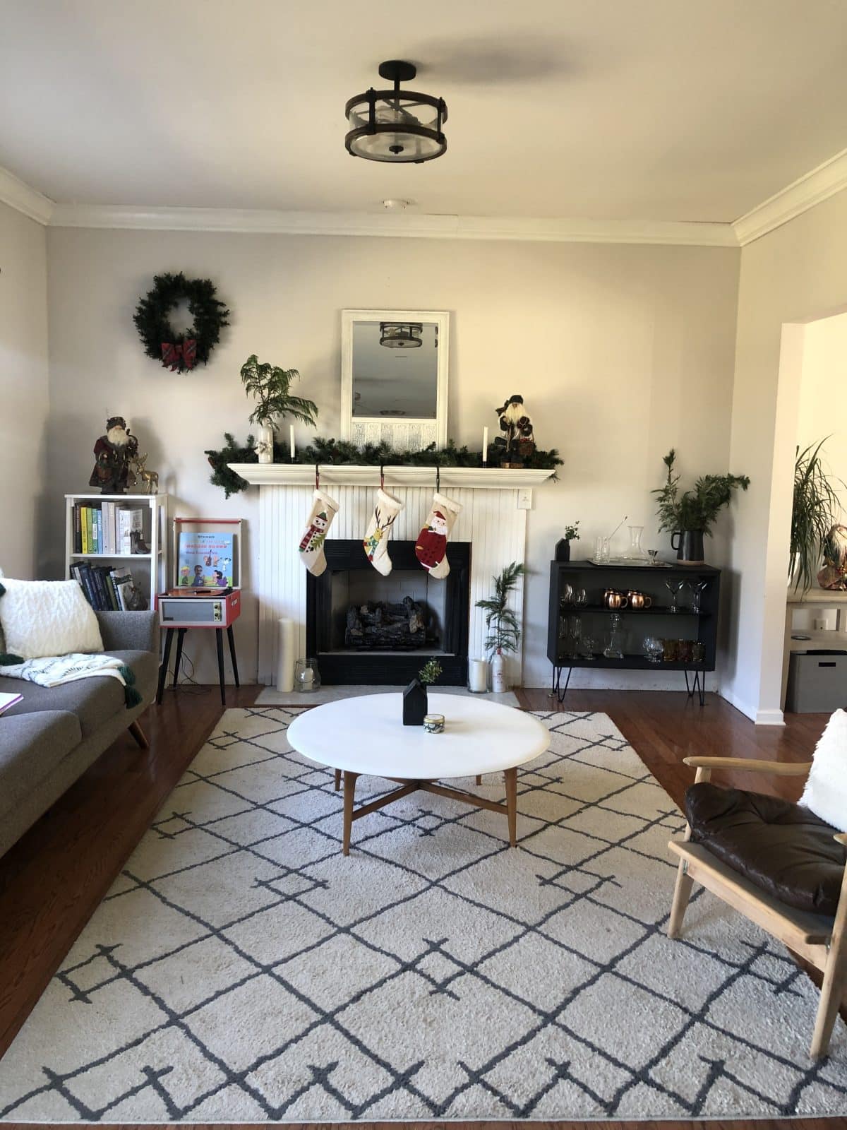
Here’s a shot of their mantel, before! A simple update can make such a big difference.
It was just so nice to give them a fresh, colorful update with both beautiful tiles via Jeffrey Court.
They have so many amazing options!
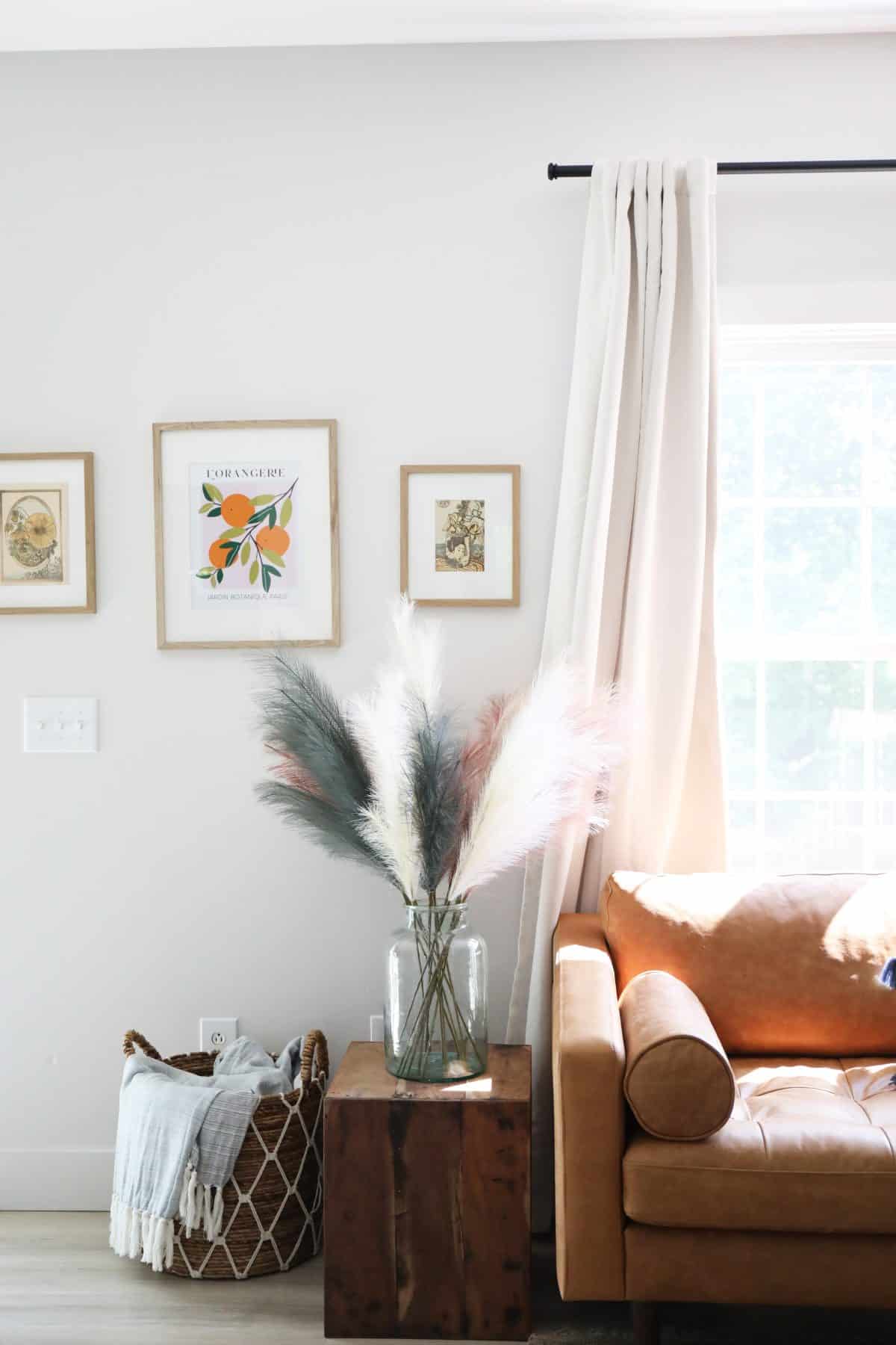
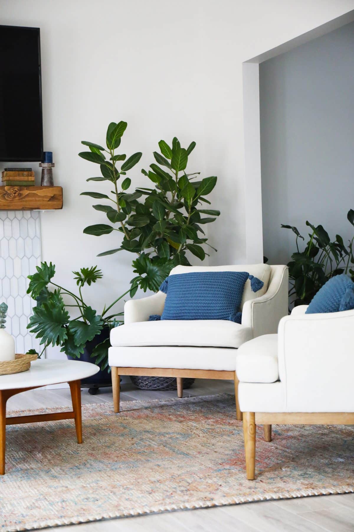
Living Room Details: sofa / chairs / rug / pillows / tables are found/vintage / pampas grass
Lighting:
We topped off the space with a modern ceiling fan from Kichler, as well. We love the options they have for attractive, modern ceiling fans!
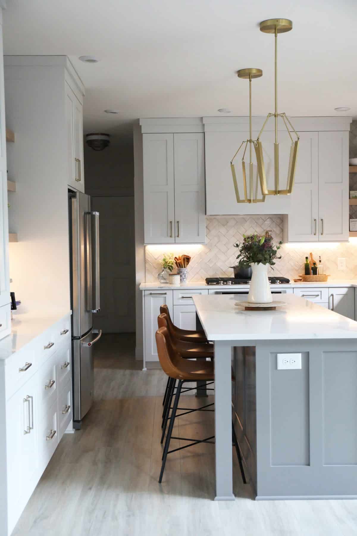
These Kichler light pendants {Calters in champagne gold} are so unique! I absolutely love the way that they added so much to the space. But wait until you see them on…
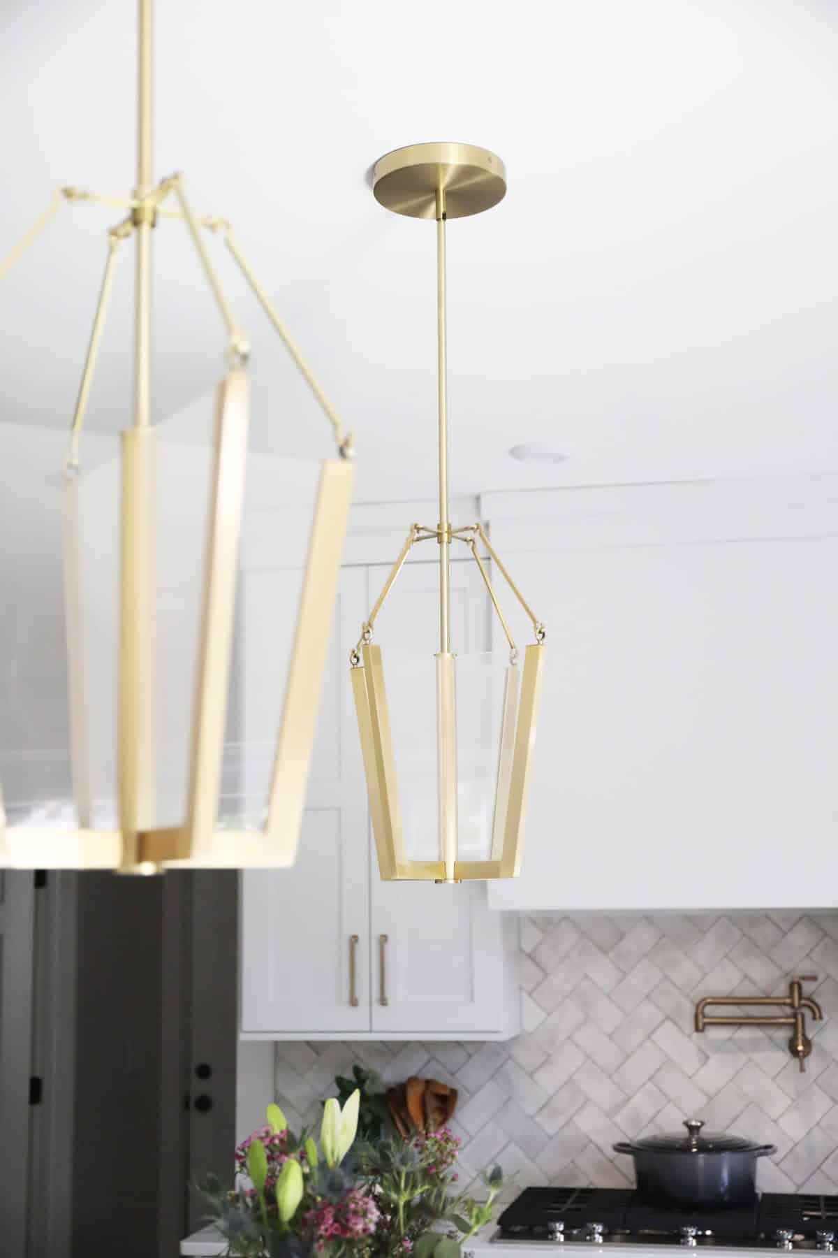
LIT. {Are the young people still saying such things?} I’ve been waiting to use that one. I’ll stop now.
They’re LED, so they really glow. I love the lines and what they add to the space!
Another must have in the kitchens we design, is this under cabinet lighting from Kichler. It truly changes the entire ambience in a space, with the multiple lighting options they provide.
Isn’t it amazing? These photos just don’t do it justice. But these lights are an amazing addition, especially at night!
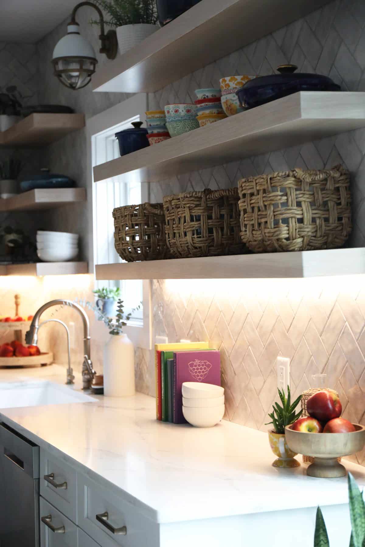
When people think of under cabinet lighting, they often think of those big fluorescent lights that were often chunkily placed underneath upper cabinets. What we love about these is their undetectable existence, along with the dimmer switches you can use to adjust the lighting. They’re available on an LED tape, which is a true game changer.
This Tollis Sconce is another one of our favorite lines as well from Kichler. We adore this character!
We continued the look in their hallway with this flush mount, as well. It’s so fun to bring in that style in subtle ways!
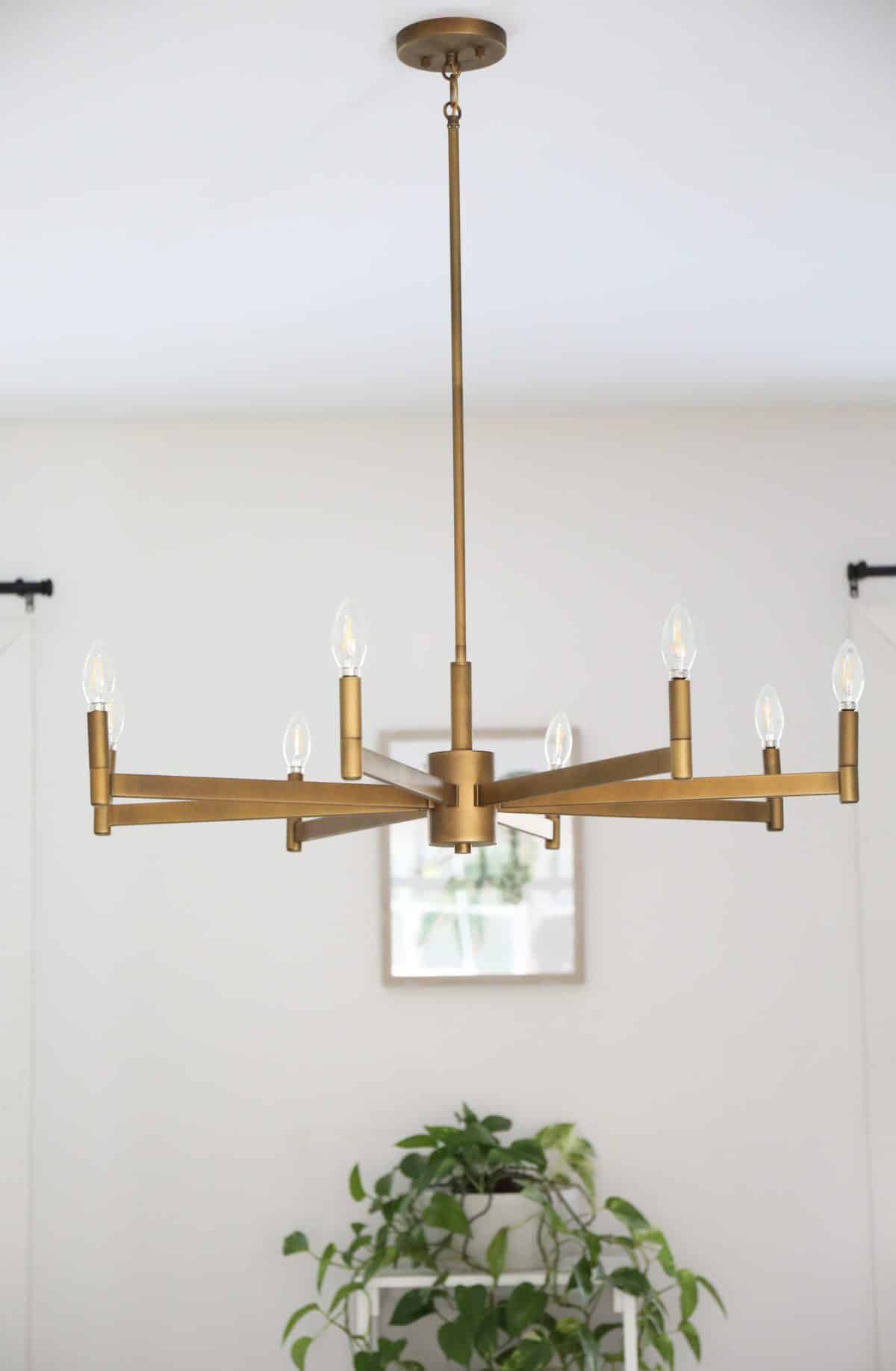
Their new dining space holds this Erzo chandelier as well to truly brighten the space!
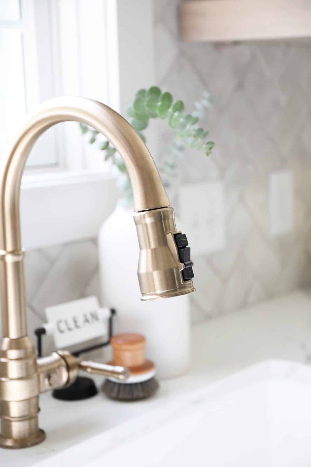
Let’s talk all things fixtures. We believe that dependable products are all too important when it comes to faucets. That’s why we love using Delta in our clients’ homes.
They offer incomparable style + value. We’ve visited the Delta headquarters and what we know about them personally, is that they think about all the minutia so that you don’t have to. They live, eat and breathe faucets, and make it a true art form.
We chose from the Broderick™ collection for this modern industrial look. Here’s a little form their site:
The powerful features of the Broderick™ Collection take center stage in the kitchen, with an industrial style that alludes to a rich heritage. The collection includes distinctive bridge faucet and pull-down spring spout faucet options that add a unique element to any kitchen. Styled after the rugged nuts and bolts of machinery, it serves as a true centerpiece in the kitchen.
We love that they come with things like Touch-Clean® Spray Holes which make clean up a breeze, and their DIAMOND™ Seal Technology which allows their faucets to perform like new for life. That means that it comes with with a patented design which reduces leak points.
Translation: This is a big deal for a designer who learned the hard way not including Delta in her own kitchen faucet, {it was a find a long time ago} and had to replace her floors because of it. I guess you could call that Karma?
Here’s another look at the fabulous matching pot filler, as well. We love some good, functional eye candy!
These faucets just play so well in the space. They look oh so good!
These are definitely some of our favorite points for this lovely kitchen tour! We adored changing it up.
What are some of your favorite elements? We’d love to hear.
As always, let us know if you have any questions. Have an inspired day!